Data Roundup, 15 August
The quantified self, the political bias in the UK’s open government data movement and an ethnicity dot map of the US, marking each one of its 309 million residents. Some links to mull over.
TOOLS, EVENTS & COURSES
Events – let’s kick off with OFKN’s own Open Knowledge Conference taking place this September in Geneva. Running since 2005, the theme this year is OPEN DATA – Broad, Deep, Connected. Speakers come from CERN, the World Bank, Columbia university and many other places. Tickets available now.
If you’re interested in the burgeoning field of the quantified self and its implications, and happen to be in San Francisco, check out the Quantified Self 2013 Global Conference. It’s where the global community of self-trackers and tool-makers gather to work out what they can measure and what they want to do with all the measurements when they get them. On October 10-11 and tickets are available now.
Looking for a job in visualization? Some useful advice from a pro over on the flowingdata blog.
You’ve probably seen a few guides to processing raw data. This one – ‘Data Processing and Visualisation Tools’ is from the EU. You may have heard of most of the tools before, but all the listed ones are free of charge and described clearly in this authoritative survey.
DATA STORIES
Why are there more potholes in rich neighborhoods? A fascinating paper looks into the politics of the open data movement in the UK – one of the world’s leaders in the field – and examines why the open data movement isn’t as politically neutral as it appears. The paper by Jo Bates of Manchester Metropolitan University is from 2012, but the implications continue to be relevant.
On finding the hidden biases in the system, an interesting article in the Guardian on how using algorithms to crunch data can magnify the prejudices of the programmer.
Don’t always trust your eyes: change blindness and afterimages are two effects to be wary of in data visualization. The Visual.ly blog explains.
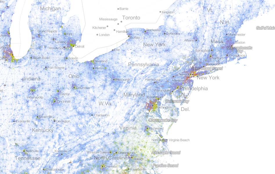
The maker of this map has used a dot to represent one of every 309 million people in the US as counted in the 2010 survey. That’s 308,745,538 people and dots – to be precise. Coding each dot with the ethnicity of the respondent, he’s created a racial dot map of America showing distribution, integration and segregation. This page also includes a description of the methodology if you’re interested in how he did it.
The site GirlsDiscovered contains map-displayed data on the status of girls and young women worldwide in areas like leisuretime, education and economic opportunity.
Back to the quantified self. Fitbit, one of the leading companies in personal data used for health, lands $43 million in funding, a sign of the increasing opportunites in the sector according to Techcrunch.
DATA SOURCES
The week’s big news story is the Egyptian government’s crackdown on supporters of its now deposed democratically-elected President. The Guardian has kept an open Google spreadsheet on the Egyptian death toll as the army clears protest camps.
How open data can help development and social justice – a post from OkCon speaker Duncan Edwards, ahead of the Geneva conference.
The FullFacts website has published a new trove of information on health data in the UK. Datasets include the latest information on topics from drug use, STI statistics to how many people receive social care.
And check out this platform containing open source geospatial data from Malawi. Used to support development in Malawi MASDAP, a web-based data sharing tool launched in November 2012. Take a look and make a new map.
We’re rounding up data news from the web each week. If you have a data news tip, send it to us at [email protected].
![]()