You are browsing the archive for Cédric Lombion.

10 years of School of Data

- February 8, 2022 in Announcement, Update

10 years ago exactly, the School of Data project was announced on the Open Knowledge blog by our founder, Rufus Pollock. Over the last decade, the School of Data team and network facilitated trainings for over 6,000 individuals around the world, designed innovative training resources and methodologies and influences several dozens of organisations around the world which are now using our open resources; and we aren’t done yet!

At the time of its launch, School of Data was inspired by the model of the Peer to Peer University (P2PU; specifically the School of Webcraft, a defunct partnership between P2PU and Mozilla), but with a focus on more curated content. The project was also rooted in the Open Educational Resource movement, to which OKF contributed through its Open Education Working Group.  School of Data was a product of its time: 12 days after our announcement Udacity started offering online courses and was followed three months later by edX. As the New York Times said at the time, it was “The Year of the MOOC”.

But the project – sustained in its early years thanks to funding from Shuttleworth, Open Society Foundation and Hewlett- quickly pivoted: it became clear that for an NGO aiming to promote open knowledge across the world, publishing learning modules and tutorials online was not enough. The people who needed data skills the most were often the ones least likely to come to our website and learn by themselves; we needed to go to them.

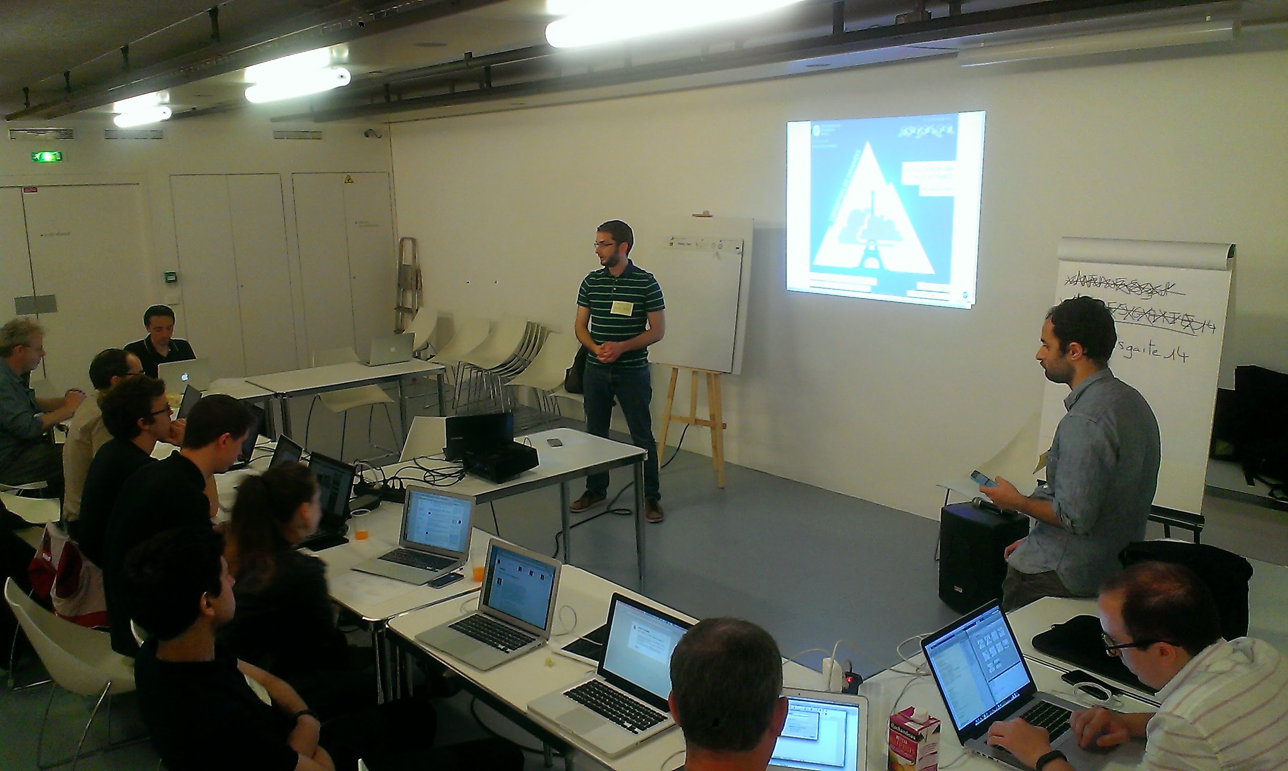
So we got to work. Starting with conferences, such as Mozfest, our team travelled around the world to teach data to journalists and civic actors. At the same time, we developed and tested the methodology and learning resources, which would become a backbone of our work: the data pipeline methodology, the data expedition format and our online learning modules. We produced several pieces of research to better understand the field of data literacy. We partnered with NGOs from other countries who shared our vision, such as SocialTIC in Mexico and Code4SA (now OpenUp). We kicked off a Fellowship programme which ran for 6 years and worked with a variety of organisations such as Hivos, NRGI, Internews, Transparency International, IREX, Publish What You Pay, IDRC, the World Bank or Code for Africa.

All this work contributed to the growth of, and was made possible by our single most important asset: the School of Data network.

map of the School of Data network

The global School of Data network is visible on the map, with former Fellows as triangles, partner organisations as circles and coordination team members (current and former) as stars

Made of former Fellows and partner organisations sharing our vision and methodologies, the School of Data network was a necessary step to address one of the biggest challenges that we had identified: the lack of mentors with the data literacy skills needed to implement our vision on the field, around the world. Today the network allows the School of Data to deliver trainings in fifteen languages across the world, ensuring that our trainings are inclusive and culturally relevant.

What’s next

Those who follow the project know that the School of Data has been quiet in the past few years. Although the work never stopped, we are very much aware that our public activity fell short of the expectations that our friends and partners had come to expect from us. But this anniversary comes at a perfect time: under the leadership of our new CEO, Renata Ávila, OKF will once again invest in reimagining and launching an updated School of Data, combining knowledge, technical tools and critical thinking about the present and future of technology. With this renewed focus, we will be able to support our network better, continue innovating with better training and learning resources, and, more importantly, speed up our work toward achieving our vision: a world where everyone, from civil society organisations, to journalists and citizens,  are empowered with the skills they need to use data effectively, transforming into knowledge, leading to change.

If you want to work with us on what’s coming next, don’t hesitate to contact us!

Flattr this!

Prototyping a card game about datavisualisation – Part 1

- May 4, 2015 in Data Stories

On April 11, I was invited by TechSoup Europe to Istanbul to speak at ThingsKamp, a conference dealing with topics such as data, technology, peer learning… This event was a the culmination of a series social projects about technology and community building.

I was asked to make an interactive presentation, so I grabbed the chance to work on an idea I was toying with: making a datavisualisation card game.

You can grab my slides here.


1. Why a card game?

The card game has the advantage of being physical, which is nice break from the all-computer kind of data workshops. It facilitates discussion, create a more relaxed learning atmosphere and works for all ages.

Games in general, when designed well, can be picked up by beginners who will understand the rules and the nuances as they read the ruleset and play the game. This is a definitive advantage if we want to spread data literacy: a game can reach more people than we ever will.

I got the permission of Severino Ribecca, the creator of the ever useful datavizcatalogue, to use his illustrations as teaching materials, so I used them to build the prototype.


2. How does it look like?

dataviz card game

There are two sets of cards:

  • The playing cards, with the visualisations. On the front, the symbol and the name of the visualisation. On the back, the categories those visualisations belong to. Most materials were sourced from the datavizcatalogue.
  • The « scenario » cards, where I’ve written typical questions that we use to explore a dataset. For this prototype there were 9 cards around a same theme, with two themes: traffic accidents and domestic violence.

I won’t distribute the files for now because it’s a prototype, and the illustrations are not under a creative commons licence. A dedicated website will be set up to distribute the cards and rulesets once the illustrations are reworked and the mechanics improved.


3. How does it play like?

Because I was uncertain about the number of attendees, I decided on game that could be played quickly, and with groups.

avr. 14, 2015 09:43

I set up two tables, one set of playing cards by table. The participants were split into two groups, each one assigned to a table. After I’d read a « scenario » card, the groups had to search together the corresponding charts, in a limited time. When the time was over, they had to put the cards in the air, so I could verify their cards, give out points and explain the correct reasoning.

The game is played over several turns, and the winning group is the one with the most points at the end, by adding points for each good card and subtracting for each wrong one.


4. How did people react?

The group game pushed people to debate about what works and what doesn’t. The groups only had one minute to decide, so the final seconds were stressful but definitely fun.

The positive feedback:

  • « it was really interesting, I learned a lot »,
  • « I never went beyond the line, pie and bar chart, so I discovered a lot of new charts, just by seeing them on the table »,
  • « I never made the conscious efforts of linking variables with charts, so this was a great learning experience for me »
  • « It was fun to use physical cards »

The negative feedback:

  1. « There were many people around the table, so its was hard to look at all the cards. A reference sheet would have helped »
  2. « It went a bit quickly, so I couldn’t understand all the explanations and illustrations »

For a test run, this workshop was successful. In part 2, I will describe the process of creating the game, and the challenges left to tackle.

Flattr this!

Data expedition tutorial: UK and US video game magazines

- February 3, 2015 in HowTo

Data Pipeline

This article is part tutorial, part demonstration of the process I go through to complete a data expedition alone, or as a participant during a School of Data event. Each of the following steps will be detailed: Find, Get, Verify, Clean, Explore, Analyze, Visualize, Publish

Depending on your data, your source or your tools, the order in which you will be going through these steps might be different. But the process is globally the same.


FIND

A data expedition can start from a question (e.g. how polluted are european cities?) or a data set that you want to explore. In this case, I had a question: Has the dynamic of the physical video game magazine market been declining in the past few years ? I have been studying the video game industry for the past few weeks and this is one the many questions that I set myself to answer. Obviously, I thought about many more questions, but it’s generally better to start focused and expand your scope at a later stage of the data expedition.

A search returned Wikipedia as the most comprehensive resource about video game magazines. They even have some contextual info, which will be useful later (context is essential in data analysis).

Screenshot of the Wikipedia table about video game magazines
https://en.wikipedia.org/wiki/List_of_video_game_magazines

GET

The wikipedia data is formatted as a table. Great! Scraping it is as simple as using the importHTML function in Google spreadsheet. I could copy/paste the table, but that would be cumbersome with a big table and the result would have some minor formatting issues. LibreOffice and Excel have similar (but less seamless) web import features.

importHTML asks for 3 variables: the link to the page, the formatting of the data (table or list), and the rank of the table (or the list) in the page. If no rank is indicated, as seen below, it will grab the first one.

Once I got the table, I do two things to help me work quicker:

  • I change the font and cell size to the minimum so I can see more at once
  • I copy everything, then go to Edit→Paste Special→Paste values only. This way, the table is not linked to importHTML anymore, and I can edit it at will.

VERIFY

So, will this data really answer my question completely? I do have the basic data (name, founding data, closure date), but is it comprehensive? A double check with the French wikipedia page about video game magazines reveals that many French magazines are missing from the English list. Most of the magazines represented are from the US and the UK, and probably only the most famous. I will have to take this into account going forward.

CLEAN

Editing your raw data directly is never a good idea. A good practice is to work on a copy or in a nondestructive way – that way, if you make a mistake and you’re not sure where, or want to go back and compare to the original later, it’s much easier. Because I want to keep only the US and UK magazines, I’m going to:

  • rename the original sheet as “Raw Data”
  • make a copy of the sheet and name it “Clean Data”
  • order alphabetically the Clean Data sheet according to the “Country” column
  • delete all the lines corresponding to non-UK or US countries.

Making a copy of your data is important

Tip: to avoid moving your column headers when ordering the data, go to Display→Freeze lines→Freeze 1 line.

Ordering the data to clean it

Some other minor adjustments have to be made, but they’re light enough that I don’t need to use a specialized cleaning tool like Open Refine. Those include:

  • Splitting the lines where 2 countries are listed (e.g. PC Gamer becomes PC Gamer UK and PC Gamer US)
  • Delete the ref column, which adds no information
  • Delete one line where the founding data is missing

EXPLORE

I call “explore” the phase where I start thinking about all the different ways my cleaned data could answer my initial question[1]. Your data story will become much more interesting if you attack the question from several angles.

There are several things that you could look for in your data:

  • Interesting Factoids
  • Changes over time
  • Personal experiences
  • Surprising interactions
  • Revealing comparisons

So what can I do? I can:

  • display the number of magazines in existence for each year, which will show me if there is a decline or not (changes over time)
  • look at the number of magazines created per year, to see if the market is still dynamic (changes over time)

For the purpose of this tutorial, I will focus on the second one, looking at the number of magazines created per year Another tutorial will be dedicated to the first, because it requires a more complex approach due to the formatting of our data.

At this point, I have a lot of other ideas: Can I determine which year produced the most enduring magazines (surprising interactions)? Will there be anything to see if I bring in video game website data for comparison (revealing comparisons)? Which magazines have lasted the longest (interesting factoid)? This is outside of the scope of this tutorial, but those are definitely questions worth exploring. It’s still important to stay focused, but writing them down for later analysis is a good idea.

ANALYSE

Analysing is about applying statistical techniques to the data and question the (usually visual) results.

The quickest way to answer our question “How many magazines have been created each year?” is by using a pivot table.

  1. Select the part of the data that answers the question (columns name and founded)
  2. Go to Data->Pivot Table
  3. In the pivot table sheet, I select the field “Founded” as the column. The founding years are ordered and grouped, allowing us to count the number of magazines for each year starting from the earliest.
  4. I then select the field “Name” as the values. Because the pivot tables expects numbers by default (it tries to apply a SUM operation), nothing shows. To count the number of names associated with each year, the correct operation is COUNTA. I click on SUM and select COUNT A from the drop down menu.

This data can then be visualized with a bar graph.

Video game magazine creation every year since 1981

The trendline seems to show a decline in the dynamic of the market, but it’s not clear enough. Let’s group the years by half-decade and see what happens:

The resulting bar chart is much clearer:

The number of magazines created every half-decade decreases a lot in the lead up to the 2000s. The slump of the 1986-1990 years is perhaps due to a lagging effect of the North american video game crash of 1982-1984

Unlike what we could have assumed, the market is still dynamic, with one magazine founded every year for the last 5 years. That makes for an interesting, nuanced story.

VISUALISE

In this tutorial the initial graphs created during the analysis are enough to tell my story. But if the results of my investigations required a more complex, unusual or interactive visualisation to be clear for my public, or if I wanted to tell the whole story, context included, with one big infographic, it would fall into the “visualise” phase.

PUBLISH

Where to publish is an important question that you have to answer at least once. Maybe the question is already answered for you because you’re part of an organisation. But if you’re not, and you don’t already have a website, the answer can be more complex. Medium, a trendy publishing platform, only allows images at this point. WordPress might be too much for your need. It’s possible to customize the Javascript of tumblr posts, so it’s a solution. Using a combination of Github Pages and Jekyll, for the more technically inclined, is another. If a light database is needed, take a look at tabletop.js, which allows you to use a google spreadsheet as a quasi-database.


Any data expedition, of any size or complexity, can be approached with this process. Following it helps avoiding getting lost in the data. More often than not, there will be a need to get and analyze more data to make sense of the initial data, but it’s just a matter of looping the process.

[1] I formalized the “explore” part of my process after reading the excellent blog from MIT alumni Rahoul Bhargava http://datatherapy.wordpress.com

Flattr this!

The quest for air pollution data in Paris

- August 13, 2014 in Data Expeditions

#EDpollution

On June 15th 2014, during the Parisian digital festival Futur en Seine, the French Open Knowledge local group organized its first data expedition. Our theme was air pollution in Paris urban area. The expedition was hosted by the Infolab, a progOKF - logo EDpollutionramme dedicated to data analysis for the general public.

Air pollution made sense as a theme to explore. The subject hit the news some months ago with a pic of pollution in Paris, and there were some obvious datasets we wanted to investigate. The workshop was successful on the whole, but not necessarily where we expected it to be. Air pollution in Paris urban area was definitely a complex subject to explore, and little if any related data was available.


14   The number of attendees

Attendees had to position themselves on a scale going from 0 to 3 regarding several competencies: Storyteller, Explorer, Data Technician, Analyst and Designer. A quick analysis showed that some competencies were unevenly distributed, with the exception of storytelling.

average level of participants
 

3   The number of approaches

After a brainstorming to find interesting questions about air pollution in Paris (first phase), five questions were selected. The participants then split in 3 groups with each choosing one question as a starting point for exploration.

  • Group 1 : Do public transport strikes have an impact on air quality?

  • Group 2 : Has the rise in bike use helped decrease the overall level of air pollution?

  • Group 3 : Is Paris different than other international capitals in terms of air pollution? And what is behind the difference?

Notably, the question about strikes came from an OKF Twitter follower, @fcharles
 

10   The number of data providers used

Airparif, data.gouv.fr, European Environment Agency… various data providers have been combed (second phase) to find useful data for the expedition. Among the 14 datasets found, the most useful were those from Airparif. They describe the evolution of the concentration of the 4 most important pollutants (SO2, NO2, O3, PM10). One group made a call for help on Twitter to find more data about Paris’ bike sharing service, which helped two important datasets to be opened to the public.
 

0   The number of significant correlations found

It looks like a low number, but no significant result does no mean no result at all. The subject was ambitious, and the data was often incomplete, or even unavailable for analysis (third part).

Group 1: this group studied the strike of the national railway company workers that occurred on June 11th 2014.
Hypothesis: by measuring the levels of pollution during and after the strike we can highlight the impact of the strike on air pollution.
Result: comparing the during and after didn’t yield significant results.

Group 2:  this group tried to compare the evolution of bike use with the evolution of air pollutants concentration.
Hypothesis: some of the people who bike to work choose this transport solution over their car, meaning that they contribute to a reduction in air pollution.
Difficulty encountered: the raw data of Airparif was complex to manipulate, which kept the group from finishing their analysis in time.

Group 3: this group decided to create a dataset from scratch with geographic, demographic, transport and pollution data regarding several world capitals.
Hypothesis: by comparing enough variables, we can observe which characteristics are linked to air pollution.
Result: Even visualised in a bubble chart, no obvious trend was found
 

5   The number of data set created, improved or made public

From Datasets Sources
Group 2 Monthly variation of Parisian bike traffic since 2008 Observatoire des déplacements à Paris
Group 2 Geolocalised data from Airparif’s pollution sensors regarding the 4 main pollutants (this data can’t be reshared) Airparif
Group 3 Geographic, demographic, transport and pollution data for Paris, London, Berlin, Madrid, Brussels, Copenhagen, Amsterdam Earth Policy Institute
Agence européenne de l’environnement
Commission européenne
Air Quality Index
Eurostat
Etienne Côme Historical data of 20 bike sharing services from several cities in Belgium,  France, Japan, Norway, Slovenia, Spain, Sweden http://vlsstats.ifsttar.fr/rawdata/ (fr)
Mathieu Arnold Historical data of the usage of Paris bike sharing service’s parking stations. Updated every 10 minutes since 2008 http://v.mat.cc/ (fr)

Sadly, Airparif’s licence does not grant the right to share their data. This is surely something that should be investigated considering the status of Airparif, an association whose mission of providing pollution info is a public service under delegation of the French Government.
 

Some other numbers :

0 The number of data used that were really in open data. The data retrieved was either in PDF format, or wasn’t under a open data compatible licence.
15 The approximate number of hours spent studying air pollution to prepare the expedition.
5 The number of software tools used: LibreOffice, Google Spreadsheets, R, Google Charts, Open Data Soft
270 The duration of the event in minutes. From 11h30 to 16h00

Flattr this!