 Ben Hur Pintor, our fellow from the class of 2018, here shares his thoughts and research on public procurement data in the Philippines.
During the selection process for the 2018 School of Data Fellowship here in the Philippines, I was informed that the selected Fellow will be working with data related to public procurement. As I wasn’t a public procurement expert, I did a little research on the topic. Here, I’d like to share some of the interesting observations that I noticed:
Public Procurement Data in the Philippines
In theory, we expect public procurement in the Philippines to produce a lot of data considering how the process is defined by RA 9184 or the Government Procurement Reform Act.
Under the law, public procurement includes all “acquisition of Goods, Consulting Services, and the contracting for Infrastructure Projects by any branch, department, office, agency, or instrumentality of the government” including procurement for projects that are wholly or partly funded by Foreign Loans or Grants pursuant to a Treaty or International or Executive Agreement unless different procurement procedures and guidelines are expressly stated or if the foreign loan and grant is classified as Official Development Assistance (ODA) under RA 8182 or the Official Development Assistance Act.
From this definition alone, we can see that almost all government spending falls under public procurement and, thus, it is logical to assume that whenever the government spends, public procurement data should be produced.
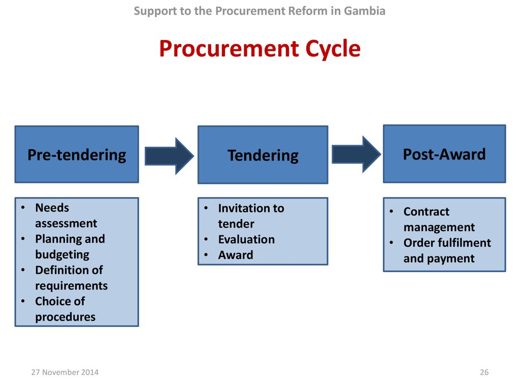
Aside from the definition of public procurement, the law also provides, as a general rule, that all procurement shall undergo Competitive Bidding except for specific cases when Alternative Methods of Procurement such as Limited Source Bidding, Direct Contracting, Repeat Order, Shopping, and Negotiated Procurement are allowed. These specific cases are subject to the prior approval of the Head of the Procuring Entity (HOPE) and should be justified by the conditions provided by the Act.
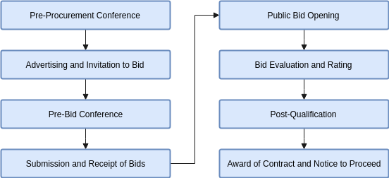
Most of the time, Competitive Bidding which has the following steps — advertisement, pre-bid conference, eligibility screening of prospective bidders, receipt and opening of bids, evaluation of bids, post-qualification, and award of contract — is followed.
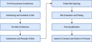
Steps in Public Procurement by Competitive Bidding
Each step in the public procurement process produces its own data — bid posts, pre-procurement and pre-bid conference proceedings, submitted bids, winning bids, information on the bidders, and the awarded contracts to name a few. There are also monitoring and evaluation documents and reports that are regularly created during the implementation of a government project and even after its completion.
So with all this public procurement data supposedly being produced, where can it be found?
Where to Find It
The Government Procurement Reform Act or RA 9184 enacted in 2003 is the comprehensive law governing public procurement in the Philippines that put together all procurement rules and procedures covering all forms of government purchases from goods, to consulting, to infrastructure services. It sought to address the complexity and vagueness of public procurement and its susceptibility to abuse and corruption due to multiple procurement laws by simplifying and standardizing the procedures with a focus on transparency and accountability.
The law added two interesting features to ensure transparency and accountability:
- the creation of an electronic portal which shall serve as the primary and definitive source of information on government procurement (PhilGEPS); and
- the establishment of the Government Procurement Policy Board (GPPB).
The PhilGEPS (Philippine Government Electronic Procurement System) is the country’s single, centralized electronic portal that serves as the primary and definitive source of information on government procurement. Government agencies, as well as suppliers, contractors, manufacturers, distributors and consultants, are mandated to register and use the system in the conduct of procurement of goods, civil works, and consulting services.
On the website, the government can publish what goods, consulting services, and civil works projects it needs while suppliers, private contractors, and companies can search and view these procurement opportunities. It features an Electronic Bulletin Board where all procurement opportunities, results of bidding, and related information are posted; a Registry of Manufacturers, Suppliers, Distributors, Contractors and Consultants; and an Electronic Catalogue of common and non-common use goods, supplies, materials and equipment. When fully implemented, the system is also intended have a Virtual Store, Electronic Payment System, and Electronic Bid Submission. The system is managed by the Procurement Service of the Department of Budget and Management.
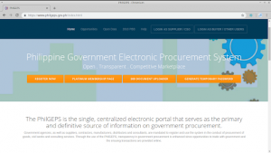
The PhilGEPS website (version 1.5)
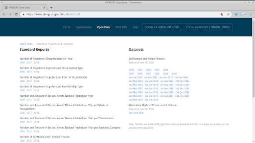
PhilGEPS also releases public procurement data published by different government agencies as mandated by the Government Procurement Reform Act together with other infographics and reports.
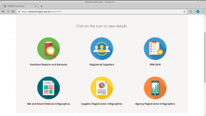
Some datasets available in PhilGEPS
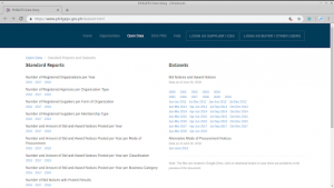
Standard Reports and Datasets

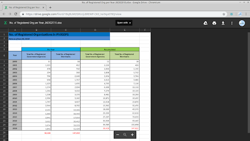
Sample data (Number of Registered Organizations per Year)
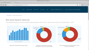
Reports, Notices, and Infographics
The GPPB, as established by the Government Procurement Reform Act, is an independent inter-agency body with private sector representation envisioned as the policy making entity and the governing body overseeing the implementation of procurement reform in the country. Its objectives include the preparation of a generic procurement manual and standard bidding forms for procurement; establishing a sustainable training program to develop the capacity of Government procurement officers and employees; and ensuring the conduct of regular procurement training programs by the procuring entities.
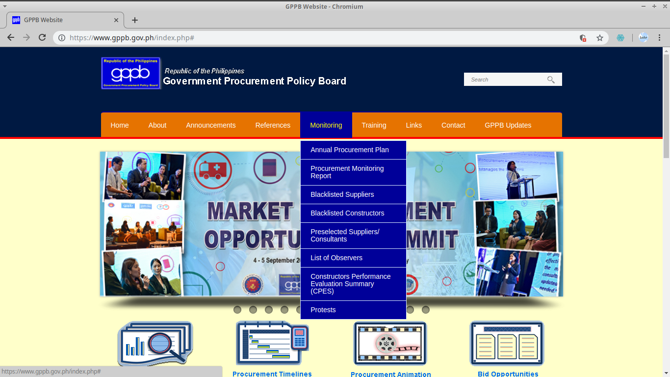
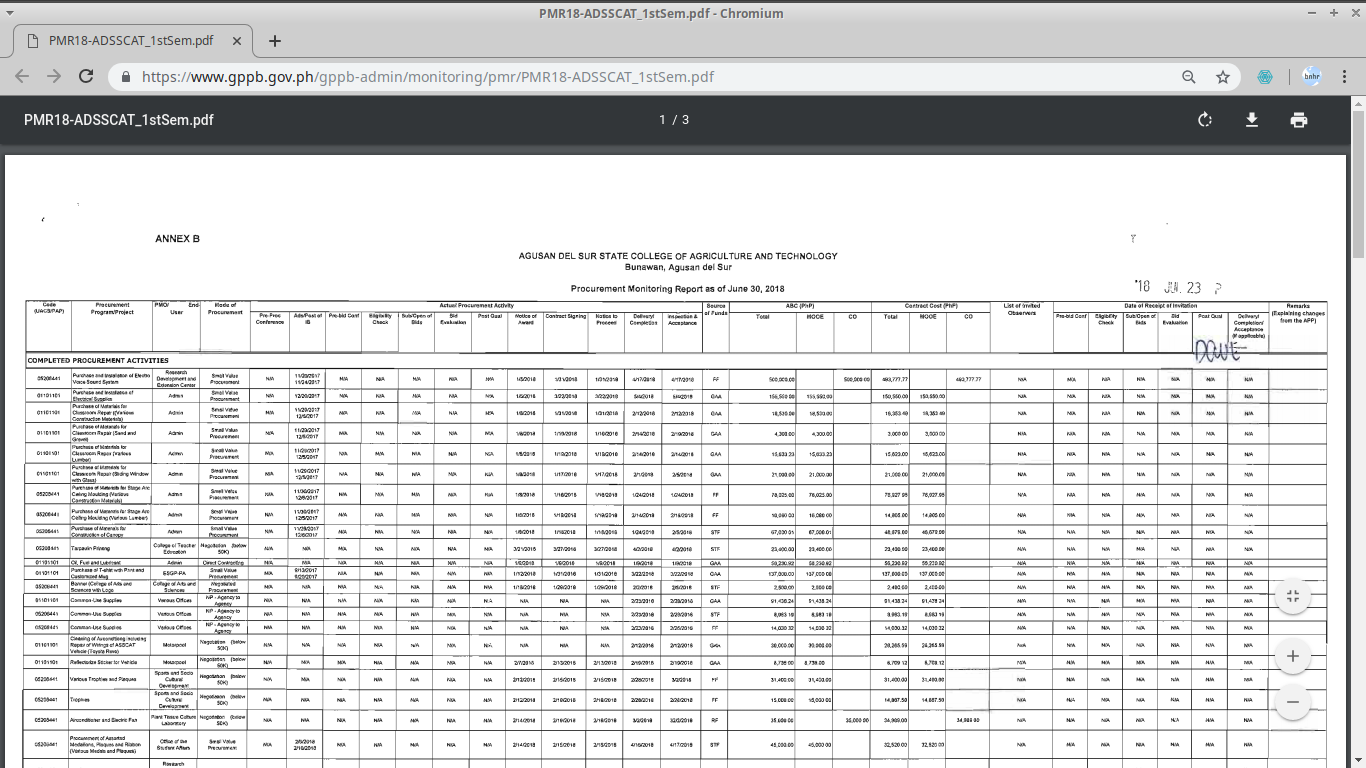
It also stores and displays public procurement data submitted to it by procuring entities and regulatory bodies. These include information on Annual Procurement Plans, Procurement Monitoring Reports, List of Blacklisted Suppliers and Constructors, Constructors Performance Evaluation Summaries, Pre-Selected Suppliers and Consultants, List of Observers, and Status of Protests.
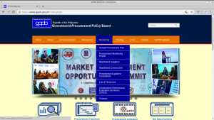
GPPB Website and Monitoring Data
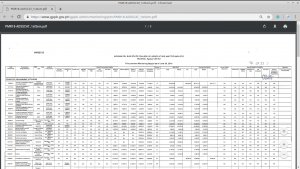
Sample data (PDF format)
Aside from the PhilGEPS and GPPB, the different government agencies also publish procurement records on their respective websites in compliance with National Budget Circular No. 542. This Circular is more commonly known in the Philippines as the Transparency Seal Circular because it directs government agencies to have a Transparency Seal visible on their websites where the public can access information related to their agency.
Some of the data that the circular requires to be released are: annual reports, approved budget and corresponding targets, major programs and projects, program and project beneficiaries, status of implementation and program/project evaluation and/or assessment reports, annual procurement plans, contracts awarded, and the name of contractors/suppliers/consultants.
For example, the Department of Public Works and Highways has a Civil Works page on their website that shows key documents related to the public procurement of civil works projects.
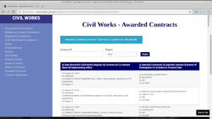
DPWH Civil Works page
Is it Enough?
As highlighted by the Philippine Center for Investigative Journalism (PCIJ) on their report “Public Contracting in the Philippines: Breakthroughs and Barriers” about the infrastructure projects of the Department of Public Works and Highways (DPWH), there are challenges in terms of the completeness and accessibility of public procurement data in the country. Tracking the process from planning to implementation is difficult because not all the documents related to the procurement of infrastructure projects are published. This is compounded by the weak organization of files in agency websites which can confuse those unfamiliar with the procurement process. For example, even though the different documents related to one infrastructure project are available in the DPWH site, they are located on different web pages and are not linked to one another thus preventing users from easily understanding how documents might connect to each other. Aside from this, even though PhilGEPS and the GPPB are good sources of public procurement data, they are only repositories and are dependent on the data submitted to them by procuring entities. This becomes problematic when the procuring entities themselves fail or even refuse to submit their data.
Another important thing I noticed about public procurement data in the Philippines is this: Publishing public procurement data in machine-readable formats is not (yet) the norm in the Philippines. If you look at the Government Procurement Reform Act, there is no mention about releasing or publishing procurement data and documents in machine-readable formats. The training programs by the GPPB designed to develop the capacity of procurement officers and employees for both the private sector and the national government agencies, government-owned and controlled corporations, etc do not include parts on working with or publishing machine-readable data. As a result, procuring entities and agencies release data without considering the implications of the format they are releasing it in.
In fact, aside from those found in PhilGEPS, most of the public procurement data in the country are in non-machine-readable formats — as PDFs, documents, or even scanned images. Now, the procuring entities releasing the data might not consider this as a problem since compliance with the law only requires them to release the data but from the point of view of a data practitioner analysing public procurement data, a civil society organization creating visualizations in support of its advocacy, a journalist investigating government infrastructure projects, or even just a citizen trying to look for possible evidence of corruption in the procurement process, this adds a lot of extra steps to convert and standardize the data before any meaningful work can be done on it. Steps that could have been skipped had the data been released in a machine-readable format such as a spreadsheet, a comma-separated value (CSV) file, or JavaScript Object Notation (JSON) file.
One of the positive things pointed out by the PCIJ report was the opportunity to standardize, link, and publish more contracting data given by the current trend of government agencies creating or upgrading their information-management systems. This should be supported by efforts to raise awareness and convince the procuring entities, journalists, CSOs, and citizens of the benefits of releasing machine-readable data.
Public procurement data should not be released just for the sake of releasing it. It should be released for the purpose of ensuring transparency, accountability, and equitability in the procurement process. To do this, it is imperative that the documents and information for each step in the procurement process, from planning to implementation, should be released in an open, transparent, and timely manner. Public procurement data should also serve the purpose of encouraging citizens, individuals, and organizations to keep themselves informed and engaged in how public money is spent. Towards this end, it is important to release data in formats such as spreadsheets, CSV, or JSON that make it easier for stakeholders to analyse, share, and re-use the data. One of the ways to ensure that data is easily shareable, analysable, and reusable is by following a standard like the Open Contracting Data Standard (OCDS). Of course, simply following a standard is not enough and could even be counterproductive when done without the right preparation. It is equally important to study how a standard complements the process and how it can be integrated with the current system.
Sources
Civil Works – Department of Public Works and Highways. http://www.dpwh.gov.ph/dpwh/business/procurement/civil_works/awarded_contracts
Open Contracting Data Standard. Open Contracting Partnership. http://standard.open-contracting.org/latest/en/
Philippine Transparency Seal – Department of Budget and Management. https://www.dbm.gov.ph/index.php/about-us/philippine-transparency-seal
Public Contracting in the Philippines: Breakthroughs and Barriers. Philippine Center for Investigative Journalism (PCIJ) with support from Hivos and Article 19. http://pcij.org/wp-content/uploads/2018/01/PCIJ.-Open-Contracting-in-Philippines-Report_01102018_b.pdf
RA 9184 (Government Procurement Reform Act). https://www.gppb.gov.ph/laws/laws/RA_9184.pdf
The 2016 Revised Implementing Rules and Regulations of RA 9184. https://www.gppb.gov.ph/laws/laws/RevisedIRR.RA9184.pdf
The Government Procurement Policy Board. https://www.gppb.gov.ph/
The Philippine Government Electronic Procurement System. https://www.philgeps.gov.ph/
The Procurement Service. http://main.ps-philgeps.gov.ph/