You are browsing the archive for Data Stories.

The Latin America open data community speaks loud

- October 22, 2015 in Community, Data Stories, Events, Fellowship

Last September the open data community in Latin America gathered in Santiago de Chile in the two most important events in the region to talk and discuss about open data. Since 2013, Abrelatam and ConDatos have been a space to share experiences, lessons learned and discuss issues regarding open data in Latin America.

In this third edition hundreds people from the region came to Chile showing that the open data community has a lot of potential and is continuously growing and involving in the open data movement.

As a fellow of School of Data, this was my first time in Abrelatam and ConDatos and it was a great experience to see, exchange ideas with the community and learn from all the different projects in the region. I had the opportunity to share with journalists, civil society and technology groups that were working on amazing open data initiatives.

Since there was a lot of interest in learning new tools and working specifically with data, there was also a training track in the conference with several workshops about data analysis, data cleaning, data visualization, access to public information, among others. School of Data had three workshops with ex-fellows Antonio Cucho (Perú), Ruben Moya (México) and myself as a current fellow from Costa Rica. The attendants were excited and interested in learning more.

IMG_3759IMG_3749

In the past years I’ve been mainly working as a data journalist in Costa Rica, but I had never had the chance to meet the community that shared my same interests and concerns. This is what makes Abrelatam and ConDatos most valuable. It helped me learn about how things and data projects are done in other countries and see how can I improve the work I’m doing in my own country.

We all have similar issues and concerns in the region, so there’s no point in trying to fix things by yourself if you have a huge community willing to help you and share their lessons and mistakes. On the other hand, as a School of Data fellow I was given the opportunity to share my knowledge with others in data workshops, and it was a great way to show people from other countries the work we are doing in School of Data, helping build data literacy in civil society.

The most important lesson learned from this four days in Chile is that there’s an eager movement and a growing need to work together as a region to make data available and to push the open data agenda with governments. There’s no doubt the region speaks loud and is creating a lot of noise worldwide, so it’s in our hands to keep up and innovate as a community!

If you are interested in learning more about the projects, here’s a list of the projects that participated in AbreLatam in 2014 (the 2015 list well be ready soon!).


Flattr this!

How Open Map Data is Helping Save Lives in Nepal

- June 15, 2015 in Data Stories, Fellowship

My name is Nirab Pudasaini, and I am a new School of Data fellow from Nepal. Just 5 days after the beginning of my fellowship, a devastating earthquake of magnitude 7.9 hit my country. It was on April 25th.

As of May 30 the death toll of the quake had risen to 8691 while 22054 were injured. In one district called Rasuwa, as much of 1.73% of the total population was injured. Nepal was hit bad by the earthquake and there was an immediate need to respond.

image alt text

a map visualization showing the extent of the damage.

In the aftermath of the quake, national and international volunteers quickly joined forces to rescue people under debris, provide food and shelter to those who lost their home and generally provide relief to the affected communities. And the mapping effort was essential to this life-saving effort.

Mapping as a community effort

Crisis mapping, which has been the job of a few specialists in big NGOs like the Red Cross, has dramatically changed in the past few years. With the advent of the open source collaborative mapping project OpenStreetMap (OSM), and more recently the Humanitarian OpenStreetMap Team (HOT), thousands of volunteers contribute to the mapping of countries affected by disasters, with an unprecedented speed. By April 25, 5052 mappers had made 121525 edits to OpenStreetMap.

A part of this effort was shouldered by the non-profit tech organisation where I work, Kathmandu Living Labs. As part of this work, I spent the past two years building community around OpenStreetMap, with disaster resilience in mind.

With no detailed map of Nepal available, building a map with locals was the most efficient way to get there. Not only we were able to map Kathmandu in great detail, but all the school and health facilities in Kathmandu Valley along with their structural data was made freely available to everyone in OSM.

To make this work, we cannot expect to do all the work ourselves. So we train locals and empower communities so they can map their area themselves, using OSM. This way, we expanded our work to other cities than Kathmandu: Bharaptur, Hetaud, and villages like Bajrabarahi, Manahari and Padampur. The maps are used for many applications like agriculture, water health and sanitation and local governance. One of the major area is, of course, humanitarian use.

Data collection, needs assessment and supporting relief workers

Having centralised information proved to be a essential to help fill the information gaps during the earthquake crisis response. After the quake we have been focusing our efforts in four different tasks:

1) A platform where people can submit reports for earthquakes related needs: http://quakemap.org. 1800 reports have come into the system, which aggregates and display needs related to food, medicine, shelter, and sometimes evacuations. A team of volunteers verifies many of those needs, and signal them to appropriate responding organizations. Responding organizations can, and do subscribe to alerts for new reports that come into the system.

image alt text

2) The collaboration with the international OSM community and Humanitarian OpenStreetMap Team to engage remote mappers. Mapper are given instructions on what and where to map, using the OSM tasking manager. The collaboration extends to satellite imagery providers to make aerial imagery available for post disaster mapping.

3) There is a huge need of data collection after the quake for the need assessment and planning. Data collection, storage and management is much easier, faster and cheaper when a mobile based digital solutions are used. We have developed a system using KLL Collect (a mobile app for data collection) which uses Ona’s Server and Dashboard solution to provide a complete data collection and storage solution. This is being used by various organization for their data collection needs.

image alt text

Me teaching Nepal Engineer Association volunteers about mobile data collection

4) http://quakerelief.info is a platform where we provide printable maps created with OSM data. The website provides instructions on using OSM data for Maps and Navigation without a mobile internet connection. The platform also contains useful digital maps like Deaths and Injuries from Earthquake for different districts, Earthquake Intensity by Population and more.

In the coming days information and maps will be playing a vital role in recovery and reconstruction. There are lots of challenges that needs to be overcome in the coming days but with challenges comes opportunity. Having adequate data in an understandable form will be important to plan for all the recovery and reconstruction work that will be done in Nepal and to capitalize those opportunities. Openly accessible map data will be for Nepal a vital piece of that information. As a 2015 School of Data fellow i will keep on working on making Maps for Nepal.

Flattr this!

Prototyping a card game about datavisualisation – Part 1

- May 4, 2015 in Data Stories

On April 11, I was invited by TechSoup Europe to Istanbul to speak at ThingsKamp, a conference dealing with topics such as data, technology, peer learning… This event was a the culmination of a series social projects about technology and community building.

I was asked to make an interactive presentation, so I grabbed the chance to work on an idea I was toying with: making a datavisualisation card game.

You can grab my slides here.


1. Why a card game?

The card game has the advantage of being physical, which is nice break from the all-computer kind of data workshops. It facilitates discussion, create a more relaxed learning atmosphere and works for all ages.

Games in general, when designed well, can be picked up by beginners who will understand the rules and the nuances as they read the ruleset and play the game. This is a definitive advantage if we want to spread data literacy: a game can reach more people than we ever will.

I got the permission of Severino Ribecca, the creator of the ever useful datavizcatalogue, to use his illustrations as teaching materials, so I used them to build the prototype.


2. How does it look like?

dataviz card game

There are two sets of cards:

  • The playing cards, with the visualisations. On the front, the symbol and the name of the visualisation. On the back, the categories those visualisations belong to. Most materials were sourced from the datavizcatalogue.
  • The « scenario » cards, where I’ve written typical questions that we use to explore a dataset. For this prototype there were 9 cards around a same theme, with two themes: traffic accidents and domestic violence.

I won’t distribute the files for now because it’s a prototype, and the illustrations are not under a creative commons licence. A dedicated website will be set up to distribute the cards and rulesets once the illustrations are reworked and the mechanics improved.


3. How does it play like?

Because I was uncertain about the number of attendees, I decided on game that could be played quickly, and with groups.

avr. 14, 2015 09:43

I set up two tables, one set of playing cards by table. The participants were split into two groups, each one assigned to a table. After I’d read a « scenario » card, the groups had to search together the corresponding charts, in a limited time. When the time was over, they had to put the cards in the air, so I could verify their cards, give out points and explain the correct reasoning.

The game is played over several turns, and the winning group is the one with the most points at the end, by adding points for each good card and subtracting for each wrong one.


4. How did people react?

The group game pushed people to debate about what works and what doesn’t. The groups only had one minute to decide, so the final seconds were stressful but definitely fun.

The positive feedback:

  • « it was really interesting, I learned a lot »,
  • « I never went beyond the line, pie and bar chart, so I discovered a lot of new charts, just by seeing them on the table »,
  • « I never made the conscious efforts of linking variables with charts, so this was a great learning experience for me »
  • « It was fun to use physical cards »

The negative feedback:

  1. « There were many people around the table, so its was hard to look at all the cards. A reference sheet would have helped »
  2. « It went a bit quickly, so I couldn’t understand all the explanations and illustrations »

For a test run, this workshop was successful. In part 2, I will describe the process of creating the game, and the challenges left to tackle.

Flattr this!

Seven Ways to Create a Storymap

- August 25, 2014 in Data Stories, HowTo

If you have a story that unfolds across several places over a period of time, storymaps can provide an engaging interactive medium with which to tell the story. This post reviews some examples of how interactive map legends can be used to annotate a story, and then rounds up seven tools that provide a great way to get started creating your own storymaps.

Interactive Map Legends

The New York Times interactives team regularly come up with beautiful ways to support digital storytelling. The following three examples all mahe use of floating interactive map legends to show you the current location a story relates to as they relate a journey based story.

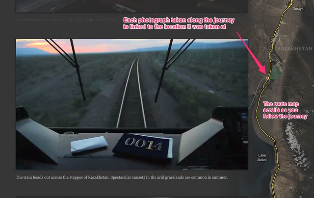
Riding the Silk Road, from July 2013, is a pictorial review featuring photographs captured from a railway journey that follows the route of the Silk Road. The route is traced out in the map on the left hand side as you scroll down through the photos. Each image is linked to a placemark on the route to show where it was taken.

Riding_the_New_Silk_Road_-_Interactive_Feature_-_NYTimes_com

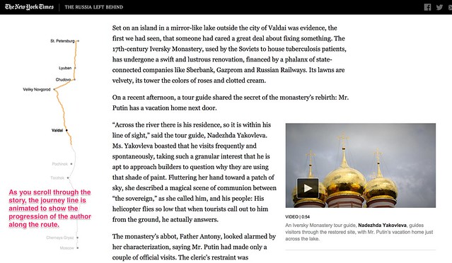
The Russia Left Behind tells the story of a 12 hour drive from St. Petersburg to Moscow. Primarily a textual narrative, with rich photography and video clips to illustrate the story, an animated map legend traces out the route as you read through the story of the journey. Once again, the animated journey line gives you a sense of moving through the landscape as you scroll through the story.

The_Russia_Left_Behind

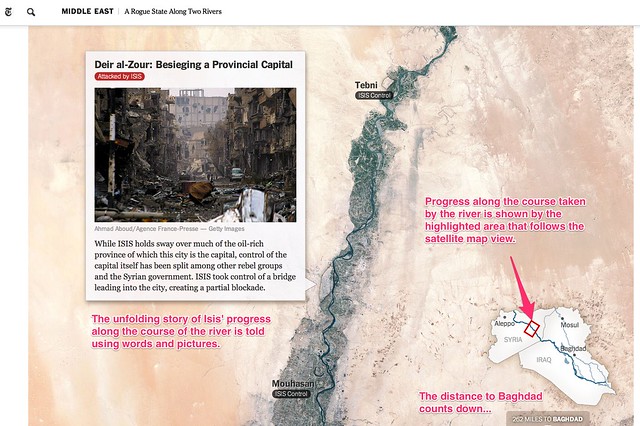
A Rogue State Along Two Rivers, from July 2014, describes the progress made by Isis forces along the Tigris and Euphrates Rivers is shown using two maps. Each plots the course of one of the rivers and uses place linked words and photos to tell the story of the Isis manoeuvres along each of the river ways. An interactive map legend shows where exactly along the river the current map view relates to, providing a wider geographical context to the local view shown by the more detailed map.

A_Rogue_State_Along_Two_Rivers_-_NYTimes_com

All three of these approaches help give the reader a sense of motion though the journey traversed that leads the narrator being in the places described at different geographical storypoints described or alluded to in the written text. The unfolding of the map helps give the reader the sense that a journey must be taken to get from one location to another and the map view – and the map scale – help the reader get a sense of this journey both in terms of the physical, geographical distance it relates to and also, by implication, the time that must have been expended on making the journey.

A Cartographic Narrative

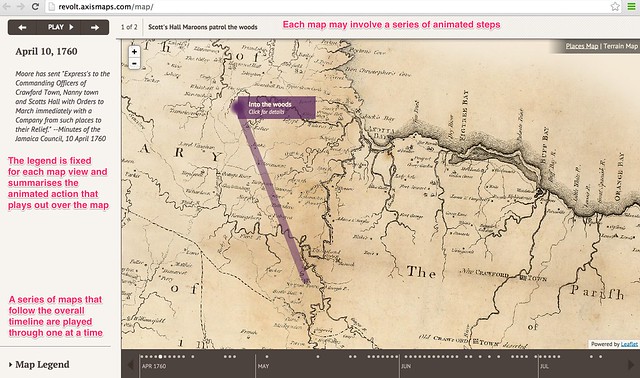
Slave Revolt in Jamaica, 1760-1761, a cartographic narrative, a collaboration between Axis Maps and Harvard University’s Vincent Brown, describes itself as an animated thematic map that narrates the spatial history of the greatest slave insurrection in the eighteenth century British Empire. When played automatically, a sequence of timeline associated maps are played through, each one separately animated to illustrate the supporting text for that particular map view. The source code is available here.

Jamaican_Slave_Revolt

This form of narrative is in many ways akin to a free running, or user-stepped, animated presentation. As a visual form, it also resembles the pre-produced linear cut scenes that are used to set the scene or drive the narrative in an interactive computer game.

Creating you own storymaps

The New York Times storymaps use animated map legends to give the reader the sense of going on a journey by tracing out the route being taken as the story unfolds. The third example, A Rogue State Along Two Rivers also makes use of a satellite map as the background to the story, which at it’s heart is nothing more than a set of image markers placed on to an an interactive map that has been oriented and constrained so that you can only scroll down. Even though the maps scrolls down the page, the inset legend shows the route being taken may not be a North-South one at all.

The linear, downward scroll mechanic helps the reader feel as if they are reading down through a story – control is very definitely in the hands of the author. This is perhaps one of the defining features of the story map idea – the author is in control of unraveling the story in a linear way, although the location of the story may change. The use of the map helps orientate the reader as to where the scenes being described in the current part of the story relate to, particularly any imagery.

Recently, several tools and Javascript code libraries have been made available from a variety of sources that make it easy to create your own story maps within which you can tell a geographically evolving story using linked images, or text, or both.

Knight Lab StoryMap JS

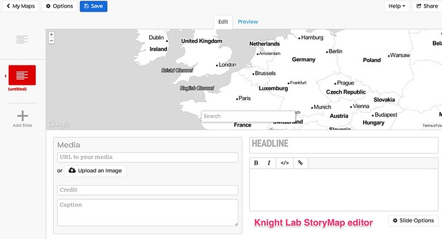
The Knight Lab StoryMap JS tool provides a simple editor synched to a Google Drive editor that allows you to create a storymap as a sequence of presentation slides that each describe a map location, some header text, some explanatory text and an optional media asset such as an image or embedded video. Clicking between slides animates the map from one location to the next, showing a line between consecutive points to make explicit the linkstep between them. The story is described using a custom JSON data format saved to the linked Google Drive account.

knightStoryMap_editor

[StoryMapJS code on Github]

CartoDB Odyssey.js

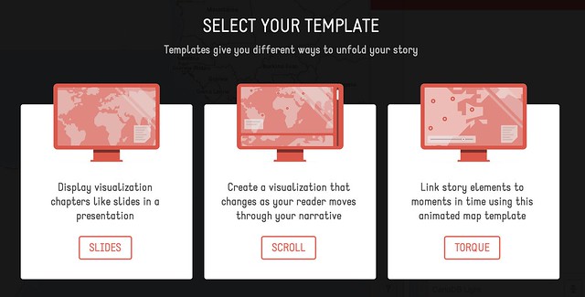
Odyssey.js provides a templated editing environment that supports the creation of three types of storymap: a slide based view, where each slide displays a location, explanatory text (written using markdown) and optional media assets; a scroll based view, where the user scrolls down through a stroy and different sections of the story trigger the display of a particular location in a map view fixed at the top of the screen; and a torque view which supports the display and playback of animated data views over a fixed map view.

Odyssey_js_Sandbox

A simple editor – the Odyssey sandbox – allows you to script the storymap using a combination of markdown and map commands. Storymaps can be published by saving them to a central githib repository, or downloaded as an HTML file that defines the storymap, bundled within a zip file that contains any other necessary CSS and Javascript files.

[Odyssey.js code on Github]

Open Knowledge TimeMapper

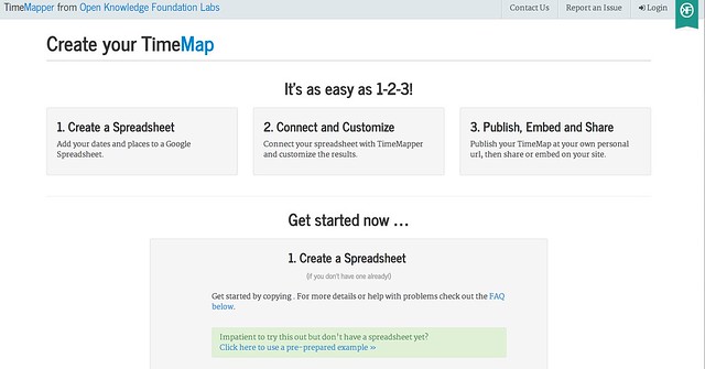
TimeMapper is an Open Knowledge Labs project that allows you to describe location points, dates, and descriptive text in a Google spreadsheet and then render the data using linked map and timeline widgets.

Create_-_TimeMapper_-_Make_Timelines_and_TimeMaps_fast__-_from_the_Open_Knowledge_Foundation_Labs

[Timemapper code on Github]

JourneyMap (featuring waypoints.js

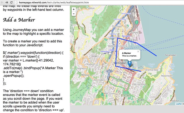
JourneyMap is a simple demonstration by Keir Clarke that shows how to use the waypoints.js Javascript library to produce a simple web page containing a scrollable text area that can be used to trigger the display of markers (that is, waypoints) on a map.

Journey_Map

[waypoints.js on Githhub; JourneyMap src]

Google Earth TourBuilder

Google Earth TourBuilder is a tool for building interactive 3D Google Earth Tours using a Google Earth browser plugin. Tours are saved (as KML files?) to a Google Drive account.

Tour_Builder

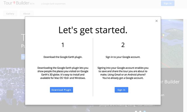
[Note: Google Earth browser plugin required.]

ESRI/ArcGIS Story Maps

ESRI/ArcGIS Story Maps are created using an online ArcGIS account and come in three type with a range of flavours for each type: “sequential, place-based narratives” (map tours), that provide either an image carousel (map tour) that allows you to step through a sequence of images that are displayed separately alongside a map showing a corresponding location or a scrollable text (map journal) with linked location markers (the display of half page images rather than maps can also be triggered from the text); curated points-of-interest lists that provide a palette of images, each member of which can be associated with a map marker and detailed information viewed via a pop-up (shortlist), a numerically sequence list that displays map location and large associated images (countdown list), and a playlist that lets you select items from a list and display pop up infoboxes associated with map markers; or map comparisons provided either as simple tabbed views that allow you to describe separate maps, each with its own sidebar description, across a series of tabs, with separate map views and descriptions contained within an accordion view, and swipe maps that allow you to put one map on top of another and then move a sliding window bar across them to show either the top layer or the lower layer. A variant of the swipe map – the spyglass view alternatively displays one layer but lets you use a movable “spyglass” to look at corresponding areas of the other layer.

App_List___Story_Maps

[Code on github: map-tour (carousel) and map journal; shortlist (image palette), countdown (numbered list), playlist; tabbed views, accordion map and swipe maps]

Leaflet.js Playback

Leaflet.js Playback is a leaflet.js plugin that allows you to play back a time stamped geojson file, such as a GPS log file.
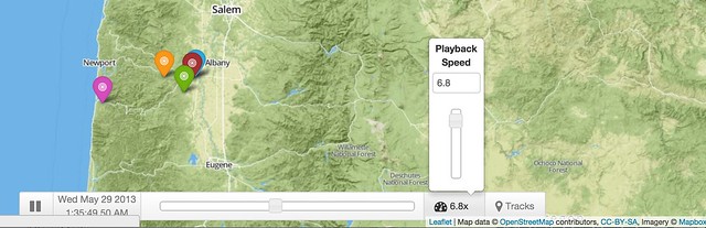
LeafletPlayback

[Code on Github]

Summary

The above examples describe a wide range of geographical and geotemporal storytelling models, often based around quite simple data files containing information about individual events. Many of the tools make a strong use of image files as pat of the display.

it may be interesting to complete a more detailed review that describes the exact data models used by each of the techniques, with a view to identifying a generic data model that could be used by each of the different models, or transformed into the distinct data representations supported by each of the separate tools.

UPDATE 29/8/14: via the Google Maps Mania blog some examples of storymaps made with MapboxGL, embedded within longer form texts: detailed Satellite views, and from the Guardian: The impact of migrants on Falfurrias [scroll down]. Keir Clarke also put together this demo: London Olympic Park.

UPDATE 31/8/14: via @ThomasG77, Open Streetmap’s uMap tool (about uMap) for creating map layers, which includes a slideshow mode that can be used to create simple storymaps. uMap also provides a way of adding a layer to map from a KML or geojson file hosted elsewhere on the web (example).

Flattr this!

Festing with School of Data

- July 8, 2014 in Community, Data Expeditions, Data Stories, Events

School of Data Fellows, Partners, Friends, staff and supporters will converge on Berlin next week for OKFestival: July 15 – 17, 2014. We know that many of you may be attending the festivities and we’d love to connect.

Mingling: Science is Awesome!

Tuesday, July 15, 2014 18:00 CET
OKfestival starts with a Science Fair to help you get to a taste of of all the amazing people and activities. We’ll be there to share School of Data with the large global community. Please stop by and say hi!

Activity: Be A Storyteller

July 15 – 17, 2014
As those of you who have attended Data Expeditions before, being able to tell an impactful story is key to success. Join the Storytelling team as we meander through the festival collecting and sharing real-time stories. To join.

Session: How to Teach Open Data

Thursday, July 17th, 2014 15:30 – 16:30 CET
Are you passionate about teaching data and tech? Are you striving to support a community of data teachers and learners? Are you keen to exchange experiences with other professionals in the field of teaching data? Then this is the right session for you.
Join us for a conversation about standards and methodologies for data teaching with School of Data, Peer to Peer University and Open Tech School.

  • How to organise tech and data workshops
  • Building effective curriculum and accreditation
  • Type of education activities: a blended offline, online
  • Designing passion driven communities

More about the session.

Informal Session: How to Build a School of Data

Thursday, July 17, 2014 16:30 – 17:15 CET (same room as the previous session.)
Are you keen to join School of Data? Do you want to set up a School of Data instance in your locale? Join us to meet staff, fellows and partners. We’ll answer your questions and start the conversations.

Most of all – happy Festing!

(Note: For those of you are unable to attend OKfestival, we’ll be sure to share more details post-event. See you online.)

Flattr this!

Why should we care about comparability in corruption data?

- May 29, 2014 in Data Expeditions, Data Stories

Does comparing diverse data-driven campaigns empower advocacy? How can comparing data on corruption across countries, regions and contexts contribute to efforts on the ground? Can the global fight against corruption benefit from comparable datasets? The engine room tried to find some answers through two back-to-back workshops in London last April, in collaboration with our friends from School of Data and CIVICUS.

The first day was dedicated to a data expedition, where participants explored a collection of specific corruption-related datasets. This included a wide range of data, from international perception-based datasets such as Transparency International’s Global Corruption Barometer, through national Corruption Youth Surveys (Hungary), to citizen-generated bribe reports like I Paid A Bribe Kenya.

SCODAwall2

Hard at work organizing corruption datatypes.

The second day built on lessons learned in the data expedition. Technologists, data literates and harmonization experts convened for a day of brainstorming and toolbuilding. The group developed strategies and imagined heuristics through an analysis of existing cases, best practices and personal experience.

Here is what we learned:

Data comparability is hard

Perhaps the most important lesson from the data expedition was that one single day of wrangling can’t even begin to grasp the immensely diverse mix of corruption data out there. When looking at scope, there was no straightforward way to find links between locally sourced data and the large-scale corruption indices. Linguistic and semantic challenges to comparing perceptions across countries were an area of concern. Since datasets were so diverse, groups spent a considerable amount of time familiarizing themselves with the available data, as well as hunting for additional datasets. Lack of specific incident-reporting datasets was also noticeable. In the available datasets, corruption data usually meant corruption perception data: data coming from surveys gauging people’s feelings about the state of corruption in their community. Datasets containing actual incidents of corruption (bribes, preferred sellers, etc) were less readily available. Perception data is crucial for taking society’s pulse, but is difficult to compare meaningfully across different contexts — especially considering the fluidity of perception in response to cultural and social customs — and very complex to cross-correlate with incident reporting.

Finding patterns in caos

Pattern-finding expedition

An important discussion also came to life regarding the lack of technical capacity among grassroots organizations that collect data, and how that negatively impacts the data quality. For organizations on the ground it’s a question of priorities and capacity. Organisations that operate in dangerous areas, responding to urgent needs with limited resources, don’t necessarily consider data collection proficiency a top-shelf item. In addition, common methods and standards in data collection empower global campaigns for remote actors (cross-national statistics, high-level policy projects etc) but don’t necessarily benefit the organizations on the ground collecting the data. These high-level projects may or may not have trickle-down benefits. Grassroots organizations don’t have a reason to adopt standardized data collection practices, unless it helps them in their day-to-day work: for example providing tools that are easier to use, or having the ability to share information with partner organizations.

Data comparability is possible

While the previous section might paint a black picture, the reality is more positive, and the previous paragraph tells us where to look (or, how to look). The amorphous blob of all corruption-related data is too generically daunting to make sense of — until we flip the process on its head. Like in the best detective novels, starting small and investigating specific local stories of corruption lets investigators find a thread and follow it along, slowly unraveling the complex yarn of corruption towards the bigger picture. So for example, a small village in Azerbaijan complaining about the “Ingilis” that contaminate their water can unravel a story of corruption leading all the way to the presidential family. This excellent example, and many more, come from Paul Radu’s investigative experience, described in the Exposing the Invisible project produced by the Tactical Technology Collective.

Screengrab from "Our Currency is Information" by Tactical Technology Collective

Screengrab from “Our Currency is Information” by Tactical Technology Collective

There are also excellent resources that collect and share data in comparable, standardized and functional ways. Open Corporates, for example, collects information on more than 60 million corporations, and provides beautiful, machine-readable, API-pluggable information, ready to be perused by humans and computers, and easily comparable and mashable. If your project involves digging through corporation ownership, Open Corporates will most surely be able to help you out. Another project of note is the Investigative Dashboard that collects scraped business records from numerous countries, as well as hundreds of reference databases.

What happens when datasets just aren’t compatible, and there is no easy way to convince the data producers to make them more user-friendly? Many participants voiced their trust in civic hackers and the power of scraping — even if datasets aren’t provided in machine-readable formats, or standardized and comparable, there are many tools (as well as many helpful people) that can come to the rescue. The best source for finding both? Well, the School of Data, of course. Apart from providing a host of useful tutorials and links, it acts as a hub for engaged civic hackers, data wranglers and storytellers all over the world.

Citizen engagement is key

During a brainstorm where participants compared real-life models of data mashups (surveys, incident reporting, budget data), it became clear that many corruption investigation projects involve crowdsourced verification. While crowdsourcing is a vague concept in itself, it can be very powerful when focused within a specific use case. It’s important for anti-corruption projects that revolve around leaked data (such as the Yanukovych leaks), or FOIA requests that yield information in difficult-to-parse formats that aren’t machine readable (badly scanned documents, or even boxes of paper prints). In cases like these, citizen engagement is possible because there are clear incentives for individuals to get involved. Localized segmentation (where citizens look only at data directly involving them or their communities) is a boon for disentangling large lumps of data, as long as the information interests enough people to engage a groundswell of activity. Verification of official information can also help, for example when investigating whether state-financed infrastructures are actually being built, or if there is just a very expensive empty lot where a school is supposed to be.

It makes perfect sense, then, to look at standardization and comparability as an enabling force for citizen engagement. The ability to mash and compare different datasets brings perspective, and enables the citizens themselves to have a clearer picture, and act upon that information to hold their institutions accountable. However, translating, parsing and digesting spaghetti-data can be so time-consuming and cumbersome that organisations might just decide it’s not worth the effort. At the same time, data-collecting organizations on the ground, presented with unwieldy, overly complex standards, will simply avoid using them and compound the comparability problem. The complexity in the landscape of corruption data represents a challenge that needs to be overcome, so that data being collected can truly inspire citizen action for change.

Flattr this!

Learning to Listen to your Data

- March 27, 2014 in Data Stories

School of Data mentor Marco Túlio Pires has been writing for our friends at Tactical Tech about journalistic data investigation. This post “talks us through how to begin approaching and thinking about stories in data”, and it was originally published on Exposing the Invisible‘s resources page.

Journalists used to carefully establish relationships with sources in the hope of getting a scoop or obtaining a juicy secret. While we still do that, we now have a new source which we interrogate for information: data. Datasets have become much like those real sources – someone (or something!) that holds the key to many secrets. And as we begin to treat datasets as sources, as if they were someone we’d like to interview, to ask meaningful and difficult questions to, they start to reveal their stories, and more often than not, we come across tales we weren’t even looking for.

But how do we do it? How can we find stories buried underneath a pile of raw data? That’s what this post will try to show you: the process of understanding your data and listening to what your “interviewee” is trying to tell you. And instead of giving you a lecture about the ins and outs of data analysis, we’ll walk you through an example.

Let’s take an example from the The Guardian, the British newspaper that has a very active data-driven operation. We’re going to (try to) “reverse engineer” one of their stories in the hopes you get a glimpse at what happens when you go after information that you have to compile, clean, and analyse and what kind of decisions we make along the way to tell a story out of a dataset.

So, let’s talk about immigration. Every year, the Department of Immigration and Border Protection of Australia publishes a bunch of documents about immigration statistics down under. Published last year, the team at The Guardian focused on a report called Asylum Trends for 2011-2012. There’s a more up-to-date version available (2012-2013). By the end of this exercise, we hope you can use the newer version to compare it with the dataset used by The Guardian. Let us know in the comments about your findings.

The article starts with a broad question: does Australia have a problem with refugees? That’s the underlying question that helps makes this story relevant. It’s useful to start a data-driven investigation with a question, something that bothers you, something that doesn’t seem quite right, something that might be an issue for a lot of people.

With that question in mind, I quickly found a table on page 2 with the total number of people seeking protection in Australia.

People seeking Austria's protection

Let’s make a chart out of this and see what the trend is. Because this is a pesky PDF file, you’ll need to either type the data by hand into your spreadsheet processor or use an app to do that for you. For a walkthrough of a tool that does this automatically, see the Tabula example here.

After putting the PDF into Tabula this is what we get (data was imported into OpenOffice Calc):

Tabula

I opened the CSV file in OpenOffice Calc and edited it a bit to make it clearer. Let’s see how the number of people seeking Australia’s protection has changed over the years. Using the Chart feature in the spreadsheet, we can compare columns A and D by making a line chart.

Line chart

Take a good look at this chart. What’s happening here? On the vertical axis, we see the total number of people asking for Australia’s protection. On the horizontal axis, we see the timeline year by year. Between 2003 and 2008, there’s no significant change. But something happened from 2009 on. By the end of the series, it’s almost three times higher. Why? We don’t know yet. Let’s take a look at other data from the PDF and use Tabula to import it to our spreadsheet. Maybe that will show us what’s going on.

Australia divides their refugees into two groups: those who arrived by boat and those who arrived by air. They use the acronyms IMA and non-IMA (IMA stands for Irregular Maritime Arrivals). Let’s compare the totals of the two groups and see how they relate across the years presented in this report. Using Table 4 and Table 25, we’ll create a new table that has the totals for the two groups. Be careful, though, the non-IMA table goes back up to 2007, but the IMA table goes only as far as 2008. Let’s create a line chart with this data.

image 5

What’s that? It seems that in 2011-2012, for the first time in this time series, the number of refugees arriving in Australia by boat surpassed those landing by plane. The next question could be: where are all the IMA refugees coming from? We already have the data from table 25. Let’s make a chart out of that, considering the period 2011-2012. That would be columns A and E of our data. Here’s a donut chart with the information:

Donut chart

Afghanistan (deep blue) and Iran (orange) alone represent more than 64% of all IMA refugees in Australia in 2011-2012.

From here, there are a lot of routes we could take. We could use the report to take a look at the age of the refugees, like the folks at The Guardian did. We could compare IMA and non-IMA countries and see if there’s a stark difference and, if so, ask why that’s the case. We could look at why Afghans and Iranians are travelling by boat and not plane, and what risks they face as a result. How does the data in this report compare with the data from the more recent report? The analysis could be used to come up with a series of questions to ask to the Australian government or a specialist on immigration.

Whatever the case might be, it’s worth remembering that finding stories in data should never be an activity that ends in itself. We’re talking about data that’s built on the behavior of people, on the real world. The data is always connected to something out there, you just need to listen to what your spreadsheet is saying. What do you say? Got data?

Flattr this!

The World Tweets Nelson Mandela’s Death

- December 10, 2013 in Data Stories

The World Tweets Nelson Mandela’s DeathClick here to see the interactive version of the map above 

Data visualization is awesome! However, it conveys its goal when it tells a story. This weekend, Mandela’s death dominated the Twitter world and hashtags mentioning Mandela were trending worldwide. I decided to design a map that would show how people around the world tweeted the death of Nelson Mandela. First, I started collecting tweets associated with #RIPNelsonMandela using ScraperWiki. I collected approximately 250,000 tweets during the death day of Mandela. You can check this great recipe at school of data blog on how to extract and refine tweets.

scraperwiki

After the step above, I refined the collected tweets and uploaded the data into CartoDB. It is one of my favorite open source mapping tools and I will make sure to write a CartoDB tutorial in future posts. I used the Bubble or proportional symbol map which is usually better for displaying raw data. Different areas had different tweeting rates and this reflected how different countries reacted. Countries like South Africa, UK, Spain, and Indonesia had higher tweeting rates. The diameter of the circles represents the number of retweets. With respect to colors, the darker they appeared, the higher the intensity of tweets is.

That’s not the whole story! Basically, it is easy to notice that some areas have high tweeting rates such as Indonesia and Spain. After researching about this topic, it was quite interesting to know that Mandela had a unique connection with Spain, one forged during two major sporting events. In 2010, Nelson Mandela was present in the stadium when Spain’s international football team won their first ever World Cup Football trophy as well. Moreover, for Indonesians, Mandela has always been a source of joy and pride, especially as he was fond of batik and often wore it, even in his international appearances.

Nonetheless, it was evident that interesting insights can be explored and such data visualizations can help us show the big picture. It also highlight events and facts that we are not aware of in the traditional context.

Flattr this!

Visiting Electionland

- November 6, 2013 in Data Stories, HowTo


After the German elections, data visualization genius Moritz Stefaner created a map of election districts, grouping them not by geography but by election patterns. This visualisation impressively showed a still-existing divide in Germany. It is a fascinating alternative way to look at elections. On his blog, he explains how he did this visualization. I decided to reconstruct it using Austrian election data (and possibly more countries coming).

Austria recently published the last election’s data as open data, so I took the published dataset and cleaned it up by removing summaries and introducing names for the different states (yes, this is a federal state). Then I looked at how to get the results mapped out nicely.

In his blog post, Moritz explains that he used Z-Scores to normalize data and then used a technique called Multidimensional Scaling (MDS) to map the distances calculated between points into 2-dimensional space. So I checked out Multidimensional Scaling, starting on Wikipedia, where I discovered that it’s linear algebra way over my head (yes, I have to finish Strang’s course on linear Algebra at some point). The Wikipedia article fortunately mentions a R command cmdscale that does multidimensional scaling for you. Lucky me! So I wrote a quick R script:

First I needed to normalize the data. Normalization becomes necessary when the raw data itself is very hard to compare. In election data, some voting stations will have a hundred voters, some a thousand; if you just take the raw vote-count, this doesn’t work well to compare, as the numbers are all over the place, so usually it’s broken down into percentages. But even then, if you want to value all parties equally (and have smaller parties influence the graph as much as larger parties), you’ll need to apply a formula to make the numbers comparable.

I decided to use Z-Scores as used by Moritz. The Z-Score is a very simple normalization score that takes two things, the mean and the standard deviation, and tells you how many standard deviations a measurement is above the average measurement. This is fantastic to use in high-throughput testing (the biomed nerd in me shines through here) or to figure out which districts voted more than usual for a specific party.

After normalization, you can perform the magic. I used dist to calculate the distances between districts (by default, this uses Euclidean distance) and then used cmdscale to do the scaling. Works perfectly!

With newly created X and Y coordinates, the only thing left is visualization—a feat I accomplished using D3 (look at the code—danger, there be dragons). I chose a simpler way of visualizing the data: bubbles the size of voters in the district, the color of the strongest party.

Wahlland visualization of Austrian general Elections 2013
(Interactive version)

You can see: Austria is less divided than Germany. However, if you know the country, you’ll find curious things: Vienna and the very west of Austria, though geographically separated, vote very similarly. So while I moved across the country to study when I was 18, I didn’t move all that much politically. Maybe this is why Vienna felt so comfortable back then—but this is another story to be explored another time.

Flattr this!

Findings of the investigation of garment factories of Bangladesh

- October 29, 2013 in Community, Data Expeditions, Data Stories

BANGLADESH-BUILDING/

Credit: Weronika (Flickr) – Some rights reserved.


Connecting the Dots: Mapping the Bangladesh Garment Industry

This post was written in collaboration with Matt Fullerton.

During the weekend of October 18th-October 20th, a group of volunteers, data-wranglers, geo-coders, and activists teamed up with the International Labor Rights Forum and P2PU for a Data Expedition to investigate the Garment Factories. We set out to connect the dots between Bangladeshi garment producers and the clothes that you purchase from the shelves of the world’s largest retailers.

Open Knowledge Foundation Egypt and Open Knowledge Foundation Brasil ran onsite Data Expeditions on garment factories and coordinated with the global investigation.

In previous endeavors, School of Data had examined the deadly history of incidents in garment factories in Bangladesh and the location of popular retailers’ clothing production facilities. This time around, we worked draw the connections between the retailers that sell our clothes, the factories that make it, the safety agreements they’ve signed, the safety of those buildings, and the workers who occupy them day and night.

Sources of Bangladeshi Garment Data

The Importance of the Garment Industry In Bangladesh

Bangladesh, as many people are aware, is a major provider of garment manufacturing services and the industry is vital to Bangladesh’s economy, accounting for over 75% of the country’s exports and 17% of the country’s GDP. As in many developing countries, conditions can be harsh with long hours and unsafe working conditions. This project seeks to provide a resource which can then be used to drive accountability for these conditions and improve the lives and livelihood of average garment worker.

What’s Being Done

Many organisations and agreements already seek to promote the garment industry in Bangladesh and to ensure worker health and safety (Bangladesh Garment Manufacturers and Exporters Association (BGMEA), Bangladesh Safety Accord, Alliance for Bangladesh Worker Safety, International Labor Rights Forum (ILRF), Clean Clothes Campaign (CCC), Fair Wear Foundation, The Solidarity Center). Collectively, these groups provide a range of data on Bangladeshi Garment factories: where they are located, safety incidents, and what retailers the factories supply. Our goal focused on connecting suppliers to sellers within the datasets, and geographically plotting the results on an interactive map. Ultimately, we seek to create a usable tool that is filterable on several criteria, specifically on membership to the various organisations and safety agreements which exist, the factory incident history, and the retailers that are being supplied by these factories. Styling of point radii would allow a quick overview of e.g. the number of workers and pop-up information could include additional data from the certification and auditing data including addresses, contact information, website addresses, incidents, and many more.

We made significant progress at the Data Expedition of October 20-21 as we:

Keep Moving Forward

We however do not want to stop here. Rather, we see this as simply the beginning of a longer international collaborative project to make it possible for you to find out who created your clothing and under what conditions.

Get involved in the continued investigation of the garment factories by:

Flattr this!