Module Objectives:
- Learn about how aid data is currently used in the media through a couple of case studies
-
Understand how to ‘reverse engineer’ these figures, to fact-check them from the source.
-
Understand why lots of these figures often deserve a second look, rather than being taken at face value
Prerequisites/before you get started:
-
Complete ‘An introduction to aid data; what is it, where is it’
-
Read the two articles in the case studies – Why is Afghanistan sending aid to Gaza and British aid money is funding corruption overseas
Table of Contents:
-
Introduction
-
Case study #1
-
Case study #2
-
Exercise
-
Conclusion
Introduction
It’s all very well learning where aid data is, what it is, and how to find it – but most often, we come across the data already packaged up as ‘information’. In this module, we’ll try to ‘reverse engineer’ some of the figures that we come across in a couple of media outlets – this can give us a hint of where journalists might find their data, and it also helps us to fact check the information that is presented to the public.
Content
Case study 1: Why Is Afghanistan Sending Aid to Gaza?
Let’s start with this story: Afghanistan – a low-income country which receives Official Development Assistance from other, richer countries – is, apparently, sending aid to Gaza.
The way the headline is structured sounds almost indignant – by asking the question, we’re starting at the point of thinking that, in fact, Afghanistan shouldn’t be sending any aid. The story explains as much to begin with, and goes on to give some precise figures:
According to World Bank estimates, Afghanistan received more than $6.7 billion in foreign aid in 2012, the bulk of which came from the US.
Happily, there are links next to both of those claims – let’s follow them.
The first (following the link from ‘aid’ in the quote above) takes us to the World Bank’s databank:
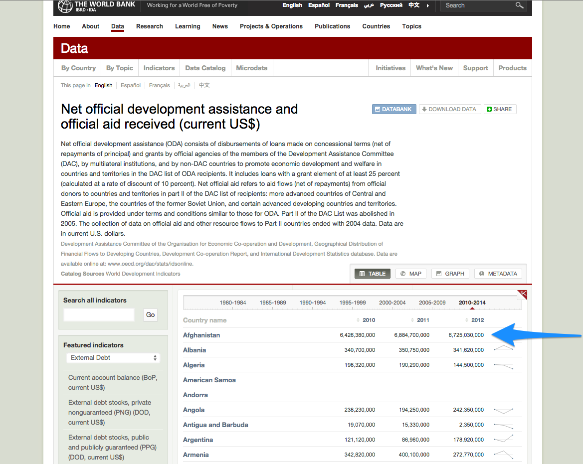
And marked with the arrow, is the figure that is being quoted – that Afghanistan received over $6.7 billion in ODA in 2012. It’s great that the journalist here has actually linked to the data source, as this makes it much easier to verify the figure!
So, let’s move on to the next link in that sentence, which quotes where the ‘bulk’ of the aid comes from – this takes us directly to this image:
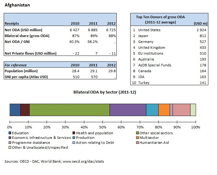
The table ‘Top Ten Donors of gross ODA’ seems to indicate that the US was by far the biggest donor to Afghanistan – although, presenting the information as an image is possibly the least useful way that it could be presented, as it is not machine readable and impossible to get the data in a structured way! In case we wanted to follow the trail further, the source of the data is however stated, as
www.oecd.org/dac/stats – this time though, we’ll leave it there.
We’ve now traced the source of the two main statistics stated – as you can see, it’s made quite simple if the writer links to where they got their information from. Unfortunately, however, that’s not always the case…
Case study 2: British aid money is funding corruption overseas, damning new report finds
This is something of an unusual case: the entire article is focused around a newly released report about the ‘impact’ of British Aid, conducted by the Independent Commission for Aid Impact . They carried out an investigation looking into how British aid was spent, and the results are somewhat controversial, hence the media coverage.
Let’s look into some figures that are quoted:
Figures earlier this year disclosed that Britain hiked its aid spending by more than any other country in Europe last year. Foreign aid soared by 28 per cent last year, meaning the UK hit its target of spending 0.7 per cent of GDP on overseas development. It left Britain with the second most generous aid budget in the world, outstripped only by the United States.
Where might we go to verify these figures?
To start with: ‘Foreign aid soared by 28% last year’.
Presumably, this means in 2013. First, let’s have a look at the OECD Aid Statistics– unfortunately, this seems to only give data for 2012.
How about the DevTracker portal, which tracks DFID (the agency discussed in the report) spending?
There, we can see various things: aid by sector, aid by location… but what about aid by year? This doesn’t seem to be an option, even by putting the keywords ‘2013’ ‘total’ into the search bar.
So… about a general search? “UK ODA 2013” brings up some reports: this one, entitled Statistics on International Development, 2013 – but although it says 2013 in the title, it means that it was written in 2013, about 2012 data.
What about searching on that same page for Statistics on International Development, 2014? As it turns out, we’re in luck: a new report was just published on October 30th, 2014, and seems to be an annual publication, with lots of statistics!
Let’s try the first table that comes up, Excel Tables: Statistics on International Development
If we download this table (just by clicking on it) we see in Excel, or whatever spreadsheet software you are using, that there are a number of different tables provided, in the Index sheet:

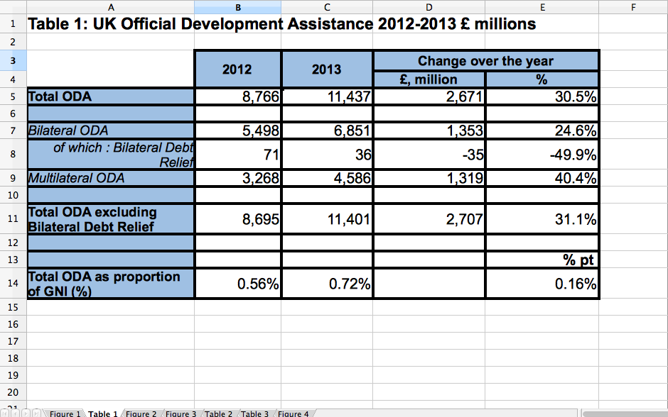
Table 2: Total UK Net ODA sounds like it might be what we’re looking for – so, select the tab ‘Table 2’ along the bottom.
And there, we find the answer! The columns P and Q show ‘change since 2012’, and in fact the % here given is 30.2%, actually higher than the 28% noted in the article.

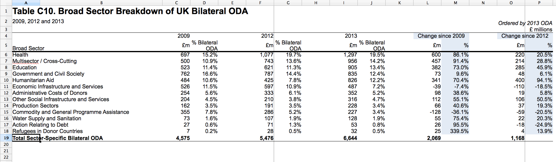
While we’re on the this spreadsheet, it might be interesting to have a little look around the data provided – for example, how is that money spent? If we click on Table C10, we can see the ‘broad sector’ breakdown; are there any surprises?
Exercise:
*Have a look at, for example:
- what has changed drastically from 2012 to 2013 (Columns O and P)
-
How much money is spent internally (Row 12)
-
What has changed a lot from 2009 until 2013? (Columns L and M)*
But before we get too distracted- wait, why did they say 28%, then?
Maybe it’s because they were using older figures than these – at the top of this Statistics page it also mentions that DFID publishes ‘Provisional UK ODA’ statistics, which we can see here. Table 1 in this document looks like this:
Again – the change from 2012 to 2013 in Total ODA is 30% (actually, 30.5% here, in Cell E5).
So – the figure clearly isn’t from here.
Now that we’re simply looking for the source of the figure quoted in the original article, how about searching directly for it – “UK ODA 28%”. The third result we get is ]an article from Development Initiatives, which cites a data source at the bottom – OECD DAC – DAC provisional 2013 ODA release.
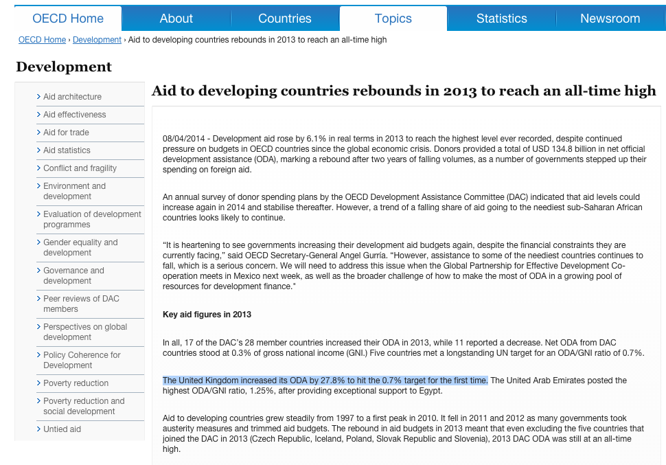
Following that link, we get to this press release, Aid to developing countries rebounds in 2013 to reach an all-time high.
Found it!
Great – so we can make a fairly informed guess as to why 28% is quoted as a figure in the article…but why is it different to the figure given by the UK Government?
The data upon which this press released is based, is linked at the bottom of that page – if you click on ‘See the data behind the tables and charts’, you’ll get another spreadsheet download.
Here, we can see in Table 2 that the % change from 2012 to 2013 for the UK is down as 28%.
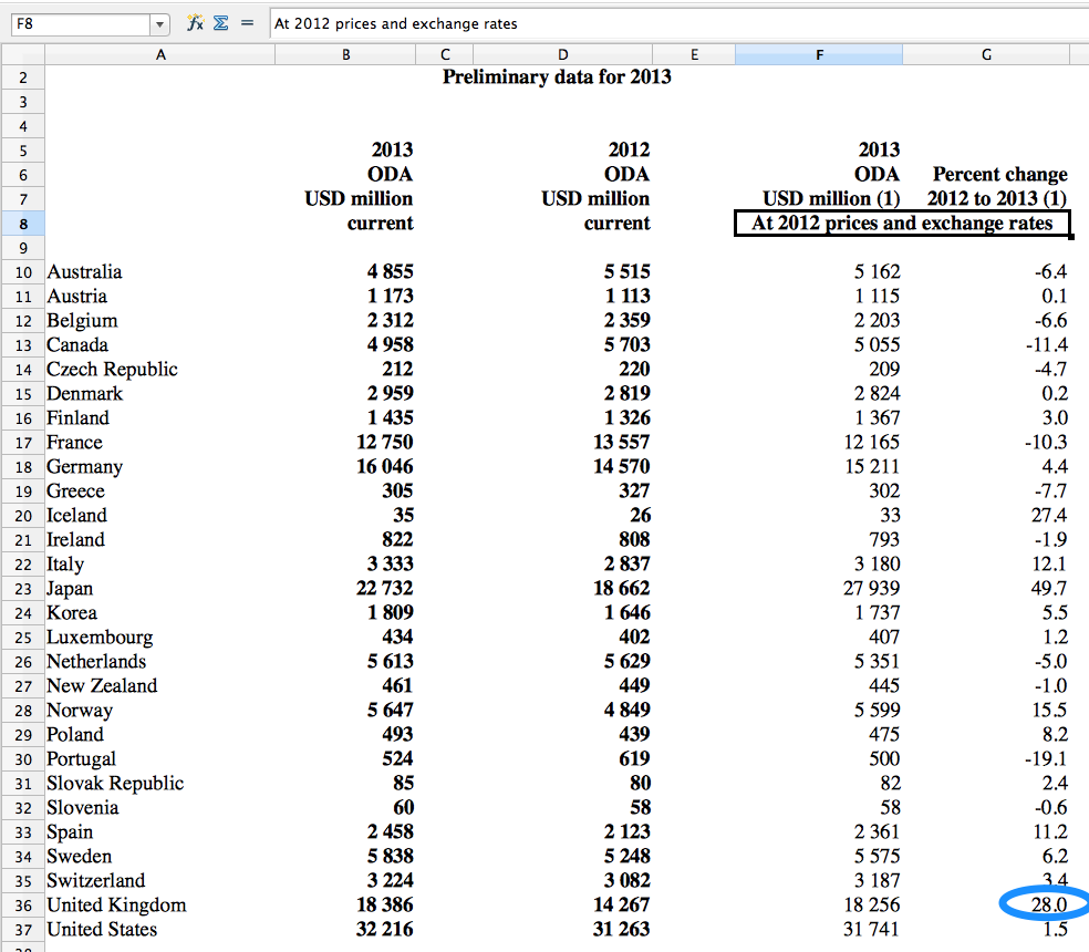
It also states that these figures are “At 2012 prices and exchange rates”.
Underneath this table (on the same sheet) – it also states:
Notes: The data for 2013 are preliminary pending detailed final data to be published in December 2014.
Another point to notice, though we’re concentrating here on the percentage change rather than the actual figures is that the OECD data gives the prices in USD million, and the UK govt. data is in GBP. Though of course, this should not make a difference with regards to percentage change!
Without diving deeper into finding out how the two institutions came up with those figures, it is difficult to understand why the percentage change is actually different here; we did, however, achieve our goal of finding out where that figure came from, in the original story.
Exercise
Take a look at this article, Why Israel and other foreign militaries — not the global poor — get the biggest US aid packages.
Can you spot any problems with the article? Think especially about the years mentioned, facts that are mentioned as though they are definite, when they might actually not happen…
Conclusion
As we’ve seen, it can sometimes take a few tries to find out the ‘original’ source of data quoted – but, it can definitely be worth it, especially if the claim in a news story sounds a little unlikely to you.
Once you have an idea of what the main sources of aid data are, it won’t take long to narrow it down to where you should go to find your answer – and, who knows what you might learn along the way!
Further resources:
Here are some more articles which mention aid data figures – why not see if you can reverse engineer these ones? If you come across any good ones, post them in the comments!
-
Why Israel and other foreign militaries — not the global poor — get the biggest US aid packages
-
Afghanistan has cost more to rebuild than Europe after Second World War
-
Bangladesh weighs options after World Bank pulls out of Padma bridge project
-
Operating in conflict zones: lessons from a financial institution in Somalia