This course was created for the School of Data by Tactical Technology Collective. Tactical Tech is an international NGO working at the point where rights advocacy meets information and technology. This course builds on Tactical Tech’s earlier course for the School of Data, A Gentle Introduction to Cleaning Data.
Table of Contents
- Introduction
- Section 1: Getting Started
- Section 2: Make a pivot table even more useful by adding ‘data fields’
- Section 3: Adding columns to pivot tables
- Section 4: Adding charts to pivot tables
Introduction
Your resistance to answering this question is futile: you’ve probably just answered it without even thinking.
We doubt it’s controversial to say that many of you taking this course have the instinct and itch to know what a column of numbers adds up to, or how the numbers are spread across the different categories in the dataset in front of you. Spreadsheets make this sort of descriptive analysis easy by giving you a kit of mathematical functions to add, subtract, multiply, divide and create averages and percentages from numbers. We think that you know how to use some of these, but if you want to brush up your skills, run through our data fundamentals course on analysing data.
However, the spreadsheet also has another powerful descriptive analysis tool called pivot tables. In a nutshell, this is what they do:
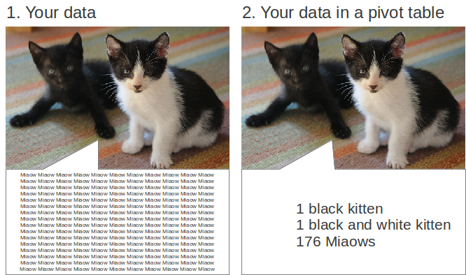
Image: “More Kittens”, courtesy Hitchster. Some rights reserved: CC-BY 2.0. Adapted by Tactical Tech.
Pivot tables summarise complete datasets without you having to write formulae, create new columns, or arrange your data in any particular way. They enable you to combine data in ways that reveal the relationships that exist in the data, and show it to you in a new light. They don’t change your data, they have a stack of useful functions built in and using them effectively can cut down on a lot of repetitive tasks, saving you time.
A combination of a number of spreadsheet functions – like sort and filter, and some formulae – work in a similar way to pivot tables in that they enable you to rearrange and pull out small bits of data more easily. Pivot tables do these things for the complete dataset, and present it to you so you can see it all.
Upon completion of this course, you will:
- understand the basics of pivot tables and how they work;
- have created around 20 different examples of pivot tables;
- be able to build and adapt the layout of pivot tables; and,
- be able to use pivot tables to examine and explore a dataset.
Course requirements
A gentle introduction to exploring and understanding your data builds on two earlier School of Data courses:
- Data Fundamentals, which covers the basics of data, and how to work with a spreadsheet.
- A Gentle Introduction to Cleaning Data, which looks at the four most common ways that data gets messy and dirty, and outlines practical solutions to them using a spreadsheet.
To do this course you will require the following:
- An up-to-date version of the free and open source software Libre Office installed on your computer. We assume you know how to do this. We have chosen to use LibreOffice because it doesn’t cost anything (unlike Microsoft Excel), doesn’t systematically invade your privacy or require a continual broadband internet connection (like Google Spreadsheet).
- a copy of the sample dataset for this course, which is a small set of data about the contents of the author’s kitchen shelves. In the course, we’ll use it to demonstrate the basics of making pivot tables.
- a copy of GRAIN’s data on “land grabbing”. This dataset is typical of the sorts of data that Non-Governmental Organisations (NGOs) create and work with. We have used it as the example dataset in our earlier course on data cleaning. In this download there are two worksheets: the original ‘dirty’ data, and the ‘cleaned’ version. Throughout, we will work with the cleaned version.
Course contents
There are four sections in this course.
- Section 1 covers the first steps in building a pivot table, showing what happens to your data when it is added as a Row Field in a pivot table.
- In Section 2 we look at how to make a pivot table even more useful by adding ‘data fields’.
- Adding Column Fields is covered in Section 3.
- To complete the course, Section 4 looks at how to create charts from data in pivot tables, adding a visual aspect to your understanding of the data.
There are three parts in each section:
- A quick task which uses a dataset about the contents of a kitchen shelf to illustrate the concept of pivot tables.
- A longer task using a dataset about the massive sell-off of agricultural land in the developing world. This will go deeper into creating pivot tables, along with some problems that will help you put your new skills into practice.
- A bonus feature, which explains how pivot tables relate to the other useful features in a spreadsheet.
How to do this course
This course is quite short. We suggest you work sections 1 to 4 in sequence, as later sections probably won’t make much sense on their own.
Section 1: Getting started
Make sure you’ve got copies of the sample dataset and the GRAIN dataset on landgrabbing open in your copy of LibreOffice.
A quick task
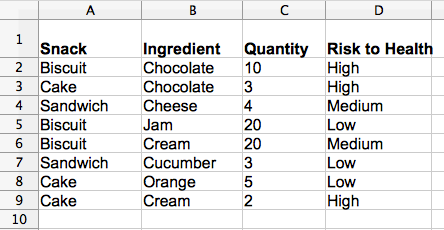
Take a look at the sample dataset about the selection of snacks on the author’s kitchen shelves. It has data about their main ingredient, quantity, and the risk they pose to the author’s health:
Start by building a pivot table using the data from the sample sheets:
-
Select all the data. You can do this by selecting cell A1 and dragging the mouse to cell D9, or holding down Ctrl-A (Cmd-A on Apple Mac computers).
-
With the data now selected choose Data → Pivot Table → Create from the spreadsheet’s top menu. A pop-up window will appear asking if you want to use the ‘current selection’. Choose OK.
-
As illustrated below, you’ll see some grey tiles that correspond with the column headings from your raw data.
-
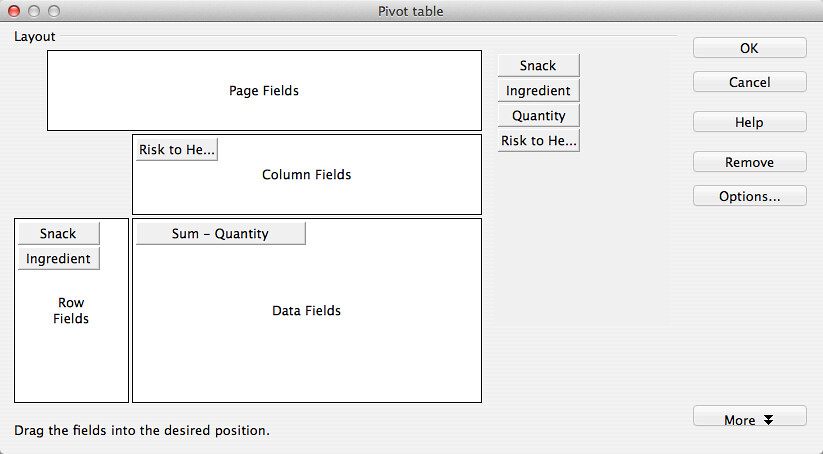
Let’s pivot them, that is, turn a column into a row. Select and hold the tile labelled Snack and drag it into the white area called Row Field, as illustrated below:
-
Click OK. A new worksheet will be created, which you’ll see in the tabs at the bottom of the spreadsheet. Below is the data it will contain:
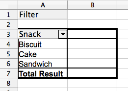
So, what has happened to the data?
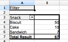
In the original data, “Biscuit” is mentioned 3 times: the Pivot table shows it only once. “Sandwich” is mentioned 2 times: the Pivot table shows it only once. And so on. The Pivot table has grouped and summarised the data in the Snack column of your raw dataset. It answers the question of what different types of snack are included in the data.
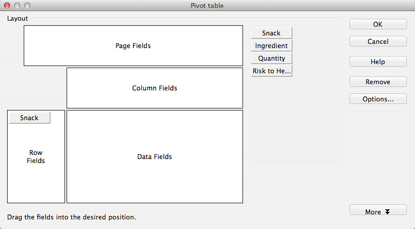
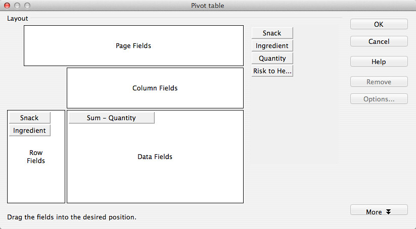
Pivot tables can be created with more than one Row Field. Using the sample dataset, let’s choose another row of data to add:
-
In the pivot table you have created, there is a secondary menu. This is activated with a right click of your mouse (or a two-fingered tap on the keypad on Apple Mac computers) anywhere on the pivot table. It will look like this:
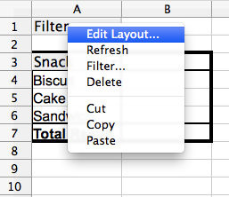
-
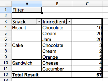
Select Edit Layout. This will open the pivot table editor again. This time, drag Ingredient into the Row Fields area, then click on OK. The data produced by the pivot table will now look different:
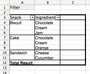
What’s happened this time? In the same way as before, the pivot table has also grouped and summarised the data about ‘Ingredients’. The great thing about this is that it has grouped the data about ingredients to show them for each type of snack. We can turn this around to give another view, from the perspective of the ingredient, not the treat.
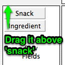
To do this, edit the pivot table layout again (right click on the pivot table), re-order the tiles that appear as Row Fields (as shown below) to place ‘Ingredient’ on top.
Select OK to re-create the pivot table with the new layout. This is how the data in it will look:
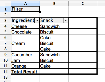
In this pivot table the groups of values are arranged in a different way. Rather than showing the ingredients that go into each snack, this shows the types of snack that contain a particular ingredient.
Got it? Let’s try it out on a larger dataset where we can see the value of a pivot table more dramatically.
A longer task
Let’s try the same technique on the larger GRAIN dataset on commercial landgrabbing, a cleaned version of which you can download from the Datahub.
Spend a bit of time familiarising yourself with this dataset. A good (but more time consuming) way of doing this is to work through the School of Data course called A Gentle Introduction to Cleaning Data, which also uses the GRAIN dataset as the basis of lessons.
If you don’t have time right now, the basics of this dataset are as below:
- the dataset has been made by GRAIN, a research and advocacy organisation which works to support biodiversity and sustainable, community-controlled food systems.
- each row of the dataset contains details about the sale of a huge amount of agricultural land in a country, often in the global south.
- the columns contain data about the names of investors and the countries where they are based, the country where the land deal has been carried out, the size of the land deal, and the amount of money invested to purchase the land, and whether the deal went ahead.
To create a pivot table in the GRAIN dataset the steps are the same:
- Select the complete dataset (from cell A1 to I417). Remember that if you don’t select data, it won’t be included in the pivot table.
- From the top menu, select Data → Pivot Table → Create.
- In the window that appears, choose “Current selection” and then click “OK”.
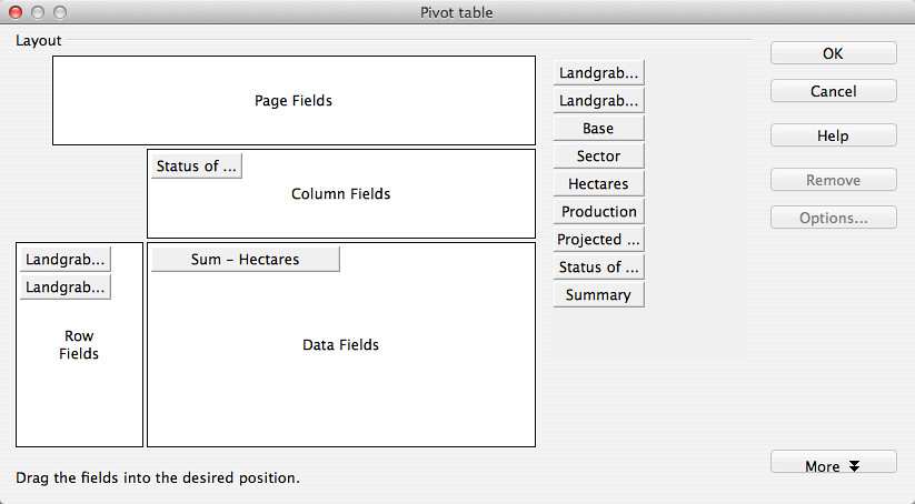
- Choose the layout of your pivot table by dragging the ‘tiles’ representing the different columns of data into different parts of the pivot table layout.
- When you’re happy, select ‘OK’ to create the pivot table.
- If you want to change the layout of a pivot table, right click on the pivot table to bring up a secondary menu, and select ‘Edit Layout’.
The GRAIN dataset has nine columns of data. In this lesson, we’ll just add different combinations of fields into the Row Fields part of the pivot table to answer specific questions.
We’ll walk through one of the questions to get you started: “In which countries has land been acquired?”
-
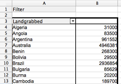
The data you need to answer this is in column A, labelled ‘Landgrabbed’.
-
Select the complete dataset. Go to Data → Pivot Table → Create.
-
Choose ‘Current selection’ and the empty layout window will appear, as below:
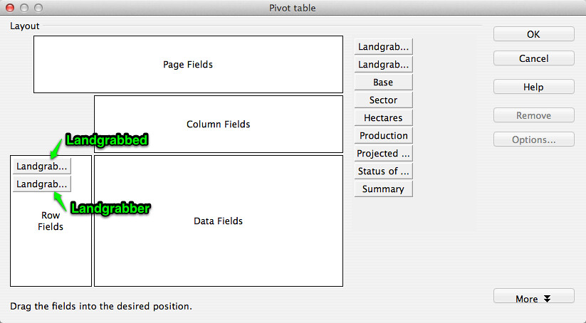
-
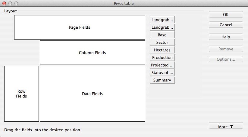
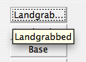
Uh oh! As you can see, there are two tiles that are labelled the same. This is because there are two columns that are very similar – ‘LandgrabbeD’ and ‘LandgrabbeR’ – and the pivot table layout unhelpfully trims the label. Hover your mouse over the tile to reveal the full name of the column of data you want to add, as below:
-
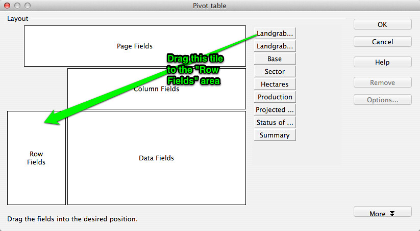
Now you know which tile contains the right data, drag ‘Landgrabbed’ into the Row Fields area, and click on OK to make the pivot table:
-
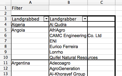
The data in this pivot table will be as below, a list of countries:
We can now build on this list to increase our understanding of what is in the dataset. For example, by editing the layout and dragging the tile called ‘Landgrabber’ into the Row Fields area, we can answer this question: “Which companies have acquired land in which countries?”
-
Here’s how the pivot table layout should look:
-
After clicking “OK”, here’s the first few rows of data that you’ll get in the pivot table:
-
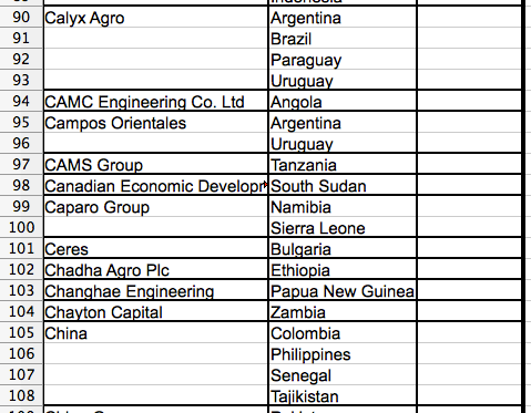
For extra points, try reversing the order of the tiles and creating a pivot table from that layout. It will show you the same data but arranged around the investor (the ‘Landgrabber’) rather than the country where land has been acquired. Here’s a bit of the data you’ll get from that layout:
Now you’re pretty much an expert, here are a few more questions that you can answer by adding in data to the Row Fields of a pivot table. Have a go at these:
- In which countries are investors based (their base)?
- In which countries are investors based, and where did they acquire land?
- Which investors are working in which sectors?
- Which investors are working in which sectors, and how did they use the land they purchased? Tip: data on how acquired land was used is in the column called ‘Production’.
- Which companies work in which sectors, broken down by base country?
- What are the names of investors that have made similar sized land acquisitions, and in which countries did they make those acquisitions?
- What were similar sized land acquisitions used for, and in which country, and what is the status of the deal?
Bonus features: sort and autofilter
Where you see a downwards-pointing triangle in the top row of a pivot table, click it to activate the sort and autofilter features of the spreadsheet. Click on them to bring up the interface and have a play around with it to see how it affects the data in the pivot table.
Section 2: Make a pivot table even more useful by adding ‘data fields’
In Section 1 we tried out building sorted and grouped lists that can use your data to answer questions. But what else can a pivot table do? In this section we’ll look at how the ‘Data Field’ part of the pivot table works.
A quick task
Build a pivot table of the different types of snack again, as outlined in Section 1 above. This time however, we’ll add in a “Data Field” that will calculate how many of each type of snack there are:
-
Your pivot table layout should look like the image below:
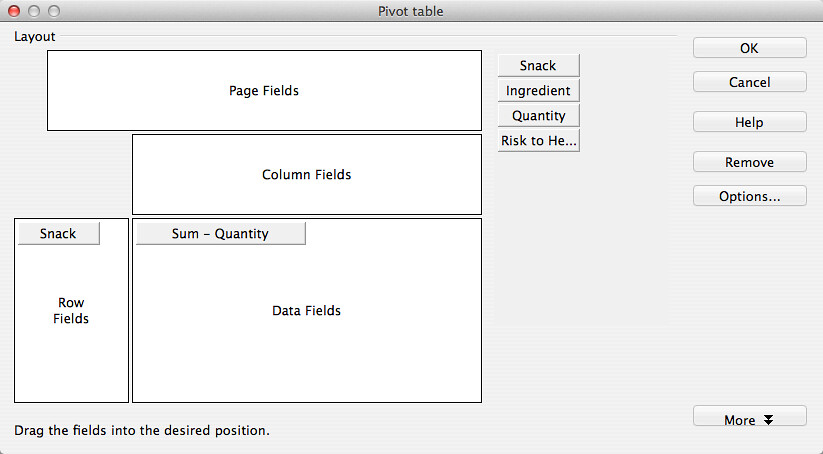
-
After creating this pivot table, the data you get will look like this:
So, what’s happened?
The pivot table has grouped and summarised the data on the types of snacks, which you put into a Row Field. The data on the quantity of snacks – which you put in the Data Field – has been added up to create a total for each type of snack. Neat, huh? Let’s add in another Row Field, just as we did in Section 1, and see what it tells us:
-
Bring up the secondary menu by right clicking on the pivot table, and select ‘edit layout’.
-
Change the pivot table layout so it looks like the screenshot below:
-
The data shown will change again. This time, the types of snack are sub-grouped by the sort of ingredient, along with the quantities:
A longer task
We can apply the same steps to the GRAIN dataset on landgrabbing to create more useful summary views of the data. For example, let’s find out how much land was reported as being acquired in each country:
-
We won’t repeat in full the steps required to create a pivot table, but will show you the layout:
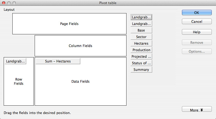
Note: in the image above, the tile in Row Fields is ‘Landgrabbed’. As noted above, the layout editor shortens it in an annoying manner. Hover your mouse over it to show the full fieldname.
-
The effect is the same as with the example above in the short task. The data in the Row Field is summarised and grouped to show a list of countries, without duplicates. The data in the Data Field has been added up to give a total figure for each country. Here are some sample rows of what this pivot table will produce:
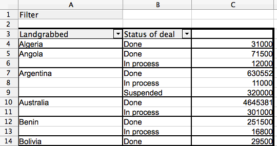
As before, we can continue to ask questions of the data by adding in different Row Fields. The data above shows the amount of land acquired in each country. Add in ‘Status of deal’ as a row field to refine this picture even further and show which deals are done, in process, proposed and so on.
-
Again, here’s the layout of the pivot table:
-
After creating the pivot table from the layout above, here are a few rows of the data it will generate for you:
Using your knowledge of choosing Row Fields, and now adding Data Fields, try creating pivot tables which show the following:
- a little profile for each investor, showing the countries where they have acquired land, and the size of the land area they have acquired e.g. a pivot table that shows Adecoagro reportedly made deals in Argentina for 242000 ha, Brazil for 165000 ha and Uruguay for 8600 ha.
- The total amount that that each investor has invested to acquire land e.g. this pivot table should show that Saxonian Estates reportedly made investments totalling USD 7.7 million.
- The amount of land that has been acquired, organised by investment sector e.g. this pivot table will show that 160,000 ha have been acquired by investors that work in the telecommunications sector.
- The amount of investment made, organised by the size of the land acquired, showing the country where the land was acquired e.g. the pivot table you make here should be able to quickly show us that land deals of 6000 ha were made in Australia for USD 335 million, in Russia for USD 39 million and in Nigeria where there is no record of the amount invested.
Bonus features: change which aspects of data are shown
The fields that you add to pivot tables have two useful features you should know about. We’ll provide a workthrough below, but here’s an overview:
-
The data that we have positioned in the Data Field of the pivot table is often just added up – that is, where there are multiple values they are added together to show the “sum”. However, the pivot table can show this data differently by:
- picking out the highest (the “max”) or lowest (the “min”) values from a list.
- giving a total of the number of values (the “count”).
- calculating the data as a percentage or running total.
This feature is activated by double-clicking on any tile that you’ve dragged into any area of the pivot table layout editor.
-
As with the Row Fields, you can have more than one data field in a pivot table. This means you can display different aspects of the same data next to each other. To use it, just drag another fieldname into the Data Fields area.
Here’s an example pivot table layout that demonstrates both these features.
-
This is the layout you’re aiming for:
-
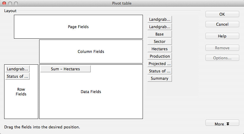
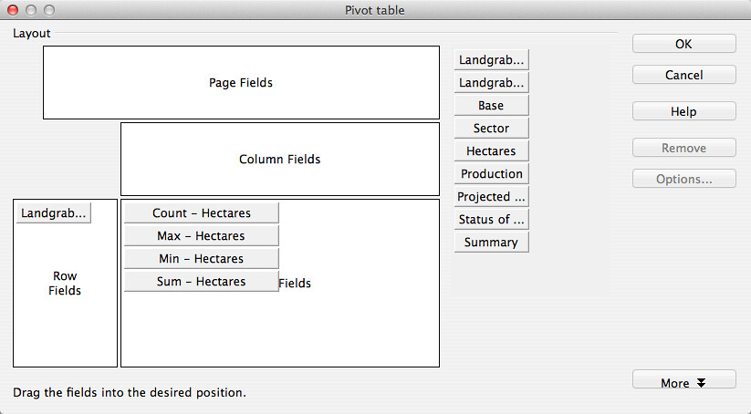
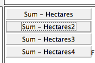
To get there, build your pivot table as usual. This time drag ‘Hectares’ into the Data Fields four times. You’ll see this:
-
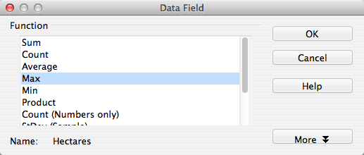
Next, change the way that the data are displayed. To do this, double click on one of the tiles you’ve dragged into Data Fields . A pop-up window will appear, like the one below:
-
Choose an option from the list, then select OK.
-
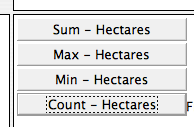
When you’ve done all four, the tiles in the Data Fields part of the layout will look like this below:
-
After you’ve completed your layout, create the pivot table.
-
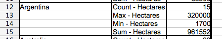
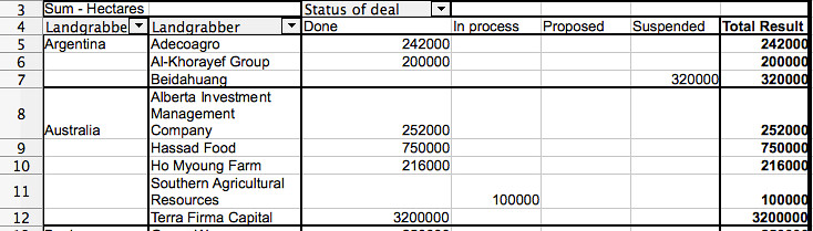
This pivot table will show four pieces of data for each country where land has been acquired: the number (or ‘count’) of deals where the amount of land is recorded, the largest acquisition (‘max’), the smallest acquisition (‘min’) and the total amount of land (‘sum’). Here’s a clipping from the pivot table which shows the entry for Argentina:
Section 3: Adding columns to pivot tables
In the previous sections, we looked at how to add row fields and data fields to your pivot tables. We also looked at how to sort and filter data in pivot tables, and how to adapt the display of data to pick out the largest and smallest values in a list. In this section, we’ll add the final basic component: Column Fields.
A quick task
After building nearly 30 pivot tables in this course, we’re sure you’re now getting the hang of this. The next step is to choose the data that can be a Column Field in your pivot table.
-
Take as a starting point the pivot table you made about snacks in Section 2. Edit the layout. This time, drag the tile labelled ‘Risk to Health’ into the Column Fields area. It will look like this:
-
After creating the pivot table, below is how the data in it will look with the new columns added:
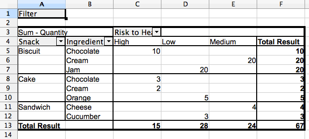
The effect of adding the Column Field is to further sub-group the data. Here’s the original pivot table from Section 2, so you can see the difference:

The version that includes columns enables you to see at a glance which the high risk snacks are, what they are made of, and how many of them there are. Better avoid chocolate biscuits and cream cake!
A longer task
Returning to the GRAIN dataset, we can see how adding this final dimension affects how the data is shown.
-
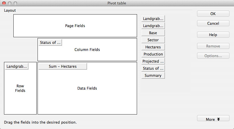
Create a basic pivot table which shows how much land (‘Hectares’) has been acquired in each country (‘Landgrabbed’).
-
This time include the ‘Status of deal’ field in the Column Fields area of the pivot table layout editor:
The effect should be quite predictable for you by now. The pivot table will give an overview of the total amounts of land acquired for each country, broken down by the status of the deal:
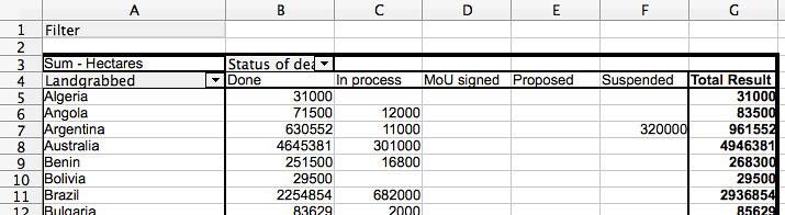
The ‘Status of deal’ field is a fairly convenient field to add to the Column Fields area. When summarised by the pivot table it has only five distinct categories. This means it fits easily into the screen area! Something like ‘Production’, which has over 100 categories, would not be as easy to view.
Have a go at changing the layout of the pivot table whilst keeping ‘Status of deal’ as a column:
- Replace the tile in the Row Fields with ‘Landgrabber’ (ie. the investor) and change the tile in Data Fields to ‘Projected Investment’ (ie. the amount paid for land). This shows how much money investors have tied up in done deals, deals that are signed, proposed and so on.
- Replace the Row Fields with ‘Sector’ and the Data Fields with a count of the number of investors. We covered how to do this in Section 2’s Bonus Feature section. This pivot table will show the number and status of deals by the sector that the investor is most associated with.
Bonus features: standard filters
As we noted in Section 1, the sort and filter features of the spreadsheet work in pivot tables. Another useful feature that operates in pivot table data is the standard filter. We can use this to exercise far more control over what data is displayed in a worksheet, and in pivot tables. Let’s see how it works.
-
Create this pivot table from the GRAIN data. It has ‘Landgrabbed’ and ‘Landgrabber’ as the Row Fields, ‘Status of deal’ as a Column Field, and a sum of the total size of deals (‘Hectares’) as the Data Fields:
-
Click OK. The data it produces will be like this:
-
In the resulting pivot table click on the tile called ‘Filter’ in cell A1. The Filter Criteria window will pop-up.
-
Change the fields to make them look the same as the below. Then click ‘OK’ to apply this filter to the pivot table:
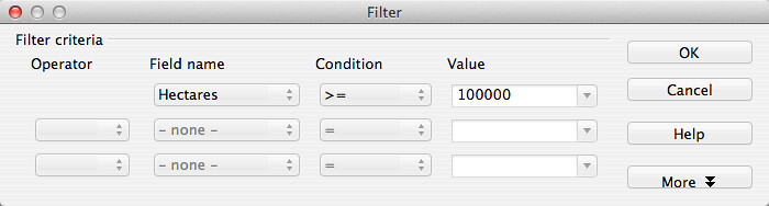
-
This will filter the data to show only those deals that are equal to or larger than (>= in mathematical notation) 100,000 ha.
-
The filter can be removed by opening the Filter Criteria window and selecting ‘none’ in the field name drop-down menu.
Section 4: Adding charts to pivot tables
You can chart data that is produced from a pivot table. Having both a summary of the data, and a chart is a way of further exploring and coming to an understanding of the data you have. Using the GRAIN data, here’s a simple example of how it works.
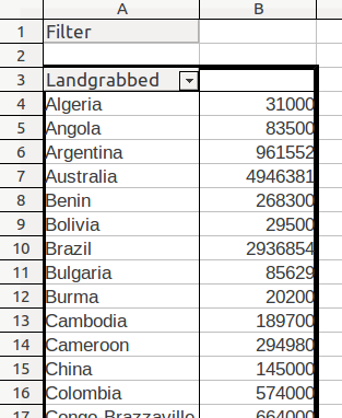
Once again, create a basic pivot table which shows the amount of land purchased in each country: drag ‘Landgrabbed’ into the Row Fields and ‘Hectares’ into the Data Fields. Here’s a sample of how the data will appear:
First, sort the data so the largest land deal is at the top of the list:
- Select cells B4 to A69 (in that order).
- Click the “Sort Descending” button in the spreadsheet toolbar (it’s a little ‘up’ arrow).
Second, add a chart:
-
The data should still be selected from when you filtered it.
-
In the top menu, go to Insert → Chart
-
The Chart Wizard window will pop-up. The chart it will choose is a Vertical Bar Graph. Don’t change a thing, just select Finish and you’ll get this dense chart:
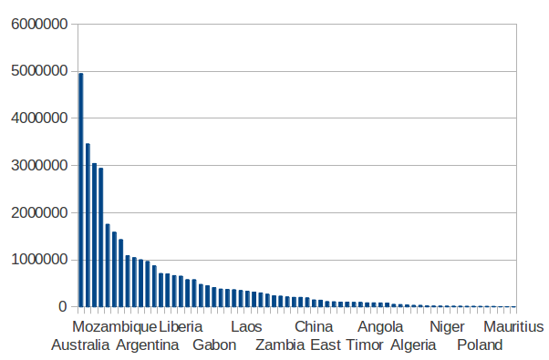
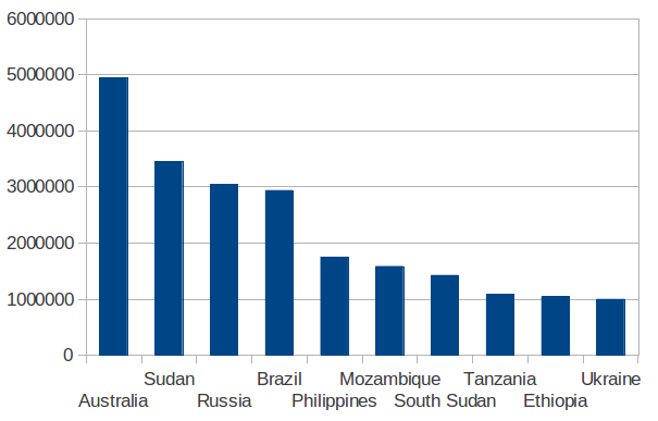
Third, refine the chart to show only the 10 countries where the most land has been acquired:
-
By hiding rows in the pivot table, we can change what data is shown in the chart.
-
Select rows 14 to 70. In the top menu, go to Format → Row → Hide. The chart will change to the below, which is far easier to grasp:
A quick task
Try to create a pivot table with a chart showing which investors have acquired the most land.
Last updated on Sep 02, 2013.