You are browsing the archive for Open Data Day.

May we Fetch you Some Data Skills? Exactly, at the Open Data Day in Abuja

- March 8, 2015 in Events

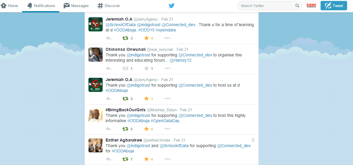
While everyone else whines about more training time for tools to can improve their data skills at our last open data party in Abuja, we did something about it at the Open Data Day in Abuja, on Saturday, February 21, 2015: 2 hours, 10 skill shares, 10 facilitators, 72 registered participants, and view the screenshot below to read what some of our participants said at the end of the event.

sayings_oddabuja15

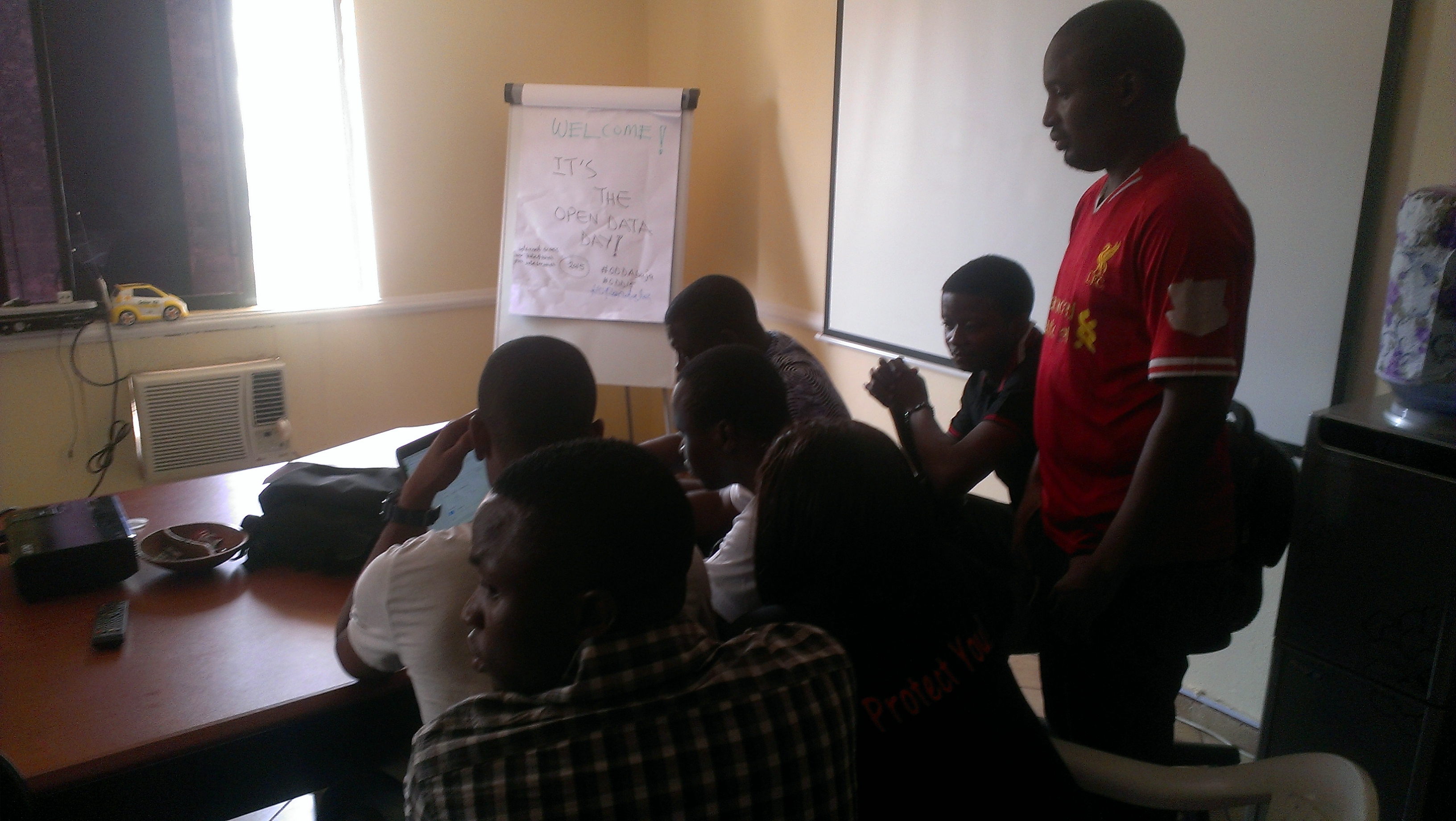
Tagged a skill share day that kicked off at 11a.m. it could not have been a wrong day to chose for this event, as 30 minutes before start of event, power was interrupted, and to make it worse, some part of the facility was going through renovation, Nevertheless, it began with an insanely charming activist from Devnovate/ Social Good Nigeria, Esther Agbarakwe, handing each of the participants a list of what to expect, and how the minutes are going to roll by in a flash – 2 hours will soon be over!

Surprisingly, the participants remain excited as we chose the first five skill shares that will run for the first hour (in a world cafe system). No thanks to our facilitators, who quickly had their laptops to run for next one hour without power. The skill shares for the hour were – Data Analysis using Excel Spreadsheet, Data Coding, using Google Spreadsheet for collaboration, Facilitation Skills and Community Building Skills. “It was quite intriguing to learn some simple skills around analysis with excel, been having headache around this all this while until this 15 minutes session” said one of the participants.

IMAG2220

While the heat of the sun started settling in, it was quite obvious that the every 15 minutes change to another skill share for the participants became an exercise that will soon be gone. A new set of skill shares were introduced after 1 hour 15 minutes. “How come we already run through an hour and 15 minutes, that was in a dash” exclaimed Oladotun Fadeyiye. New skill shares included using infographics, using twitter for good, funding mechanisms, using ArCGIS for mapping, creating great blogging website.

IMAG2231

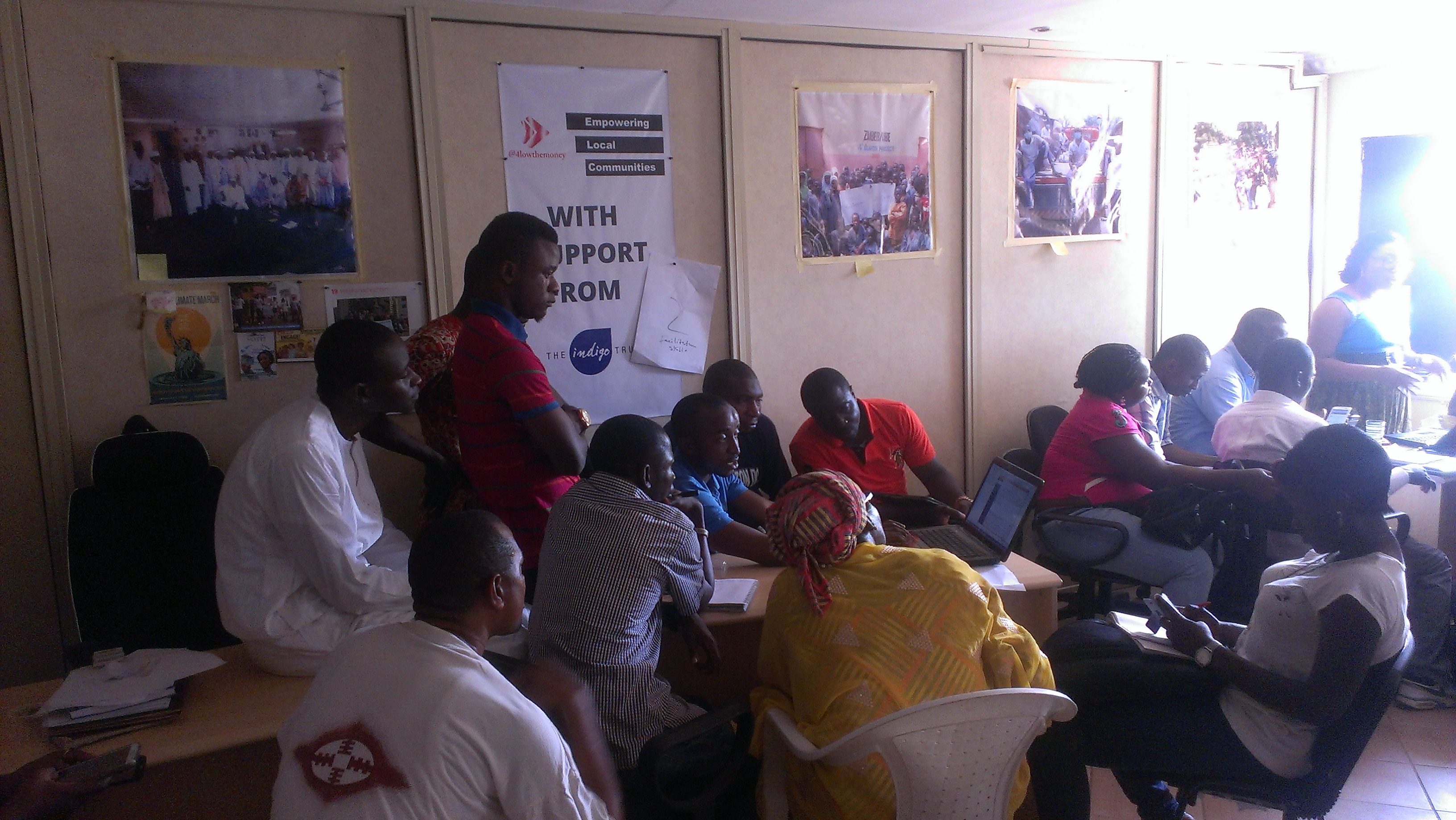
Yusuf Suleiman taking on ARCGIS for mapping


Two hours fifteen minutes went by, and we were impressed at some of the ingenious ways our facilitators came up with, to teach without power! Did BRCK come to the rescue? No, not yet, it was a short time, so we got all laptops fully charged, so that by the time we finished, all laptops battery would be beeping. Internet came from shared sticks, and also I saw a facilitator using practically online screen shots for demonstration, making look like he was browsing – how intelligent!

As it was a short time, participants were instructed to scribble their questions on sticky notes, to be read at plenary, after the “party’ was over. We had questions like why is it important to code data, how can a stammer facilitate, how secured is it to share files with Google Doc, Can I use the Google Drive if I do not have a Gmail account. Had suggestions like can we more time for the skill share next time – like dedicating one hour to a particular topic, thus taking us to the advanced skills.

IMAG2235

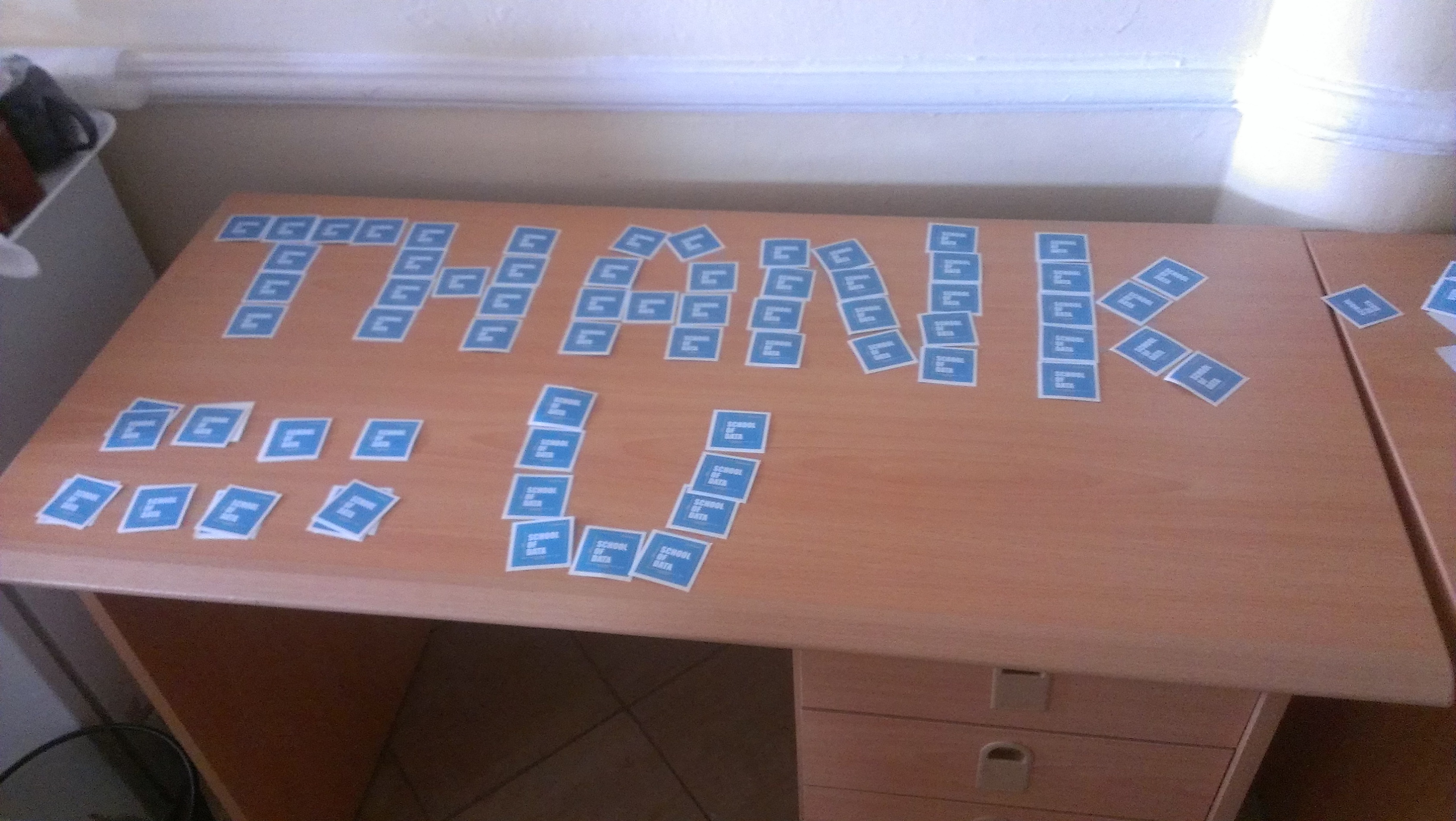
School of Data stickers up for grabs in a Thank you format to all Participants


At the end of the event, despite the fact that I had to fix laptops battery that were running out, collect sticky notes, shared sweeties and stickers, make sure sugar and energy drinks were available, tried blowing out the heat from participants sweat, Little said I would make a great concierge. We kept our cool and bantered with participants, and have useful connections, admittedly largely at getting feed backs. When it is time for another data skill share, I will be prepared to serve. My first question is going to be whether participants miss their homes during the skill share hours ;)

Flattr this!

Data Expeditions on Open Data Day

- February 26, 2013 in Data Expeditions, Events

This post was written on Open Data Day, Saturday 23rd February about the latest data expeditions from the School of Data team in Amsterdam and Berlin.

Open Data Day in Berlin and we’re at the ZEIT Online offices. There’s pizza, alcohol-free beer, plenty of Club Mate and we’re ready to roll…

The day kicks off with a brief introduction to the world of Open Data and pitches from proposed projects.

School of Data is here and gearing up to some data expeditions. It’s handy that the first part of the day, teams have been working on completing the Open Data Census, which this year has been extended to include city-level data.

Berlin storms ahead and is the first city to complete the census, partially because we have representatives from the City of Berlin to help with some of the answers.[1]

Kicking off with the census was a great way to get people familiar with what data was out there in time for some data expeditions based upon that data to start….

So what did the groups get up to?

If you’re not familiar with the notion of data expeditions, they are investigations in to the world of data. We help to set the topic, map out the phases (providing guidance as ‘sherpas’) and assign roles (we need, designers, storytellers, engineers, analysts and scouts) but the groups are entirely responsible for their direction and outputs. Here’s what they got up to on the day…

Group 1: Speise oder Scheisse? (Polite translation: Dreadful or Dish(y)?)

Over to Pete Haughie of Expedition English to tell us more about their delicious application…

[We created] an online app to check available health and safety inspection data against available listed restaurants in Berlin so that a user can make an informed decision which establishment to frequent.

Currently there are only two data sets to compare and only in one region of Berlin due to the method of gathering the data. There is a full spreadsheet available on request which we will attempt to ingest at a later date.

We are also considering being able to select establishments by street, food style (Oriental, German, Italian, American etc) depending on available information.

We would really like to mash against Qype reviews as well as by Health Statistics (specifically food poisoning!) to see if some areas are more ‘poisonous’ than other areas. In much the same way as Cholera sources were discovered in London in the 19th Century by Dr John Snow.

You can check out our app online.

Other members of the team thought hard about how to present the information in such a way that people would understand it and went for a highly artistic solution to the problem. Using a graphics programme and a tablet (now, that’s preparation, bringing along a tablet!), Astrid took on the challenge of presenting the data as artistically and accessibly as possible and sketched out possible ways of slicing and dicing the data, contrasting it and comparing it in space. (Note: these are hypothetical ways data could be presented and not based on real data.)

Find the original full sketch online.

Another member, of the team, Kate McCurdy experimented with R and graphics packages to quickly get other angles on the data. Some fascinating data experiments came out, showing for example, which roads have only clean restaurants, and from which ones it may be riskier to walk into off the street without a recommendation…

Find the full data experiments online.

Group 2: How Number of Sports Facilities Influences the Physical Abilities of School Starters in Berlin

Group 2 set themselves the challenge of finding out whether the availability of sports facilities in various different areas of Berlin had any impact on the physical ability of children in different areas of the city.

In the graph below, the diameter of the bubble reflects the number of children in a particular region, while the further along to the right a bubble is, the higher the percentage of school starters with conspicuous(ly low) (auffällig) Hand-Eye coordination…

Of course, we acknowledge that correlation does not equal causation, but the downwards trend does suggest some interesting patterns. Is it true that the fewer sports facilities, the lower the Hand-eye coordination of the children in the area?

See the raw data and other slices and dices on it here.
#Data Expedition in Amsterdam

Ten energetic volunteers joined a Data Expedition dedicated to exploring tax havens, letterbox companies and the distinctive tax scheme known as the Dutch sandwich. The expedition began with a tour around some of the public data available on Dutch tax payments and company registrations.


Querying away for Dutch companies at OpenDataDay @Waag

During the expedition the team also received a few neat research tools from one of the leading tax evasion experts.

From the initial discussions two ideas were explored:

  • Locating letterbox companies in Amsterdam: As the city is currently exploring banning the presence of letterbox companies, it was considered how to find data traits, which could identify letterbox companies from regular companies. One suggestion for spotting letterbox companies, was to identify number of employees and annual turnover. Unfortunately such data remains behind the paywall of the Dutch company register. A local council member of Amsterdam East pledges (and tweeted) so encourage increased spending transparency from the city of Amsterdam in order to enable access to more supplier details for at least the public side of the economy.  
  • Company density vs. people density: A team developed the first test for running a count of Dutch company registrations per zip code, which would provide a highly granulated distribution across the 60,000 Dutch postal codes. An initial attempt was made to fetch the zip code count with yahoo pipes from the OpenCorporates API, however not concluded.

Keen to know when the next data expedition will be launched? Join the School of Data Announce List and we’ll keep you informed when the next ones are coming up.

[1] (Note: the census details are completed to the best of the knowledge of the volunteers based on the data we could find on the day).

Flattr this!