Netneutralitymap.org – converting 700Gb of data to a map.
In this post, Michael Bauer explains how he wrangled data from measurement lab in order to create this visualisation of netneutrality, which maps interference with end user internet access.
Netneutrality describes the principle that data packets should be transported as best as possible over the internet without discrimination as to their origin, application or content. Whether or not we need legal measures to protect this principle is currently under discussion in the European Union and in the US.
The European Commission have frequently stated that there is no data to demonstrate the need for regulation. However, this data does exist: The measurement-lab initiative has collected large amounts of data from tests designed to detect interference with end user internet access. I decided to explore whether we can use some of the data and visualize it. The result? netneutralitymap.org.
Data acquisition: Google Storage
Measurement lab releases all their data with CC-0 licenses. This allows other researchers and curious people to play with the data. The datasets are stored as archives on Google storage. Google has created a set of utilities to retrieve them: gsutils. If you are curious about how to use it, look at the recipe in the school of data handbook.
All the data that I needed was in the archives – alongside a lot of data that I didn’t need. So I ended up downloading 2Gb data for a single day of tests, and actually only using a few megabytes of it.
Data Wrangling: Design decisions, parsing and storage
Having a concept of how to do things when you are starting out always pays. I wanted to keep a slim backend for the data and do the visualizations in browser. This pretty much reduced my options to either having a good API backend or JSON. Since I intend to update the data once a day, I only need to analyze and generate the data for the frontend once a day. So I decided to produce static json files using a specific toolchain.
For the toolchain I chose python and postgres SQL. Python for parsing, merging etc. and postgres for storage and analysis. Using SQL based databases for analysis pays off as soon as you get a lot of data. I expected a lot. SQL is considered to be slow, but a lot faster than python.
The first thing to do was parsing: the test I selected was glasnost. It is a testsuite emulating different protocols to transfer data and trying to detect whether these protocols are shaped. Glasnost stores very verbose logfiles. The logfiles state the results in nicely human readable format: So I had to write a custom parser to do this. There are many ways of writing parsers – I recently decided to use a more functional style and do it using pythons itertools and treating the file as a stream. The parser simply fills up the SQL database. But there is one more function – since we want to be able to distinguish countries, the parser also looks up the country belonging to the IP of the test using pygeoip and the geolite geoip database.
Once the table was filled, I wanted to know which providers the IPs of the test clients belonged to. So I added an additional table and started to look up ASNs. Autonomous System Numbers are numbers assigned to a block of Internet addresses, which tell us who currently owns the block. To look them up I used a python module cymruwhois (which queries whois.cymru.com for information). Once this step was complete, I had all the data I needed.
Analysis: Postgres for the win!
Once all the data is assembled, analysis needs to be done. The glasnost team previously used a quite simple metric to determine whether interference was present or not. I decided I use the same one. I created some new tables in postgres and started working on the queries. A good strategy is to do this iteratively – figure your subqueries out and then join them together in a larger query. This way things like:
INSERT INTO client_results
SELECT id,ip,asn,time,cc,summary.stest,min(rate) FROM client INNER JOIN
(SELECT test.client_id,test.test,max(rxrate)/max(txrate) AS
rate,mode,test.test AS stest FROM result,test WHERE test_id=test.id
GROUP BY test.client_id,mode,test.port,test.test HAVING max(txrate)>0)
summary ON summary.client_id=id WHERE id NOT IN (SELECT id FROM client_results)
GROUP BY client.id,client.asn,client.time,client.cc,client.ip,summary.stest;
don’t seem too scary. In the map I wanted to show the precentage of tests in which intereference with a user’s internet connection took place, both by country and by provider. The total number of tests, the number of tests in which interference was detected, and the precentage of ‘interfered with tests’ are thus calculated for each country and for each provider. The Glasnost suite offers multiple tests for different applications. To do this the results are then further broken down by applications. Since this is run once a day I didn’t worry too much about performance. With all the data, calculating the results takes a couple of minutes – so no realtime queries here.
The next step is to simply dump the result as json files. I used python’s json module for this and it turned out to work beautifully.
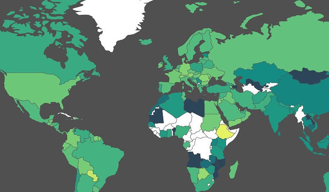
Visualization: Jvectormap
For visualization I imagined a simple choropleth map with color-coded values of interference. I looked around how to do it. Using openstreetmap/leaflet seemed too cumbersome, but on the way I stumbled across jvectormap – a jquery based map plugin. I decided to use it. It simply takes data in the form of {“countrycode”:value} to display it. It also takes care of color-coding etc. A detailed recipe on how to create similar maps can be found in the School of Data Handbook. Once I had the basic functionality down e.g. display country details when a country is clicked, it was time to call in my friends. Getting feedback early helps in developing something like the map. One of my friends is a decent web designer – so he looked at it and immediately replaced my functional design with something much nicer.
Things I’ve learned creating the project:
- SQL is amazing! Creating queries by iteration eases things down and results in mindboggling queries
- Displaying data on maps is actually easy (this is the first project I did so).
- 700 Gb of data is a logistical challenge (I couldn’t have done it from home, thanks to friends at “netzfreiheit.org” for giving me access to their server)
If you’re interested in the details: check out the github repository.
Michael Bauer is a new datawrangler with the OKFN. He’ll be around schoolofdata.org and okfn labs. In his free time he likes to wrangle data from advocacy projects and research.
![]()