Data roundup, May 1
We’re rounding up data news from the web each week. If you have a data news tip, send it to us at [email protected].

Photo credit: Anonymous
TOOLS, COURSES, AND EVENTS
If you missed out on the School of Data’s “School of Data Journalism 2013” workshop at the International Journalism Festival, don’t let that stop you from learning from it. Michael Bauer’s social network analysis tutorial will teach you how to use Gephi for journalism in the comfort of your own home, and Gregor Aisch‘s tutorials will teach you how to create charts with Datawrapper and how to analyze datasets with Tableau public. And there’s more—much, much more—on datadrivenjournalism.net.
In other news from datadrivenjournalism.net, the Spanish Data Journalism Handbook translation has been released. The handbook is a free and open introduction to the world of data-driven journalism through case studies and discussions of methods. This translation, produced by Argentina’s La Nación, will help foster data journalism in the Spanish-speaking world.
The 72 finalists for the 2013 Data Journalism Awards were announced on Saturday, selected from a pool of over 300 applicants. The eight winners will be announced in June, and a total of €15,000 will be awarded.
The Global Data on Events, Location, and Tone database (GDELT), a “CAMEO-coded data set containing more than 200-million geolocated events with global coverage for 1979 to the present”, has been receiving a great deal of hype lately. What can be done with GDELT? Recent blog posts by Rolf Fredheim provide preliminary explorations: mapping GDELT in R and experiments in Python and D3.
Much has already been written about D3.js’s mechanism of “selections”. But a new post by D3.js creator Mike Bostock is perhaps the deepest explanation of D3.js selections yet published, promising to “dispel any magic and help you master data-driven documents”.
Are you using Vincent to help you generate data-driven graphics from Python yet? No? Perhaps this new blog post showing you how you can use Vincent to create a map viz in less than 10 lines of Python will convince you to start.
DATA STORIES
R-help, a mailing list for dealing with problems with the statistical programming language R, has a somewhat scary reputation. Some have wondered: has R-help gotten meaner over time? Trey Causey investigates, with results that are “surprising, but [have] some simple sociological explanations”.
Stephen Wolfram shows off the power of Mathematica and his eponymous programming language by analyzing donated Facebook data. The result is a detailed and illustrated exploration of the demographics of Facebook.
TweetMap ALPHA lets you play with a dataset of 95 million tweets, querying them by time, space, and keyword and viewing the results on an interactive world map. The map both displays individual tweets as dots and aggregates them into a heatmap.
Dzhokhar Tsarnaev’s social media activity continues to haunt investigators. This Digg post features a network graph of Tsarnaev’s Twitter connections and digs into the network’s topology and its implications.
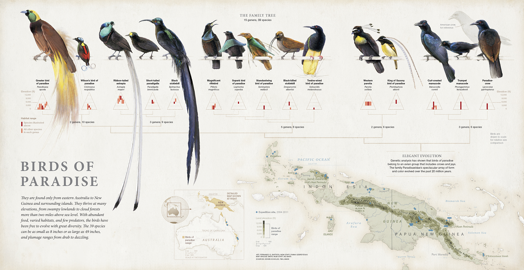
National Geographic published a story on a quest to find and photograph all 39 birds of paradise in December of 2012, accompanied by a spectacular graphic illustrating the birds’ relationships. A new blog post on National Infographic explores the evolution of the graphic.
Explore the density of underwater grasses in Chesapeake Bay with a beautiful new visualization. The map draws on decades of bathymetric data to show the ebb and flow of vegetation living in the Bay.
Where do mathematicians go when they graduate? A guest post by Kaisa Taipale on mathbabe.org digs into arXiv data using R and Circos to discover patterns, across time and by subfield, in the emigration patterns of mathematics PhDs.
Beer Mapper is an iPad app that will present you your beer preferences in the form of a heat map of “beer space”. The inner workings of the app, which implements Kevin Jamieson’s research on active ranking, are explained in detail.
DATA SOURCES
A year after its announcement, WikiData has been born. WikiData serves “the over 280 language versions of Wikipedia as a common source of structured data”, published under a Creative Commons public domain license. The Guardian and GigaOM provide further details.
The United Kingdom’s Land Registry has announced that it will be releasing a number of free datasets in the coming months. This includes historical house price index data next month and historical price paid data the month after that.
The city of Buenos Aires has opened a new data portal. The portal, built with CKAN, provides RESTful API access to the city’s transparency data and links to apps built with the data.
The city of Raleigh in North Carolina has launched its official data portal, built with Socrata. Popular datasets include fire incidents and crime data from 2012.
![]()