Seeing is believing – measuring is evidence.
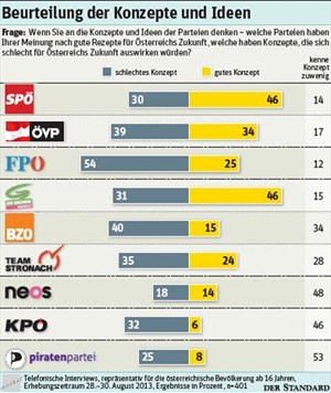
Recently an Austrian newspaper published the graph above. It was part of an interesting story on how people viewed the different political parties. One thing is notable: The first row and the fourth row are nearly similar – except the fourth row has much more on the left side (distrust) then the first. Let’s put them together to see this:

Now check the numbers – telling the percentage of people (dis)-trusting – note how the bar on the fourth (that says 31%) is nearly as long as the one next to it saying 40%? Let’s look at it with a line helping us:
Look at this: Someone made a mistake (or intended to show a difference bigger than it really was). This is pretty clear cut and several readers noted this in the comments below the article.
How much is it off?
Let’s find out how much it is wrong. Going back from graphs to numbers is challenging and a tricky process – I use a tool called imagej made to measure graphics (you can also do this using your graphics manipulation program). I measure the length of all the bars. Based on this and the value we can calculate whether the graph is well made. Two things are important to us: the start point (y) and the scale (x). The scale tells us how many pixels were used per unit, the start point at which value the graph started.
This gives the following formula for any bar: L=y+x*V (L is the length in pixels, V the value of the data-point). Since we do have two unknowns we need a second value/length pair to do the calculation L1=y+x*V1 – transforming this tells us x=(L-L1)/(V-V1) and y=L-x*V. This way we can calculate both scale and starting point. I did this in a spreadsheet for all the bars next to each other – since your measuring will be slightly inaccurate x and y will vary. I simply took the median of all x and y as their final values. Now we can calculate the expected length for each value point and the difference it has to the measured length: Most of the bars are about the right size (I do think this is measurement mistakes) – however the bar in question is 13-14 pixels too long. Gotcha sloppy data journalist.
Want more: @adrianshort did this for uk election advertisements
![]()