Contextualising the Chance of Something Happening – Micromorts
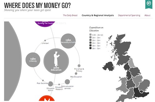
One of the most common problems associated with storytelling around numbers is getting across in a meaningful way how big a particular number is in the grander scheme of things: is the £38 billion or so budgeted to be spent in the UK on education in 2013 large amount, or a small amount, for example, compared to other budget areas?
Sites such as WhereDoesMyMoneyGo use graphical techniques to help put numbers such as these into some sort of overall budgetary context, as well as breaking down the numbers to show how they are further apportioned:
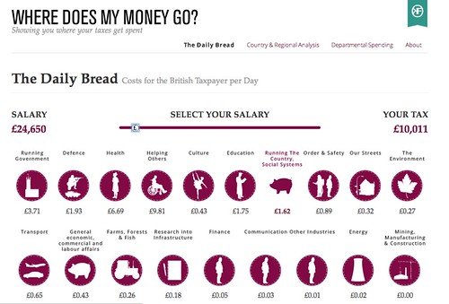
Another strategy for making numbers meaningful is to put them into a personally meaningful, everyday context. Once again, WhereDoesMyMoneyGo provides an interesting example of this. The Daily Bread is an application which allows a user to enter their approximate salary, and then see not only what the tax take is, but how it is allocated to different budgetary areas on a “pounds spent per day” basis:
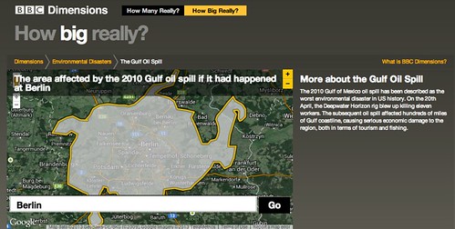
Communicating the extent of a geographical area can often be made more meaningful by putting the size of one area in the context of another: the number of football (soccer) pitches that can fit into a given area is one commonly used measure, for example. A couple of years ago, design agency BERG produced a prototype for the BBC called BBC Dimensions that allowed users to see the extent of one geographically related event centred on a location chosen by the user:
Again, this approach can be used to personalise a story and make it locally meaningful for audiences anywhere in the world.
I recently came across another unit that can be used to help people make sense of risks associated with mortality – the micromort. Originally coined by decision analyst Ronald Howard in a paper entitled Microrisks for Medical Decision Analysis published in the International Journal of Technology Assessment in Health Care / Volume 5 / Issue 03 / July 1989 , pp 357-370 (not an open access journal – so you’ll need a subscription, or willingness to pay, to read the article…), a micromort is a 1 in 1 million chance of death, a short form for 1 microprobability of mortality.
As David Speigelhalter, a Cambridge don with a passionate interest in risk, describes, about 50 people a day in England and Wales – population 50 million – have a non-natural death each day. That is, residents of England and Wales have a 50/50 million = 1 in a million chance of having a non-natural death each day; using our new found unit, they are exposed to 1 micromort a day.
If we now measure the chance in a million of dying from any particular activity, we can calculate the number of micromorts associated with that activity, and then make a comparison on that basis between activities.
David Spiegelhalter has further developed this notion of making sense of risks to life expectancy, introducing the notion of microlives, where one microlife represents thirty minutes of life expectancy. Engaging in particular activities that are unhealthy, and might be expected to reduce (or increase) your life expectancy, can then be compared in terms of the numbers of microlives they cost (or gain) you when you partake of that activity.
What all these examples show is how we can help audiences engage with data driven stories by trying to put them into a personally meaningful context, ideally something that can reach out at the human level to each member of that audience. Determining what comparative scale or relocation trick to use in any given situation may be culturally determined depending on the audience you are trying to reach out to. As with many data stories – pay attention to the units!
If you have an examples of useful scalings for communicating the relative size or impact of a particular measurement or event, please let us know via the comments below.
![]()