The World Tweets Nelson Mandela’s Death
 Click here to see the interactive version of the map above
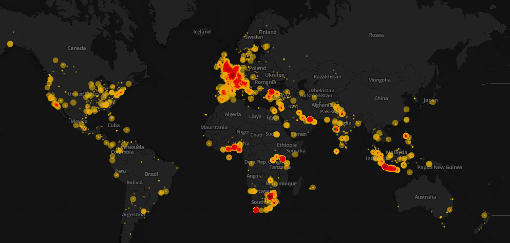
Data visualization is awesome! However, it conveys its goal when it tells a story. This weekend, Mandela’s death dominated the Twitter world and hashtags mentioning Mandela were trending worldwide. I decided to design a map that would show how people around the world tweeted the death of Nelson Mandela. First, I started collecting tweets associated with #RIPNelsonMandela using ScraperWiki. I collected approximately 250,000 tweets during the death day of Mandela. You can check this great recipe at school of data blog on how to extract and refine tweets.
After the step above, I refined the collected tweets and uploaded the data into CartoDB. It is one of my favorite open source mapping tools and I will make sure to write a CartoDB tutorial in future posts. I used the Bubble or proportional symbol map which is usually better for displaying raw data. Different areas had different tweeting rates and this reflected how different countries reacted. Countries like South Africa, UK, Spain, and Indonesia had higher tweeting rates. The diameter of the circles represents the number of retweets. With respect to colors, the darker they appeared, the higher the intensity of tweets is.
That’s not the whole story! Basically, it is easy to notice that some areas have high tweeting rates such as Indonesia and Spain. After researching about this topic, it was quite interesting to know that Mandela had a unique connection with Spain, one forged during two major sporting events. In 2010, Nelson Mandela was present in the stadium when Spain’s international football team won their first ever World Cup Football trophy as well. Moreover, for Indonesians, Mandela has always been a source of joy and pride, especially as he was fond of batik and often wore it, even in his international appearances.
Nonetheless, it was evident that interesting insights can be explored and such data visualizations can help us show the big picture. It also highlight events and facts that we are not aware of in the traditional context.
![]()