Data Analysis for Human Rights Advocacy
Brian Root - November 22, 2013 in Data for CSOs
At Human Rights Watch, we consistently seek ways to improve our research methods to not only better expose violations of human rights but to be more effective in our advocacy efforts so that we might create meaningful impact. One of the tools in our research methodology toolbox that has been extremely useful in this regard, though it is not without its potential pitfalls, is data analysis.
Data analyses can be effective primarily because they allow us to re-frame and examine topics in ways that provide context or insight that is different from the qualitative information gathered through our traditional fact-finding methods. Typically, data allows us to provide an aggregated view of the scope of potential violations. Policymakers, media and the public are often focused on numbers. Numbers exist on a common plane that allows people to relate to them in a way that is very different from testimony. They also can be packaged in compelling data visualizations that can gain attention in ways that words simply cannot. And so Human Rights Watch is finding that data analyses can be extremely effective not only in providing evidence of potential violations but as advocacy tools.
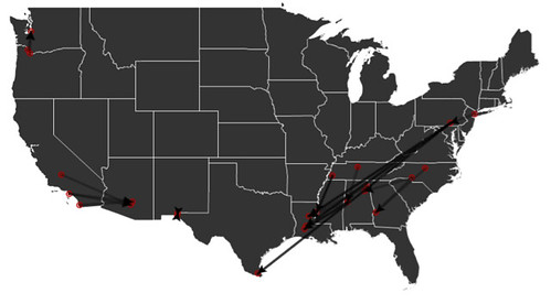
A strong example of this work is two years old but nicely illustrates the ties between data analysis, research and advocacy. The following map represents the results of a policy that, our report concluded, often undermines various human rights:

Each line here represents a movement of an immigrant detainee through the largest detention system in the United States. US Immigration and Customs Enforcement (ICE) holds hundreds of thousands of men, women and children in detention centers every year; people are held in this “civil” detention system anywhere from a few days to several years. But because the system has been built on sub-contracting detention to local jails and private criminal detention facilities, it cannot operate without constantly shuffling detainees around. Thus, we found, detainees were packed into a van or plane at a moment’s notice and transferred throughout the network of facilities with little to no information provided to families, attorneys or the public.
We had already published plenty of qualitative testimony detailing abuses caused by these transfers, but knew we needed more to achieve our ultimate advocacy goal of a change in ICE policy. This is because very few people could really grasp the scope of the issue. We needed to express, quantitatively, how pervasive the use of this policy was.
The first step was to acquire the data, which is not publicly released by ICE. We filed a Freedom of Information Act (FOIA) request, and after many months of legal communications, we received a large dataset of over 5 million records. The raw data looked like this:
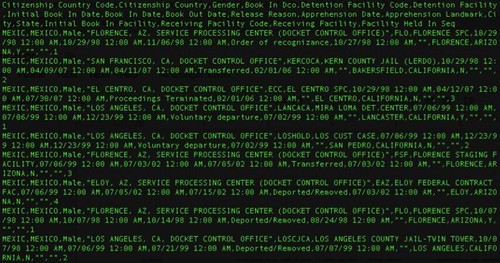
It had no unique identifiers, and unlike previous datasets we’ve received from ICE, each row of data was not an individual, but an event, meaning that each row ended in an action that was taken—a deportation, a release or a transfer. We had to determine how to identify individuals in these rows of events. For example, if two Mexican males were consecutive in the database, we had to figure out a method of sorting which actions belonged to which person. Using a single variable indicating the very first action of a detainee, we were able to identify individuals. Then, using the remaining variables, we were able to isolate individual people utilizing a method called “record linkage” and determine how many times they were detained and transferred as well as their eventual releases.
And what did we find? The 5.4 million records referred to 2.8 million episodes of detention of 2.4 million people (some detained multiple times), and these people collectively experienced transfers along more than 25,000 routes among more than 1,500 facilities. We understood how people were being moved through the system, how many times they were transferred, which facilities they were in, and how long they were in each facility.
To convey these numbers, distances and times to policymakers, we found that maps were an extremely effective tool.
Most frequently used transfer routes:
A single detainee’s odyssey:

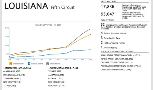
We used maps to illustrate just how large the system is, the distribution of facilities that hold detainees, and the distances that detainees are transferred, which allowed us to develop estimates of the cost of transfers. In addition to maps, simply presenting descriptive statistics was very useful. We detailed how the use of transfers had skyrocketed from 10% of detainees in 1998 to over 50% in 2010 experiencing a transfer. We found 31,000 people held in immigration detention for a year or more. We saw that those that are transferred spend three times as long in detention and that the average transferred detainee was moved almost 400 miles.
We were also able to aggregate data at the local level. When local lawmakers could see that their state was sending and receiving almost the same number of detainees to another state, they also saw an inefficiency that needed to change. I believe that bringing a federal issue to the local media to show the local impact of a policy was an important advocacy tool for this project.
Six months after the publication of the report, the Department of Homeland Security issued a transfer directive that sought to “minimize the long-distance transfer of detainees within ICE’s detention system” by establishing “criteria for transfer decisions that will substantially reduce the transfer of detainees who have family members in the area, local attorneys, or pending immigration proceedings.” I am not attributing any causation to our report, but our advocacy efforts certainly went a long way towards securing the policy change. Sadly, there is minimal evidence that transfers have been significantly reduced post-directive.
The analysis was led by me, Enrique Piraces (@epiraces), now Vice President of the Human Rights Program at Benetech, and Alison Parker, US Program Director at HRW. We used open source tools for several reasons, the most important of which was our limited budget. We used the LAMP package, with PHP to query our data tables, which were stored in MySQL databases. GeoNames and other geolocation APIs were used to geo-reference the facilities. QGIS and TileMill were used for mapping and ProtoVis and amMaphttp://www.ammap.com/ were used for rapidly generating our data visualizations. The full data and findings can be seen online.
![]()