This tutorial uses Google spreadsheets to create a scatterplot. There is sample data for this tutorial `here`_ .
So let’s create a scatterplot.
-
Start with World Bank Data.
-
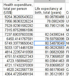
Copy it to a new sheet and put the columns “healthcare expenditure total per person” and “life expectancy” next to each other.
-
Click insert charts... and select “scatter plot” from charts.
-
Select the first one, since this is what we want to do.
-
And there you go: simply adapt the scatterplot so it looks nice. Don’t forget to label axes. Try to make the dots smaller if there is significant overlap.
Any questions? Got stuck? Ask School of Data!
Last updated on Sep 02, 2013.