Depending on who the audience is for your data, you may want to think about presenting or delivering your data differently.
The Spending Data Handbook covers some important considerations about targeting your data project.
In this chapter, we cover a data conversion technique that the Open Knowledge Foundation employ regularly in order to make data more accessible and (if caution is applied) comparable between countries.
Grouping budgets and spending by topics people care about
Functional classifications, for those of you who don’t regularly ‘sail the wide accounting seas’ tell you things like what general area of spending we area talking about “health”, “education”, “defence”, which is often more interesting from the perspective of the citizen user than e.g. which ministry group it was spent by.
Some governments already classify their data by functional classifications, but you can also group them . No idea what we are talking about or why you should care? Read on:
Why Functional Classifications?
Simply speaking, many users of data want to know what government spent money on, rather than who spent it, who received it. People (I’m talking about the general public here) generally care about services – not bank transfers.
You don’t have to make these classifications up from scratch, there are internationally recognised systems of these. For example, the stylishly named Classifications of Functions of Government (COFOG, for short) – is how the government already publishes its data in the UK. This, with a few amendments to translate the terms from political jargon into terms that people could identify with – was the system used to make the budget understandable in Where Does My Money Go?
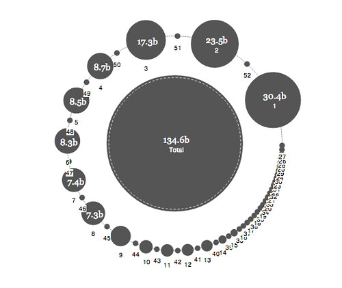
For other projects which we’ve done e.g. Cameroon.OpenSpending.org we’ve used a COFOG-esque mapping. Why ‘esque’? Firstly, the government didn’t publish their data classified like this, so we had to group it ourself. Secondly, we were aiming here for a functional classification which worked when you visualised it, if we’d used COFOG exactly for Cameroon’s specific case, we’d have ended up with a huge bubble for general public services which would have made all the others really small, so you wouldn’t be able to see the difference in size. So we modified the set of top-level items to make it easier to see smaller distinctions.
What fits?
The other thing to bear in mind, particularly if you are planning on visualising your data, is how many things you can fit on your visualisation. You should consider two factors:
- How many categories will fit spatially on your visualisation?
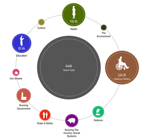
- How many categories can people take in? Lots of categories can be overwhelming for the observer of a visualisation. For Where Does My Money Go? The fact that there were only 10 or so top level items was one of the reasons we were able to use the COFOG classification.
Compare the visualisations below:
International Comparisons
While we’re always warning people about making comparisons between countries (data not being collected in the right way etc lalala), these classifications using COFOG are quite often used to make international comparisons. OECD do it regularly, so it’s probably one of the less-evil ways to do it, in case you’re interested in that type of thing.
De-jargonising COFOG
Let’s face it, the terminology used by the government is often not the most appealing, or illustrative from the point of view of the user. Hence, for the Where Does My Money Go Project, we specifically de-jargonised it, and translated the terms into friendly forms that we felt were more accessible to the average user. For example: ‘Executive and legislative organs, financial and fiscal affairs, external affairs’ became ‘Top level government’. You can take a look at how we mapped them on to one-another in this Google Doc.
How to map your budget into COFOG classifications:
Basically, if your government doesn’t do this for you – you’ll always have to use your best judgements, someone may have made a different call, and may well disagree with the way you’ve done what you’ve done. But as long as you document your practices, anyone will be able to pick up anything they don’t agree with and produce a different model.
- Make a codesheet and align your functional groups to the things you want to go under that umbrella term.
- Do a dataset cross using Google Refine or use HLOOKUP in Excel. Dataset merging will allow you to match information from different data sources or spreadsheets, without merging them, so the original data remains available.
Task:
Find budgets or spending for your country. Take a look at Where Does My Money Go? if you need inspiration.
You are now ready to produce a visualisation with your data!
Last updated on Sep 02, 2013.