As well as calculating simple numerical statistics and summary statistics on a dataset using a spreadsheet, we can also use spreadsheets to generate quick graphical views of the results. You can use data visualization in two ways: 1.) to explore the data you have in front of you and 2.) to show what you’ve found.
Spreadsheets support basic ways of graphing. Google spreadsheets even allows for a small degree of interactivity in the created graphs (and you can embed them to your websites). However, it is quite picky on how the data has to be laid out in order to produce the graphs you need – basically the data has to be right next to each other to produce a graph (this is different from the way LibreOffice or Excel implement their graphs).
Here we’ll be creating to basic plots: A histogram and a scatterplot. Both are fundamental in understanding your data better.
Walkthrough: Basic Graphs
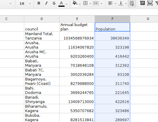
- Before we start any graphing, we’ll need to bring the columns we want to graph next to each other. The first graph we’ll create is a histogram of the spending per head (of each council we have).
-
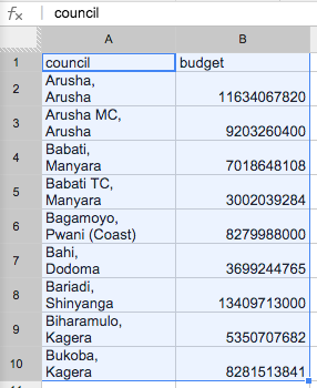
To create an histogram, you need a column with labels next to a column with values – here this will be the council column and the budget column
-
To avoid creating unintended changes in your data, create a new sheet.
-
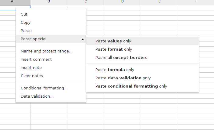
Then simply copy the data you want over, be sure to include the “values” only not the formulas. Do this by marking the column you want to copy from, then change to the sheet you want to paste in, right click and select “Paste special -> Paste values only”
-
Obviously, you don’t want to have “Mainland total” in your data because it is a total, and not a council. So you can delete the corresponding row in your pasted values.
- Now mark both columns (in the new spreadsheet)
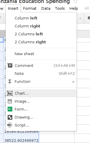
- And select “Insert -> Chart”
- Next you’ll need to select the correct chart- by default Google spreadsheets suggests some charts it thinks might be good. (For me, the histogram is one of them). To select your chart – click on the “charts” tab in the window that appears.
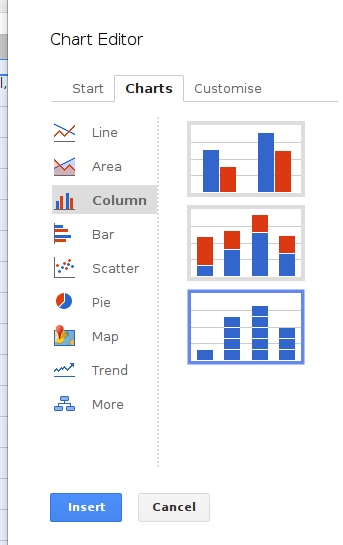
- Now click on Column and select the Histogram as shown above.
-
Click the “Insert” button to make the chart appear.
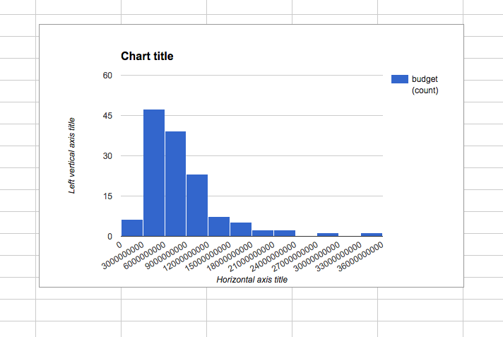
- The histogram shows you how your data is distributed. Can you find top and bottom spending councils?
-
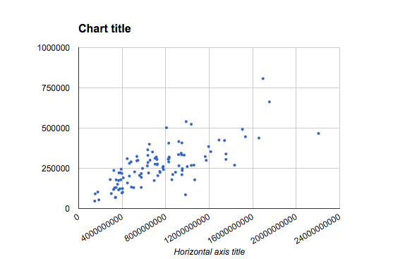
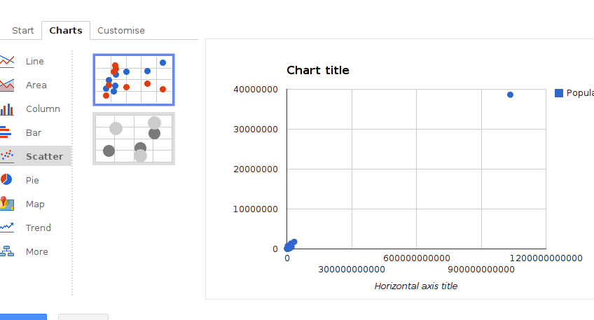
We will now explore the link between budget and population with a graph called scatterplot. The scatterplot is very useful see trends and identify outliers: data points that are very different than the average (like a city with a very big population but a small budget). In a scatterplot one value is on the x axis and another is on the y axis. Each combination (of e.g. population and budget) is put down as a dot.
-
For a scatterplot we’ll need two columns: one with the values for x and one with the values for y. So we just need to add the population data next to our budget column.
- Now mark the two value columns and select insert chart as above
-
Click on “chart -> Scatter” and select the scatterplot
- Click on Customize to customize your chart.
-
Since we only have one data row we can remove the legend.
-
You can make the dots a little smaller, rotate the labels to avoid overlap, change the color and other cosmetic changes
-
Now which points are clearly outliers?