A School of Data module written by Ketty Adoch, School of Data Fellow.
Module Goals
- Learn the basics of QGIS as a GIS software tool
-
Convert spreadsheet data to a map
-
Style the map to convey more information
Course requirements
Knowledge of Data Fundamentals, a course which covers the basics of data, and how to work with a spreadsheet.
And the following:
- The QGIS software (that you can download here)
-
The OpenLayers plugin (installation instructions below)
-
Your dataset as a spreadsheet document, with latitude/longitude or easting/northing values. You can use this example dataset
Table of contents
-
Introduction
-
Installing QGIS
-
Adding data to QGIS
-
Styling the data
Introduction
According to GIS folklore, the story of GIS begins in the world of maps. A map is a simplified and conventional visual representation of real things from the real world.
The acronym GIS stands for Geographical Information System. Just as the name suggests, a GIS is a computer system which allows you to work with geographical information – just like you would use a word processor to type a document or a spreadsheet to do numerical calculations and make graphs to visualize your data.
Sometimes you have data in a spreadsheet and it has geographical information. This could be:
- names of places (countries, cities, villages),
-
addresses,
-
zip codes,
-
geographic coordinates (in the form of latitude and longitude),
-
cartesian coordinates.
Learn more about coordinates: Coordinate systems, map projections and geographic transformations
GIS allows you to create, manipulate and visualize data with a location attribute. There are several GIS applications but we will focus on QGIS. A GIS deals with two types of geographical information:
- Vector data
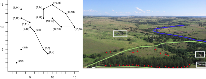
This is made up of either points (for instance a restaurant location), lines (for instance a road) or enclosed areas/polygons (like a forested area). The location of these features are defined by x,y coordinates and sometimes z, for 3-D features.
- Raster data
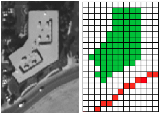
These are usually images defined by tiny squares of varying color, called pixels. This type of geographical data is important for storing map information as digital images.
If you ever wanted to visualise a dataset using a map, and explore the mapped data, this course if for you. This module will be an introduction to using QGIS to work with spreadsheet data.
Installing QGIS
Installing QGIS
QGIS is an open source GIS software that is available for free. You can download on the official website. If you are a Mac user, make sure to follow the instructions and install the Gdal package and the Mathplotlib library.
Installing the OpenLayers Plugin
A plugin adds functionality to software. One thing to note about QGIS is that, there are over 200 plugins that add functionality to the application allowing you to do so much more with your data. Take a look at the popular ones. After opening QGIS, you can install a plugin by Opening the Plugins menu item > Manage and Install plugins then type the name of the plugin in the search bar. In case the OpenLayers Plugin is not installed then head to the ‘Manage and Install Plugins’ menu item. Type ‘OpenLayers Plugin’ in the search box, select it and Click ‘Install Plugin’ It will appear as checked once installed.
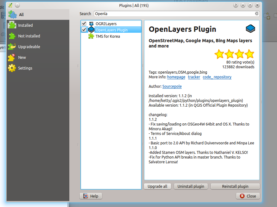
We’ll follow the above steps each time we need to install a plugin.
Adding data to QGIS
Once you have identified geographical data to work with or a spreadsheet with geographical coordinates (latitude/longitude or easting/northing values) , the next step is to add it to your QGIS project. Our goal is now represent geographical data using a map. We’ll use an extract from the list of schools in Tanzania to demonstrate this.
This is how our sample data looks like as a spreadsheet:

You will notice that the data has several fields/columns: Eastings, Northings, Village/Area, Particulars and Population among others. This data also has 13 records/rows. The first is the column header which defines the content of your rows. Each row represents a feature – remember we defined what a feature is earlier. With the easting and northing values, we can plot the school points on a map.
- First, save the spreadsheet(.xls, .ods or .csv) as a text file (.txt) by renaming the file and changing the the extension (the last three letters after the point).
This is a shortcut to make sure the numbers in the file (Population column) are recognised as numbers (integers or real values data type) and not as text (string data type). If you do not have numbers (excepted your coordinates), the recommended format is .csv.
- Start QGIS. You’ll be able to see a clean project once QGIS is ready for use.
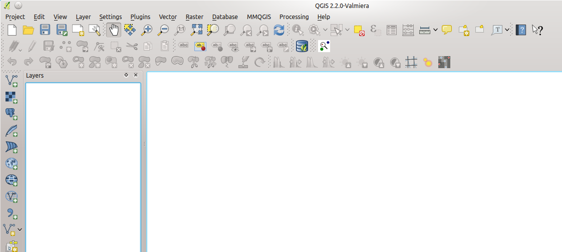
Before we add the list of schools, we need to add a world map (usually called basemap) which will give context to the schools locations. You can add the basemap via the OpenLayers plugin. Once installed, the OpenLayers Plugin will appear under the “Internet” menu item. You can then choose which map you want as the basemap.
- Let’s use the OpenStreetMap basemap, so under Internet > OpenLayers Plugin > Add OpenStreetMap Layer. A world map will be displayed.
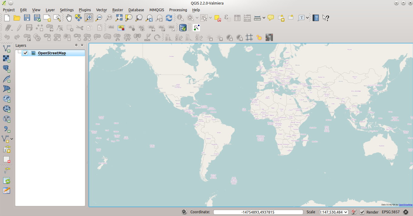
-
We are now ready to import the .txt file we created from the spreadsheet. Click the Add delimited text layer button
 and browse to where you saved the .txt file.
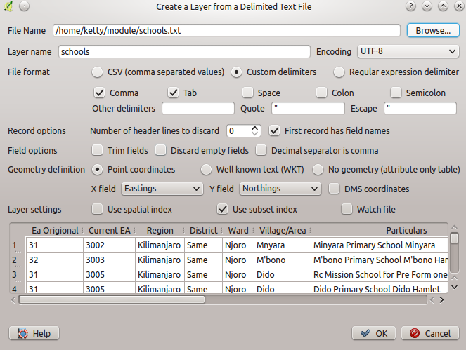
In the dialogue above, you’ll notice that the easting and northing are already detected, this defines the geometry of your features, in case they are not detected, play with the delimiters: comma, tab, space etc until the geometry is detected.
- Click OK, select the correct coordinate reference system as WGS 84 /UTM Zone 36S. You can find it by typing its name in the Filter field.
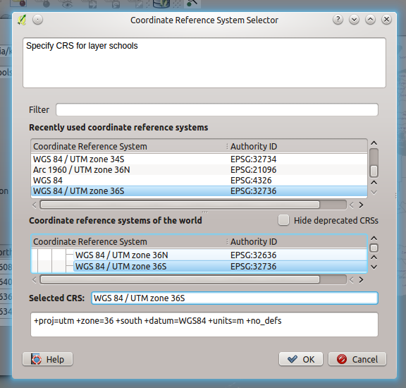
The Coordinate Reference System (CRS) specifies the transformation relative to the location on earth. What the CRS does is to apply a mathematical formula to your data so that it’s converted from spherical (shape of earth) to a flat surface (your computer screen). So depending on where you are on earth, the CRS will vary. Selecting a wrong CRS may warp your data the wrong way.
Most tiled web maps (such as the OSM maps and Google Maps) use the Mercator projection, EPSG 3857. If you want to create web map tiles and plan to use similar mapping services, this is the right choice. If you are interested in working directly with geographical coordinates or want to transform the coordinates into some other spatial reference system or projection, use the WGS84 (EPSG 4326) reference system, which is the system used by the Global Positioning System (GPS)
- Once you have selected your CRS, you can click OK. You should now see the school layer and points added to the project -you just created a map!
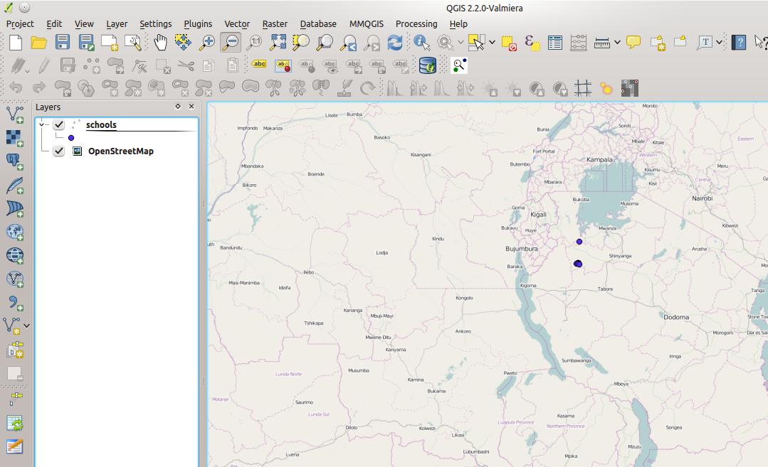
You can zoom in/out using the following tools: 
Sometimes, depending on how clean your spreadsheet is, you may have this warning (no worries, the sample dataset we use is already clean):
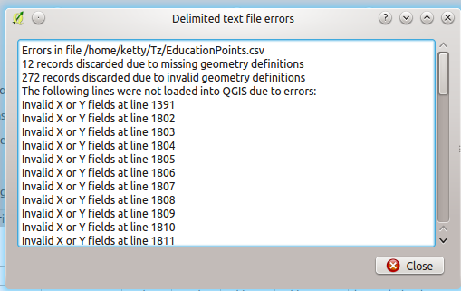
This means that the easting/northing values are wrong or have characters like ‘?’, – , space, #, or empty cells and this compromises the quality of your map! The best thing to do is engage in a data cleaning exercise before you continue.
Read more: A Gentle introduction to Data Cleaning
Styling the Data
Reviewing the data
If you want to review the original data, you can open the attribute table which contains all the data about the layer. Select the schools layer > right click > open attribute table. Below is what you should see- same as the spreadsheet data.

Styling the data
We can style the data by using the style tab functions. Styling the data helps finding answers you might ask your data. Here we want to clearly show how population varies between schools.
- To style, we can use graduated symbols- they vary in size depending on the values in the attribute. Close the attribute table > double click the schools layer > select style.
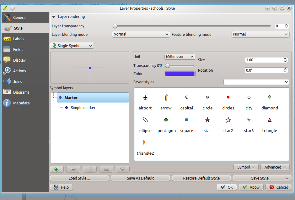
- Click the Advanced drop down arrow at the right below corner of the window, Click on the size scale field. You will notice a list of the attributes: Ea Region, Current EA, Eastings, Northings and Population.
All these attributes have numerical values which you can style using graduated symbols, but what we want to explore is the variation in population.
- Select Population, change the unit size to 0.05mm and Click OK. You can zoom in to take a closer look at the map.
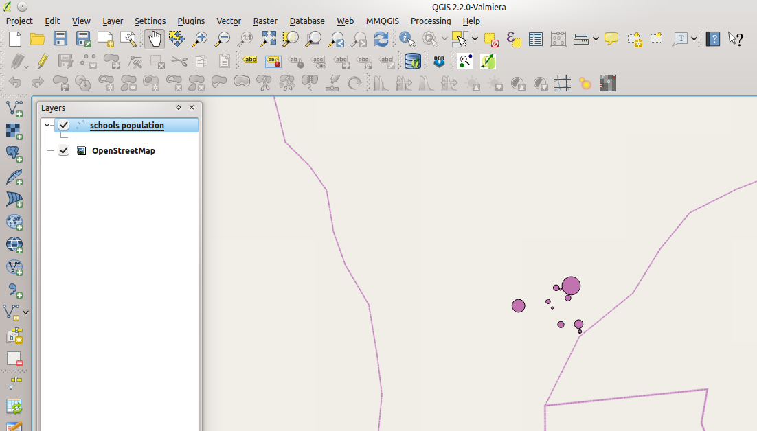
- You can change the name of the layer: right click the layer and select Rename, type the new name as : school population. Play around with the color, symbols, transparency and size tools in the window shown below.
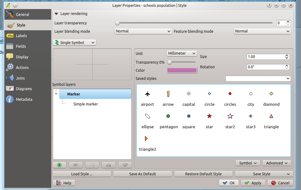
The final map shows the population in the schools using graduated symbols.
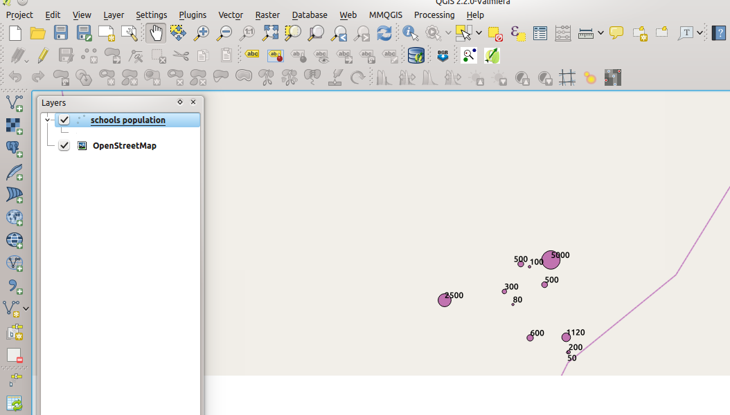
The map we just created seems not to communicate much: we can give it more context by adding other layers like, the roads or building layer or you can add name labels to the schools so that you can see the names. That will be the topic of a future module.
