Introduction
Do you know the popular phrase: “There are three kinds of lies: lies, damned lies and statistics”? It illustrates the common distrust of numerical data and the way it’s displayed. And it has some truth: for too long, graphical displays of numerical data have been used to manipulate people’s understanding of ‘facts’. There is a basic explanation for this. All information is included in raw data – but before raw data is processed, it’s too much for our brains to understand. Any calculation or visualisation – whether that’s as simple as calculating the average or as complex as producing a 3D chart – involves losing a certain amount of data, so that we can take it in. It’s when people lose data that’s really important and then try to make big statements about the whole data set that most mistakes get made. Often what they say is ‘true’, but it doesn’t give the full story’
In this tutorial we will talk about common misconceptions and pitfalls when people start analysing and visualising. Only if you know the common errors can you avoid making them in your own work and falling for them when they are mistakenly cited in the work of others.
The average trap
Have you ever read a sentence like: “The average european drinks 1 litre of beer per day”? Did you ask yourself who this mysterious “average european” was and where you could meet him? Bad news: you can’t. He or she doesn’t exist. In some countries, people drink more wine than beer. How about people who don’t drink alcohol at all? And children? Do they drink 1 litre per day too? Clearly this statement is misleading. So how did this number come together?
People who make these kind of claims usually get hold of a large number: e.g. every year 109 billion liters of beer is consumed in Europe. They then simply divide that figure by the number of days per year and the total population of Europe, and then blare out the exciting news. We did the same thing two modules ago when we divided healthcare expenditure by population. Does this mean that all people spend that much money? No. It means that some spend less and some spend more – what we did was to find the average.The average makes a lot of sense – if data is normally distributed. Normal distribution is the classic bell shaped curve.

The image above shows three different normal distributions. They all have the same average. And yet they are clearly different.What the average doesn’t tell you is the range of data.
Most of the time we do not deal with normal distributions either: take e.g. income. The average income (something frequently reported) would suggest that half of the people would earn less and half of them would earn more than the average. This is wrong. In most countries, many more people earn below the average salary than above it. How? Incomes are not normally distributed. They show a peak around a certain level and then have a long tail towards large salaries.
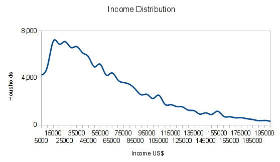
The chart shows actual income distribution in US$ for households up to 200,000 US$ Income from the 2011 census. You can see a large number of households have incomes around 15,000-65,000 US$, but we have a long tail skewing the average up.
If the average income rises, it could be because most of the people are earning more. But it could also be that a few people in the top income group are earning way more – both would move the average.
Task: If you need some figures to help you think of this, try the following:
Imagine 10 people. One earns 1€, one earns 2€, one earns 3€… up to 10€. Work out the average salary.
Now add 1€ to each of their salaries (2€, 3€….11€). What is the average?
Now go back to the original salaries (1€, 2€, 3€ etc) and add 10€ only to the very top salary (so you have 1€, 2€, 3€… 9€, 20€). What’s the average now?
Economists recognise this and have added another value. The “ GINI-Coefficient ” tells you something about the distribution of income. The “GINI-Coefficient”” is a little complicated to calculate and beyond the scope of this basic introduction. However, it is worth knowing it exists. A lot of information gets lost when we only calculate an average. Keep your eyes peeled as you read the news and browse online.
Task: Can you spot examples of where the use of the average is problematic?
More than just your average…
So if we’re not to use the average – what should we use? There are various other measures which can be used to give a simple mean figure some more context.
- Combine the average figure with the range; e.g say range 20-5000 with an average of 50. Take our beer example: it would be slightly better to say 0-5 litres a day with an average of 1 litre.
- Use the median: the median is the value right in the middle where 50% of values are above and 50% of values are below. For the median income it holds true that 50% of people earn less and 50% of people earn more.
- Use quartiles or percentiles: Quartiles are like the median but for 25,50 and 75%. Percentiles are the same but for varying percent ranges (usually 10% steps.) This gives us way more information than the average – it also tells us something about the distribution of data (e.q. do 1% of the people really hold 80% of the wealth?)
Size matters
In data visualization, size actually matters. Look at the two column charts below:
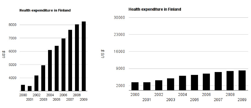
Imagine the headlines for these two graphs. For the graph on the left, you might read “Health Expenditure in Finland Explodes!”. The graph on the right might come under the headline “Health Expenditure in Finland remains mainly stable”. Now look at the data. It’s the same data presented in two different (incorrect) ways.
Task: Can you spot why the data is misleading?
In the graph on the left, the data doesn’t start at $0, but somewhere around $3000. This makes the differences appear proportionally much larger – for example, expenditure from 2001-2002 appears to have tripled, at least! In reality, this wasn’t the case. The square aspect ratio (the graph is the same height as width) of the graph further aggravates the effect.
The graph on the right starts with $0 but has a range up to $30,000, even though our data only ranges to $9000. This is more accurate than the graph on the left, but is still confusing. No wonder people think of statistics as lies if they are used to deceive people about data.
This example illustrates how important it is to visualize your data properly. Here are some simple rules:
- Always use a range that is appropriate to your data
- Note it properly on the respective axis!
- The changes in size we see in a chart should actually reflect the change of size in your data. So if your data shows B is 2 times A, then B should be 2 times bigger in your visualization.
The simple “reflect the size” rule becomes even more difficult in 2 dimensions, when you have to worry about the total area. At one point, news outlets started to replace columns with pictures, and then continue to scale the dimensions of pictures up in the old way. The problem? If you adjust the height to reflect the change and the width automatically increases with it, the area increases even more and will become completely wrong! Confused? Look at these bubbles:
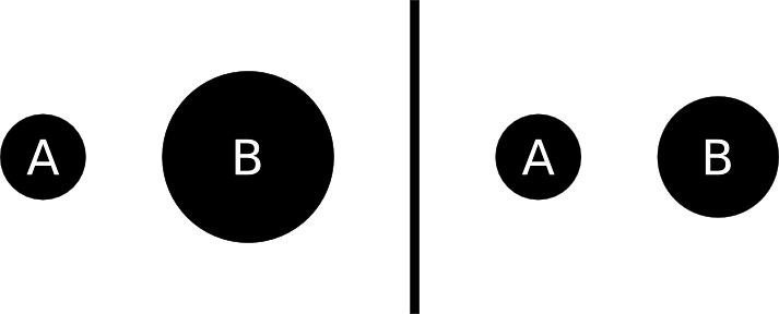
Task: We want to show that B is double the size of A. Which representation is correct? Why?
Answer: The diagram on the right.
Remember the formula for calculating the area of a circle? (Area = πr² If this doesn’t look familiar, see here). In the left hand diagram, the radius of A (r) was doubled. This means that the total area goes up by a scale factor of four! This is wrong. If B is to represent a number twice the size of A, we need the area of B to be double the area of A. To correctly calculate this, we need to adjust the length of the radius by ⎷2. This gives us a realistic change in size.
Time will tell?
Time lines are also critical when displaying data. Look at the chart below:
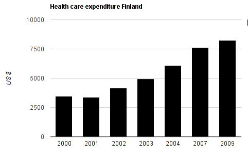
A clear stable increase in health care costs since 2002? Not quite. Notice how before 2004, there are 1 year steps. After, there is a gap between 2004 and 2007, and 2007 and 2009. This presentation makes us believe that healthcare expenditure increases continuously at the same rate since 2002 – but actually it doesn’t. So if you deal with time lines: make sure that the spacing between the data points are correct! Only then will you be able to see the trends correctly.
Correlation is not causation

by XKCD
This misunderstanding is so common and well known that it has its own wikipedia article. There is nothing more to say about this. Simply because two data points show changes that can be correlated, it doesn’t mean that one causes the other.
Context, context, context
One thing incredibly important for data is context: A number or quality doesn’t mean a thing if you don’t give context. So explain what you are showing – explain how it is read, explain where the data comes from and explain what you did with it. If you give the proper context the conclusion should come right out of the data.
Percent versus Percentage points change
This is a common pitfall for many of us. If a value changes from 5% to 10% how many percent is the change?
If you answered 5% – I’m afraid you’re wrong! The answer is 100% (10% is 200% of 5%). It’s a change in 5 percentage points. So take care the next time people try to report on elections, surveys and the like – can you spot their errors?
Need a refresher on how to calculate percentage change? Check out the “Maths is Fun” page on it.
Catching the thief – sensitivity and large numbers
Imagine, you are a shop owner and you just installed and electronic theft detection system. The system has a 99% accuracy of detecting theft. The alarm goes off, how likely is it, that the person who just passed is a thief?
It’s tempting to answer that there is a 99% chance that this person stole something. But actually, that isn’t necessarily the case.
In your store you’ll have honest customers and shoplifters. However, the honest customers outnumber the thiefs:: there are 10,000 honest customers and just 1 thief. If all of them pass in front of your alarm, the alarm will sound 101 times. 1% of the time, it will mistakenly identify a honest customer as a thief – so it will sound 100 times. 99% of the time, it will correctly recognise that a shoplifter is a shoplifter. So it will probably sound once when your thief does walk past. But of the 101 times it sounds, only 1 time will there actually be a shoplifter in your store. So the chance that a person is actually a thief when it sounds is just below 1% (0.99%, if you want to be picky).
Overestimating the probability if something is reported positive in such a scenario is called the base rate fallacy. This explains why airport searches and other methods of mass screening always will turn up lots of false positives.
Summary
In this module we reviewed a few common mistakes made when presenting data. When using data as a tool to tell stories or to communicate our issues and results. While we need simplification to understand what the data means – doing it wrong will mislead us. When we present graphical evidence: try to stay true to the data itself. If possible: don’t only release your analysis: release the raw data as well!
Last updated on Sep 02, 2013.