Introduction
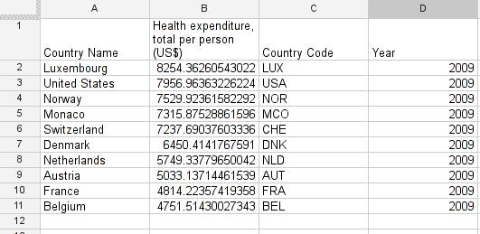
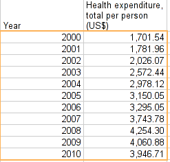
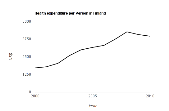
The last tutorials was all text and grey, so let’s add some glitter to the world of data: Data Visualization. Data visualization is not just about making what you found look good – often it is a way of gaining insight into the data. We just understand graphical information on a better level than we understand numbers and tables. Look at the example below: How long does it take to see the trend in the table, how long in the chart?
 Data visualization is a great skill and if done right has great value. If done incorrectly, you will lead people astray and plant wrong ideas in their heads. Remember: With great power comes great responsibility.
In this tutorial we have two missions:
- To understand which type of chart is most appropriate to present your data
- To learn the basic workflow for inserting basic charts into a spreadsheet with Google Docs.
For this tutorial you will need to have the share settings on your spreadsheet set to “public on the web” – otherwise some of the things we cover won’t work. Do so by changing the settings with the blue share button on the top right.
In case you haven’t completed the last module the spreadsheet we are working with is here.
How to present data?
We have largely quantitative data in our dataset. The question we have to ask ourselves is: Do we compare one entity over time, multiple entities with each other or do we want to know how two variables interact? Depending on this we choose different presentation formats.
| What we want to do | Presentation chosen |
|---|---|
| Compare values from different categories | barchart |
| Follow value over time (timeseries) | linechart |
| Show interaction between two values | scatterplot |
| Show data related to geography | map |
Presenting quantitative data from different categories – Bar/columncharts
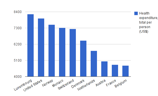
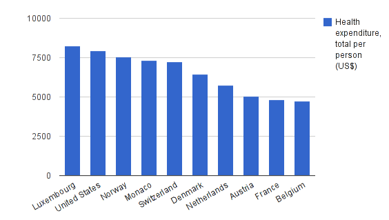
A barchart is one of the most commonly used forms of presenting quantitative data. It is simple to create and to understand. It is best used when comparing data from different categories: e.q. public healthcare expenditure in the top 10 countries – and as 11th column your country. A typical columnchart looks like this:
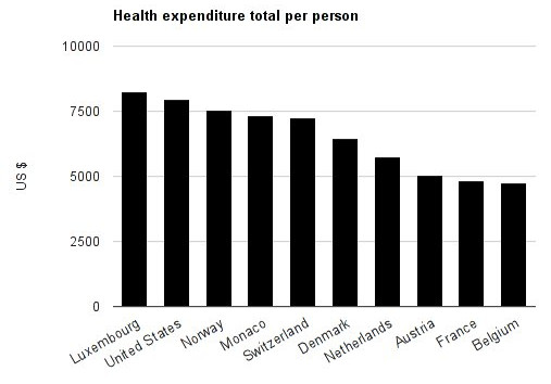 Reading barcharts is simple: We usually have a few values – ordered as categories on the x or y axis (for column and barcharts respectively) in our example it’s the countries. Then we have the values expressed as bars (horizontal) or columns (vertical). The extent of the bars is the value.
As simple as it is there are a few rules to keep in mind:
- Don’t overload barcharts Although you can do multiple colours and pack two categories in there, if it’s too many categories it becomes confusing.
- Always label your axes whoever is looking at your graphs needs to know what the units are they are looking at.
- Start your values at 0. Most spreadsheet tools will automatically adjust the range: undo this and set it to 0 – this shows contrast in an appropriate scale! We’ll show you why this is important in the next module.
Walkthrough: Create a column chart for the top 10 countries.
So let’s create a column chart from our dataset. It’s not really good style to have too many different columns in there: the chart becomes very hard to read. So what we will do is to limit ourselves to the 10 countries with the highest healthcare expenditure. This is an arbitrary cutoff and you can look at all the countries as well. Doing so might help you discover something that’s hidden in the data.
To do so, filter the World Bank dataset for a single year (e.g. 2009).
Sort the filtered world bank data set by the column “Health care expenditure total per person (US$)” one of the columns we created in the last challenge. You can avoid having the first row being moved by going to View -> Freeze -> 1 row
Select the top 10 countries (the first 11 rows including the header row) and copy it to another sheet. (For this press ctrl + c for copy and then insert a new sheet, press ctrl + v in the new sheet to paste).
To select the data we are interested in, we can first select the name of the countries, then select the Health expenditure total per person while maintaining CTRL (CMD on a Mac) pressed. Another interesting option, especially if you have a small screen, is to move the second column to put it next to the first.
To do so, click on the grey label to select it. Release the mouse then click and drag it until it is in position. Your column A should now be Country Names, Column B should be “healthcare expenditure per person total US$”. Your sheet should look like this:
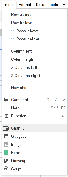
Now select the two columns of interest and then open chart... from the insert menu.
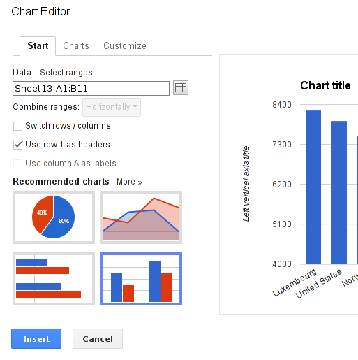
One of the suggested charts should be a column chart
Click on it and you will see a preview. Did you note the range on the y axis?
It starts with 4000 so it looks like Belgium is only spending a fraction of Luxembourg’s spending on healthcare – let’s change this.
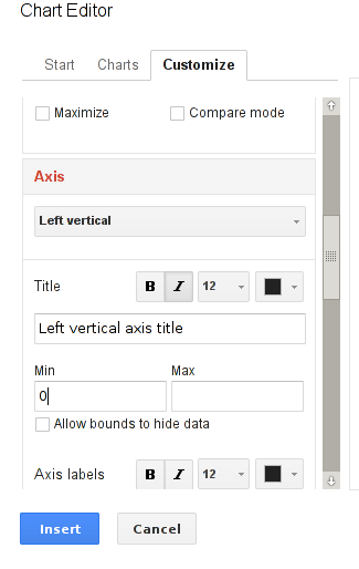
Open the Customize tab and scroll down to “Axis” . Now select “Left Vertical” from the drop down.
See the max and min boxes? Just enter 0 into the min and the range will start at 0. This way the contrast between the countries looks more realistic.
Play around with the customizing settings. Try to remove and position the legend, change the colour of your bars etc.
When you are done, click on Insert and your chart will be there.
If you click on the chart you can move it around. Notice the triangle up right? It’s the option menu. Select Edit chart to change the settings of the chart. Can you change it to a bar chart?
Task: Create a column chart with other data from the World Bank sheet.
So now you know how to create a column chart – feel free to experiment with other types of chart and use the recipes in the Handbook to guide you. The following sections deal with when to pick a particular type of chart and what data it is suitable for. We cover the most common charts: line charts, choropleth maps and scatterplots. For all of these, you can find an accompanying howto recipe in the handbook.
Presenting data from categories over time – linecharts
Sometimes you do not only have categories: e.g. countries, but you have values over time. This is where line charts are quite handy. A line chart looks like:
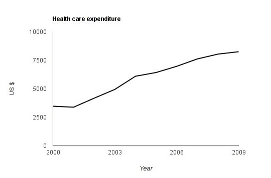 On the y axis we still have our values on the x axis we have the time measured. This graph works best if the time interval between the measurements is equal (Of course line charts are not limited to timeseries). Again it’s important, when comparing multiple categories, to start your y axis with 0. Only when displaying a single line it’s ok to start somewhere in between – but give a relation – say where your graph starts and where it ends.
Task: Compare Luxembourg to the other top spending countries – create a line chart with the different countries on one chart.
Showing geographical data – mapping
In our case we do not only have numerical data but we also have numerical data that is linked to geographical places. This calls for a map! Whenever you have a large number of countries or regions, displaying data on a map helps. If you have countries or regions you usually create a choropleth map. This special type of map displays values for a specific region as colours on that region. An example of a choropleth map from our data is shown below:
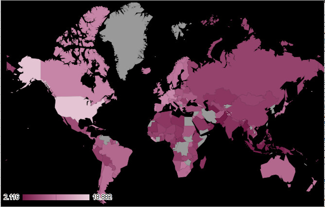 The map shows health care expenditure in % of GDP. It allows us to discover find interesting aspects of our dataset. E.g. Western Europe is spending more on healthcare in %GDP than eastern Europe and Liberia spends more than any other state in Africa.
Some things to be aware of when using choropleth maps:
- One shortcoming of choropleth maps are the fact that bigger regions or countries attract most attention, so smaller regions may get lost.
- Pay attention to colour-sclae. The standard red-green colour scale is not very well suited for a variety of reasons such as making it difficult for colour-blind observers (Read more about this in Gregor Aisch’s post in the Further Reading section). Single hued colour scales are in most cases easier to guess. If your range of values becomes too big it will be hard to single out things
Task: Try another set of data on a choropleth. How does it work?
Researching interaction between variables – scatterplots
What if we are interested not in a single variable but in how different variables depend on each other? Well in this case we have scatterplots – good for looking at interaction between two variables.
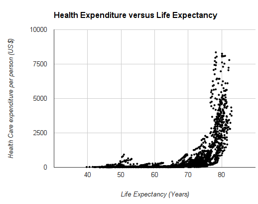 Look at the sample scatterplot above: we have one numerical value on the X and another numerical value on the Y axis. The dots are one data point. This plot has certain shortcomings as well: The dots overlap and thus if there are a lot of dots you don’t really see where they are. This could be solved by adding transparency or by selecting a specific range to show. Nevertheless one trend becomes clear: Above a certain life expectancy, health care costs suddenly increase dramatically. Also notice the three single dots on the lower left? Interesting outliers – we’ll look at them in a later module.
Task: Make a scatterplot comparing other data in the dataset. Does it work? Issues, problems, interesting findings?
Summary
In this tutorial we covered basics of data visualization. We discussed common basic plots and created them. In the next tutorial we will discuss some pitfalls to avoid when handling and interpreting data.
Further reading
- “Doing the Line Charts Right” by Gregor Aisch
- Also by Gregor Aisch: Say Goodbye to Red-Green Color Scales
Last updated on Sep 02, 2013.

