This tutorial uses Google spreadsheets to create a choropleth map. There is sample data for this tutorial `here`_ .
-
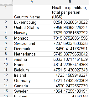
Filter for a single year (e.q. 2009) insert a new sheet and copy the filtered data into it.
-
As with all previous charts also here the columns need to be in a special position.
-
Move your data column (the one you want to use to display) right next to the country names.
-
Now mark the two columns and select “Chart…” from “insert”.
-
Under “Charts” select “Map” and then “geo chart – regions”.
-
You’ll see a preview. Play with the settings in customize to change the map, the colour-scale etc.
-
A note on colours: the red-green scale that is selected by default is not the best scale. So select a different one showing contrasts nicely.
Last updated on Sep 02, 2013.