Social network analysis for journalists using the Twitter API
Social Network analysis allows us to identify players in a social network and how they are related to each other. For example: I want to identify people who are involved in a certain topic - either to interview or to understand what different groups are engaging in debate.
What you’ll Need:
- Gephi (http://gephi.org)
- OpenRefine (http://openrefine.org)
- The Sample Spreadsheet
- Another sample Dataset
- Bonus: The twitter search to graph tool
Step 1: Basic Social Networks
Throughout this exercise we will use Gephi for graph analysis and visualization. Let’s start by getting a small graph into gephi.
Take a look at the sample spreadsheet - this is data from a fictional case you are investigating.
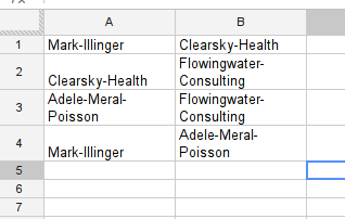
In your country the minister of health (Mark Illinger) recently bought 500,000 respiration masks from a company (Clearsky-Health) during a flu-scare that turned out non substantial. The masks were never used and rot away in the basement of the ministry. During your investigation you found that during the period of this deal Clearsky-Health was consulted by Flowingwater Consulting and paid them a large sum for their services. A consulting company owned by Adele Meral-Poisson. Adele Meral-Poisson is a well known lobbyist and the wife of Mark Illinger.
While we don’t need to apply network analysis to understand this fictional case - it helps understanding the sample spreadsheet. Gephi is able to import spreadsheets like this through it’s “import csv” section. Let’s do this.
Walkthrough Importing CSV into Gephi
- Save the Sample Spreadsheet as csv (or click download as → comma seperated values if using google spreadsheet)
- Start Gephi
- Select File → Open
- Select the csv file safed from the sample spreadsheet.
- You will get a import report - check whether the number of nodes and edges seem correct and there are no errors reported
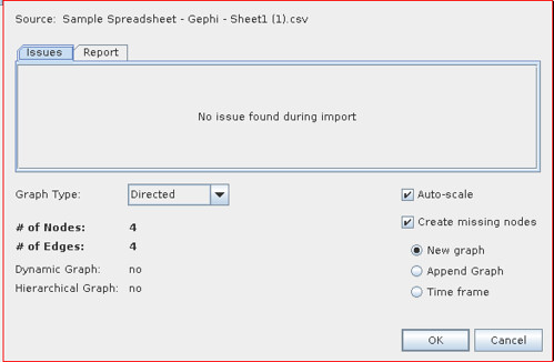
- The default values are OK for many graphs of this type. If the links between the objects in your spreadsheet are not unilateral but rather bilateral: e.g. lists of friendship, relationships etc. select Undirected instead of directed.
- For now we’ll go with directed - so click “OK” to import the graph.
Now we have imported our simple graph and already see some things on the screen let’s make it a little nicer. By playing around with Gephi a bit.
Walkthrough: Basic layout in Gephi
See the grey nodes there, let’s make this graph a little easier to read
- Click on the big fat “T” on the bottom of the graph screen to activate labels

- Let’s zoom a bit, click on the button on the lower right of the graph window to open the larger menu

- You should see a zoom slider now, slide it around to make your graph a little bigger:

- You can click on individual nodes and drag them around to arrange them nicer.
Step 2: Getting data out of Twitter
Now we have this, let’s get some data out of Twitter. We’ll be using the twitter search for a particular hashtag to find information who talks about it, with whom and what do they talk about. Twitter offers loads of information on their API for search it’s here: https://dev.twitter.com/docs/api/1/get/search
It basically all boils down to using https://search.twitter.com/search.json?q=%23 tag (the %23 is the #character encoded - so %23ijf corresponds to #ijf). If you open the link in the browser you will get the data in json format - a format that is ideal for computers to read - but rather hard for you. Luckily Refine can help with this and turn the information into a table. (If you’ve never worked with refine before, consider having a quick look at the cleaning data with refine recipe at the school of data: https://schoolofdata.org/handbook/recipes/cleaning-data-with-refine/)
Walktrough: Get JSON data from web apis into Refine
- Open Refine
- Click Create Project
- Select “Web Adresses”
- Enter the the following url https://search.twitter.com/search.json?q=%23ijf - this searches for the #ijf hashtag on twitter.
- Click on “Next”
- You will get a preview window showing you nicely formatted json:
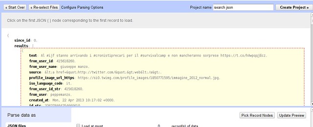
- Hover over the curly bracket inside results and click this selects the results as the data to import into a table.
- Now name your project and click “create project” to get the final table
By now we have the all the tweets in a table. You see there is a ton of information to each tweet: we’re interested in who communicates with whom and about what: so the columns we care about are the “text” column and the “from_user” column -let’s delete all the others. (To do so use “All → Edit Columns → remove/reorder Columns”)
The from user is stripped of the characteristical @ in front of the username that is used in tweets - since we want to extract the usernames from tweets later, let’s add a new column with from as @tweets. This will involve a tiny bit of programming - don’t be afraid it’s not rocket science
Walkthrough: Adding a new column in Refine
- On your from_user column Select “Edit column → add column based on this column...”
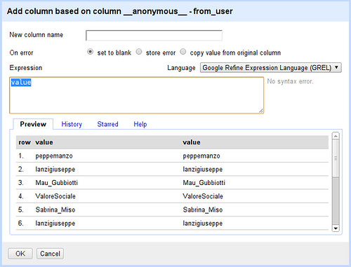
- Whoah - Refine wants us to write a little code to tell it what the new column looks like
- Let’s program then: Later on we’ll do something the built in programming language doesn’t let us do, luckily it offers two alternatives Jython (basically python) and clojure. We’ll go for clojure as we’ll need it later.
- Select Clojure as your language
- We want to prepend “@” to each name (here “value” refers to the value in each row)
- Enter (str “@” value) into the expression field
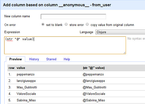
- See how the value has been changed from peppemanzo to @peppemanzo - what happened? In clojure “str” can be used to combine multiple strings: (str “@” value) therefore combines the string “@” with the string in value - what we wanted to do.
- Now simply name your column (eg. “From”) and click on OK you will have a new column
Ok we got the first thing of our graph: the from user - now let’s see what the users talk about. While this will get a lot more complicated - don’t worry we’ll walk you through....
Walkthrough: Extracting Users and Hashtags from Tweets
- Let’s start with adding a new column based on the text column
- The first thing we want to do is to split the tweet into words - we can do so by entering (.split value “ “) into the expression field (make sure your language is still clojure)
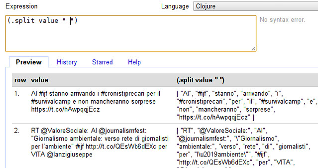
- Our tweet now looks very different - it has been turned into an “Array” of words. (an Array is simply a collection, you can recognize it by the square brackets.
- We don’t actually want all words, do we? We only want those starting with @ or # - users and hashtags (so we can see who’s talking with whom about what) - so we need to filter our array.
- Filtering in clojure works with the “filter” function, it takes a filter-function and an array - the filter-function simply determines whether the value should be kept or not. In our case the filter-function looks like “#(contains? #{\# \@} (first %))” - looks like comic-book characters swearing? Don’t worry, contains? basically checks if something is in something else, here whether the first character of the value (first %) is either # or @ (#{\# \@}) - exactly what we want. Let’s extend our expression:
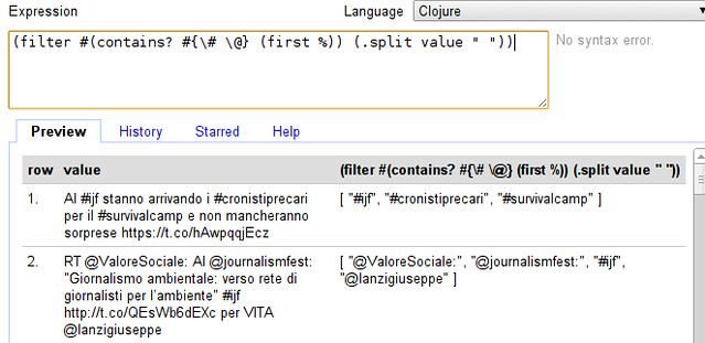
- Whoohaa, that seemed to have worked! Now the only thing we need to do is to create a single value out of it. - Remember we can do so by using “str” as above.
- If we do this straight away we run into a problem: before we used “str” as (str “1st” “2nd”) now we want to do (str [“1st” “2nd”]) because we have an array - clojure helps us here with the apply function: (apply str [“1st” “2nd”]) converts (str [“1st” “2nd”]) to (str “1st” “2nd”). Let’s do so...
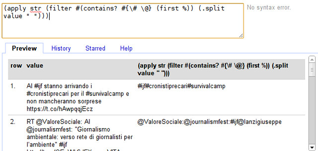
- Seems to have worked. Do you spot the problem though?
- Exactly the words are joined without a clear seperator, let’s add a seperator: The easiest way is to interpose a character (e.g. a comma) between all the elements of the array - clojure does this with the interpose function. (interpose “,” [1 2 3]) will turn out to be [1 “,” 2 “,” 3]. Let’s extend our formula:
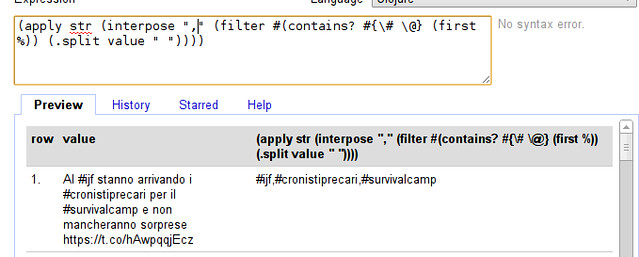
- So our final expression is:
(apply str (interpose "," (filter #(contains? #{\# \@} (first %)) (.split value " "))))
Looks complicated but remember, we built this from the ground up.
- Great - we can now extract who talks to whom! name your column and click “OK” to continue
Now we have extracted who talks with whom, but the format is still different from what we need in gephi. So let’s clean up to have the data in the right format for gephi.
Waltkthrough Cleaning up
- First, let’s remove the two columns we don’t need anymore: the text and the original from_user column - do this with “all → edit columns → remove and reorder columns
- Make sure your “from” column is the first column

- Now, let’s split up the to column so we have one row in each entry: use “to → edit cells → split multi valued cells” enter “,” as seperator
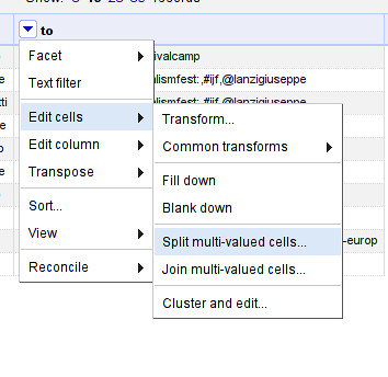
- Make sure to switch back to “rows” mode.
- Now let’s fill the empty rows: Select “from → edit cells → fill down”
- Notice that there are some characters in there that don’t belong to names (e.g. “:” ?) Let’s remove them.
- Select “to → edit cells → transform...”
- To replace our transformation is going to be (.replace value “:” “”)
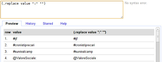
You’ve now cleaned your csv and prepared it enough for gephi, let’s make some graphs! Export the file as csv and open it in gephi as above.
A small network from a Twitter Search
Let’s play with the network we got through google refine:
- Open the CSV file from google refine in gephi
- Look around the graph - you’ll see pretty soon that there are several nodes that don’t really make sense: “from” and “to” for example. Let’s remove them
- Switch gephi to the “data laboratory” view

- This view will show you nodes and edges found

- You can delete nodes by right clicking on them (you could also add new nodes)
- Delete “from” “to” and “#ijf” - since this was the term we searched it’s going to be mentioned everywhere
- Activate the labels: it’s pretty messy right now so let’s add some layouting. To layout simply select the algorithm in layout and click “play” - see how the graph changes.
- Generally combining “Force Atlas” with “Fuchterman Reingold” gives nice results. Add “label adjust” to make sure text does not overlap.
- Now let’s make some more adjustments - let’s scale the label by how often things are mentioned. Select label size in the ranking menu
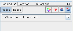
- Select “Degree” as rank parameter

- Click on “Apply” - you might need to run the “label adjust” layout again to avoid overlapping labels
- With this simple trick, we see what kind of topics and persons are frequently mentioned
Great - but it has one downside - the data we’re able to get via google refine is very limited - so let’s explore another route.
A larger network from a Twitter search
Now we analyzed a small network from a search - let’s deal with a bigger one. This one is from a week of searching for the twitter hashtag #ddj. (you can download it here)
The file is in gexf format - a format for exchanging graph data.
Walkthrough: Network analysis using Gephi
- Open the sample graph file in gephi
- Go to the Data view and remove the #ddj node
- Enable Node labels
- Scale labels by Degree (number of edges from this node)
- Apply “Force Atlas”, “Fuchterman Rheingold” and “Label Adjust” (remember to stop the first two after a while).
- Now you should have a clear view of the network
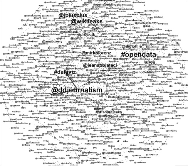
- Now let’s perform some analysis. One thing we are interested in is: who is central and who’s not: in other words: Who is talking and who is talked to.
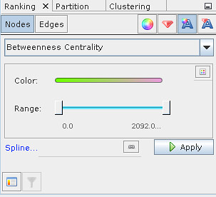
- For this we will run statistics (found in the statistics tab on the right) - we will use the “Network diameter” statistics first - they tell us about eccentricity, Betweenness centrality and closeness centrality. Betweenness centrality tells us which nodes connect nodes: in our terms: high betweenness centrality are nodes who are communication leaders. Low betweenness centrality are topics.
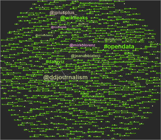
- Now we ran our test, we can color the labels according to this. Select the label color ranking and “Betweenness Centrality”
- Pick colors as you like them - I prefer light colors and a dark background.
- Now let’s do something different. Let’s try to detect the different groups of people who are involved in the discussion. This is done with the “modularity” statistic.
- Color your labels using the “Modularity Class” - now you see different clusters of people who are involved in the discussion
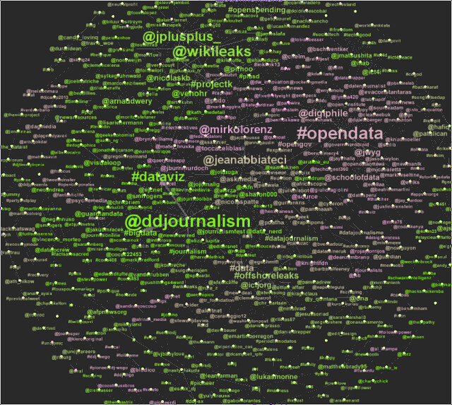
Now we have analyzed a bigger network - found the important players and the different groups active in the discussions - all by searching twitter and storing the result.
Bonus: Scraping the twitter search with a small java utility
If you have downloaded the .jar file mentioned above - it’s a scraper extracting persons and hastags from twitter - think of what we did previously but automated. To run it use:
java twsearch.jar "#ijf" 0 ijf.gexf
This will search for #ijf on twitter every 20 seconds and write it to the file ijf.gexf - the gexf format is a graph format understood by gephi. If you want to end data collection: press ctrl-c - simple isn’t it? - In fact the utility just runs using java - it is written entirely in clojure (the language we used to work with the tweets above).
