You are browsing the archive for Data Expeditions.

Data in December: Sharing Data Journalism Love in Tunisia

- January 11, 2016 in Data Blog, Data Expeditions, Data for CSOs

NRGI hosted the event #DataMuseTunisia in collaboration with Data Aurora and School of Data senior fellow Ali Rebaie on the 11th of December 2015 in beautiful Tunis where a group of CSO’s from different NGOs met in the Burge Du Lac Hotel to learn how to craft their datasets and share their stories through creative visuals.

Bahia Halawi, one of the leading women data journalism practitioners in the MENA region and the co-founder at Data Aurora, led this workshop for 3 days. This event featured a group of professionals from different CSO’s. NRGI has been working closely with School of Data for the sake of driving economic development & transparency through data in the extractive industry. Earlier this year NRGI did similar events in Washington, Istanbul, United Kingdom, GhanaTanzania, Uganda and many others. The experience was very unique and the participants were very excited to use the open source tools and follow the data pipeline to end up with interactive stories.

The first day started with an introduction to the world of data driven journalism and storytelling. Later on, participants checked out some of the most interesting stories worldwide before working with different layers of the data pipeline. The technical part challenged the participants to search for data related to their work and then scraping it using google spreadsheets, web extensions and scrapers to automate the data extraction phase. After that, each of the participants used google refine to filter and clean the data sets and  then remove redundancies ending up with useable data formats. The datasets were varied and some of them were placed on interactive maps through CartoDB while some of the participants used datawrapper to interactively visualize them in charts. The workshop also exposed participants to Tabula, empowering them with the ability of transforming documents from pdfs to excel.

Delegates also discussed some of the challenges each of them faces at different locations in Tunisia. It was very interesting to see 12321620_1673319796270332_5440100026922548095_nparticipants share their ideas on how to approach different datasets and how to feed this into an official open data portal that can carry all these datasets together. One of the participants, Aymen Latrach, discussed the problems his team faces when it comes to data transparency about extractives in Tataouine. Other CSO’s like Manel Ben Achour who is a Project Coordinator at I WATCH Organization came already from a technical backgrounds and they were very happy to make use of new tools and techniques while working with their data.

Most of the delegates didn’t come from technical backgrounds however and this was the real challenge. Some of the tools, even when they do not require any coding, mandate the knowledge about some technical terms or ideas. Thus, each phase in the data pipeline started with a theoretical explanatory session to familiarize delegates with the technical concepts that are to be covered. After that, Bahia had to demonstrate the steps and go around the delegates facing any problems to assist them in keeping up with the rest of the group.

It was a little bit messy at the beginning but soon the participants got used to it and started trying out the tools on their own. In reality, trial and error is very crucial to developing the data journalism skills. These skills can never be attained without practice.
11232984_1673319209603724_5889072769128707064_n
Another important finding, according to Bahia who discussed the importance of the learnt skills to the delegate’s community and workplace, is that each of them had his/her own vision about its use. The fact that the CSO’s had a very good work experience allowed them to have unique visions about the deployment of what they have learnt at their workplaces. This, along with the strong belief in the change open data portals can drive in their country are the only triggers to learning more tools and skills and bringing out better visualizations and stories that impact people around.

The data journalism community 3 years ago was still at a very embryonic stage with few practitioners and data initiatives taking place in Africa and Asia. Today, with enthusiastic practitioners and a community like School of Data spreading the love of data and the spirit of change it can make, the data journalism field has very promising expectations. The need for more initiatives and meet ups to develop the skills of CSOs in the extractive industries as well as other fields remains a priority for reaching out for true transparency in every single domain. 

Thank you,

You can connect with Bahia on Twitter @HalawiBahia.

Flattr this!

Happy Birthday, Data Expeditions! Some reflections.

- November 10, 2015 in Data Expeditions

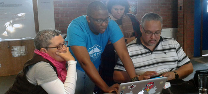
10th November marks the 3 year anniversary of the very first data expedition. What have we learned in the last 3 years?

Anyone who followed School of Data closely in the early years knows that originally the focus of the project was online. This is the story of how and why the project moved away from prioritising its online offering to rely heavily on a network of humans to do the work. There are a diversity of views about the subject within the School of Data network, this is my take.

Musings about materials

Let’s talk for a second about why writing materials for data skills training is particularly tricky.

1. Tool volatility

You may be merrily using a tool one week and the next, it has been killed off. People were still grumbling about the loss of Needlebase several years later. Companies also change their offerings substantially
(e.g. ScraperWiki) and materials quickly went out of date. We couldn’t keep up.

I felt strongly that one of School of Data’s tasks was to make the world of data tools less overwhelming: to show that you could do a lot with only a few key tools. We picked some staples — easy tools you could do a lot with.

New tools and services are appearing every day. Many are old wine in new bottles — but some are very impressive. Evaluating when it makes sense to move from an old favourite to something new is time intensive in and of itself, let alone writing training materials for them.

2. Software discrepancies

Through early user tests we discovered the diversity of software used for even basic tasks such as spreadsheets was very large. Even if we wrote a tutorial for one piece of software, e.g. LibreOffice, the differences between other versions of similar programmes e.g. Excel / GoogleDocs were just great enough to leave learners entirely stuck if they were using anything but the type we had written it for.

3. No two organisations ever want to do exactly the same thing

The direction of teaching materials falls somewhere on a spectrum between closely tailored to an individual use case and open ended general principles.

At one end: the handholding, instructive walkthrough.
Pros: Very easy to follow. Excellent for beginners.
Cons: Interesting for a very narrow audience. Doesn’t encourage the learner to think creatively about what they could do with those skills. Breaks very easily as soon as anything about the service you are using changes.

At the other end: general principles e.g. “mapping” (vs “using X tool to create maps” and open ended challenges.)
Pros: Don’t need updating as often. Encourage learners to think more broadly about how the skills they use could be applied.
Cons: There needs to be some way for the user to make the leap from general principle to concrete implementation.

When you are supporting organisations to find stories in data or use data to support their advocacy, no two organisations will ever have exactly the same questions. This makes it very hard to find a common set of materials for them.

4. The resource question $$$

Creating teaching materials for any topic is a lot of work. In the early days of School of Data, we were 2-3 people.

Don’t get me started on how much work it is to produce a MOOC. We dabbled in these for a while. I’ve personally taken part in some good ones and partners have had some success with them, but the problem for School of Data was that with our resourcing level, it would have been putting all of our eggs in one basket very early on in the project.

We needed more time and flexibility to experiment with different formats, to see what would work for our specific target audience.

5. The feedback problem

There was a feedback problem with online materials, we had no idea whether the people we were reaching with the online materials were the ones we were targeting. In the early days, we really only did workshops to get feedback for a more online approach. We got the best feedback from participants at test workshops we did in person. Feedback which we got through the website was sparse.

Then something happened…

Enter the dragon: the beginning of Data Expeditions

Dragon TTC

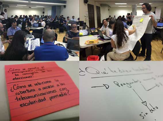
It’s 10th November 2012 and I’m surrounded by nerds in sparkly capes. This is Mozilla Festival (MozFest) — a playground for new ideas that have something to do with making use of the web in creative and fun ways.

MozFest 1

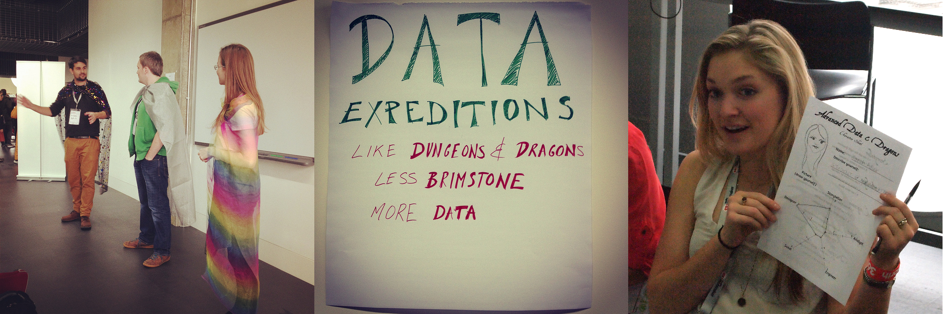
A few months earlier (on the day of the MozFest submission deadline) my colleague, Friedrich (in the green hoodie and silver cape above) had lamented that it was really hard to teach investigative skills in an interesting way. Michael Bauer (star cape, far left), from the School of Data team, happened to be in town visiting.

We agree that we should try and find a way of including investigations in the session. A far cry from the carefully planned tutorials with perfectly aligned practice data, participants would get a taste of reality… In the wild, there is no-one to clean your datasets for you. What we needed now was a way to get other people to help each other through the mires and holes that the participants will inevitably find themselves in.

Friedrich and Michael start nerding-out about how cool it would be to model a session on Dungeons and Dragons. Confession: I to this day have never played D&D. Nevertheless, I catch enough of their gist to gather that it is some kind of role-playing game, and there are dragons — how wrong can it go?

Mother of Data

We decide that if this idea is going to work anywhere, it’s going to be at MozFest, whose open minded guinea pigs — sorry, participants — are usually up for a laugh. We have a name, “Data Expeditions”, now we just have to work out how to facilitate a session with an unknown number of people, with unknown skillsets, and a mostly-hypothetical internet connection.

Bring it on! Worst case scenario: I’ll dress them all in something ridiculous and we’ll clown around to camouflage the parts of the session that don’t work.

Crunch time…

Head count: approx 60 - much more than expected

Skillset balance: good to excellent

Internet connection status: quaint

I won’t elaborate too much on the process of how a data expedition works as that is covered by the (now ancient) Guide for Guides.

But the principle simple: all teams start with a question e.g.

  • “The life expectancy in Botswana all of a sudden dropped sharply at a particular point in time. What was the reason?” or
  • “Who really owns these mines in the Democratic Republic of Congo?”

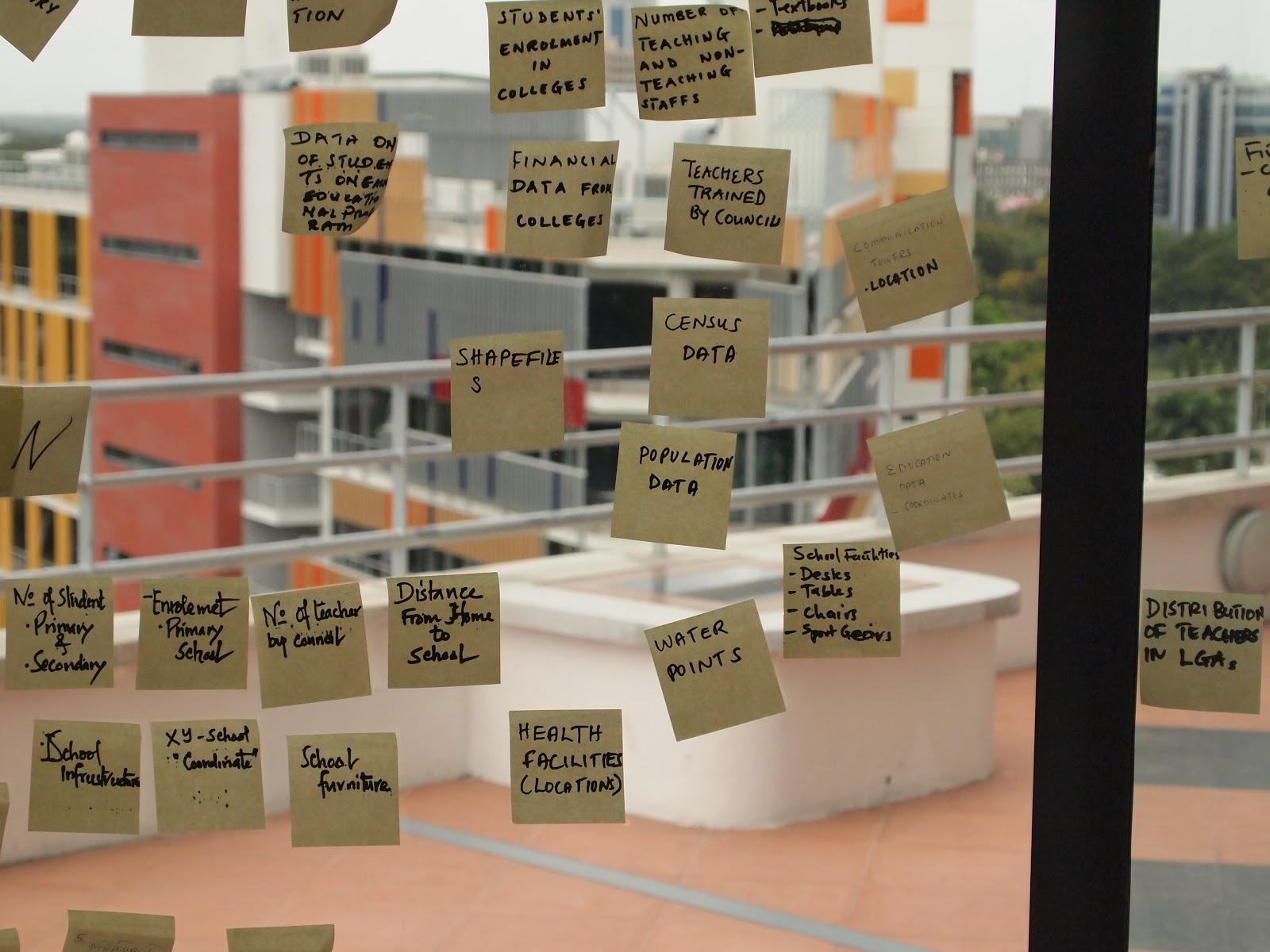
The facilitators then guide them as far as possible along the data pipeline as they can get in the allotted time.

Data Pipeline
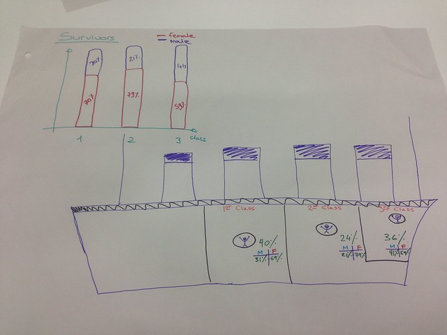
Source: Spending Data Handbook

At the end, people present whatever they can. Any output is valid; a clean dataset, a full data visualisation, a paper sketch of what they would have done had they had the time/resources/skills, or even a list of problems they experienced.

Back in the room

I’m astounded by the number of people who have come to the session, the room is packed and … it somehow appears to be working…?!

…People are asking each other if they don’t know how to do something and actually producing results. It’s absolute bedlam and incredibly noisy but it’s working!

MozFest2

Learnings from data expeditions

our inkling was that the only way to really teach data skills was to confront people with a mountain. By forging [their] own path […] data explorers can pinpoint the extra skills they need to develop in order to scale new obstacles, map their own journey and ultimately to tell their own story. The answer may be at the top, but there are multiple routes to the summit – and each will offer a fresh view over the landscape.

Followup blogpost to the first data expeditions

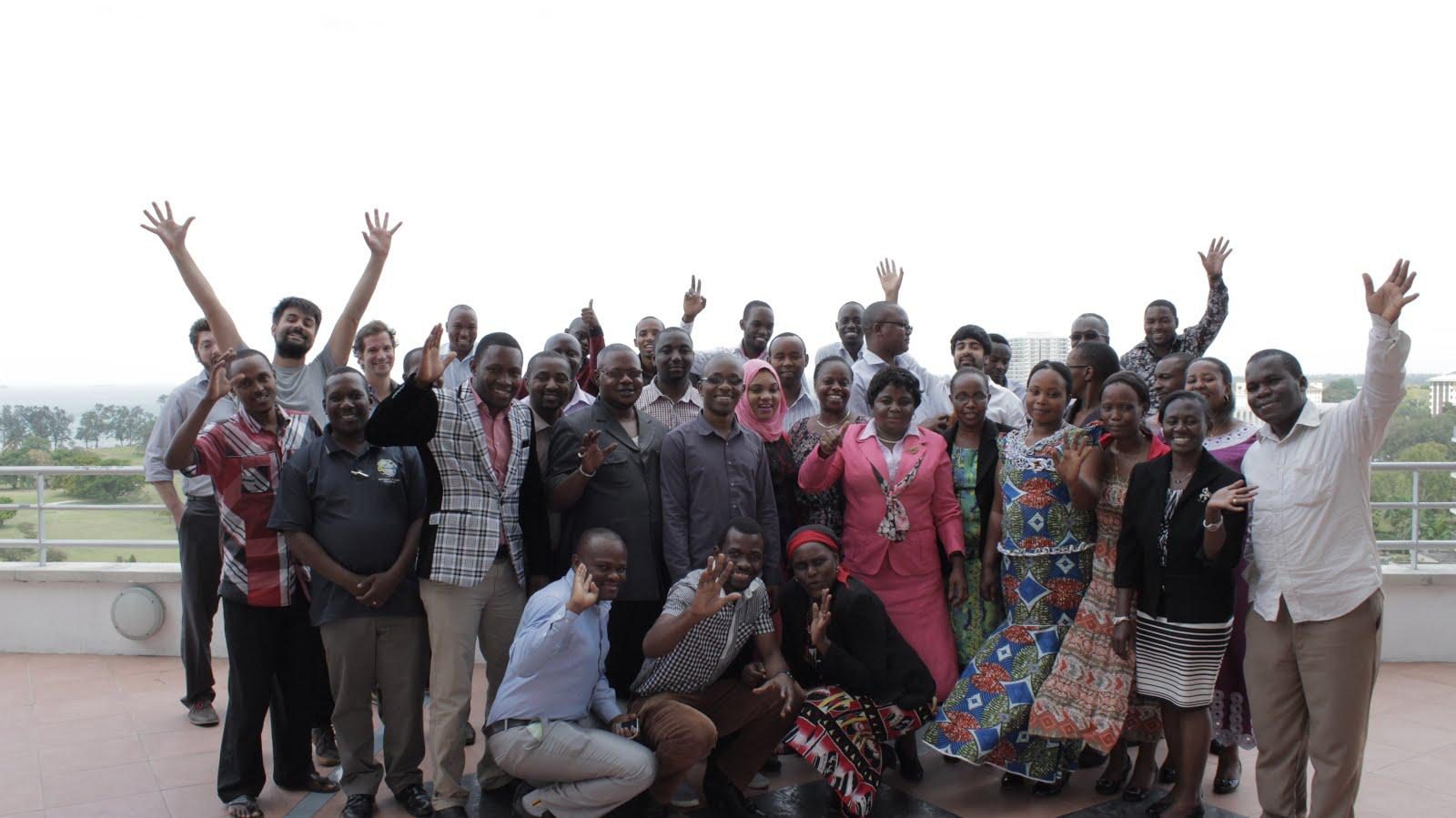
After MozFest, we went on to lead many data expeditions around the world. We had to adapt to many different things: knowledge levels, time constraints, participants who really wanted to get a specific thing from the expedition.

Here is my rundown from the major discoveries of that period:

Number 1: It is very hard to predict what someone will learn from a data expedition – but they will learn something

Everything depends on the course the group takes. It’s hard to know how far the group will even get.

If you are trying to teach a specific skill in a workshop, you either need to stage parts of the expedition very carefully (possible, but lots of work) or, you should probably pick another format.

Number 2: The right people are important, but they’re not the ones you might think.

Most important skillset: topic expertise — you can do a huge amount with basic tools, even if there are no advanced engineers or analysts in the room. All you need is one or two people who have a deep understanding of the topic area. If you are low on data-chops in the room, you’ll need to be more hands-on as a facilitator and probably spend more time helping people to google things. Don’t let it become too much about you showing them things, try and encourage the same self sufficiency as if they were genuinely on their own.

Number 3: Online expeditions can be hairy, but you can make them work.

Online expeditions are particularly facilitator intensive, because people don’t keep the same level of focus as they do in person. Even if they are engaged at the beginning, their attention wanes… they end up in Buzzfeed listicle rabbitholes. For longer expeditions, it’s hard to gauge availability and whether people are stuck. The poor stuck people are left hanging as the only person in their group who can help goes to have a bath or pick up their kid from kindergarten.

The most successful expeditions we ran online were short, a couple of hours to a day max. Both online and offline, a short timeline helps to focus people on their desired outcomes.

Unexpected side effects of data expeditions

Both at MozFest and in the online version, people were forced to spend time with people they wouldn’t normally do. I remember one girl coming up to me and saying, entirely out of the blue:

“I’ve never spoken to a coder before!”

Also online, while a lot of the groups entirely disintegrated, some people used the group structure we had set up to stay in touch or ask for help on data or tech issues long beyond the date that the data expedition was scheduled to finish.

Data expeditions were more than just a teaching tool, they brought people together in a way that working alone on a problem or exercise never could.

The final balance

The success of the Data Expeditions and other in-person formats like Data Clinics or targetted workshops meant that School of Data moved away from being a solely online learning mechanism to one which favoured human interaction.

School of Data did still produce materials, and as community members attest, they are a core part of the identity, but the English resources were usually produced “on demand” when an event was coming up which needed them.

The focus on in-person training also changed the nature of what we produced: more lesson plans and materials suited for in-person training.

As the reputation of School of Data grew, the demand for in-person training did too. This is the reason the fellowship was born and that a lot of what School of Data currently does is skillshare. It is much better for people to learn in their own language, taught by people who understand local contexts than for a small group of Europeans to fly around the world pretending to know everything.

So:

  • Get yourself some foundational resources so that you can react quickly to common requests for training.
  • Instead of developing material for every topic on the planet, tailor existing resources to specific audiences you are going to work with. If you are working with a budgeting group from Nepal, use budget data from Nepal if you can get it. If you can’t get it, at least use something locally relevant.
  • Find yourself some trainers with big ears, who listen more than they talk. A teacher’s job is to understand the problems people are having and provide solutions which are appropriate for them — not to deliver pre-packaged solutions.

Materials are important for sustainability. They can quickly be picked up, translated and shared all across the world. But nothing compares to the reality check that comes from being with the users of those materials in person to make sure you are keeping the project on the right lines.

Postscript

Some of you will have noticed that I promised to write a 5 part series nearly 6 months ago now and have so far produced only 2/5 posts.

The rest of these posts have been sitting on my harddrive, festering and I have been too deliberative to finish them.

On 13th of September 2015, procrastination exterminator and cattle-prod extraordinaire, Michael Bauer, friend and School of Data colleague tragically and unexpectedly passed away.

Michael could not stand procrastination, and never allowed anyone around him to engage in it.

I couldn’t think of a more fitting tribute to you than actually finishing this, Michael. I hope you realised how much things moved forward because of you.

A version of this post appears on Tech to Human as part of the 5 years worth of learnings series.
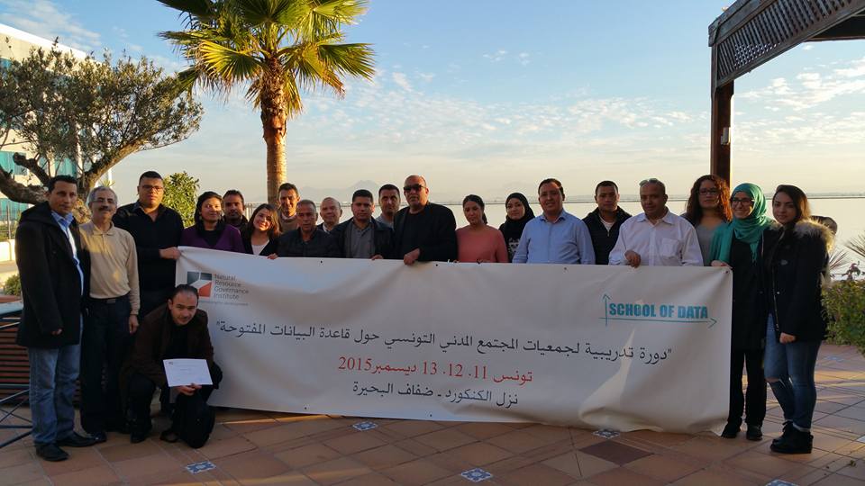
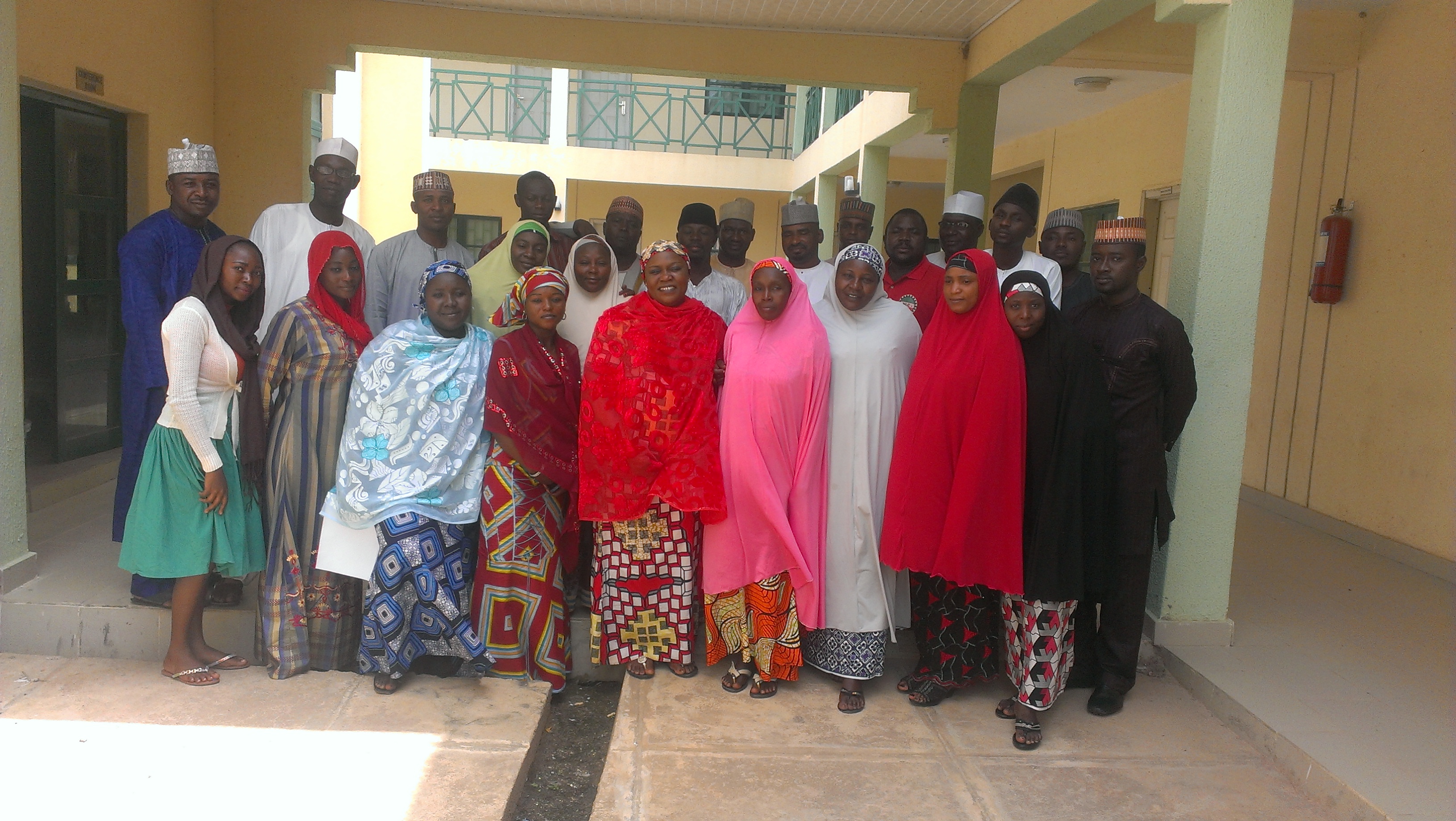
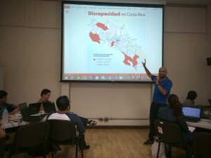
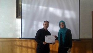
Flattr this!

School of data in Mexico City!

- July 21, 2015 in Data Expeditions, Event report, Fellowship

Data can be a powerful tool for NGOs that can help them improve their daily work. In order to teach these organizations ways to effectively use data, School of Data, Social Tic and colleague from Guatemala’s digital media Plaza Pública hosted a workshop on July 1st in the NGO Festival FITS in Mexico City.

Most of the participants didn’t have previous experience with open data so the idea of the workshop was to show them how to find information online or ask for it to public institutions; teach them simple analysis tools like pivot tables in Excel and give them an introduction to data visualization.

The 25 participants found the workshop interesting and were curious about more data trainings for the future.

Besides helping NGOs, data can be useful for journalism students, data science students, or even curious citizens interested in learning about open data. So we hosted another workshop on July 2nd in the TAG CDMX a huge event in Mexico City about technology.

School of data and Social Tic had two workshops and Data Expeditions with more than 70 participants across the two sessions. We taught data cleaning with Open Refine, data analysis with Excel and data visualization. All of this with public databases available online.

IMG_3094 IMG_3090IMG_3089


The experience was really good since we had a really diverse audience that was interested in learning new things. We had positive feedback afterwards of participants that came to ask more questions about trainings and how could they get in touch with School of Data.

A good tip to remember is to have different activities prepared for workshops in big events, since you don’t know for sure what kind of audience is going to attend and you have to be able to adapt the contents.

Mexico City, with its big open data community and its many data-related projects, is an inspiring example for the open data community in Latin America.

Flattr this!

Analyzing regional data: Data Expedition in Costa Rica

- July 6, 2015 in Data Expeditions, Event report, Fellowship


2.947 civil servants will be elected next year in Costa Rica, during the upcoming municipal elections. But, are the citizens aware of what’s going on in every district? Do they know the main issues their district is facing or the way the budget been spent?

To answer these questions Abriendo Datos Costa Rica, School of Data and Social Tic organized a Data Expedition in Costa Rica. As a result 57 people from civil society (journalists, analysts, programers, designers,…) worked in teams during eight hours with the data.

The database that was used in the expedition can be accessed here. We built it with data from the Supreme Electoral Tribunal, the National Institute of Statistics and the General Contoller of Finances.

What did the participants find?

The participants worked in ten different groups and each one tried to answer one specific question.  This were some of the findings:

  • One of the teams thought as an exercise: If we were to allocate money to elderly population in poverty, in which districts we would invest it? Analyzing the data, they concluded that in 17% of the districts a tenth of the pIMG_2906
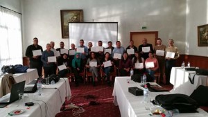
opulation was elderly people in poverty. This was a good example of how to use data to make informed decisions.
  • Another group asked: Which are the best districts to live in if you are a woman? The participants classified the districts according to their gender gap index and found that the ones with more gender inequality had a female occupation rate two times lower that the districts with less gender inequality.
  • One team found that the district with more electoral participation in local elections had one of the worst budget spending. Why isn’t the local government spending on its population?
  • Some other teams analyzed the districts with more disabled people or with more usage of technology.


During the activity the team of facilitators tried to explain the difference between correlation and causation, which was one of the most common mistakes the attendants were making when analyzing the data.

exp6

For this training we provided a database ready to use to the participants. But in the future it might be interesting to show them where where can they find public databases and more datasets to enrich their analysis.

Overall the best part of the experience was to see so many people interested in learning about how to use data, working in teams and answering questions that affect their daily lives. As Julio Cortés, one of the participants, said, the idea behind these activities is to help building a more informed society. So, we’ll definitely be planning new activities in the next months to encourage the usage of open data!

More pictures of the event here.

Flattr this!

Memories from San Jose

- January 29, 2015 in Data Expeditions

This article was originally posted in Spanish at Escuela de Datos by Phi Requiem, School of Data fellow in Mexico.


Last November, the Open Government Partnership (OGP) Summit took place in Latin America. CSO participants from 18 countries got together to share and exchange in an “unconference” where many topics were discussed. It was really interesting to learn about ways data things are handled in different countries, and to pinpoint the similarities and differences between our contexts.

Screen Shot 2015-01-13 at 16.48.14After a few words from the President of Costa Rica and other government representatives, a series of talks and roundtables began… And then, in parallel, Antonio (School of Data fellow in Peru) and I started a datathon.

In this datathon, our task was to give training and support to the five teams asking questions to the dataset on the commitments of the OGP countries, and which can be found here → Action Plan Commitments and IRM Data, http://goo.gl/yZmcKC, http://goo.gl/vLgYWj

The first step is to approach the data and structure it. After this, it was time to pose the questions we wanted to answer through the analysis of this data, and a lot of great questions (and interesting purposes) arose – many more than time allowed us to develop further. Teams picked the topics that seemed most relevant to them.

Screen Shot 2015-01-13 at 16.49.48Teams were already working on their analysis at 9 sharp the following morning, while OGP San Jose sessions were taking place. The datathon participants looked for more data, did cross-comparisons, scraping, etc. By noon, they had found results and answers – it was time to start working to present them in visualizations, infographics, maps, articles, etc. At 3PM, the teams impressed us with their presentations, and showed us the following outcomes: http://ogpcr.hackdash.org

  • Team Cero Riesgos: Generating information on risks by area. Data: OIJ, Poder Judicial.
  • Team Accesa: Comparing the perception of Latin American citizens on current topics in the LatinoBarometer with the commitments and achievements per country. The goal: to know if governments are responding to citizen concerns.
  • Team E’dawokka: Comparing the agendas and priorities of Central America with those in the rest of Latin America.
  • Team InfografiaFeliz: What countries look like in the Human Development Index in terms of their anti-corruption measures (and their success).
  • Team Bluffers: Measuring the percentage of delay and achievement of the commitments acquired by each country, and relating the design process for the commitments (measured by their relevance and potential impact) and their achievement.

At the end of the day, the jury chose teams InfografiaFeliz and Accesa as winners (which earned them a prize in cash).

Screen Shot 2015-01-13 at 16.51.43This was the first data expedition in Costa Rica, and you can find more in the following links: https://www.facebook.com/ogpsanjose, https://twitter.com/OGPSanJose, https://www.flickr.com/photos/ogpsanjose , http://grupoincocr.com/open-data/miembros-de-grupo-inco-ganan-la-primera-expedicion-de-datos-en-costa-rica

What I take away from my experience in this expedition is that people are always willing to learn and create, but not everyone is aware of what open data is, or how it can be useful for them. Initiatives of this sort are achieving their mission, but are insufficient – and that’s why we need to keep in touch with the participants and encourage them to share their experiences, and, why not: to replicate these initiatives.

Here are some tips for people with an interest in running data expeditions:

  • It’s difficult to explain the difference between a hackathon and a data expedition… But, the earlier this is out of the way, the better.
  • There most be a conceptual baseline. With such limited time it’s difficult to give introductions or previous workshops, but trying to do a bit of this can be really useful.
  • Teams always have good ideas to handle information and show conclusions, but many times impose limitations on themselves because they think the technical barriers are huge. Having a hackpad or Drive folder with examples and lists of tools can help people overcome that fear.

Flattr this!

Education Data Dive in Tanzania

- November 10, 2014 in Data Expeditions, Events

We recently had a round of training in Dar es Salaam to continue growing momentum and capacity around open data in Tanzania, which is part of a bigger commitment by the Tanzanian government to the Open Government Partnership (OGP), a global initiative that aims at promoting transparency, empower citizens, fight corruption and encourage use of new technologies to improve governance. In Tanzania this commitment covers three main sectors: education, health and water.

“Open Data Training: Education Data Dive” workshop was held on 6-10 October 2014, in Dar Es Salaam, with representatives from Ministry of Education and Vocational Training (MoEVT), Prime Minister’s Office- Regional Administration and Local Government, National Examination Council of Tanzania (NECTA), E-Government Agency (EGA), National Bureau of Statistics (NBS) and National Council of Technical Education (NACTE), Tanzania Education Authority and other institutions.

Group photo for training in Dar es Salaam

Group photo for training in Dar es Salaam

This was my first time co-facilitating a workshop of this kind as a School of Data Fellow in Tanzania. And it was a fantastic opportunity for me to sharpen my facilitation skills and also to learn from other facilitators, including the main facilitator and a more experienced among us all, Michael Bauer from the School of Data. It was a wonderful thing seeing all these government agencies responsible for education, in one room, learning and sharing from one another, which even by their own admission is very rare situation. When we were preparing for this workshop we knew that there is an existing expertise and knowledge about specific education datasets, but the challenge is mainly in letting other agencies know this so that they can be able to collaborate between themselves. It was fitting then that we had several datasets from some of the agencies that we used during our workshop to bring participants to a common understanding of open data concepts, teach and practice data wrangling skills and clean and join key datasets that some of them were already familiar with.

We started the workshop by focusing on developing a common understanding of open data and data management with concepts such as improving usability of already available public data providing better metadata and improving data workflows, to open licensing of data. Then we proceeded to introduction of various tools for data cleaning, analysis and visualization, including Open Refine, QGIS, Fusion Tables and Pivot Tables. This was the first time that most of the participants were using these tools, and they were excited to see how these tools opened up a world of possibilities that they did not know that existed with the datasets that they are working with often. An example was clearly illustrated by one participant from the PMO-RALG who was glad to have discovered Pivot Tables, as most of the tasks that he is working on most datasets would be simplified a lot using Pivot Tables skills. These practical hands on sessions were met with enthusiasm by all participants, and despite dedicating two full days, they were still up to spending more time cleaning, merging, analyzing and visualizing their datasets using these tools.

Brainstorming during the workshop

Brainstorming during the workshop

One major discussion that resonated throughout the workshop and how these agencies through working together might be able to come up with solutions about this , was the lack of unique codes that can be used to identify schools by different education stakeholders when dealing with education datasets containing schools. Most participants were of the agreement that merging data sets and coming up with analysis and visualizations during the workshop, would have been much easier, if we had unique codes used by every agency whose data sets were used during the workshop.

The latter part of the workshop was mainly spent, collecting feedback about the workshop and jointly plan the way forward for the implementation of what participants learned in their daily workflows. The follow up plan was drafted in which we will have a bi–weekly sessions with some of the participants to work together to implement what they learned during the workshop and also to revise various techniques about the tools learned and to dive deep into techniques we could not cover during the workshop.

Post-it notes from the workshop

Post-it notes from the workshops

The highlight for me of this workshop was the informal discussions that participants were having during breaks in which most of them were of the agreement that Open Data initiatives need not be seen as a foreign based concept imposed on Tanzania, but rather Tanzanians themselves need to see the benefits and take ownership of this concept.

Flattr this!

School of Data Goes to MozFest 2014 ! – Part 2

- October 31, 2014 in Data Expeditions, Events

Part 2 of our MozFest recap: check out the first blog post for our Day 1 adventures…

Third Day Recap – Second School of Data Session!

After our first successful session, the School of Data team went in excitedly for the second session on Day 3! The floors were packed in the morning because the organizers made the surprising decision of giving (we think everyone) who attended the Mozilla Festival a Firefox OS Flame phone. A sweet phone, which caused long queues in the Ravensbourne building.

With the sessions now in full steam, the second School of Data session was scheduled in the afternoon, and we brought a familiar School of Data format: that is, the data expedition! The theme for today session is “Analysing Data Using Spreadsheets”, and we went ahead, data sherpa style!

The theme chosen for this data expedition session was all about the re-enacting the Titanic. We provided data on the passengers of the Titanic, and from there we tried to work the data through the familiar School of Data data pipeline. We split the participants into two groups based on the operating system that they use, and then we started hacking! We started by first using a lot of post it notes to try finding questions that we could answer using the data, and after that we used spreadsheet tools such as Excel to find some answers, and last but not least, visualize those answers.

We had an interesting mix of participants in this session, with some them having already worked with spreadsheets a lot, which led to the wonderful situation where participants were teaching with other about various things such as pivot table techniques, formulae, and even the super useful but hard to notice text to column button in Excel (and we also learn new things too) – as following the collaborative learning spirit of Mozilla Festival.

In the end, this is what we made : A visualization of titanic, showing the survival rate of the passengers, separated by gender and passenger class. Really nice expedition :)

School Of Data @ Mozilla Festival London

Flattr this!

Breaking the Knowledge Barrier: The #OpenData Party in Northern Nigeria

- October 1, 2014 in Community, Data Expeditions, Data for CSOs, Events, Uncategorized

If the only news you have been watching or listening to about Northern Nigeria is of the Boko Haram violence in that region of Nigeria, then you need to know that other news exist, like the non-government organizations and media, that are interested in using the state and federal government budget data in monitoring service delivery, and making sure funds promised by government reach the community it was meant for.

This time around, the #OpenData party moved from the Nigeria Capital – Abuja to Gusau, Zamfara and was held at the Zamfara Zakat and Endowment Board Hall between September Thursday, 25 and Friday, 26, 2014. With 40 participant all set for this budget data expedition, participants included the state Budget Monitoring Group (A coalition of NGOs in Zamfara) coordinated by the DFID (Development for International Development) State Accountability and Voice Initiative (SAVI),other international NGOs such as Society for Family Health (SFH), Save the Children, amongst others.

IMAG1553

Group picture of participants at the #OpenData Party in Zamfara

But how do you teach data and its use in a less-technology savvy region? We had to de-mystify teaching data to this community, by engaging in traditional visualization and scraping – which means the use of paper artworks in visualizing the data we already made available on the Education Budget Tracker. “I never believed we could visualize the education budget data of the federal government as easy as what was on the wall” exclaimed Ahmed Ibrahim of SAVI

IMAG1516

Visualization of the Education Budget for Federal Schools in Zamfara

As budgets have become a holy grail especially with state government in Nigeria, of most importance to the participants on the first day, was how to find budget data, and processes involved in tracking if services were really delivered, as promised in the budget. Finding the budget data of the state has been a little bit hectic, but with much advocacy, the government has been able to release dataset on the education and health sector. So what have been the challenges of the NGOs in tracking or using this data, as they have been engaged in budget tracking for a while now?

Challenges of Budget Tracking Highlighted by participants

Challenges of Budget Tracking Highlighted by participants

“Well, it is important to note that getting the government to release the data took us some time and rigorous advocacy, added to the fact that we ourselves needed training on analysis, and telling stories out of the budget data” explained Joels Terks Abaver of the Christian Association of Non Indigenes. During one of the break out session, access to budget information and training on how to use this budget data became a prominent challenge in the resolution of the several groups.

The second day took participants through the data pipelines, while running an expedition on the available education and health sector budget data that was presented on the first day. Alas! We found out a big challenge on this budget data – it was not location specific! How does one track a budget data that does not answer the question of where? When involved in budget tracking, it is important to have a description data that states where exactly the funds will go. An example is Construction of Borehole water pump in Kaura Namoda LGA Primary School, or we include the budget of Kaura Namoda LGA Primary School as a subtitle in the budget document.

Taking participants through the data pipelines and how it relates to the Monitoring and Evaluation System

Taking participants through the data pipelines and how it relates to the Monitoring and Evaluation System

In communities like this, it is important to note that soft skills are needed to be taught – , like having 80% of the participants not knowing why excel spreadsheets are been used for budget data; like 70% of participants not knowing there is a Google spreadsheet that works like Microsoft Excel; like all participants not even knowing where to get the Nigeria Budget data and not knowing what Open Data means. Well moving through the school of data through the Open Data Party in this part of the world, as changed that notion.”It was an interesting and educative 2-day event taking us through the budget cycle and how budget data relates to tracking” Babangida Ummar, the Chairman of the Budget Working Group said.

Going forward, this group of NGO and journalist has decided to join trusted sources that will be monitoring service delivery of four education institutions in the state, using the Education Budget Tracker. It was an exciting 2-day as we now hope to have a monthly engagement with this working group, as a renewed effort in ensuring service delivery in the education sector. Wondering where the next data party will happen? We are going to the South – South of Nigeria in the month of October – Calabar to be precise, and on the last day of the month, we will be rocking Abuja!

Flattr this!

Data for Social Change in South Africa

- September 29, 2014 in Community, Data Blog, Data Expeditions, Data for CSOs


We recently kicked off our first local Code for South Africa School of Data workshops in Johannesburg and Cape Town for journalists and civil society respectively.

I arrived in the vibrant Maboneng district in central Johannesburg excited (and a little nervous) about helping my fellow school of Data Fellow Siyabonga facilitate our first local workshop with media organisations The Con and Media Monitoring Africa. Although I’ve attended a data workshop this was my first experience of being on the other end and it was an incredible learning experience. Siya did a fantastic job of leading the organisations in defining and conceptualising their data projects that they’ll be working on over the course of the rest of the year and I certainly borrowed and learned a lot from his workshop format.

It was great to watch more experienced facilitators, Jason from Code for South Africa and Michael from The School of Data, work their magic and share their expert knowledge on more advanced tools and techniques for working with and presenting data and see the attendees eyes light up at the possibilities and potential applications of their data.

Johannesburg sunset

Johannesburg sunset at the workshop venue

A few days later we found ourselves back in the thick of things giving the second workshop in Cape Town for civil society organisations Black Sash and Ndifuna Ukwazi. I adapted Siyabonga’s workshop format slightly, shifting the emphasis from journalism to advocacy and effecting social change for our civil society attendees.

We started off examining the broader goals of the organisation and worked backwards to identify where and how data can help them achieve their goals, as data for data’s sake in isolation is meaningless and our aim is to help them produce meaningful data projects that make a tangible contribution to their goals.

The team from Ndifuna Ukwazi at work

The team from Ndifuna Ukwazi at work

We then covered some general data principles and skills like the data pipeline and working with spreadsheets and easy-to-use tools like Datawrapper and Infogr.am, as well as some more advanced (and much needed) data cleaning using Open Refine as well as scraping data using Tabula which the teams found extremely useful, having been manually typing out information from pdfs up until this point.

Both organisations arrived with the data they wanted to work with at hand and it immediately became apparent that it needed a lot of cleaning. The understanding the organisations gained around working with data allowed them to reexamine the way they collect and source data, particularly for Black Sash who realised they need to redesign their surveys they use. This will be an interesting challenge over the next few months as the survey re-design will still need to remain compatible with the old survey formats to be useful for comparison and analysis and I hope to be able to draw on the experience and expertise of the School of Data network to come up with a viable solution.

BlackSash_at_work

Siya working his magic with the Black Sash team

By the end of the workshop both organisations had produced some visualisations using their data and had a clear project plan of how they want to move forward, which I think is a great achievement! I was blown away by the enthusiasm and work ethic of the attendees and I’m looking forward to working with them over the next few months and helping them produce effective data projects that will contribute to more inclusive, equitable local governance.


Flattr this!

Data skills in Jakarta: Lego, visualisations, and APIs!

- September 24, 2014 in Community, Data Expeditions, Events

This week, School of Data was in Jakarta, Indonesia, for our first workshop facilitated with our School of Data fellow, Yuandra Ismiraldi, and Open Knowledge Ambassador, Ramda Yanurzha, together with local organisation Perludem, and a coalition of other CSOs in attendance.

We began with a jargon-busting exercise, and working out where the common problems were that people in the room were facing. Common themes were accessibility, actual availability of the data and data validity.

There were also common terms that people had heard, but weren’t so sure about – as always, lots of acronyms! API, CSV, RSS, to name a few. Here are some others:

Next, we talked about a topic that often gets missed out in open data discussions: data ethics. Here, we didn’t just mean how to make sure your data is correct and you’re reporting things accurately, but also in terms of what data you’re publishing and working with, what you’re asking from the government, and how you deal with sensitive topics.

This topic sparked lots of discussions among the group; from wondering what to do with data that is available about the families of parliamentarians, to the line between what is considered ‘public’ and what is considered to be ‘private’ data, and questioning the role that cultural context has to play in making these judgements.

Especially as lots of the groups present work with election data, the question of public-private data – ie. data on those elected to public office – is particularly pertinent, and it definitely sounded like there was a lot more to be explored.

Next, Ramda gave us a quick run through of where to find data, including the new Indonesian data portal (I was happy to discover it’s running on CKAN, too!) – http://data.id. Lots of the participants had expressed a desire to delve into data visualisations, and Perludem were kind enough to provide us with an incrediblye 3000 pieces of Lego, so we were excited to run our first ‘offline data visualisation’ session, with Lego!

Some of our favourite offline visualisations:

Visualising the room: the group here gathered data on participants, and visualised it, by gender, and then looking at more detailed ‘features’ – how many of us were wearing glasses (45%) – rings (21%) – watches (33%) – and batik shirts (21%).

Visualising World Bank development indicators on Indonesia: (personally, this is the coolest thing I’ve seen done with World Bank data, ever!) – different economic indicators are shown visualised between two different years (the red and the yellow) – and, it’s all shaped into the rough shape of Indonesia!

And, the loudest cheer went to the group who used paper as well as lego, to visualise commodity prices in Indonesia!

The next day was dedicated mainly to taking those offline visualisation skills online, using Datawrapper and Infogr.am. Here, we saw the importance of cleaning the data, and of organising the data correctly in terms of rows and columns (the ‘transpose’ feature on Datawrapper was greatly appreciated!)

You can see a list of infographics and visualisations created by participants here, and we’ve embedded a couple of our favourites at the bottom of this post.

We also learned about APIs, and started planning for future plans of working with election data in Indonesia, in a great interactive session facilitated by Perludem.

Big thanks to our hosts Perludem, and the Asia Foundation for their financial support for the event. We hope to see you all very soon!

– which shows gender split between members of the regional legislative parliament.

Number of violations in the Presidential Elections:

Flattr this!