You are browsing the archive for Escuela de Datos.

Memories from San Jose

- January 29, 2015 in Data Expeditions

This article was originally posted in Spanish at Escuela de Datos by Phi Requiem, School of Data fellow in Mexico.


Last November, the Open Government Partnership (OGP) Summit took place in Latin America. CSO participants from 18 countries got together to share and exchange in an “unconference” where many topics were discussed. It was really interesting to learn about ways data things are handled in different countries, and to pinpoint the similarities and differences between our contexts.

Screen Shot 2015-01-13 at 16.48.14After a few words from the President of Costa Rica and other government representatives, a series of talks and roundtables began… And then, in parallel, Antonio (School of Data fellow in Peru) and I started a datathon.

In this datathon, our task was to give training and support to the five teams asking questions to the dataset on the commitments of the OGP countries, and which can be found here → Action Plan Commitments and IRM Data, http://goo.gl/yZmcKC, http://goo.gl/vLgYWj

The first step is to approach the data and structure it. After this, it was time to pose the questions we wanted to answer through the analysis of this data, and a lot of great questions (and interesting purposes) arose – many more than time allowed us to develop further. Teams picked the topics that seemed most relevant to them.

Screen Shot 2015-01-13 at 16.49.48Teams were already working on their analysis at 9 sharp the following morning, while OGP San Jose sessions were taking place. The datathon participants looked for more data, did cross-comparisons, scraping, etc. By noon, they had found results and answers – it was time to start working to present them in visualizations, infographics, maps, articles, etc. At 3PM, the teams impressed us with their presentations, and showed us the following outcomes: http://ogpcr.hackdash.org

  • Team Cero Riesgos: Generating information on risks by area. Data: OIJ, Poder Judicial.
  • Team Accesa: Comparing the perception of Latin American citizens on current topics in the LatinoBarometer with the commitments and achievements per country. The goal: to know if governments are responding to citizen concerns.
  • Team E’dawokka: Comparing the agendas and priorities of Central America with those in the rest of Latin America.
  • Team InfografiaFeliz: What countries look like in the Human Development Index in terms of their anti-corruption measures (and their success).
  • Team Bluffers: Measuring the percentage of delay and achievement of the commitments acquired by each country, and relating the design process for the commitments (measured by their relevance and potential impact) and their achievement.

At the end of the day, the jury chose teams InfografiaFeliz and Accesa as winners (which earned them a prize in cash).

Screen Shot 2015-01-13 at 16.51.43This was the first data expedition in Costa Rica, and you can find more in the following links: https://www.facebook.com/ogpsanjose, https://twitter.com/OGPSanJose, https://www.flickr.com/photos/ogpsanjose , http://grupoincocr.com/open-data/miembros-de-grupo-inco-ganan-la-primera-expedicion-de-datos-en-costa-rica

What I take away from my experience in this expedition is that people are always willing to learn and create, but not everyone is aware of what open data is, or how it can be useful for them. Initiatives of this sort are achieving their mission, but are insufficient – and that’s why we need to keep in touch with the participants and encourage them to share their experiences, and, why not: to replicate these initiatives.

Here are some tips for people with an interest in running data expeditions:

  • It’s difficult to explain the difference between a hackathon and a data expedition… But, the earlier this is out of the way, the better.
  • There most be a conceptual baseline. With such limited time it’s difficult to give introductions or previous workshops, but trying to do a bit of this can be really useful.
  • Teams always have good ideas to handle information and show conclusions, but many times impose limitations on themselves because they think the technical barriers are huge. Having a hackpad or Drive folder with examples and lists of tools can help people overcome that fear.

Flattr this!

Web scraping in under 60 seconds: the magic of import.io

- December 9, 2014 in HowTo

This post was written by Rubén Moya, School of Data fellow in Mexico, and originally posted on Escuela de Datos.


Import.io is a very powerful and easy-to-use tool for data extraction that has the aim of getting data from any website in a structured way. It is meant for non-programmers that need data (and for programmers who don’t want to overcomplicate their lives).

I almost forgot!! Apart from everything, it is also a free tool (o_O)

The purpose of this post is to teach you how to scrape a website and make a dataset and/or API in under 60 seconds. Are you ready?

It’s very simple. You just have to go to http://magic.import.io; post the URL of the site you want to scrape, and push the “GET DATA” button. Yes! It is that simple! No plugins, downloads, previous knowledge or registration are necessary. You can do this from any browser; it even works on tablets and smartphones.

For example: if we want to have a table with the information on all items related to Chewbacca on MercadoLibre (a Latin American version of eBay), we just need to go to that site and make a search – then copy and paste the link (http://listado.mercadolibre.com.mx/chewbacca) on Import.io, and push the “GET DATA” button.

Screen Shot 2014-12-08 at 20.30.28

You’ll notice that now you have all the information on a table, and all you need to do is remove the columns you don’t need. To do this, just place the mouse pointer on top of the column you want to delete, and an “X” will appear.

Screen Shot 2014-12-08 at 20.31.02

You can also rename the titles to make it easier to read; just click once on the column title.

Screen Shot 2014-12-08 at 20.32.30

Finally, it’s enough for you to click on “download” to get it in a csv file.

Screen Shot 2014-12-08 at 20.33.26

Now: you’ll notice two options – “Download the current page” and “Download # pages”. This last option exists in case you need to scrape data that is spread among different results pages of the same site.

Screen Shot 2014-12-08 at 20.34.21

In our example, we have 373 pages with 48 articles each. So this option will be very useful for us.

Screen Shot 2014-12-08 at 20.35.13

Screen Shot 2014-12-08 at 20.35.18
Good news for those of us who are a bit more technically-oriented! There is a button that says “GET API” and this one is good to, well, generate an API that will update the data on each request. For this you need to create an account (which is also free of cost).


Screen Shot 2014-12-08 at 20.36.07

As you saw, we can scrape any website in under 60 seconds, even if it includes tons of results pages. This truly is magic, no?
For more complex things that require logins, entering subwebs, automatized searches, et cetera, there is downloadable import.io software… But I’ll explain that in a different post.

Flattr this!

Escuela de Datos en Filipinas

- June 9, 2014 in Community, Data Expeditions, Events

[Cross-posted from Escuela de Datos. (Written by Sergio Araiza, data trainer at SocialTIC, for Escuela de Datos)]

School of Data in Philippines

(English Translation to follow)

Hace un par de semanas, SocialTIC y Escuela de Datos literalmente cruzaron océanos para llegar a Filipinas y, junto con Anders Petersen, habilitar el entrenamiento sobre manejo de datos organizado por el gobierno filipino, Banco Mundial y OKFN.

La capacitación estaba planeada para diferentes grupos de usuarios como periodistas, organizaciones de la sociedad civil y personal del gobierno de distintas dependencias. Las diferencias en el grado de uso de datos fueron una constante durante todas las sesiones.

A todo esto viene una serie de reflexiones sobre los entrenamientos y actividades que se debe hacer para garantizar que los usuarios con poco contexto sobre manejo de datos puedan tener una experiencia valiosa y positiva que les motive a, en un futuro, seguir adelante con proyectos de datos.

Hazlo simple

Para quienes pertenecemos al área técnica, es común trabajar con datos de distintas maneras y, por tanto, es una actividad de la vida diaria. Quienes no provienen de esas disciplinas encuentran que manejar datos puede ser una tarea de dimensiones titánicas (y, por tanto, “imposible” para el juicio de algunos).

Transmitir confianza a los asistentes de cada sesión era la tarea principal, más allá de la transmisión de habilidades técnicas que pueden absorber en unas horas. Si bien uno de los objetivos era generar las capacidades para la manipulación de la información, en el fondo siempre será valioso para todos los participantes poder sentir que, aunque las bases de datos pueden ser de cientos o miles de registros, manipularlas no es un reto si se tiene conciencia de los pasos a seguir.
Conoce sus necesidades

Cada grupo de trabajo es diferente y, por lo tanto, sus necesidades cambian. No es el mismo interés el de un activista que usa datos para generar incidencia o demostrar las causas de una problemática que un periodista que busca una nota con alto valor informativo para su público. Incluso el gobierno mismo es un consumidor de los datos, y en eso destaca la necesidad de las dependencias de usar información que no necesariamente se encuentra en los formatos más adecuados para hacerlo.

Las audiencias cambian. Para eso se debe estar preparado en todo momento y siempre tener en mente qué es mejor en términos de herramientas para cada grupo. Esto permitirá que los asistentes tengan una experiencia más satisfactoria durante las actividades.

Prepara todo

Todas las tardes después de terminar las actividades, evaluaba junto con Anders qué había salido bien, qué no funcionó y qué debíamos preparar para la siguiente actividad. De igual manera, antes de iniciar las actividades por la mañana platicaba con los asistentes para preguntar qué tenían en mente que podrían aprender, y acercarme más a sus ideas con los ejemplos que yo usaba. Cada ejemplo que se manejó durante el taller tenía, entonces, un propósito. ¡No dejes una capacitación tan importante a la improvisación!

Tener estos tres consejos en mente cuando prepares una capacitación datera te ayudará a crear un evento que permita ver que los datos no son difíciles de manejar, y que todos podemos aprender y enseñar. Recuerda: una sesión exitosa podría ser una gran bienvenida al emocionante mundo de los datos.

¿Has hecho capacitaciones similares, y tienes otros tips? ¡Nos encantaría compartirlos en el blog! Estamos en @EscuelaDeDatos y en Facebook.


A couple of weeks ago, SocialTI and School of Data literally crossed oceans to go to the Philippines, and, along with Anders Petersen, participate in the data training organized by the Philippine government, the World Bank and OKFN.

The training was planned for different types of data users such as journalists, NGOs and government workers. The differences in the extents to which they already did data analysis were visible in all sessions.

After this experience, we want to share some reflections on trainings and the activities to ensure that users with little context in data analysis can still have a valuable and positive experience that will motivate them in their future to remain involved in data projects.

Make it simple

For those of us in technical areas, it is common to work with data in different ways everyday. However, people from other areas may think that data analysis is an endeavor of titanic dimensions (and, therefore, an “impossible one”).

The main mission, beyond the training in technical skills, is always to help participants feel confident in their abilities. Even though the “real” objective was to generate the capacities for data crunching, at the bottom, it will always be valuable for all participants to feel like manipulating databases won’t be an impossible challenge because they will have an awareness of the steps they can follow.

Know their needs

All groups are different and, therefore, their needs are too. Activists may be interested in data use for incidence or for the understanding of social problems, whereas journalists may be looking for material for highly informative articles. Even the government is a consumer of data that isn’t always in the most adequate formats.

Audiences vary. This is why you have to be mindful at all times of sets of tools that may be especially relevant to each of them. This will allow participants to have a more satisfactory experience throughout the activities.

Prepare everything

Every evening, after the activities for the day were over, Anders and I evaluated what had gone well, what had not, and what we needed to prepare for the following day. In a similar way, each day I asked participants before the training what they thought they wanted to learn, and this gave great input for the examples I used later in the training. Each example had a specific purpose. Don’t rely on improvisation when doing important trainings!

Having these three considerations in mind when you are preparing a data training will help you create an event that will show people that data is not difficult to use, and that all of us can learn and teach. Remember: a successful session might be a great welcome to the exciting world of data.

Have you done similar trainings and have other tips? We’d love to share them on the blog! You can find us at @SchoolOfData or Facebook.

(Photo by @datagovph)

Flattr this!

Latin American experiences in data platforms: inegifacil.com

- June 5, 2014 in Community, HowTo

At Escuela de Datos we collect stories on the use and appropriation of data-related projects in Latin America and Spain. Today, we share Boris Cuapio Morales’ story – he is the developer behind INEGI Fácil, a tool that allows the easy search of data offered in the not-very-user-friendly web service of Mexico’s National Statistics Institute.

We thank Boris for his time and help for this interview, which was carried out at Data Meetup Puebla. This post was originally published in Spanish by Mariel García, community manager at Escuela de Datos.yo-mero-v3


(español para seguir a continuación)


“When I was in university, I was always struck by the fact that media like The New York Times always linked to the websites of US-based information systems. I always asked myself: why is it that we don’t have such systems in Mexico, too?”

Boris Cuapio is an illustrator-turned-into-programmer that lives in Puebla, Mexico. In late 2012, he intended to use data from the National Statistics System (INEGI), and he found their web service. But he wasn’t qualified enough to use it. End of the story.

That is, until late 2013. Boris had spent some time working for Canadian clients that requested products that incorporated the use of APIs of social networks like Twitter or Flickr, which forced him to learn what he needed in order to use the web service. His workmates encouraged him to start coding on his free time in order not to lose practice, and so he thought of a new project: to try and display INEGI data in an easier, more accessible way.

That is how INEGI Fácil (Easy INEGI) was born. It is a website that queries the web service of inegi.gob.mx to show the results in tables and graphics.

Is there value in the fact that a citizen, rather than the government, was behind this project? Boris thinks the speed of institutional processes would not allow the system to undertake the technological adoptions that are necessary in services of this sort. For example: while INEGI provides data in XML (a heavy format that has been gradually abandoned in other services), INEGI Fácil provides data in JSON, and with additional markers. INEGI has a tutorial that is rather difficult to grasp, whereas INEGI Fácil has a PHP library that makes the task simpler. Thanks to Hugo, the mastermind behind the design and interaction of the site.

inegifacil_homev1

In reality, the government and Hugo are not competing. INEGI Fácil launched around July 2013, and in January 2014 Boris was contacted by someone at INEGI. In few words, they were surprised that someone was actually using the web service. When this service increases from its two current data sources to the hundred they expect to have, Boris will be a beta tester.
This project has allowed him to learn a lot about JS, XML, PHP, databases, dataviz – how to make graphics, how to export data. And he likes this type of work; he wants it to stop being a hobby, and rather become his main project. He wants to sell this product to universities, which are the institutions that use INEGI data the most.

But, meanwhile, he hopes all the indexes will be searchable by the end of this month, and that INEGI Fácil will soon be accessible from mobiles. In a year, if he can find financing, he would hope for INEGI Fácil to become a web service paralell to the one of INEGI itself; in other words, that it is used by media outlets through site embeds. His dream: he wants his own university to start doing information design, graphics, instructional catalogues, educational texts and other materials based on the data they can extract through INEGI Fácil.

Tip from Boris (which, according to him, he has given to everybody even if he doesn’t know anyone other than him that has followed it): “Gather your money and buy SafariBooks when you know what it is you want to learn. I have learned most things through them!”

In Mexico, platforms based on open data are being developed. Do you know others in Latin America? We would love to share their stories at Escuela de Datos.


En Escuela recopilamos historias de uso y apropiación de proyectos dateros en Latinoamérica y España. Hoy les compartimos la de Boris Cuapio Morales, creador de INEGI Fácil – una herramienta que permite la búsqueda de datos del web service del Instituto Nacional de Estadística y Geografía en México.

Agradecemos a Boris la disposición para esta entrevista, que fue llevada a cabo en Data Meetup Puebla. Este post fue publicado originalmente por Mariel García, community manager de Escuela de Datos.

“En la universidad, me llamaba la atención que las notas en medios como The New York Times siempre se enlazaba a páginas web de sistemas de información de EEUU. Entonces yo me preguntaba: ¿Por qué no hay en México sistemas así?”

Boris Cuapio es un ilustrador-convertido-en-programador que vive en Puebla, México. A finales de 2012, él tenía la intención de usar información del INEGI, y encontró el servicio web… pero no tenía la capacidad para usarlo. Fin de la historia.
…Hasta finales de 2013. Boris estuvo trabajando para clientes en Canadá, que pedían productos que incorporaban el uso de APIs de redes sociales como Twitter o Flickr, lo cual le capacitó para usar el servicio web. Sus compañeros de trabajo le recomendaron comenzar proyectos de programación personales para no perder práctica, él pensó en uno: tratar de mostrar los datos del INEGI de una manera más fácil y más accesible.

Así nació INEGI Fácil, un portal que hace consultas al servicio web de inegi.gob.mx, y muestra los resultados en tablas y gráficas.

¿Pero por qué hay valor en que esto lo haga un ciudadano, y no el gobierno en sí? Boris piensa que la velocidad de los procesos institucionales no permitiría las adopciones tecnológicas que son necesarias en servicios de este tipo. Por ejemplo: mientras INEGI provee datos en XML (formato pesado que se ha ido abandonando en otros servicios), INEGI Fácil ya los da en JSON, y con marcadores adicionales. INEGI tiene un tutorial un tanto difícil de acceder, mientras que INEGI Fácil tiene una librería PHP que simplifica el trabajo. En términos de experiencia de usuario, no hay comparación (gracias a Hugo, la mente maestra detrás de los temas de diseño e interacción del sitio).

inegifacil_homev1

En realidad, el gobierno y él no son competencia. INEGI Fácil inició cerca de julio de 2013, y en enero de 2013 Boris fue contactado una persona en el INEGI. En pocas palabras, les sorprendió que alguien de hecho usara los servicios web! Cuando el sitio pase de sus dos fuentes actuales de información a las cien planeadas, él será un beta tester.
El proyecto le ha permitido aprender mucho sobre JS, XML, PHP, bases de datos, dataviz – cómo hacer gráficas, cómo exportar datos. Y le gusta ese trabajo; quiere que ya no sea un hobby, sino su proyecto principal. Quiere vender el producto a universidades, porque es donde más se utiliza los datos del INEGI.

Pero, por lo pronto, espera que en este mes los índices ya sean buscables y se pueda acceder a INEGI Fácil desde celulares. En un año, si consigue dinero, esperaría que se convierta un servicio web paralelo al INEGI; es decir, que lo utilicen medios de comunicación a través de embeds. Su ideal: le gustaría que en su universidad hagan diseño de información, gráficas, catálogos instructivos, textos educativos, y que aprovechen INEGI Fácil.

Tip datero de Boris (que, según él, le da a todo mundo, y nadie ha seguido) – “Junta tu dinero y contrata SafariBooks. Con eso puedes aprender lo que sea”.


En México se desarrolla plataformas basadas en datos abiertos. ¿Conoces otras en Latinoamérica? Nos encantará difundir sus historias en Escuela.

Flattr this!

How much does the president of your university earn?

- May 21, 2014 in Community

[Cross-post via Escuela de Datos: Aramís Castro, investigative journalist and general coordinator of Corresponsales.pe, a digital platform created by university students in Peru to publish information of interest for their community. The post was originally published in Spanish on Escuela de Datos. Corresponsales logo

Corresponsales.pe uses digital tools in data journalism in its creation of news, and also trains students in public universities in digital journalism. In 2013, they won, in the Digital Press category, the most important university journalism contest in the country: Etecom 2013.]

(Texto español abajo)

portada

As part of the global campaign for Open Data, and to support Peru’s commitment to have an Open Government, Corresponsales.pe decided to share information about the salaries of university presidents in the country. Supported by the Peruvian laws on Transparency and Access to Public Information and Sworn Declarations, we worked for four months on a digital tool that uses open data. Now, we can share more about this process.

1. Searching for the data

Despite the law on Transparency, most university websites display little information on their spending. This is why the official source of the data used in the project was the General Comptroller of the Republic, the Institution that supervises the use of public resources in Peru.

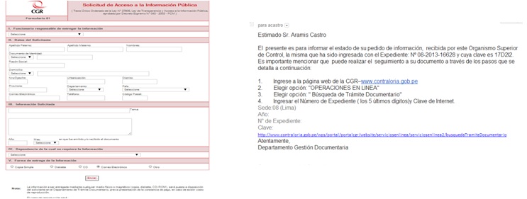
The petition for information was made through a contact form on the website of the Comptroller. We requested for the data to be sent via email.

The deadline imposed by law (7 work days, and 5) expired, and no excuses were given for the delay. After almost two months of phone calls and apologies, the people responsible told us the information we requested was ready… and they sent it in a PDF. The work for Corresponsales.pe was just beginning.

FOTO_PASO_1

FOTO_PASO_12

2. Data analysis and processing

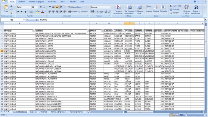
The data was comprised of around 200 pages in PDF format as digitalized images. This had to be entered manually into a spreadsheet. In order not to risk any mistakes that would compromise the credibility of the final result, this task was done one-by-one by two people (full-time) over two weeks.

The spreadsheet was verified twice by a third member of <a href=”Corresponsales.pe, again, in order to avoid mistakes.

Once this process was completed, the entire team (Corresponsales.pe journalists, designer and web developer) gathered to decide how this information would be presented. Once this stage was completed we were a bit closer to the final result.

PASO_2

3. Visualization and coding

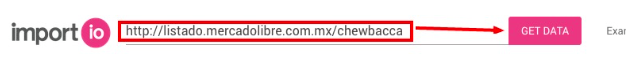
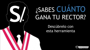
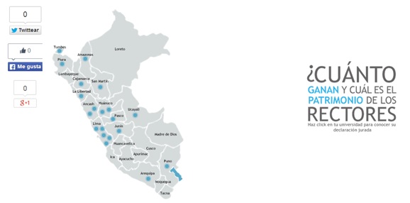
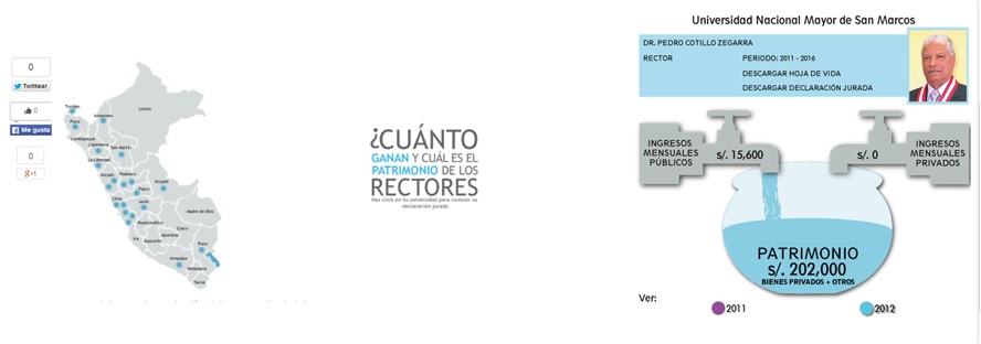
For the data visualization, we opted for a map of Peru that would interactively show all universities by region. The displayed information included the sworn declaration in PDF, the CV of the university president, and a graphic that showed the evolution of his or her income (see the image below).

Alongside the graphic design, we worked on the coding of the website. We decided against using Flash or formats that slowed down the website. Many regions in Peru don’t have reliable Internet access, and we wanted the site to work 100% for a wide audience. This is why we opted for static images.

PASO_31

PASO_32

4. Awareness-raising

Once we had a product, we reached out to regional media and to students from different universities, asking them to check out the tool and share it in their networks.

Main obstacles
  • The delay in governmental response to our request.
  • Receiving information in images in PDF, which didn’t allow us to use scraping programs.
  • Not all university presidents in Peru turn in their sworn declarations, and not all universities publish information in this regard.

Open data

The spreadsheet we created was published in the same website as our interactive map so that all readers can analyze and look at all the information in one file.

First findings

  • Between 2008 and 2012, twelve university presidents raised their income and assets.
  • In 2011, for example, Dr. Pedro Cotillo became the president of the University of San Marcos. At the beginning of his mandate, he declared S/. 202 000; in 2012, he reduced his monthly earnings from S/. 15 600 to S/. 7637,32, while his assets went up to S/. 454,6 thousand.

More information

  • You can find out how much university presidents in Peru earn, and how big their estate is (in Spanish)
  • Take a look at the sworn declarations of university presidents in Peru (in Spanish)

[Este blog post fue escrito por Aramís Castro, periodista de investigación y coordinador general de Corresponsales.pe, plataforma digital creada por universitarios que publica información de interés y utilidad para la comunidad universitaria peruana.

Corresponsales logo

Corresponsales.pe usa herramientas digitales aplicadas al periodismo de datos para la elaboración de sus noticias y, además, brinda capacitaciones de periodismo digital a estudiantes de universidades públicas del Perú. En 2013, ganó, en la categoría Prensa Digital, el más importante concurso de proyectos periodísticos universitarios: Etecom 2013.]

portada

En el marco de la campaña mundial por los Datos Abiertos y el compromiso del Perú por un Gobierno Abierto; y con el objetivo de compartir a la comunidad universitaria los ingresos de sus máximas autoridades, apoyados en la Ley de Transparencia y Acceso a la Información Pública y la Ley de Declaraciones Juradas, Corresponsales.pe trabajó cerca de cuatro meses en una herramienta digital alimentada con datos oficiales. Aquí contamos el proceso:

1. Búsqueda y obtención de la data

Ante la falta de información –pese a estar normado en la Ley de Transparencia– en los portales de las universidades públicas, la fuente oficial para la recolección de la información fue la Contraloría General de la República, institución que supervisa los bienes y recursos públicos del Perú.

El pedido se realizó en la web de la Contraloría a través de un formulario de libre acceso al ciudadano. Incluso se detalló que la entrega sea por correo electrónico.

El plazo máximo de respuesta por Ley (7 días hábiles y 5 de prórroga de ser notificado a quien solicita la información) venció y no hubo un pronunciamiento oficial por la demora. Luego de casi dos meses de llamadas y disculpas, la Contraloría informó que tenía listo el pedido y lo enviaron en formato PDF. El trabajo para Corresponsales.pe recién empezaba.

FOTO_PASO_1
FOTO_PASO_12

2. Procesamiento y análisis de la data

La data –cerca de 200 páginas en PDF- al estar digitalizada como imagen y para evitar errores que comprometan la credibilidad del trabajo final, tuvo que ser ingresada manualmente (dato por dato) en una hoja de cálculo. Participaron dos personas y finalizaron la labor en dos semanas a tiempo completo.

La hoja de cálculo recibió la verificación, en dos oportunidades, de un tercer miembro de Corresponsales.pe a fin de evitar algún dato equivocado.

Tras recibir la aprobación definitiva, se definió entre todos cómo se presentaría la información. Participaron los periodistas, la diseñadora y el desarrollador web de Corresponsales.pe. Una nueva etapa concluida y cada vez más cerca la presentación final.

PASO_2

3. Visualización y programación

Para la etapa de visualización se optó por un mapa del Perú que mostrara la región de la universidad y que fuera a la vez interactivo. La información incluyó la declaración jurada en PDF, el CV del rector y un gráfico que mostraba la evolución en sus ingresos (ver imagen).

A la par del diseño, se trabajó la programación. Se decidió no usar flash o algún formato que retrase la carga en la web debido a que varias regiones del Perú no cuentan con buena conexión de Internet y se corría el peligro que la herramienta no funcionara al 100%. Así, se usaron imágenes estáticas.

PASO_31

PASO_32

4. Difusión

Se contactó a medios regionales y representantes estudiantiles de diferentes universidades para que conocieran la herramienta y pudieran compartirla entre sus redes.

Principales obstáculos

  • Retraso en la entrega de la información.
  • Información en formato PDF como imagen lo que imposibilitó el uso de programas de extracción de datos para un procesamiento más sencillo.
  • No todos los rectores presentan sus declaraciones juradas y las universidades no brindan información al respecto.

Datos abiertos

La hoja de cálculo se puso a disposición de los lectores para que analicen y conozcan la información completa en un solo archivo.

Primeros hallazgos

Entre el 2008 y 2012, doce rectores del país aumentaron sus ingresos y su patrimonio, según un análisis de sus declaraciones juradas.

En 2011, por ejemplo, el Dr. Pedro Cotillo asumió el rectorado de la Universidad de San Marcos. Al inicio de su gestión declaró S/. 202 mil por concepto de bienes y otros; en 2012 redujo sus ingresos mensuales del sector público de S/. 15 600 a S/. 7637,32, mientras que sus bienes y otros ascendieron a S/. 454, 6 mil.

Más información:

  • Entérate cuánto gana tu rector y a cuánto asciende su patrimonio (nota informativa)
  • Conoce las declaraciones juradas de los rectores de las universidades del país (herramienta)
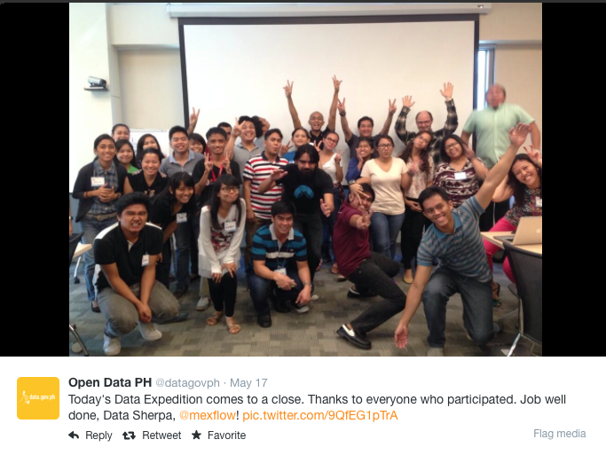
Flattr this!