Using data for improving cyclist community in Riga, Latvia

Would you believe that a socially relevant, data-driven project can be accomplished without a budget, a big team and full-time staff? How? This question was the focus of the ‘How we did it?’ meetup in Riga, Latvia. It was the final point of #Velodati – a data-driven project that crowdsourced geographic data about cycling mobility in Riga, initiated and conducted by the School of Data Latvian local group (Datu skola).
The Datu Skola’s mission is to facilitate data-driven projects, conducted by journalists and activists, in collaboration with data analysts and programmers. The #Velodati project works as an example for such projects.
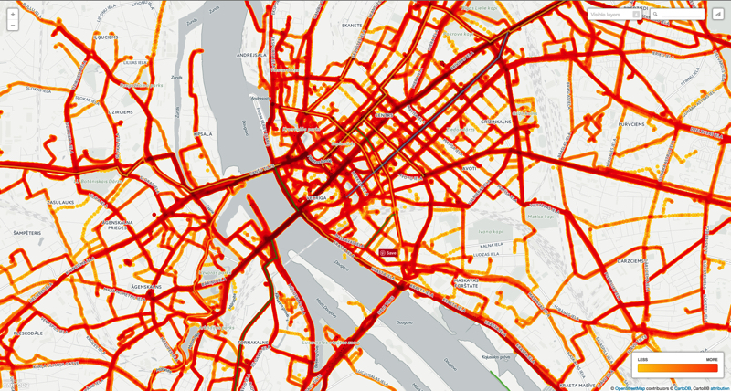
As a result an interactive online map was created showing the most busy cycling routes and how they overlap with the net of cycle tracks in Riga.

The project took nothing more than three months of one person’s work and 37 euros for posters, that encouraged Riga cyclists to share GPS recordings of their routes during the Riga Cycling Week in May. This was possible thanks to the open source and freemium tools used to create the crowdsourcing campaign, to clean and to visualize data. As a result, the online map got over 16.2K+ views (in a country of 1.9M population) and received coverage in eight national media outlets.
Here is a list of tools used for every part of the data project:
| Crowdsourcing campaign | Data collection | Data cleaning | Data visualization, publication | |
|---|---|---|---|---|
| Froont | campaign’s web page | |||
| Animaker | video animation | |||
| Typeform | survey | sharing instructions | ||
| Google Docs | data recording instructions | |||
| Zapier | email automation | |||
| Gmail | data compilation | |||
| “Save emails and attachments” Google Spreadsheet add-on | organising data | |||
| QGIS | data cleaning, formating | |||
| CartoDB | map visualization | |||
| Tableau Public | survey data visualization | |||
| Social media (Twitter, Facebook) | social media campaign | promotion of results |
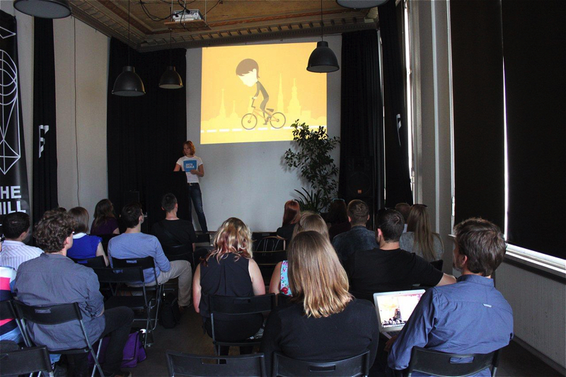
Each tool was demonstrated during the first part of the event. Attendees were particularly interested in Animaker, the video editing tool, Zapier, the cross-platform integration tool, the “Save emails and attachments” Google add-on, that organises email attachments automatically on Google Drive and CartoDB, a geographic data visualization tool.
Attendees also wanted to know why data vas visualized using points instead of lines and how a person who cleaned data made choices regarding which routes to keep or delete. Some also started to wonder how to improve the data crowdsourcing campaign for greater data submissions.
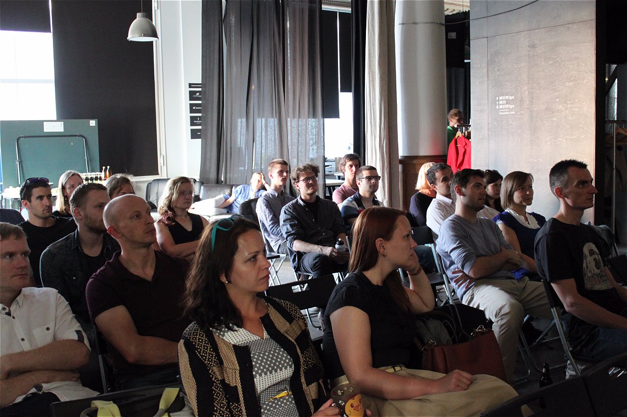
This was a great warm-up for the second part of the event. Participants split into three working groups to brainstorm about next steps for the project.
- One group discussed how the project could be improved for more impactful, data-driven results.
-
Another group discussed how to lobby Riga municipality for better cycling infrastructure in the capital.
-
Finally, there was a group which brainstormed ideas for other data journalism projects.
All groups concluded that it’s useful to combine cycling data with data about public transportation. Bicycles can serve as a good alternative, not only for cars, but also for reaching areas of the city where public transportation is inconvenient. Research, such as that conducted as part of this project, could be used to make evidence-based decisions regarding improving citizen mobility in Riga.
The tools and methods used to produce the #Velodati story will be shared as learning modules on School of Data international page.

| Infobox | |
|---|---|
| Event Name | Velodati – How we did it? |
| Type | meetup |
| Description | a reflection on methodology and tools used to produce the “Velodati” story. |
| Trainers | Nika Aleksejeva |
| Partners | No |
| Location | Riga, Latvia |
| Date | July 5th |
| Audience | journalists, cycling community representatives, analysts, civic society representatives, others |
| Number of attendees | 23 |
| Gender split | NA |
| Duration | 3 hours |

