Creating a Map Using QGis
This is the second of the tutorials from the hands-on visualisation session from Gregor Aisch at the School of Data Journalism at the International Journalism Festival in Perugia. In this tutorial we will create a simple map of the Tour de France stations of the last 100 years.
Pre-requirements
-
Install and configure QGIS.
-
Install from http://qgis.org. On most systems there should be a one-click installer that guides you through the process.
-
We need to install the following handy plugins:
-
Add Delimited Text Layer allows us to read and plot points from a CSV file.
-
Edit Any Layer allows us to easily edit CSV layers
-
In menu click Plugins > Fetch Python Plugins. In the appearing dialog type in
edit anyin the the filter box to narrow down the list:
-
Select the plugin and click Install/upgrade plugin. Repeat the same for Add Delimited Text Layer.
-
Download country shapefile from naturalearthdata.com. We are looking for ne_50m_admin_0_countries.
-
Download our sample dataset from http://vis4.net/perugia13/tour-de-france.csv.
Creating the base map layer
-
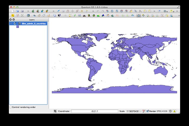
Click Layer > Add Vector Layer > Browse and select the file 50m_admin_0_countries.shp. That’s the shapefile containing the borders of all countries. Click Open to add finally it to the map.
-
Filter for countries with ISO code of France. Right-click on the layer and select Query from its context menu. In the text box SQL where clause enter the text:
ISO_A3= ‘FRA’. Make sure to use single-quotes as double-quotes are reserved for addressing column names. Click OK to apply the filter.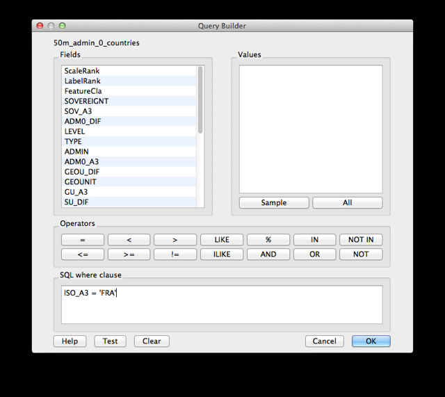
-
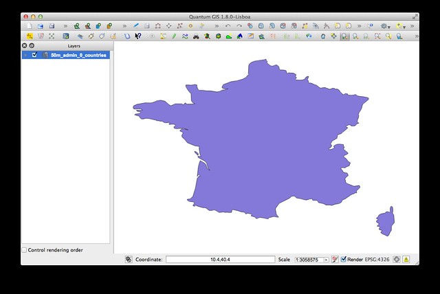
Zoom to Metropolitan France. You can simply use the Zoom In tool

and draw a rectangle around France.
-
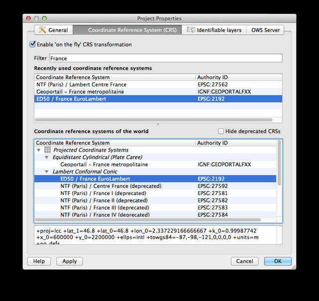
You might have noticed by now that France looks rather compressed. That is because by default QGIS is using the Plate Carree projection (nerdily referred to by its EPSG code
EPSG:4326). You can change the projection by clicking the following icon in the lower right of the window:
-
In the opening dialog activate the checkbox next to “Enable ‘on the fly’ CRS transformation”. Then in the filter text field enter France to search for map projection spezialized for France. For instance you can pick ED50 / France EuroLambert. Click OK to activate the projection.
-
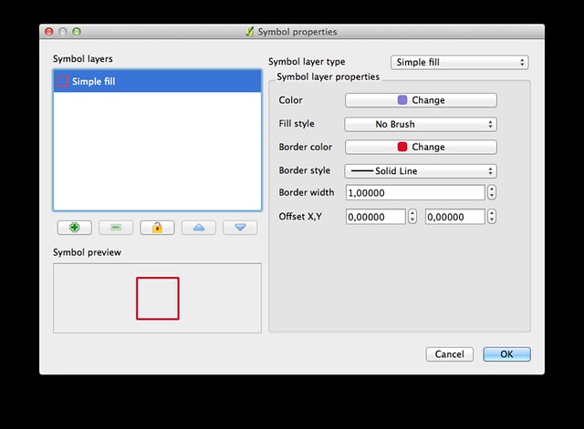
Let’s change the default styling. Again, right-click the layer and select Properties. The next dialog should be opened with the Style tab selected by default. Click the button Change… to change the layer style.
-
Now we are going to disable the filling by selecting No Brush in Fill style drop-down. Change the border color to red and increase the border width to 1. Click OK to apply the styling.
-
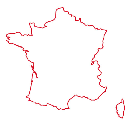
By now the resulting map should look like this:
Adding the Tour de France stations
-
Add delimited layer (CSV of tour de france stations). Click Layer > Add Delimited Text Layer. (If this option is not available, please make sure you installed the corresponding plugin in the first step.) Then click Browse… and select the file tour-de-france.csv that we downloaded previously.
-
QGIS is smart enough to recognize the format of the CSV file, and it even detects that the columns named lat and lon probably contain the map coordinates. All we need to do is to click OK.

-
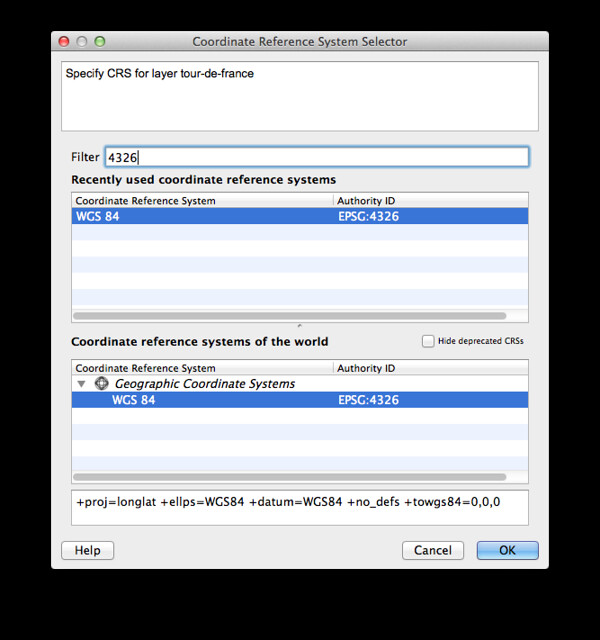
Now QGIS will ask you in what reference system (=projection) the provided coordinates are given. In most cases you will need to pick WGS 84 or EPSG:4326. Just type 4326 in the filter box and select WGS 84. Click OK to finish.
-
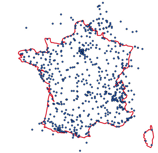
Now our map contains all the locations of Tour de France stations:
-
Now we are going to size the stations according to how often they have been part of the tour. Right click the layer tour-de-france and select Properties in the context menu.
-
Change the value in the Size field to a lower value such as 0,5.
-
Now click Advanced > Size scale field > count to let QGIS use the values in the column count as radius for the symbols.
-

You might also want to make the symbols more transparent by moving the Transparency slider to 50%.
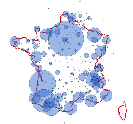
Your map should now look like this: -
Since we must always size symbols by area, and not radius, we now need to correct our map. As the area of circles depends grows proportionally with the square of the radius, we need to compute the square roots of the counts to get proper radii.
-
Usually you could have done this already during the data preparation phase and could simply stored another column in the CSV file. Also you can just load the CSV into a spreadsheet tool like Excel and add a new column with the square roots of the counts. However, you can also do this in QGIS using the Edit Any Layer plugin.
-
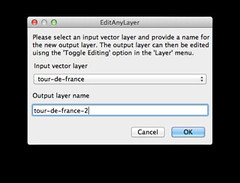
In the menu Plugins select Edit Any Layer > Create Editable Layer. Select tour-de-france as input layer and chose a name for the output layer. I will simply use tour-de-france-2 here. Click OK to proceed.
-
You will be asked for the coordinate system again. WGS84 should be selected by default so simply clicking OKshould work.
-
Now open the attribute table by right-clicking the new layer and selecting Open Attribute Table in the context menu. You will now see all the data stored in the CSV. Activate editing mode by clicking on the little blue pencil icon (see screenshot). Then open the field calculator by clicking on the little calculator icon.
-
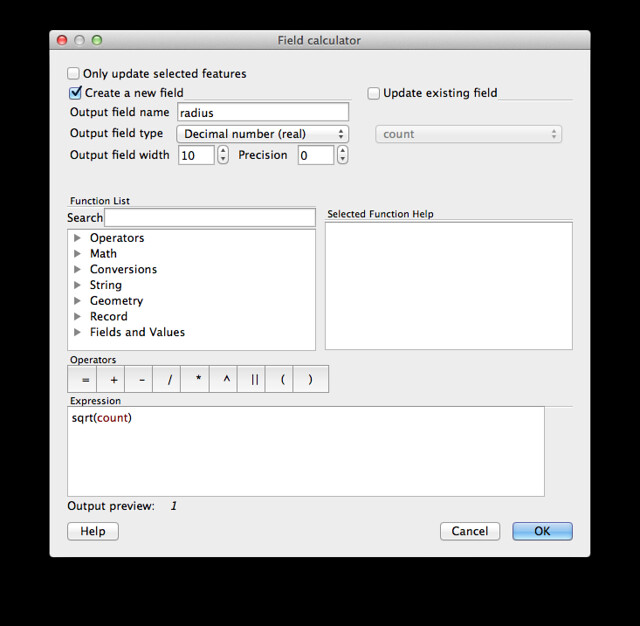
Make sure that Create a new field is checked and enter a meaningful name for the new column, e.g.
radius. As the square roots are going to be decimal numbers, select Decimal number (real) as Output field type. Finally enter the following formula into the Expression text field:sqrt(count). The dialog should now look like shown in the following screenshot. Click OK to proceed. -
Back in the attribute table you can take a look at the new column (you may have to scroll the table to the right). Now deactivate editing mode by clicking on the blue pencil icon again. QGIS will ask you if you agree to save the changes. Click Save, and Close the attribute table.
-
Now hide the layer tour-de-france that we created in step 2 by deactivating its checkbox in the layer window on the left. Now we repeat the second step with the new layer (tour-de-france-2), but instead of count we will pick the column radius for sizing the symbols.
-
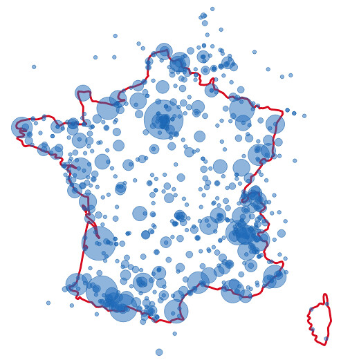
If you like, change the color to blue and set the transparency to 50%. Finally the map should look like this:



Exporting to PDF
In the last section we are going to export our map to PDF.
-
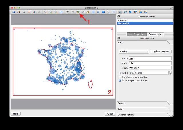
In the menu click File > New Print Composer. The print composer allows us to set up a print layout with our map. Initially the page is empty, but we are going to change this by clicking the icon for Add new map (1) and dragging a rectangle onto the page (2):
-
Optionally you can disable the black frame by disabling the checkbox General options > Show frame in the panel on the right.
-
Now in the menu click on File > Export as PDF… to finally save the map as PDF. You can now open the map in other graphic tools such as Illustrator to do some fine tuning (adding title, labels etc).
Enjoyed this? Want to stay in touch? Join the School of Data Announce Mailing List for updates on more training activities from the School of Data or the Data Driven Journalism list for discussions and news from the world of Data Journalism.

