School of Data: Live in India
Lucy Chambers and I recently travelled to India, to meet people working with open data and to explore the challenges they face. For more details of some of the discussions that took place on our journey, see the series on the main blog.

In the IT city of Bangalore, Lucy and I attended the Fifth Elephant – a big conference on big data. For two full days, around 700 participants flooded the Nimhans Convention Centre, keen to explore the latest opportunities in data technologies and techniques.
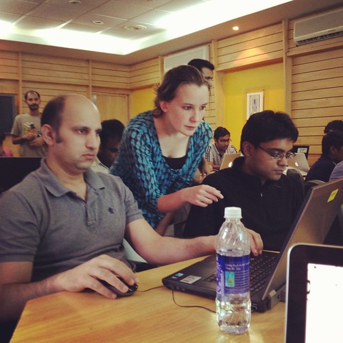
The conference was preceded by a day of workshops, during which both Lucy and I led sessions on OpenSpending and the School of Data. There had been a considerable waiting list for places on the session – which had been billed as basic – but given the conference’s largely technical audience, we were unsure what skill levels to expect. To my relief on the day, everyone turned up with a laptop and there was a decent internet connection. From a quick hands-up, the group was made up largely of programmers, software developers and data analysts. More or less everyone said they were comfortable with the basics of data cleaning, spreadsheets and simple graphs. So far so good.
The Wrangling Challenge
Thanks to the wonderful @datatelling, the workshop was themed around an interesting set of data on CO2 emissions. Recently, the Guardian ran a story on the countries which emitted the most carbon dioxide.
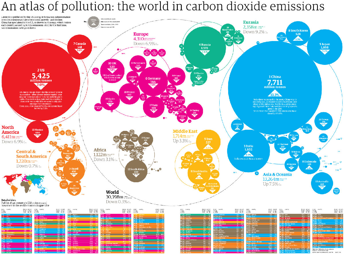
The Guardian’s visualisation is pretty interesting. India appears to be one of the biggest carbon culprits – the third biggest emitter of CO2 in the world. Yet per capita emissions tell a different story (as the Guardian acknowledged). India produces only 1.38 tonnes per person per year, compared to 18 in the USA and a global average of 4.49 tonnes per person per year. The room smiled – not so guilty then.
After a bit of discussion about how data can be (mis)represented, we got down to some wrangling. The room was provided with three data sets – CO2 emissions, population, and GDP – all with data which covered the last five years or more. Using this data (and with free rein to search for more if they felt confident to do so!), groups were asked to pose themselves a question to investigate. GDP seemed to spark the most interest, with several groups choosing ambitious projects to explore ‘carbon efficiency’ (as measured by GDP per capita / CO2 per capita). Others chose to explore carbon emissions in different continents, to look at which countries’ emissions had changed most over time, or to explore whether countries which had experienced a sharp rise in GDP had also experienced a sharp rise in CO2 emissions.
After deciding what to investigate, we all walked through the principles of cleaning, merging, analysing and representing data – with everyone carrying out the steps in order to answer the question that they had posed.
Too much information!
Circulating around the room, the areas that caused problems to the trainee data wranglers were often surprising to us.
Spreadsheets
Some technical glitches were always to be expected as people struggled to navigate different versions of Excel / OpenOffice / GDocs. But given that the majority of the audience was highly technical, the general lack of familiarity with spreadsheets was a surprise. One participant told me that he would find it easier to write some code to perform basic data analysis than to use a simple spreadsheet. This was definitely a learning point for us, and throughout our travels, many people reiterated that there was a clear need for better training in basic spreadsheet skills.
Selectivity

Too much information!…
Another common problem we encountered was actually paring down the information. Selecting which data to plot on which axes, deciding on the most appropriate form of graph to use, and working out how many variables could realistically be presented often proved challenging – a lot of ambitious and intelligent people want to use ALL the data in one go! It soon became apparent that one of the less recognised skills for Data Wranglers is actually deciding which aspects of the data to ignore in order to pull a coherent story or visualisation together. We hope that this is something that the School of Data can help people to become more comfortable with in future.
Understanding visualisations
Linked to this, the more we travelled in India, the more it was reported to us that many (or even most) people find it difficult to interpret visually-represented data – even when this is displayed in relatively simple bar charts and line graphs. Learning how to decode visually represented information is a skill that needs to be developed like any other. With these fresh insights into the challenges that people face, hopefully the School of Data can work to address basic data literacy skills, and improve people’s ability to both present and interpret visual data.
The Challenges
As expected at its first live trial, there was a lot to learn from the School of Data workshop. In an hour and a half, we got through the bulk of the exercise, but could definitely have used an extra fifteen minutes to wrap up and reflect on what we’d learned. There were a few too many ‘technical’ hold-ups (‘where is the sort function on my spreadsheet?’) and not quite enough space to reflect on some of the more interesting challenges that people encountered. Because people came with different skills and backgrounds, some were lost at points of the exercise whilst others were sailing. Many of these problems face all learning endeavours. When the School of Data launches online, some will be resolved (a key strength of the P2PU learning challenges model is the fact that it allows you to work at your own pace) – but new ones will undoubtedly appear (managing really slow internet connections, anyone?).
The Successes!
But despite some imperfections, the workshop was undoubtedly a success. On behalf of the School of Data, I learned a lot about which problems actually challenge data wranglers. I have a much better understanding of the level that many people are beginning from. And I recognise some of the practical and technical barriers that we’re going to have to work through. Personally, I can’t wait to put all that I found out into action!
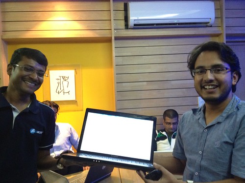
But of course, the biggest successes of the workshop weren’t about us. As we continued to move around the data circles in Bangalore, Lucy and I met several of our workshop ‘students’ again. Two young men carried on working with the data sets we had provided after the session, ultimately managing to produce a graph of the ‘carbon efficiency’ of certain countries – which had some intriguing results. Their pride and sense of achievement was wonderful to see! Another participant had gone on to gather his own data on anonymous sources, and was keen to get my help in wrangling his way through it. Everyone had a cheery wave and a positive word, and many also offered helpful feedback.
Generally, we saw huge enthusiasm for Data Wrangling in India. One person told me that he had never known he had the ability to wrangle data, but that he loved it and hoped to carry on! The more we travelled, the more support we saw for the School of Data initiative. It will be great to see the Data Wrangling community blossoming around School of Data courses over the coming months.
The Next Steps
Look out for more activity coming soon on the School of Data mailing list and blog as our development phase really kicks in.
If you want to get involved, you can:
* Sign up for the quiet School of Data mailing list or get involved with the building on the higher traffic development list.
* If you are based in India, join the open data community here.
* Otherwise, check out our FAQs for more ideas about how to get involved.
Questions? Email schoolofdata [@] okfn.org
![]()