Data roundup, June 26
We’re rounding up data news from the web each week. If you have a data news tip, send it to us at [email protected].
TOOLS, COURSES, AND EVENTS
The eight winners of the 2013 Data Journalism Awards have been announced. Check out the award-winning work on gay rights, Chinese power structure, class in Britain, and more.
Members of Investigative Reporters & Editors can now use Tableau Desktop for free. Tableau is a drag-and-drop data analysis tool popular with journalists who work with data. Now a wider range of journalists can take advantage of Tableau to tell stories with data.
Berlin Open Data Day 2013 was held this past Sunday, preceded by the redesign and addition of new data to Berlin’s open data portal. Projects showcased at the event included Bürger baut Stadt, an interactive map of construction projects, and a map of accessibility of living places by public transport.
If you’re in the Washington D.C. area, you can learn how to turn raw text into data with the magic of the Python Natural Language Toolkit by participating in a workshop on natural language processing basics being held July 27. Registration is still open, and tickets are $150.
Learn how to visualize data with a master class from one of the leading lights in data journalism, the Guardian. This “introduction to visualising data” will cover both the technical and the journalistic side of data visualization. Tickets are £99 and available till July 6.
What can you do with the statistical programming language R? Well, you can build a beer recommendation system, and yhat can show you how. This lesson starts with data from Beer Advocate and finishes with a find_similar_beers function wrapped in an API.
If you’re sharing data of a personal nature, you need to take steps to render it anonymous to protect the privacy of the people the data describes. The UK Anonymisation Network is an organization that can help you do this, providing “practical advice and information to anyone who handles personal data and needs to share it”.
“Glue is a Python library to explore relationships within and among related datasets.” Glue, which rests upon the Python numerical computation stack, specializes in links across and relations between datasets, making it easy to juxtapose your data or to use selections in one set to constrain another.
It’s a commonplace of machine learning that a trained classifier is a black box, able to generate predictions but not itself straightforwardly interpretable. New work by a team of Italian researchers shows that this is less than completely true. Higher-order machine learning classifiers—classifiers of classifiers—can be trained “to hack other classifiers, obtaining meaningful information about their training sets”.
DATA STORIES
The south of the Canadian province of Alberta flooded this past week, requiring the evacuation of thousands of people from Alberta’s largest city. A map of the Alberta floods produced by Google Crisis Response illustrates the extent of the flood and the severity of the damage.
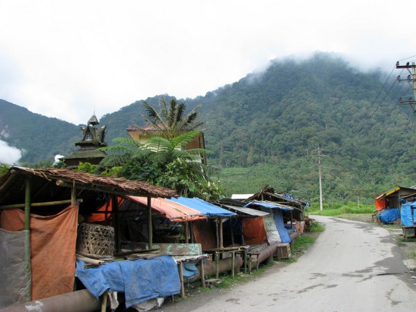
Indonesia, meanwhile, has been on fire. Smoke from forest fires in Sumatra caused unprecedented deterioration of air quality levels and forced closures of schools and airports. The World Resources Institute has compiled and mapped data on Indonesian forest fires in an effort to better understand their patterns and causes.
The summer solstice, June 21, was also Canada’s National Aboriginal Day, “a day of celebration for the Aboriginal Peoples in Canada”. Statistics Canada commemorated the occasion by releasing an annotated compilation of facts drawn from the 2011 National Household Survey.
An interactive map of Bangladesh factory disasters, presenting the past 23 years of industrial deaths in Dhaka, is certainly this week’s most heartbreaking use of CartoDB. The 1,127 dead in Rana Plaza loom large. Each accident is linked to the source of information.
Periscopic, everyone’s favorite data do-gooders, have unveiled two major new pieces this week. The first is inequality.is, an interactive created in partnership with the Economic Policy Institute to illustrate the extent, impact, and origin of income inequality in America. The next is The Wait We Carry, a grim illustration of the long wait times that American veterans experience applying for disability status.
Repetition is one of life’s great pleasures. The rhythmic quality of poetry comes about, first and foremost, through repetition and recurrence of sounds and images. Former English major and present-day natural language processor Will Kurt applies his NLP experience to visualize repetition in T.S. Eliot’s Four Quartets.
Argentine journalists have no access to Freedom of Information legislation or open data in their country—and yet they are killing it at the data-driven journalism game. A new article from journalism.co.uk highlights the award-winning data journalism of Argentina’s La Nacion.
How do different machine learning classifiers perform on different datasets? A fascinating new gallery of classifier algorithm outputs provides visual insight into this question, plotting attempts by various classifiers at learning simple two-dimensional patterns.
DATA SOURCES
I have to admit: I just didn’t encounter any major new data sources released this past week. If you want to share any, please leave a comment pointing them out!
As for last week, many, including me, were distracted by the relaunch of the Canadian federal government’s data portal, data.gc.ca. But the real story, says David Eaves, is the government’s adoption of the Open Data Charter. Meanwhile, with input from Eaves, the government has also unveiled a new Open Government License.


