You are browsing the archive for Neil Ashton.

Deadly Environment

- April 22, 2014 in Data for CSOs

Deadly Environment: impunity

Global Witness‘s new report Deadly Environment documents the past decade’s shocking rise in killings of people defending environmental and land rights. As competition for natural resources intensifies, more and more ordinary people—particularly in indigenous communities—are being murdered for resisting land grabs, expulsion from their homes, and other abuses. These crimes are going almost entirely unpunished.

School of Data worked with the Global Witness team to develop the interactive graphics that accompany the minisite of the report. We wanted to highlight the overall acceleration of the killings, their geographical distribution, and the horrifying extent of their impunity. Conscious of the moral gravity of the project, we also sought to bring the human qualities of the data to the surface.

The result is a series of graphics developed with D3.js and presented sequentially using Owl Carousel. In the graphics that highlighted individual killings, a mouseover display of the case’s details was created using the d3-tip plugin. Geospatial data for the map graphic was taken from Natural Earth.

These interactive graphics helped Global Witness’s report reach a wider audience, particularly on Twitter, where promotional tweets including screencaps of the graphics were very widely shared.


Flattr this!

#dataroundup: help round up data news on Twitter

- December 12, 2013 in Community

Photo credit: AgriLife Today

Do you like to keep tabs on new developments in data journalism, the latest in infographics, or on new tools and courses for data wrangling? Do you like to hang out on Twitter? If so, School of Data needs your help.

Over the past year, we’ve experimented with different ways of running our regular Data Roundup column on the School of Data blog. Now we’d like to try something new: turning the Data Roundup over to the School of Data community.

We invite all School of Data community members—whether mentors, learners, or just interested observers and well-wishers—to tweet about pieces of “data news” they find interesting with the hashtag #dataroundup. Every week, our Data Roundup editor (currently Marco Menchinella) will draw on the pool of tweets to create that week’s Roundup, giving credit to the user who found the story.

Suggested topics for the Roundup include:

  • data-related tools or programming language libraries
  • tutorials and other learning materials
  • announcements of workshops, conferences, and other events
  • data visualizations and pieces of data-driven or quantitative journalism (especially from less-publicized sources)
  • data portals, open datasets, and other sources of data

But these are just suggestions—the content of the Roundup is up to you. Whatever it is that you, the School of Data community, find interesting in the world of data, we want to hear about it and to help spread the news. Join us on Twitter under the hashtag #dataroundup!

Flattr this!

Geocoding in Google Docs: GeoJSON boundaries with Koordinates

- October 31, 2013 in HowTo

GeoJSON with Koordinates

In our geocoding recipe, you learned how to use Google Sheets formulas to automatically convert place names into coordinates in your spreadsheet data. In this tutorial, you’ll learn how to take geocoding a step further, converting coordinates to GeoJSON boundaries—machine-readable descriptions of the boundaries of geographical regions like countries or provinces—using the Koordinates API. The Koordinates API takes latitude and longitude coordinates and returns boundary shapes that are on or near those coordinates.

In the geocoding recipe, you used built-in functions like ImportXML, CONCATENATE, and JOIN to get coordinates from place names using formulas like this:

=JOIN(",", ImportXML(CONCATENATE("http://open.mapquestapi.com/nominatim/v1/search?format=xml&q=",A2), "//place[1]/@lat | //place[1]/@lon"))

This formula is possible because the MapQuest API used in that tutorial returns XML data, which you can query using XPath strings like //place[1]/@lat with the built-in function ImportXML.

But Koordinates, the geospatial data API we’re using in this tutorial, returns its results in JSON rather than XML, and Google Docs doesn’t have any built-in functions to traverse JSON objects. Hence we’ll have to define our own.

To get started, you need to create an account with Koordinates and get an API key. To do create a key, log in, click on your name at the top of the page, select APIs and Web Services, and then click Accept terms and create key. Make a copy of the key that is generated—you’ll be using it soon.

Now go your spreadsheet, access the Tools menu, and select Script editor. Click Close to get rid of the dialogue box that appears. Once you’re in the script editor, delete the text from the edit box and then save your file, giving it a memorable name (perhaps Koordinates API function).

Now enter the following into the empty edit box, inserting your API key at the indicated spot:

function koords (coordsString) {
 /* Block 1. Formats lat-long coordinates for Koordinates API call. */
 coordsString = coordsString.replace(/\s/, "") ;
 var coords = coordsString.split(",") ;
 var xy = "&x=" + coords[1] + "&y=" + coords[0] ;

 /* Block 2. Formats API call, makes API call, parses the result,
    and stores the resulting object in "json". */
 var key = "YOUR API KEY GOES HERE, INSIDE THESE QUOTATION MARKS" ;
 var url = "http://api.koordinates.com/api/vectorQuery.json/?key=" + key + "&layer=1103&geometry=true" ;
 var data = UrlFetchApp.fetch(url + xy) ;
 var text = data.getContentText() ;
 var json = JSON.parse(text) ;

 /* Block 3. Traverses "json" to find boundary data and returns it. */
 var result = json["vectorQuery"]["layers"]["1103"]["features"][0]["geometry"] ;
 return JSON.stringify(result) ;

} ;

Let’s go through this code block by block.

The first block of code converts a string representation of latitude-longitude coordinates into the format Koordinates expects, with longitude in first place. It throws out any spaces in the string (replace), splits the string on the character ",", and glues it back together in the reverse order. It also gets it set up to be inserted into the Koordinates API call by placing the longitude value after "&y=" and the longitude after "&x=".

The next block sets up the URL for the API call and then makes the call. It asks for map layer 1103, which is a layer for country boundaries. It also requests “geometry”, meaning actual polygons (rather than just metadata, the default). The resulting JSON string is parsed into a JavaScript object with JSON.parse and put into the variable json.

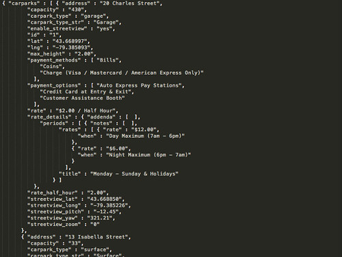
The JSON returned by the API looks like this:

Koordinates API call result

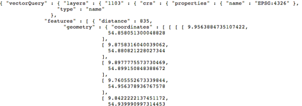
The polygon content we want, the “geometry”, is buried away deep inside the object. To get at it, we need to dig down through several layers of attributes. This is what the last block of code does, grabbing the "geometry" within the first item (item number 0) in the "features list of map objects returned for the query. It also turns the result into a string with JSON.stringify and returns it as the function’s value.

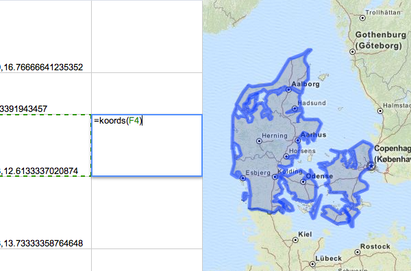
Try calling your new custom function, giving it the name of a cell that contains lat-long coordinates (here, F4):

=koords(F4)

You should get in return a blob of JSON data—the rich geometric representation of the country containing the point in F4.

You can now use koords like an ordinary Google Apps function. For example, you can wrap up the formula from the previous lesson to create a new formula that goes straight from place names to GeoJSON boundaries.

=koords(JOIN(",", ImportXML(CONCATENATE("http://open.mapquestapi.com/nominatim/v1/search?format=xml&q=",A2), "//place[1]/@lat | //place[1]/@lon")))

In this example, we used map layer 1103, which contains country boundaries. But Koordinates has many other layers which you might find useful. Check out the layers list to see what else you can do with the Koordinates API.

Flattr this!

Data Journalist in a Day

- October 22, 2013 in Data for CSOs


Data in itself is not a force for good. The mere availability of data, far from fostering democracy, can deepen pre-existing power inequalities. The recent data-driven expropriations in Tamil Nadu and Bangalore provide a striking example: the digitization of land records has allowed rich landowners, disproportionately well equipped to interpret the data in their favour, to further dispossess the already poor.

It is clearly necessary for data providers to give careful thought to the potential impact of their datasets. But it is equally clear that in our new world of open data, evil will prevail unless good people learn to find and communicate insights into the meaning of data. The skills and tools necessary to do this have so far been the preserve of “data journalists”—but data journalism must be brought to the people.

It is, however, easier than you might think to find stories in data and make them intelligible to others. Training in statistics and advanced programming skills are not necessary. To get started, all you need is data and the wherewithal to spend a few hours learning the tools described in this post. These tools can be learned in less than a day, and they cover the full pipeline of analysis and communication. Learning them is a substantial and empowering step.

Cleaning

There is no point looking for insight into data which is corrupt, which unfortunately a great deal of data is. The first step in any data exploration project is therefore cleaning, which consists of the elimination of errors, redundancies, and inconsistencies in data.

The simplest way to clean data is to do it by hand with a spreadsheet application like Google Docs. You can, however, speed up the process by using specialized data cleaning tools like OpenRefine. OpenRefine anticipates common problems with tabular data and allows you to quickly eliminate them. It has a bit of a learning curve, so be sure to set aside a few hours for experimentation.

Analysis

Once you have polished your data, you can peer into it to see the stories it contains. This means performing analysis: finding meaningful characterizations of data (mean, standard deviation, etc.) and its structure (relationships between variables).

Spreadsheet applications are the traditional tool for data analysis, but simpler and quicker alternatives are becoming more popular. StatWing is a web application that allows you to upload tabular data and perform simple statistics to arrive at a picture of your data’s properties and structure. QueryTree is a similar web application with an innovative drag-and-drop interface. Both applications aim to simplify and democratize analysis. Neither, however, is free and open software—so you may prefer to stick to free spreadsheet applications.

Charts and graphs

Once you understand your data, you can communicate your understanding. Visual presentation is the most intuitive means of imparting insight into data. The most important skill for a would-be data storyteller is therefore creating straightforward informational graphics. Excellent tools for this purpose abound.

Datawrapper is perhaps the simplest way to create and publish an infographic online. Datawrapper is an open-source web-based tool for creating “simple and correct” charts that can be embedded in web pages. Creating a chart with Datawrapper is as simple as pasting in your data, choosing a layout, and publishing the result. Each chart Datawrapper creates includes a link to the source data, allowing your readers to verify or recreate your work. For a stylish (but non-free) alternative to Datawrapper, try Infogr.am, a new tool which allows you to create complex layouts of infographical elements.

Maps

Data’s potential impact often derives from its connection to place. The best way to communicate this connection is a map visualization. Such maps can have a powerful effect on public policy. The Solano County Community Advocates, armed with both data and freely available data literacy training provided by the California Health Interview Survey, were able to create a map of asthma incidences that helped them successfully argue against a polluting construction project in their county.

In the world of data-driven cartography, one application stands out. Google Fusion Tables is a tool in the Google Drive suite that, in spite of still being “experimental” software, is the single most important application in journalistic cartography. Embedded maps created with Fusion Tables can be found wherever journalists have presented spatial data online; Canada’s Global News credits Fusion Tables with allowing them “to ram out dozens of census maps on the day of a census release”. Fusion Tables is a tool for merging together sets of data and visualizing them. Data which includes spatial coordinates can be visualized on a Google map, or it can be linked to a custom boundary file to create “intensity maps” providing a colourful view of how some quantity varies over space. Fusion Tables includes sample datasets and tutorials which allow you to quickly get started with the software.

Flattr this!

Know your Data Formats

- October 21, 2013 in Data for CSOs


The emancipatory potential of data lies dormant until data is given life in computational applications. Data visualizations, interactive applications, and even simple analyses of data all require that data be made intelligible to some kind of computational process. Democratic engagement with data depends on data being intelligible to as many forms of computation as possible.

Data should therefore be distributed in a format that is both machine-readable and open. Machine readability ensures that data can be processed with a minimum of human intervention and fuss. The use of an open file format gives users access to information without proprietary or specialized software. Any deviation from machine readability and format openness represents a hindrance to user engagement.

Machine readability

“Machine readability” means making meaningful structure explicit. The most machine-readable formats make their structure completely transparent. Unstructured documents demand that the user create structure from scratch.

Unstructured documents are not fundamentally bad—if they were, the fact that the most popular file formats for documents (PDF, Word) and bitmap images (GIF, JPEG, PNG, BMP) are unstructured would be very strange. Unstructured documents are simply unsuitable as vehicles for data. They are designed to be displayed on a screen or printed rather than to be processed programmatically. Machine-readable data formats, on the other hand, are simple and direct encodings of standard data structures. Since they contain no display information, they are not particularly easy for humans to read. Data, however, is not meant to be simply read in the raw.

Data comes in many structures, but the most common structure is the table. A table represents a set of data points as a series of rows, with a column for each of the data points’ properties. Each property may take on any value that can be represented as a string of letters and numbers. The machine-readable CSV (comma-separated values) or TSV (tab-separated values) formats are excellent encodings of tabular data. CSV and TSV files are simply plain text files in which each line represents a row and, within each line, a comma (for CSV) or a tab character (for TSV) separates columns. All data wrangling systems, great and small, include facilities for working with CSV and TSV files.

image02 Two views of a CSV table: Toronto Mayor Rob Ford’s voting record, from toronto.ca. Above: display view from toronto.ca website. Below: plaintext view in Sublime Text 2 text editor.

Some data includes structure which cannot be explicitly encoded in a table. Say, for example, each data point can be associated with some arbitrarily long list of names. This list could be represented by a string—but as far as the table structure itself is concerned, this list is not a list but just an ordinary string with the same structure as a name or a sentence. Additional structure like lists can be directly encoded with more flexible formats like JSON (JavaScript Object Notation) or XML (eXtensible Markup Language). JSON represents data in terms of JavaScript data types, including arrays for lists and “objects” for key-value maps. XML represents data as a tree of HTML-like “elements”. Both formats are very widely supported.

image00 Some XML data, viewed in Sublime Text 2: the opening words of Ovid’s
Metamorphoses, from the Latin Dependency Treebank.

Open formats

Not all data formats are created equal. Some are created under restrictive licenses or are designed to be used with a particular piece of software. Such formats are not suitable for the distribution of data, as they are only useful to users with access to their implementations and will cease to be useable at all once their implementations are unavailable or unsupported.

Closed and proprietary file formats are encountered with tragic frequency in the world of data distribution. The most common such formats are the output of Microsoft Office software, including Microsoft Word documents (.doc, .docx) and Microsoft Excel spreadsheets (.xls, .xlsx). Many pieces of free and open-source software are able to import Microsoft Office documents, but these document formats were not designed with this in mind and present considerable difficulties.

Using open and free file formats does a great deal to lower the barrier to entry. An open file format is one defined by a published specification that is made publicly available and which can therefore be implemented by anyone who cares to do so. All of the machine-readable formats described in the Machine readability section above are open formats. All of them are therefore eminently suitable as vectors of data distribution.

image01 Some JSON data, viewed in Sublime Text 2: Green P Parking data from toronto.ca

Getting started

Getting started with machine-readable and open data can be as simple as clicking “Save As”. For tabular data, most spreadsheet software—Microsoft Excel, LibreOffice, Google Drive—allows you to choose to save your spreadsheet as a CSV. Making this choice is a first step towards making your data public. For many purposes, this first step is enough.

Going beyond tabular data generally means going beyond spreadsheet software into the realm of programming. JSON and XML are generally created, as well as processed, by specially written code. Learning to read and write structured data with code using standard tools (e.g. Python’s [json (http://docs.python.org/2/library/json.html) and [/xml (http://docs.python.org/2/library/xml.html) libraries) is an excellent way to begin your new life as a civic hacker.

Flattr this!

Finding Data

- October 18, 2013 in Data for CSOs


Evidence is power, as the School of Data’s motto says: the power to transform your material and social circumstances by understanding them. But so long as you don’t know how to gain access to data, you are dispossessed of this power. This guide aims to get you started finding data and taking power back.

Data explorers with a regional Balkan focus must mostly resort to “wobbing”: taking advantage of Freedom of Information (FOI) legislation to request data from public authorities. Placing FOI requests requires knowledge of your rights as well as patience. Investigations on a more international scale can make use of freely available data provided by governments and non-governmental organizations. Getting this data is mostly a matter of knowing how to find it.

Freedom of Information

The United Nations General Assembly has asserted that the freedom of information is a fundamental human right. Over the past fifteen years, all of the Balkan states have enshrined this right in law. Citizens of the Balkans have the right to petition state bodies for information of a public character. According to Freedom House’s studies of press freedom as well as the RTI Rating, this right is widely respected. Indeed, Serbia and Slovenia are considered exemplary for their respect of the right to information.

Filing FOI requests can be slow and may encounter resistance. This is no reason to get discouraged. Data that is only available through an FOI request is typically the most valuable data of all, and journalism in the Balkans furnishes many examples of the worth of such data. The Data Journalism Handbook’s case studies of FOI-based journalism include the story of an investigation of the Yugoslav arms trade by a team of Slovenian, Croatian, and Bosnian journalists. Bulgarian journalists like Genka Shikerova and Hristo Hristov have used FOI requests to expose corruption and assassination. Patience and determination will bring rewards.

Your legal right to information is the key to a successful FOI request. Before placing your request, learn your rights. Investigate your country’s FOI legislation and learn the names of the regulations, constitutional clauses, and so on that guarantee your access to data. Make sure to find out any fees associated with information requests and to learn what time limits the FOI legislation sets for replying to your request. When placing a request, it is helpful to mention the legal basis for the request and for your expectations of a reply. Focused and unambiguous requests are the most likely to bear fruit.

Investigations in Kosovo can make use of Informata Zyrtare, a web service built on the Alaveteli platform making it easier to submit FOI requests to Kosovar authorities and to republish the results. Even if you are not using Informata Zyrtare, consider republishing responses to FOI requests as open data as a service to your community. For quantitative data, your FOI request should ask for the data in a machine-readable digital form, making this republication easier.

Portals and searches

Random search

Much useful data has already been made available on the web in centralized repositories hosted by governments and major NGOs. Open Data Albania is the only such repository in the Balkans. If your investigation’s scope is more international, however, and if you have a clear idea of what you want, data portals make a good starting point.

If you are looking for data from a particular state, see if the state has its own data portal. The Open Data Census and datacatalogues.org are two indexes which can help you locate a particular portal. The Guardian also provides a world government data search engine which allows you to search numerous state data portals simultaneously.

Comparative data on a large number of states is available from the data portals of the United Nations, World Bank, and World Health Organization. Regional portals like Africa Open Data, OpenData Latinoamérica, and the European Union open data portal aggregate data from groups of states.

A great deal of government data is indexed by ordinary web search engines. The trick to finding this data is anticipating its file format: if you limit your searches to machine-readable file formats specific to the type of data you want (e.g. CSV or XLS for tabular data, SQL or DB for databases), your search results are likely to be relevant data. Append “+filetype:extension” to your Google query to look for files with a specific extension, e.g. “+filetype:csv” to look for CSV files.

You may not be the first person to think of collecting the data you’re interested in. Check the Open Knowledge Foundation’s Data Hub, “a community-run catalogue of useful sets of data on the Internet”, to see if anyone else has put up the data you’re looking for.

Flattr this!

Seven deadly sins of data publication

- October 17, 2013 in Data for CSOs

The advantages to non-governmental organizations of digitizing data are obvious. Digital data cannot, after all, be destroyed in a fire, unlike the 31,800,000 pages of irreplaceable Maharashtra government records that burned in 2012

But NGOs should take the further step of publishing their digital data. Publishing data improves not only an organization’s credibility but also its internal circulation of data. When data is made accessible to
others, it cannot help but become more accessible to its creators in the process.

There are many ways to prepare data for publication. Many of these ways are just plain wrong: they defeat the purpose of releasing data. Follow the righteous path and avoid these seven common errors when preparing your data for release.

Sculpture: Deadly Sins (Snowglobes): Evil, Pure Products USA, by Nora Ligorano and Marshall Reese, Eyebeam Open Studios Fall 2009 / 20091023.10D.55563.P1.L1.C45 / SML

1. Using PDFs

The popular PDF file format is a great to distribute print documents digitally. It is also worthless for distributing data. Using data stored in a PDF is only slightly easier than retyping it by hand.

Avoid distributing data in PDFs or other display-oriented formats like Word documents, rich text, HTML, or—worst of all—bitmap images. Instead of using publishing data tables in PDFs, use a machine-readable and open tabular data format like CSV.

2. Web interfaces

Reuse is the goal of data publication, and raw data is the easiest to reuse. Every technological trick standing between the data and the user is an obstacle. Fancy web interfaces constructed with Flash are the worst such obstacles.

A Flash web application is a reasonable choice if the goal is an interactive presentation of an interpretation of some data. But such an application is just an interpretation, and it keeps the data hidden from the user. Users may still be able to retrieve the data, but they will effectively have to hack the software to do so! Make it easy for them: consistently provide links to data

3. Malformed tables

Spreadsheet software makes it possible to decorate data with formatting that facilitates reading, such as sub-table headings and inline figures. These features are bad for data distribution. Data users will have to spend time stripping them away. Save time by not including them in the first place.

The ideal form of published tabular data is a simple “rectangular” table. Such a table has a one-to-one correspondence between data points and rows and has the same number of columns for each row, with every row having a value for every column. Missing values should be indicated with a special value rather than left blank. Sub-tables with different columns should either be broken into separate files or, if really necessary, aggregated into a single table by combining multiple tables’ columns. The result is a table with no “special” rows and a single set of columns.

4. No metadata

You may think that “raw data” does not come with a ready-made interpretation. Not so. There should always be an intended interpretation of the units of measurement, the notation for missing values, and so on. If no indication of this basic interpretation is provided, the user has to guess. Include metadata which saves them the trouble.

Standards like the Data Package (for general data) or the Simple Data Format (for CSV files) allow you to include metadata with data as a simple JSON file. The metadata should include at least the units of measurement for quantitative values, the meaning of qualitative values, the format for dates, and the notation for a missing value.

5. Inconsistency within datasets

Inconsistencies are more common than actual errors. Inconsistencies include mayhem like haphazard units of measurement and multiple names given to the same entities. These problems are so widespread that “data cleaning”, which mostly means eliminating inconsistencies, is the first step in all data wrangling projects. Help make data cleaning a thing of the past by carefully checking your data for consistency before releasing it.

6. Inconsistency across datasets

Publication of data is a commitment not made lightly. Once a format for data and venue for data publication has been chosen, make an effort to stick to them for all future data releases of the same type.

Data is most useful when different datasets can be combined to test wide-ranging hypotheses. Not maintaining a single standard for data of a single type turns otherwise comparable data into a disconnected mess which requires considerable effort to put together. Make data freely remixable: adopt a consistent standard for data and metadata across as many datasets as possible.

7. Bad licensing

Who can use your organization’s data? The license under which data is released is a major part of the answer to this question. There is very little point in releasing data at all under a restrictive license—and if the licensing is left unspecified, the data will exist in a state of
legal limbo.

Consider making your data available under a permissive “open” license like the Open Data Commons Open Database License. Once you choose a suitable license for your data, indicate this license in the data’s metadata.

Flattr this!

Data Expedition Workshop at OKCon 2013

- September 17, 2013 in Data Expeditions

DSCF4304

What’s the best way to learn how to run a data expedition? To be a part of one! That’s why our workshop “Learn how to run your own Data Expedition” at this week’s Open Knowledge Conference in Geneva will take its participants on a data expedition of their own. These new data explorers will be guided on a journey through our crowdsourced database of Bangladesh garment factory data.

A data expedition is a fun and hands-on romp through data. It brings together people of different backgrounds to pool their abilities and help each other learn how to ask questions with data and communicate the answers they find. In a three-hour workshop taking place on Thursday, September 19 at OKCon 2013, we’ll be introducing the data expedition format and teaching participants how to organize data expeditions for their own local communities.

This introduction to data expeditions will be a data expedition in its own right. In a previous expedition, data explorers responded to the Rana Plaza garment factory catastrophe by finding data on Bangladesh garment factories and using it to shed new light on the business practices of global garment brands. The crowdsourced garment factory database they created will serve as the starting-point on Thursday. Expedition participants will peruse the database for insight into the garment supply chain and will learn how to communicate their findings through visualizations and geomaps.

We’ll be posting more about participants’ creations in the days after the workshop—stay tuned for new discoveries from our intrepid data explorers!

Flattr this!

Data roundup, July 10

- July 10, 2013 in Data Roundup

We’re rounding up data news from the web each week. If you have a data news tip, send it to us at [email protected].

Photo credit: Zeinab Mohamed

Photo credit: Zeinab Mohamed

TOOLS, COURSES, AND EVENTS

You have four more days to apply for the OKCon 2013 travel bursaries. These grants support travel to Geneva to participate in the Open Knowledge Conference that will be taking place from September 16 – 18, covering transport, accommodation, and conference lunches.

If you missed the SciPy 2013 conference and its awesome tutorials, don’t worry. It’s okay. There are plenty of videos of the SciPy tutorials available to watch on the conference website.

Remember how the UK Land Registry announced it would be releasing new open data sets a little while ago? Now they’re marking the release of that data by opening the Open Data Challenge, a contest that will give three £3,000 awards to developers who show how UKLR data can make a positive impact on the UK economy.

The ScraperWiki platform has come out of beta. ScraperWiki is a handy web service for “liberating data from silos and empowering you to do what you want with it”. Wondering what’s new about it? Check out the FAQ, not to mention the blog post announcing the FAQ with a neat visualization of #scraperwiki Twitter activity.

Last week you learned about the Poderopedia platform, a system for tracing networks of political and corporate power. Learn more about Poderopedia from a detailed discussion from creator Miguel Paz at Mozilla Source.

Friedrich Lindenberg discusses applications of text mining in investigative journalism, providing an overview of useful tools and techniques for crunching large collections of documents to unveil hidden insights.

Tuanis is a free tool created by Matthew Caruana Galizia to automate the construction of choropleth maps in the newsroom. Loading data into Tuanis is as simple as creating a Google spreadsheet and publishing it to the web. The project is explained in a post on the author’s blog.

Mise à journalisme has published a thorough review of the 20 best data visualization tools for use in the newsroom. Excluded from the list are apps that are unfree, ugly, or written in Flash—thank goodness. The remaining list contains something for every level of experience.

DATA STORIES

“Can Twitter provide early warning signals of growing political tension in Egypt and elsewhere?” Patrick Meier and colleagues have analyzed some 17 million Egyptian tweets and developed “a Political Polarization Index that provides early warning signals for increased social tensions and violence”. Their striking finding is that outbreaks of violence correspond to periods of high polarization.

“We might be able to do better at conflict resolution,” says researcher Jonathan Stray, “with the help of good data analysis.” Watch Stray’s IPSI Symposium talk on data in conflict resolution, and follow up by watching the talk by Erica Chenoweth, “Why Civil Resistance Works”, that he cites as exemplary.

UNHCR, the UN Refugee Agency, has produced an interactive map of historical refugee data, visualizing changes in the world’s refugee communities over the past five decades.

It’s been said that we’ve lately “had to face the awful conclusion that the Internet itself is one giant automated Stasi”. But how does the NSA’s data collection actually compare to that of the Stasi? See for yourself: this helpful Stasi vs. NSA map compares the size of the Stasi filing system with that which would be necessary to store the NSA’s data.

Watch_Dogs is a video game in which “the City of Chicago is run by a Central Operating System [that uses] data to manage the entire city and solve complex problems”. As the creators of the game note, this is not really a science fiction scenario. The game’s promotional website WeareData illustrates the extent of publicly available data on Paris, London, and Berlin in a fairly sinister manner.

You can do all sorts of crazy stuff with D3.js. You can, for example, use it to brute-force puzzles, as Ben Best explains at length. Learn how to find buried treasure with data-driven graphics and some simple mathematical reasoning.

DATA SOURCES

treasury.io is a daily data feed for the US Treasury, “the first-ever electronically-searchable database of the Federal government’s daily cash spending and borrowing”, updated daily and lovingly documented with a “data dictionary” explaining the structure and meaning of the hosted data.

The International Conference on Weblogs and Social Media now provides “a hosting service for new datasets used by papers published in the proceedings of the annual ICWSM conference”. These include datasets for research on sentiment extraction, social network analysis, and more.

The “Nonviolent and Violent Campaigns and Outcomes” dataset is “a multi-level data collection effort that catalogues major nonviolent and violent resistance campaigns around the globe from 1900-2011”. It has been described as “invaluable for understanding non-violence”.

Later this summer, the US National Atlas program will release “Natural Earth relief/land cover data […] intended as background bases for general purpose mapmaking”. Samples of the forthcoming data are available for download.

Flattr this!

Data roundup, July 3

- July 3, 2013 in Data Roundup

We’re rounding up data news from the web each week. If you have a data news tip, send it to us at [email protected].

Photo credit: David O'Leary

Photo credit: David O’Leary

TOOLS, COURSES, AND EVENTS

The 12th Python in Science conference, #scipy2013, just concluded, and the conference proceedings are now available. How was this superfast turnaround time possible? “For 2013 [the reviewers] followed a very lightweight review process, via comments on GitHub pull-requests.” Hopefully this remarkable publication method will achieve broader currency. If that’s not enough SciPy content for you this week, also check out Brad Chapman’s notes on day one and day two of the conference.

Escuela de Datos has launched. This new project from the School of Data is an example of the School’s efforts “to bring the School of Data methodologies and materials to people in their native languages”, transporting the School’s hands-on teaching approach to the Spanish-speaking world. OKF International Community Manager Zara Rahman reflects on meeting the Latin American open knowledge community.

Abre Latam, “the first unconference on open data and transparency in Latin American governments”, took place in Montevideo, Uruguay, on June 24th and 25th. Learn about what happened at Abre Latam in a La Nación blog post.

Poderopedia is a “data journalism website that uses public data, semantic web technology, and network visualizations to map who’s who in business and politics in Chile”. It is now also a platform. New sites on the Poderopedia model can now be created by forking the Poderopedia GitHub repository.

Open Knowledge Foundation Nepal’s first meetup took place on the 28th of June. The meetup was an informal discussion of the OKFN’s nature and purpose, setting the agenda for future activities. Prakash Neupane provides a summary of the event.

RecordBreaker “turns your text-formatted data (logs, sensor readings, etc) into structured Avro data, without any need to write parsers or extractors”. It aims to reduce that most familiar of all obstacles to data analysis by automatically generating structure for text-embedded data.

dat is a new project—existing just as a mission statement, so far!—that aims to be “a set of tools to store, synchronize, manipulate and collaborate in a decentralized fashion on sets of data, hopefully enabling platforms analogous to GitHub to be built on top of it”. Derek Willis comments on its significance.

Communist is a JavaScript library that makes it easier to make use of the JavaScript threading tools called “workers” (surely such a library should be called Manager or Cadre? anyway…). Communist’s demos include data-pertinent items like parsing a dictionary and creating a census visualization.

If you’re wondering what can be learned about you from your metadata, check out Immersion, a meditative MIT Media Labs project which takes your Gmail metadata and returns “a tool for self-reflection at a time where the zeitgeist is one of self-promotion”.

DATA STORIES

How is the Brazilian uprising using Twitter? Check out this report for some revealing numbers and insights in the form of charts and network visualizations.

Some initial results from the Phototrails project have been posted. Phototrails mines visual data from InstaGram to explore patterns in the photographic life of cities.

What went wrong at the G8 summit with the possibility of “a new global initiative to open up data that is needed to tackle tax havens”? OKFN policy director Jonathan Gray takes a look at what needs to happen in the way of G8 companies connecting “the dots between their commitments to opening up their data and their commitments to tackling tax havens”.

This has been a good month for OpenCorporates. Most recently, OpenCorporates has quietly started releasing visualizations of the network structures of corporate ownership. This visualization of the network of companies connected to Facebook Ireland gives a taste of what is to come.

La Gazette des Communes recently published an app breaking down “les préréquations horizontales” region by region as a first step to evaluating the redistribution project’s success. La Gazette has now published the code and data for the app.

firmaskat.dk is a visualization of Danish companies’ payment of corporate income tax for the year of 2011. Drawing on data from cvr.dk and built with MapBox, the map highlights a disturbing (albeit, as the authors hasten to point out, potentially legally explicable) amount of tax avoidance.

DATA SOURCES

data.police.uk has launched, providing “open data about crime and policing in England, Wales and Northern Ireland” through both CSV downloads and an API under an Open Government License.

In what the BBC is hailing as “a historic moment”, the British National Health Service has released the first of a series of performance datasets on individual British surgeons, this set covering vascular surgeons. The data is available from the NHS Choices website.

The Global Observatory, as reported by trust.org, is a database which aims to document the “large-scale land acquisitions or ‘land grabs'” that have resulted in 32.8 million hectares of land falling into the hands of foreign investors since 2000. It has recently updated its online tool for “the crowdsourcing and visualisation of data as well as the verification of sources of such data”.

Foursquare has “created an authoritative source of polygons around a curated list of places”, merged it with “data licensed from many governments around the world”, and released the result, Quattroshapes, 30 gigabytes of geospatial data, under a Creative Commons license.

Flattr this!