You are browsing the archive for Tarek Amr.

School of Data training: Welad El-Balad

- March 4, 2014 in Uncategorized

What is data journalism? How to clean, analyze and visualize data? What are the best ways to put the election results in an interactive map? All these and many other questions were in the heads of Welad El-Balad team, and they communicated them to the International Budget Partnership and the School of Data, asking for a hands-on training and workshop. Welad El-Balad is an Egyptian organization that is working on developing local news outlets in different Egyptian cities. They also offer training services to local journalists and perform media studies. They currently have 10 local newspapers in 10 different parts of Egypt.

There were nine attendees in the training that was run by two School of Data mentors, Ali Rebaie from Lebanon and yours truly from Egypt. The training lasted for four days, and the following are some of the topics tackled there:

  • Introduction to Data Journalism
  • Data Visualisation and Design Principles
  • Critique for Data Visualisations
  • Data Gathering, Scraping and Cleaning
  • Spreadsheets and Data Analysis
  • Charting Tools
  • Working with Maps
  • Time Mapper and Video Annotation
  • Preparing Visuals for Print

The handouts prepared for the different sessions will be released in Arabic and English for the wider School of Data audience to make use of them.

After the training, the attendees were asked to rank the sessions according to their preferences. It was clearly shown that many of them were interested in plotting data on maps after scraping, cleaning, and analysis to report different topics and news incidents. Design principles and charting where are also a common need among the attendees.

Different tools were used during the training for data scraping and cleaning as well as mapping and charting. Examples of the tools covered are TileMill, QGIS, Google Spreadsheets, Data Wrapper, Raw, InkScape, and Tabula.

In the end of the training, we also discussed how the attendees could arrange to give the same training to other members of their organization, how to plan it, and how to tailor the sessions based on their backgrounds and needs. Another discussion we had during the training was how to start a data journalism team in a newspaper, especially the required set of skills and the size of the team.

Finally, from our discussions with the Welad El-Balad team as well as with other journalists in the region, there seems to be a great interest in data-driven journalism. Last year, Al Jazeera and the European Journalism Centre started to translate The Data Journalism Handbook into Arabic. Online and offline Data Expeditions are also helping to introduce journalists and bloggers in the region to the importance of data journalism. Thus, we are looking forward to seeing more newspapers in the region taking serious steps towards establishing their own data teams.

Flattr this!

Tutorial: Data Visualisation for Print

- January 13, 2014 in HowTo

Let’s say you want to produce a Bubble Chart, Dendrogram or Treemap out of some data you have. You also need to be able to manually edit the output visualization, retouch it and have the ability to export it into larger resolutions for your printed newspaper or posters.

Creating The Charts

We decided to use RAW (http://app.raw.densitydesign.org/) here for two main reasons:

  1. RAW is an online tool that is capable of producing non conventional charts such as Dendrograms, Treemaps, Hexagonal Binnings and Alluvial Diagrams.
  2. The output charts from RAW are easily exported into SVG format. Scalable Vector Graphics (SVG) is an XML-based vector image format. Vector images are composed of a fixed set of shapes, as opposed to raster or bitmap images which are composed of a fixed set of dots. This results in preserving the shapes with high resolution when scaling your image, unlike bitmap images which are usually pixelated when scaled up. We also will see later on that having each shape as a standalone element in the image, gives us more flexibility in editing each shape within our image on its own.

One more reason for using RAW, that might be appealing to the hackers among you, is that it is an open source project, and anyone with programming skills can easily add more layouts and features to it.

In our example here, we are going to use the results of the Egyptian referendum in 2011. We formatted the results and saved them in the following spreadsheet.

Go the the spreadsheet,  and copy the data in the 3rd worksheet. The worksheet is called “Votes, Area and Population”. Now go to RAW and paste the data there.

Once you paste the data you will see a message there that says, “Everything seems fine with your data! Please continue”. We are now sure that everything is fine so far. You may delete any rows that you do not like to have in your final chart. One important note here, you have to make sure that you have a header row in your spreadsheet, i.e. the first row should contain the name of each column of your data.

Now we are all set to scroll down.

After scrolling down, you will be given a drop down list to choose the layout you want from it. We are going to choose “Bubble Chart” here.

Scatter plots are meant to show the relationship between two variable. One variable is represented in the x-axis while the other is displayed in the y-axis.

Bubble charts are similar Scatter plots, yet they can represent one additional variable compared to scatter plots. One variable is represented in the x-axis while the other is displayed in the y-axis, and the third variable is represented by the size of the bubbles in the chart.

Let’s say we want see if there is a relationship between the percentage of the invalid votes and those who voted with no. We want to see if those who are against the referendum were divided between voting with no and invalidating their votes. Thus we are going to drag and drop those two variables into the x and y boxes. We drop the population into the size box so that the sizes of our bubbles are proportional to the population in each governorate. The labels are matched with the governorates, and we divided Egypt into 5 zones and made sure that the bubbles for the governorates within the same zone are given the same colour here.

Now if we scroll down we are going to see our bubble chart ready. We are given the option to change the colours assigned to each zone in Egypt. We also set a maximum radius for our bubbles. Setting the radius to a very small number will convert the bubble chart into a scatter plot. Finally, you can set the width and height of your canvas and decide whether you want to see the horizontal and vertical grid lines there or not.

If you are happy with the final appearance of your chart, then you are now set to export it into a SVG, PNG or JSON file. You are also given the SVG code in case you want to embed the drawing into the your webpage or blog post. Just copy the code shown in the “Embed in HTML” box and paste it into your blog and the chart should appear there.

For our example here, we need to export the chart into a SVG file to be able to deal with it in InkScape later. Thus, we shall now write a proper filename, let’s say, ‘egypt-votes’, in the box underneath the SVG title and click on the download button to save it on our computer.

Preparing the SVG File for Print

We now need to download InkScape from its website (inkscape.org). InkScape is a Free and Open Source tool for dealing with vector graphics. There are plenty of educational screencasts and videos about InkScape here. InkScape is similar to Adobe Illustrator, Corel Draw, Freehand, or Xara X, however the latter are not free softwares. In the end, it is up to you to use whichever vector graphics editor you feel comfortable with.

Now that we have installed InkScape, and saved the chart produced by RAW on our computer into the following file, “egypt-votes.svg”, we can open the file using InkScape.

In InkScape you can select any object within your chart, resize it, change its colour, move it around, edit the text in it, etc. After double clicking on the element you it will get selected, now you can resize it using the 8 arrows shown around it, you can also drag it to a different location in your canvas, and to change its colour, by clicking on any of the colours shown in the pallet below while having your object selected.

The advanced users can also open the the “XML Editor” from the “Edit” menu and edit the SVG elements of the chart like they edit any XML file, as long as they understand the SVG format. You also can add additional elements and text to your chart if you want.

As stated earlier, it is easy to resize the SVG files without sacrificing the quality of the image. In order to use our chart in print, we may want to have it in larger sizes. From the “File”, menu open the “Document Properties”. There, you can pick one of the predefined page-sizes, for example, if you know that you are going to print your chart on an A1 page. Also, you can manually enter a custom size for your chart, then can save your changes now and we are done.

Finally, if you want to send the chart to another user or software that is not capable of dealing with vector images, you can export it into a more common format such as PNG, using the “Export Bitmap” option in the “File” menu.

Flattr this!

Mozilla Popcorn Maker

- December 19, 2013 in HowTo

As a journalist or blogger, you usually make use of lots of online videos and audio recordings on YouTube, Vimeo or Soundcloud. However, you may need sometimes to embed your own annotations, graphs or maps on top of those videos. Popcorn Maker allows you to add those content into the videos and control where and when they should appear there.

The Time magazine published a video containing 5 inventions that they consider the top 5 inventions of 2013. Let’s take that video as an example here and see how we can embed annotations and other multimedia content in it.

You first need to go to https://popcorn.webmaker.org/, and sign in there. The signup process is easy and you normally do not need to create a password or anything.

After clicking on the sign in button, you will be asked to enter your email address. If you are using an email from one of their Identity Providers, such as Gmail or Yahoo Mail, then you will be taken to your email provider’s login page to login to your email account then you will be redirected back after being authenticated. In case you are using an email provider that is not known to them – e.g. [email protected] – then you will need to create a new password on Mozilla persona.

After logging in, you need to add the url of the YouTube video to the Popcorn maker. Links are added in the “Create new media clip” media section. You can add more than one video or audio links. If you have worked with other video editing tools, such as Windows Movie Maker for example, you will notice many similarities in the process of adding multiple media files and arranging them to work in the order you want. You also can cut and paste parts of the videos you add and reorder them, or use the audio of a SoundCloud file and make it the soundtrack of your YouTube or Vimeo video.

Now after we add the URL of the Time magazine’s video, and clicking on the “Create clip” button, the video will appear in the “My media gallery” section. The media gallery is a sort of repository where you can have all your media files. To start working with the media files you have, you need to drag them into the layers section at the bottom left side of the Popcorn Maker page.

You can think of Popcorn layers as those layers you see in Photoshop, GIMP or in Windows Movie Maker. The horizontal line shows the timeline for which item(s) are to be played at each point in time, while the vertical layers control which items to appear superimposed on each other. For example, if you are having two media items, media1 and media2. If you need them to appear one after the other, you can add them both in the same layer while making sure that the second one starts only when the first one is finished, but if you want the audio of one item to appear along with the video of the other item, then you need to place them in two separate layers and make them start at the same time.

In the image above, we are having two layers, with our video in layer 1, while layer 0 contains a text item.

In order to add the above text item, we need first to click on the “+ Event” tab on the right, then click on text. A new text item will then be added to layer 0, and you will be given some fields to fill for that new item. The most important field of course is the “text” field, where you can write what to be written in your new text area. You can also set the start and end time for its appearance on the screen, or you can do the same thing by dragging and resizing the text item shown in layer 0. You can also change the text’s font, size and colour. In our case here, we added the following text in the beginning of the video, “Time’s Best Inventions of 2013”, then we moved the video item a bit to the right to appear right after the text disappears.

To edit any item you have, just click on it in the layers pane and its settings will be shown in the Events section on the right. To delete an item, just drag it to a new layer, and then delete that layer.

In the minute, 1:25, they speak about the invention of invisible skyscrapers in South Korea. So, let’s show a map with the location of South Korea on top of the video then.

We first need to click on the “+ Event” tab on the right, then click on the “Googlemap” item. This time a map item will be added into a separate layer. We already start the video 4 seconds late after the introductory text. Thus, we need the map to appear at the minute 1:29 (1:25 + 0:04). Let’s type in that value manually, and also let’s keep the map on screen for 10 seconds. In the location field let’s type “South Korea” and set the map type to “Road Map” and the zoom level to 3. We then can change the size and the position of the map item on the screen by dragging and resizing it. We also can double click on the map item to manually change its pan and zoom.

In a similar fashion to adding Text and Google Maps, you can also add images, speaker popups, and  3D models from Sketchfab. You also should find it easy to pause and skip parts of your embedded multimedia content.

When done, you need to give your project a name then click on the save button as shown above.

Finally, here comes the fun part where you can embed the output video along with the interactive multimedia on top of it into your own blog or journal. To do so, you have to click on “Project”, then copy and paste the HTML code shown in the “Embed” tab into your own blog or web page.

Flattr this!

Pie and Donut Charts in D3.js

- October 1, 2013 in Uncategorized


D3.js is a JavaScript library that is widely used in data visualisation and animation. The power of d3.js and its flexibility, comes at the expense of its steep learning curve. There are some libraries built on top of it that provide numerous off-the-shelf charts in order to make the users’ life easier, however, learning to work with d3.js is essential sometimes, especially when you need to create sophisticated and custom visualisations.

If you are not familiar with d3.js, you can read this introduction. In brief, just like jQuery and other DOM manipulation frameworks, it allows you to dynamically manipulate the properties and attributes of your HTML document elements. Nevertheless, it doesn’t stop here. Its power comes from two additional functionality. It can also create and manipulate SVG elements, and it can also bind the DOM or SVG elements to arrays of data, so that any changes in that data will be reflected on those elements they are binded to. There are numerous SVG shapes, such as circles, rectangles, paths and texts. Those shapes serve as the building blocks of your visualisations. For example, a bar chart is composed of multiple rectangles. while a scatter plot is made of circles scattered in different parts of you drawing area. You may also want to see this interactive tutorial about creating and manipulation SVG elements, as well as binding them to data arrays.

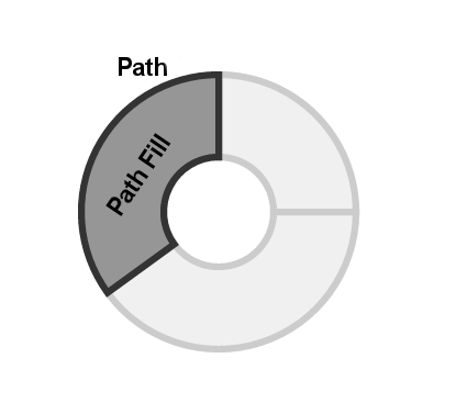
In this tutorial, we are going to show how to create pie charts and donut charts, which are very similar to pie charts with only one difference, their centre is hollow. Those two charts are built using SVG paths. The SVG path is a more advanced shape compared to circles and rectangles, since it uses path commands to create any arbitrary shape we want. So, as you can see in the above figure, a donut chart is composed of multiple arc-like paths, with a different fill colour. Fortunately, d3.js provides a helper functions to draw arcs. Arcs are drawn using 4 main parameters: startAngle, endAngle, innerRadius and outerRadius. The angles are given in radians rather than degrees, so a full circle is 2 π instead of 360 degrees. Bear with me for now, and I will show you a way to enter angles using more meaningful ways later on.

To draw an arc, let’s first add the following SVG tag in our html documents:

<svg id="svg_donut" width="600" height="400"></svg>

Now, to draw an arc that goes from 0 to ¾ of a full rotation, with inner radius of 50 pixels and outer radius of 100 pixels, we need to type the following JavaScript code.

var vis = d3.select("#svg_donut");
var arc = d3.svg.arc()
.innerRadius(50)
.outerRadius(100)
.startAngle(0)
.endAngle(1.5*Math.PI);

vis.append("path")
.attr("d", arc)
.attr("transform", "translate(300,200)");

In the above code, we first select our SVG element using its identifier, “#svg_donut”. We save our selection into a variable called “vis”. d3.svg.arc() is the d3.js helper function that we use rather than the SVG path commands. We give it our previously mentioned 4 parameters and save the result into a variable called “arc”. Now, to actually create the path and append it to our SVG element, we use vis.append(“path”), then assign the “arc” to its “d” attribute. You may consider the “d” attribute as an alternative to the SVG path command.

By default, things are drawn in the top left corner of the SVG element. To move the arc to the center of our SVG, we translate it to (300,200), which our width/2 and height/2 respectively.

The output will look as follows:

Dealing with radian angles is boring. Fortunately, d3.js provides us with another helper functions called scales. It basically helps us mapping one scale, to another. Let’s say, rather than having the full rotation spanning from 0 to 2 π, we want it to be from 0 to 100. All we need to do is to write the following code:

var myScale = d3.scale.linear().domain([0, 100]).range([0, 2 * Math.PI]);

From now on, myScale(0) = 0, myScale(100) = 2 π, myScale(75) = 1.5 π, etc. Thus, the above code can be written as follows now.

var vis = d3.select("#svg_donut");
var myScale = d3.scale.linear().domain([0, 100]).range([0, 2 * Math.PI]);
var arc = d3.svg.arc()
.innerRadius(50)
.outerRadius(100)
.startAngle(myScale(0))
.endAngle(myScale(75));

vis.append("path")
.attr("d", arc)
.attr("transform", "translate(300,200)");

So far, we learnt how to create an arc. Pie or donut charts are composed of multiple arcs the angle of each of them represents the value of one item of our data to the overall data values. In other words if we have 3 mobile brands, A, B and C, where A has 50% of the market share, while B and C, have 25% each. Then we represent them in our charts as 3 arcs with angles of π, π/2 and π/2 respectively. To implement this using the d3.js way, you need to have an array of data and bind it to arcs. As you have seen in the aforementioned tutorial, SVG elements can be created on the fly to match the data they are binded to.

var cScale = d3.scale.linear().domain([0, 100]).range([0, 2 * Math.PI]);

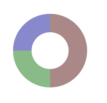
data = [[0,50,"#AA8888"], [50,75,"#88BB88"], [75,100,"#8888CC"]]

var vis = d3.select("#svg_donut");

var arc = d3.svg.arc()
.innerRadius(50)
.outerRadius(100)
.startAngle(function(d){return cScale(d[0]);})
.endAngle(function(d){return cScale(d[1]);});

vis.selectAll("path")
.data(data)
.enter()
.append("path")
.attr("d", arc)
.style("fill", function(d){return d[2];})
.attr("transform", "translate(300,200)");

The data array is composed of 3 data items, each of them is given as an array of 3 values. The first item goes from 0 to 50% of the donut with a background colour of “#AA8888”, the starting angle of the second item should comes right after the first, i.e. 50%, and it goes to 75%, with a background colour of “#88BB88. Similarly, the third item goes from 75% to 100%, with a background colour of “#8888CC”.

To append arcs dynamically based on our data, we select path, bind our data to the selections then append new paths accordingly:

vis.selectAll("path").data(data).enter().

The “startAngle”, “endAngle” and “fill” are grabbed from the data items as shown in red.

The resulting donut looks as follows:

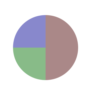
The exact same code can be used to create a pie chart, the only difference is that the value given to the innerRadius() should be set to 0. The resulting pie chart can also be seen below:

Between you and me, there are existing libraries built on top of d3.js than can create pie charts for you with less code. So, why do you need to learn all this? The idea here is to learn the d3.js internal, so you can tweak the above code to suite your needs. An off-the-shelf library can give you a pie chart, or a donut chart. But what about the following charts?

Flattr this!

Documenting Egypt’s Elections Results

- August 20, 2013 in Community, Data for CSOs

With the unfolding events in Egypt, the debate about whether the country is witnessing a coup or a second revolution in less than three years, and the cover of Time magazine tagging the country as the “World’s Worst Democrats”, some might argue that this is not a suitable time to write about grassroots approaches to document election results. In fact, in such an environment, especially in a country that lacks a history of free and fair elections, it is needed to shed light on efforts made by individuals to battle the existing obstacles and to share this experience with others that could take it further into the future.

In the summer of 2012, Egypt had its first post-revolution presidential elections. This was also the country’s first free and fair election in its entire history. Just like everybody there, the local media was not used to covering or documenting elections. Each TV channel or newspaper had a few representatives only in some of the centres where votes were being counted. They followed the process and announced the results once they got them. But the problem was that no one was summing up the results. Additionally, the results being announced were limited to those locations where media representatives were present. Seeing this, Iyad El-Baghdadi and six other Twitter users created a shared spreadsheet and started adding the results there, using the numbers being announced on TV or circulated on social media. According to Iyad, the differences between the results in their sheet and the official ones announced later were less than 1%. So, I decided to ask him for more details about their workflow and how they acquired the numbers.

When it comes to the voting results, Iyad told us that they relied mainly on the results announced by the media, especially news websites, such as Al-Shorouk, Al-Masry Al-Youm, etc. He added that they ignored politically leaning sources. Data published was mainly raw data, and it needed lots of organization and validation from their side. Hence, their workflow was as follows. They set a Google spreadsheet where each contributor had to mention the source of his numbers alongside the numbers themselves. They also agreed on some standards. Uncertain or preliminary data were to be written in italics. When done with a governorate (state), numbers were summed up and then made bold and grey. The person doing the calculations had to list his name next to the calculations. They used the chat feature extensively to resolve conflicting numbers and ask for data validation when needed. The vote counting process took about 30 to 36 hours, so they organised themselves in shifts, benefiting from the fact that the team members were living in different time zones. They repeated the same process again for the runoff results.

Iyad and his team sure gained some experience from similar attempts that took place earlier. Evan Hill (@evanchill), a foreign journalist based in Cairo, collaborated with Hany Rasmy (@hany2m), an Egyptian Twitter user, a few months earlier, to collect and validate the parliamentary election results. The parliamentary elections took place in three stages, between late 2011 and early 2012. The Egyptian governorates were divided among the three stages. Evan and Hany set three separate spreadsheets for each of them. They plotted graphs for the results within their sheets, whereas Iyad told us that some people visualised their data separately.

We finally asked Iyad if he has any tips for anyone who might like to undertake similar work later on. He said that one of the most important things to pay attention to is the spreadsheet’s structure and organization. The more structured it is, the easier it is for participants to collaborate. He also added that the overall process has to be simple, with no technical complexities, however there should be a clear workflow and sort of tradition for participants to follow. The ones moderating the process should act in a professional way, guide others, and make sure no one is there just wasting others’ time or joking. Making the resulting data both human and computer readable encourages others to build on it and produce more in depth analysis and visualisations.

Flattr this!