Data at the Karnataka Learning Partnership
Megha Vishwanath outlines how the Karnataka Learning Parntership have been working to collect and analyse data about public schools in India. Below, Megha talks us through the process of collecting data, how they integrated their information with other data sources, the stories they have already found, and the next steps for the project.

An Introduction to the Karnataka Learning Partnership
The Karnataka Learning Partnership (KLP) was formed as a framework for nonprofits, corporations, academic institutions and citizens to get involved in improving government schools in Karnataka, India. KLP aims to be an independent platform for data collation, visualisation, sharing and data-driven advocacy in Public education.
Infrastructure issues in Government schools and preschools have a domino effect on the whole functioning of a school. KLP reports aggregate data and summarise the status of public education. For more about the KLP, see this post on the OKFN India blog.
KLP’s Reports
At KLP, we try to make information on the status of public schools available, in order to allow elected representatives to better allocate budgets and improve local schools. Last academic year, KLP published overviews on:
- The demographics of government schools and preschools
- Financial allocations to government schools
- Infrastructure of government schools
The reports can be found here. The basic information for a Government school / preschool and the MP and MLA linkages per school is available as raw csv download on the website. Any additional information per school or preschool either from KLP’s database or the DISE database can be provided quickly on request.
We thank our Visualisation experts – Anand S and Rahul Gonsalves for consulting with us pro bono to make these reports meaningful.
The Data: What do we have?
Much of the data was gathered over the past decade by the Akshara Foundation. This data, collected and cleaned up, feeds KLP’s public database. For every school we have at a minimum a category, medium of instruction and DISE code (a unique identifier by which the Education Department publishes data). Additionally for all schools in Bangalore we have addresses, geo location and photo identifiers.
Akshara’s field staff mapped an MP constituency, MLA constituency and Ward name for every school and preschool in Bangalore. At first, some of the data was clearly erroneous. The exercise of collecting information was repeated several times until the numbers seemed acceptable, and until we had a mapping for every government school in Bangalore.
What kind of stories could be told with this data?
Some of the questions we were able to ask of data for this report were:
- How many schools are there in this electoral region? How many students?
- What’s the gender profile?
- What categories of schools exist? What is enrollment per category?
- Which local langauges are spoken, and are there sufficient schools to meet the needs of a multilingual community?
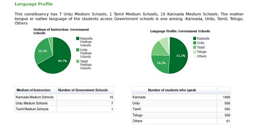
Within the reports, we published comparative graphs. Because the report is meant to be informative, we haven’t indicated e.g. whether 17 Urdu schools would be sufficient for the 938 Urdu speaking children in BTM Layout, Bangalore – but this data would clearly allow others to ask questions and begin drawing conclusions.

Simple ‘group by’ queries of our school table can yield a pie graph like the one above. On our public KLP database we provide aggregated views of the data. This can be grouped by e.g. MLA Constituency and mother tongue via school IDs.
Linking our data with information about government budgets
In order to report on financial allocations to Government schools, we needed more than our own internal data. Therefore we also began to integrate data from two further sources:
1) PAISA is Accountability Initiative’s flagship project, which works to develop innovative models to track social sector programs. From PAISA, we found that Government schools receive funding according to the following measures:
- School Maintenance Grant: Rs. 5,000 for up to 3 classrooms & Rs. 10,000 for >3 classrooms.
- School Grant: Rs. 5,000 for lower primary schools and Rs. 7,000 for upper and model primary schools
- TLM Grant: Rs. 500 per teacher
2) NUEPA-DISE: District Information System for Education’ (DISE) is a public database providing comprehensive information on Government schools across India. Year on year, the database is updated and information on basic identifiers (teachers, compliance with Right to Education, enrollment, financial allocation, school facilities etc) is published. From the DISE database, we could determine the number of classrooms and the number of teaching staff in a school.
More data, more questions..
With more data, there were many more questions that could be answered. For instance, our data now included a table of facilities. So, we could ask:
- How many schools in this electoral region have a play ground?
- How many of them have a library? How many actually have books in the library?
- How many schools have a separate girls toilet?
We did have to apply some of our own assumptions to the flat DISE data in order to assign a binary (0/1) score for each of the facilities for each school. As an example:
- The facilities table has a column –
with values <1> indicating a library exists & <2> indicating that it does not exist. Additionally there’s a column with a numeric count. Only if library = 1 and books_in_library > 0 does it mean that the school has a functional library - The table has columns
& which contain a numeric count. If toilet_common > 0 it means that the school has a common toilet. If toilet_girls > 0 it means that the school has a separate girls’ toilet.
The 11 parameters were summarised to produce the kind of indication below:

Each of the above indicators is a single or composite representation of the larger set of indicators. The colour coding indicates whether the constituency scores better than the chosen sufficiency condition for a particular indicator or not. The question asked of the aggregated data therefore becomes e.g. do 70% of the schools in this constituency have playgrounds?
Allowing for geographical comparisons
Early on in the design of our reports, we understood that it might be useful to compare constituencies with neighbouring areas. A manual exercise of reviewing which constituencies shared boundaries was carried out on publicly visible (but not downloadable) shape files on bbmpelections.in.
The results of sharing these reports
The feedback of our Elected Representatives to these reports have been overwhelming. From “wanting to make mine a Model Constituency” to “please keep me informed about the problems in my area”, these positive responses keep us motivated to publish information. The write up on the team’s experiences in delivering these reports can be found here.
The Technology Behind it All:
The underlying reporting engine is python – web.py based web app reading from a Postgres database that brings in views from the multiple data sources. Python scripts were written for all data scraping, data base creation and cleanup processes. Charting libraries used are from Google Visualization. The report is an HTML5 web page that is styled with CSS and printed off the browser in high quality.
Unicode compliance, to be able to produce a bilingual report was key to this design. The current code repository is on Github
So what next?
- We will be reporting particularly on Library Infrastructure and Learning Outcomes in these constituencies.
- We need in terms of a tech stack a rigourous reporting tool that seamlessly integrates with unicode, print formats / styling and can zoom in and zoom out on the aggregated data based on a selection of geography.
- We intend to integrate these reports if shapes files and proper geocodes be available for all these constituencies on our map page. We also need a map-math based method to determine geographic neighbours or a ward / constituency.
There’s a lot of work ahead of us though these are seemingly simple wants/needs. We invite programming and visualisation enthusiasts to help us do this task better. We welcome all constructive criticism and inputs from the data communities at dev [@] klp.org.in

