Data roundup, March 13
We’re rounding up data news from the web each week. If you have a data news tip, send it to us at [email protected].
TOOLS, COURSES, AND EVENTS
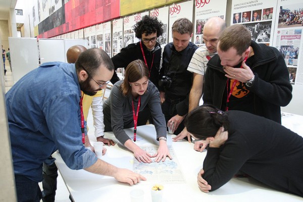
The 21st Malofiej infographics conference is currently taking place in Pamplona. The conference began with the Show, Don’t Tell! workshop and today moves on to the 21st Infographics World Summit. You can follow the event as it unfolds on Facebook.
OpenNews Learning, a new Knight-Mozilla OpenNews project, is a new way to learn the ins and outs of data journalism, providing a series of end-to-end case studies of the data journalism development process. The opening round of case studies include Matt Waite on ethics, Miranda Mulligan on visualization, and Adrian Holovaty on data.
For Journalism has been funded. The Kickstarter-funded project aims to fill “an enormous need and void in existing technical journalism training” by providing expert training in modern journalistic technologies. For Journalism will teach data science, charting and visualization, Django, and much more.
Version 1.2 of DataWrapper was released on Monday. DataWrapper is an open-source tool aimed at data journalists that promises to “[reduce] the time needed to create and embed a simple chart from hours to minutes”.
Another easy-to-use visualization tool, Tableau Desktop, has been made free for students. Tableau Desktop is a visualization suite, “so easy to use that any Excel user can learn it”, that provides a drag-and-drop approach to visual data analysis.
Python TableFu lets you use Python to work with tabular data, allowing “filtering, faceting and manipulating of data” and aiming to one day “create something akin to an ORM for spreadsheets”. It started life as a port of the Ruby gem of the same name but has since added new features of its own.
In other Python data wrangling news, slides from the Data Science London meetup on machine learning in Python are available. Participants in the meetup have been encouraged to post their code at the meetup’s Kaggle page.
Quandl, “a kind of ‘Wikipedia’ of time series data”, is now available as an R package on CRAN. This new package makes each of the 2 million time series datasets indexed on Quandl directly accessible in the R console.
Version control is a very good thing. It is also not necessarily familiar to those without a background in programming. This NICAR-inspired blog post introduces Git, the popular version control system, and shows you how to use it.
DATA STORIES
The SZ DataGraph collects SüdDeutsche.de‘s work in data journalism and visual storytelling. A post announcing the launch of DataGraph highlights some of its many stories and discusses the significance of data journalism to SZ.
Another SZ data storytelling project, the SZ-Europaatlas, has also just been launched. The atlas provides a visual perspective on wealth distribution, education, and other developmental indicators across the EU.
A visualization of the relationships of Twitter employees provides a handsome showcase for Santiago Ortiz’s new network visualization tool. To see how particular individuals in the network evolve over time, click a node and hit “play”.
An analysis of 700 years of Jewish expulsions has been written up in Wired. The data was collected from the Encyclopedia Judaica to explore the possible relationship between weather patterns and persecutions of Jews.
Anticipation of the election of the new Pope has led to a number of visualizations and interactives. Global News produced a series of graphs on two millennia of Papal Names; the Economist made a graph on the same. The Guardian produced an interactive “Pontificator” to explore the range of candidates.
Data mining has been used to find unreported drug side effects, reports the New York Times. Researchers analyzed search engine queries relating to two drugs and discovered evidence of a blood-sugar-raising interaction.
DATA SOURCES
The Wikilinks corpus, “40 million total disambiguated mentions within over 10 million web pages”, has been released by Google Research. The corpus will be a powerful tool for research on coreference resolution and other high-ambiguity domains.
The EuroGlobalMap dataset is now available under an open data license. EuroGlobalMap is a 1:1 million scale topographic dataset useful “for cross-border planning, monitoring and network analysis as well as presenting environmental policies”.
The State of New York opened its new data portal on Monday. According to the press release, the new portal features “economic development, health, recreation, and public services information”.
Three Swedish museums (under one national authority) have collectively released 40,000 images under open licenses. The images are available for browsing through a custom “open-focused search” interface.
The German state of Rhineland-Palatine has opened a government data portal. The portal is built on the OKF’s CKAN platform.


