Data in December: Sharing Data Journalism Love in Tunisia
Ali Rebaie - January 11, 2016 in Data Blog, Data Expeditions, Data for CSOs
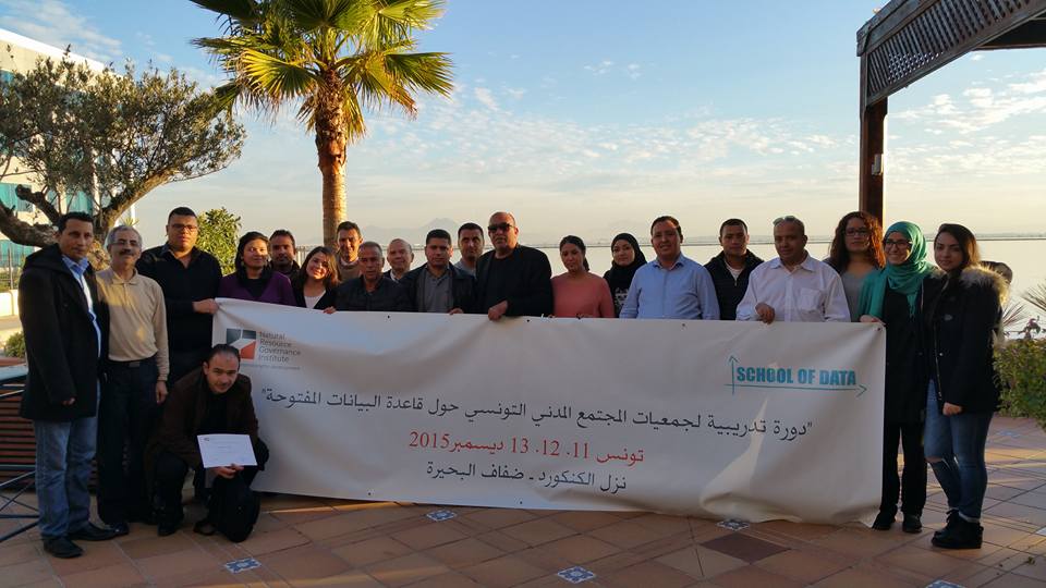
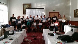
NRGI hosted the event #DataMuseTunisia in collaboration with Data Aurora and School of Data senior fellow Ali Rebaie on the 11th of December 2015 in beautiful Tunis where a group of CSO’s from different NGOs met in the Burge Du Lac Hotel to learn how to craft their datasets and share their stories through creative visuals.
Bahia Halawi, one of the leading women data journalism practitioners in the MENA region and the co-founder at Data Aurora, led this workshop for 3 days. This event featured a group of professionals from different CSO’s. NRGI has been working closely with School of Data for the sake of driving economic development & transparency through data in the extractive industry. Earlier this year NRGI did similar events in Washington, Istanbul, United Kingdom, Ghana, Tanzania, Uganda and many others. The experience was very unique and the participants were very excited to use the open source tools and follow the data pipeline to end up with interactive stories.
The first day started with an introduction to the world of data driven journalism and storytelling. Later on, participants checked out some of the most interesting stories worldwide before working with different layers of the data pipeline. The technical part challenged the participants to search for data related to their work and then scraping it using google spreadsheets, web extensions and scrapers to automate the data extraction phase. After that, each of the participants used google refine to filter and clean the data sets and then remove redundancies ending up with useable data formats. The datasets were varied and some of them were placed on interactive maps through CartoDB while some of the participants used datawrapper to interactively visualize them in charts. The workshop also exposed participants to Tabula, empowering them with the ability of transforming documents from pdfs to excel.
Delegates also discussed some of the challenges each of them faces at different locations in Tunisia. It was very interesting to see  participants share their ideas on how to approach different datasets and how to feed this into an official open data portal that can carry all these datasets together. One of the participants, Aymen Latrach, discussed the problems his team faces when it comes to data transparency about extractives in Tataouine. Other CSO’s like Manel Ben Achour who is a Project Coordinator at I WATCH Organization came already from a technical backgrounds and they were very happy to make use of new tools and techniques while working with their data.
Most of the delegates didn’t come from technical backgrounds however and this was the real challenge. Some of the tools, even when they do not require any coding, mandate the knowledge about some technical terms or ideas. Thus, each phase in the data pipeline started with a theoretical explanatory session to familiarize delegates with the technical concepts that are to be covered. After that, Bahia had to demonstrate the steps and go around the delegates facing any problems to assist them in keeping up with the rest of the group.
It was a little bit messy at the beginning but soon the participants got used to it and started trying out the tools on their own. In reality, trial and error is very crucial to developing the data journalism skills. These skills can never be attained without practice.
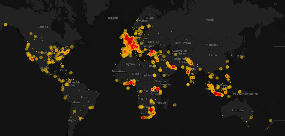
Another important finding, according to Bahia who discussed the importance of the learnt skills to the delegate’s community and workplace, is that each of them had his/her own vision about its use. The fact that the CSO’s had a very good work experience allowed them to have unique visions about the deployment of what they have learnt at their workplaces. This, along with the strong belief in the change open data portals can drive in their country are the only triggers to learning more tools and skills and bringing out better visualizations and stories that impact people around.
The data journalism community 3 years ago was still at a very embryonic stage with few practitioners and data initiatives taking place in Africa and Asia. Today, with enthusiastic practitioners and a community like School of Data spreading the love of data and the spirit of change it can make, the data journalism field has very promising expectations. The need for more initiatives and meet ups to develop the skills of CSOs in the extractive industries as well as other fields remains a priority for reaching out for true transparency in every single domain.
Thank you,
You can connect with Bahia on Twitter @HalawiBahia.
![]()
 program at AUB. The Data team at Data Aurora were really happy sharing this experience with students from different academic backgrounds, including media studies, engineering or business.
 performed. Students were analyzing climate change and later, the AUB media group on Facebook was also analyzed and we had its graph drawn. It was very cool to find out that one of the top influencers in that network was among the students taking the training. Students were also taught to do the same analysis for their own friends’ lists. Facebook data was being collected and the visualizations were being drawn in a network visualization tool.
 user-friendly to reduce the time needed to create a story,” said Jad Melki, Director of media studies program at AUB, “it was great overall.”