You are browsing the archive for Gender Data.

Data is a Team Sport: Data-Driven Journalism

- June 20, 2017 in Community, Data Blog, Event report

Data is a Team Sport is a series of online conversations held with data literacy practitioners in mid-2017 that explores the ever evolving data literacy eco-system.

Cut and paste this link into your podcast app to subscribe: http://feeds.soundcloud.com/users/soundcloud:users:311573348/sounds.rss or find us in the iTunes Store and Stitcher.

[soundcloud url=”https://api.soundcloud.com/tracks/328987340″ params=”color=ff5500&auto_play=false&hide_related=false&show_comments=true&show_user=true&show_reposts=false” width=”100%” height=”166″ iframe=”true” /]

In this episode we speak with two veteran data literacy practitioners who have been involved with developing data-driven journalism teams.

Our guests:

  • Eva Constantaras is a data journalist specialized in building data journalism teams in developing countries. These teams that have reported from across Latin America, Asia and East Africa on topics ranging from displacement and kidnapping by organized crime networks to extractive industries and public health. As a Google Data Journalism Scholar and a Fulbright Fellow, she developed a course for investigative and data journalism in high-risk environments.
  • Natalia Mazotte is Program Manager of School of Data in Brazil and founder and co-director of the digital magazine Gender and Number. She has a Master Degree in Communications and Culture from the Federal University of Rio de Janeiro and a specialization in Digital Strategy from Pompeu Fabra University (Barcelona/Spain). Natalia has been teaching data skills in different universities and newsrooms around Brazil. She also works as instructor in online courses in the Knight Center for Journalism in the Americas, a project from Texas University, and writes for international publications such as SGI News, Bertelsmann-Stiftung, Euroactiv and Nieman Lab.

Notes from this episode

Our first conversation on Data-Driven Journalism featured Eva Constantaras, on her work in developing data-driven journalism teams in Afghanistan and Pakistan, and Natalia Mazotte on her work in Brazil. They discussed what they have learned helping journalists think through how they can use data to drive social change. They agreed that good journalism necessarily includes data-driven approaches in order uncover facts and the root causes of societal problems.

Eva strives to motivate journalists to look beyond the fact that corruption exists and dig deeper into the causes and impacts. She has seen data journalists in Europe and North America making a choice to focus, for example, on polling data rather than breaking down the data behind the candidates’ policies. Eva sees this as a mistake and is committed to making emerging data journalists understand why this is problematic. Finally, Eva made a critique of the approach funders take in the field of data literacy, often putting too much emphasis on short-term solution rather than investing in long-term data capacity building programmes. This is something that School of Data has long struggled with from third-party funders and clients alike. It’s clear that more work needs to be done to explaining what short term programmes can and, more importantly, cannot achieve.

Natalia primarily discussed School of Data Brazil’s Gender and Number project. The project was designed to use data to move the discussion on gender equality past arguments based on traditional roles. She is concerned about the growing ‘data literacy’ gap between those with power, government and corporations, and those without power, people living in the favelas. In Brazil, the media landscape is changing as the mainstream are reporting  on ‘what’s happened’ while independent media is doing the more investigative reporting on ‘why it’s happened’.

They wanted to plug:

Readings/Resources they find inspiring for their work.

Resources contributed from the participants:

View the online conversation in full:

[youtube https://www.youtube.com/watch?v=92kAsMxw-Q4]

Flattr this!

Women’s Rights Campaigning: Info-Activism Toolkit

- October 15, 2014 in Uncategorized

dtm_201307

Tactical Tech

This post was written by Lisa Gutermuth, a project coordinator at Tactical Tech in Berlin. Currently she is working producing the Women’s Rights Campaigning: Info-Activism Toolkit. She has previously focused on land grabbing, crowdmapping, and e-waste for different projects at Tactical Tech and with affiliated organisations.

Tactical Tech is an organisation working to advance the skills, tools and techniques of rights advocates, empowering them to use information and communications to help marginalised communities understand and effect progressive social, environmental and political change.


Trying to figure out how to present evidence of violence in a creative way? A campaign by the India-based Blank Noise project offers us an example of how this can be done.

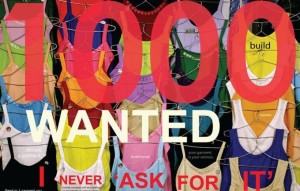
In most parts of the world, a widely-used tactic to discredit women victims of violence is to accuse them of ‘asking for it’ by dressing provocatively. Blank Noise started a campaign called ‘I Never Ask For It’, in which women who had experienced street based sexual harassment were asked to send in photos of the garments that they were wearing when they experienced the harassment. Unsurprisingly, the database of photos was mostly comprised of pictures of school uniforms, burqas, traditional salwar kameez, saris, and jeans and so on: nothing provocative about any of this. These images highlight the very personal side of harassment, while simultaneously creating an understanding among women that they are not alone, as well as working toward wider debate about these kinds of events.


foto1tt


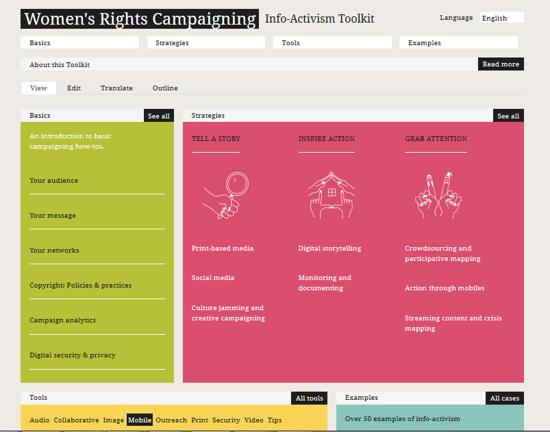
This is one of the examples found in the Women’s Rights Campaigning: Info-Activism Toolkit developed by Tactical Tech.

The toolkit is created for women’s rights activists, advocates, NGOs and community-based organisations who want to use technology tools and practices in their campaigning. The guide was developed as part of CREA‘s New Voices / New Leaders: Women Building Peace and Reshaping Democracy project, which aims to promote security by combating violence against women and enhancing the civil engagement of women in the Middle East, North Africa, South Asia and Sub-Saharan Africa.


foto2


This guide is also a good example of an older project being ‘upcycled’ into something new, updated and relevant to a specific community. The original guides we produced were called Message in-a-Box and Mobiles in-a-Box. CREA, a women’s rights organisation in India, initially approached us to update and customise our toolkits for women’s rights communities.

This gave us a chance to think about a structure and format that would work, and respond to the actual context of how specific communities think about campaigning. Each of the categories included in the guide was carefully considered in the development stages of the project, both because there was a focused community for whom it was being created, and because we had regular feedback from our local partner organisations.

The next step was translating the guide into Hindi, Bengali, Kiswahili, and Arabic. At Tactical Tech we make an effort to integrate localisation into our materials by providing options and resources for translations, as this enables communities to identify more closely with the contents and to read and use it at a more in-depth level. This is also why having the materials printed (i.e. offline) was such an important part of the project, as the communities that need the entry point to learning about the positive use of digital tools are often those most far away from them.

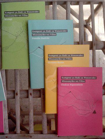
Which brings us to the latest development: the printed toolkits are just off the press! The guide has been printed as a set of four booklets: ‘Basics,’ ‘Grab Attention,’ ‘Tell a Story,’ and ‘Inspire Action,’ representing different strategic themes to use in creating a campaign. The next phase will be distribution – sign up to Tactical Tech’s monthly magazine In the Loop  for updates!


foto3

Flattr this!

Data Roundup, 3 December

- December 3, 2013 in Data Roundup

A course on online mapping, new visualization software, corruption perceptions data, bushfires in Australia through interactive maps, climate change effects infographics, the top 5 tweets of November in data visualization, a gift list for data lovers.

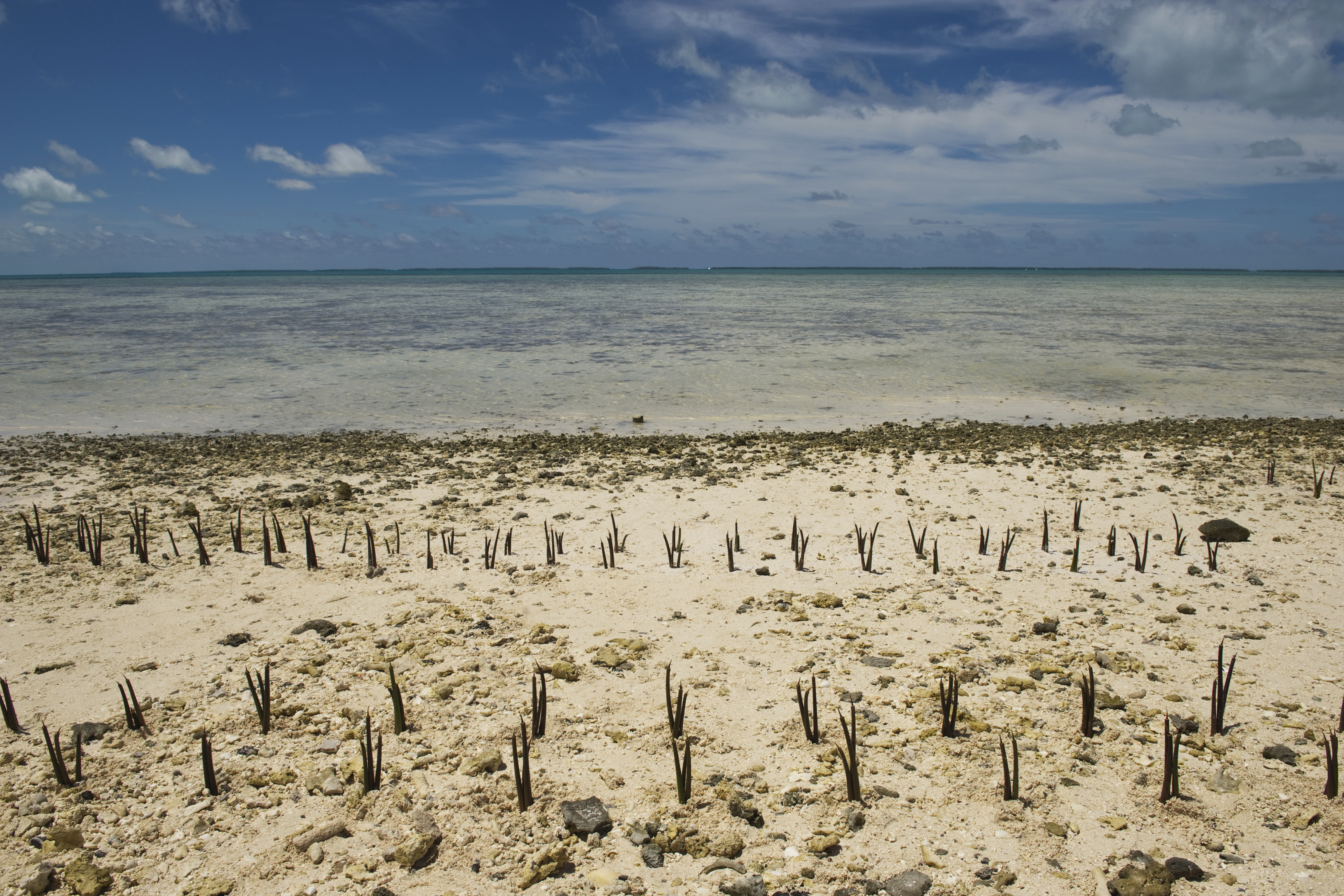
United Nations Photo – Climate Change Effects in Island Nation of Kiribati

Tools, Events, Courses

If you are a wannabe mapper and you need to acquire skills to manage your digital exploration tools you might be interested in registering at the “Online mapping for beginner” course of CartoDB starting on December the 3rd. Hurry up: only few places left!

Daniel Smilkov, Deepak Jagdish and César Hidalgo are three MIT students that developed a visualization tool called Immersion. Immersion helps you visualizing your network of e-mail contacts using only “From”, “To”, “Cc” without taking into account any kind of content.

JavaScript is one of the most common programming language frequently used to create beautiful visualizations. Follow this tutorial from dry.ly if you want to learn it bypassing D3.js. Practice makes perfect!

Data Stories

Yesterday, Transparency International launched it’s annual Corruption Perceptions Index (CPI) ranking countries according to perceived levels of corruption. Have a look at the results and see how your country ranks.

Everyone knows what a bar chart is but have you ever heard about trilinear plots? This post from Alberto Cairo introduces a short consideration on new forms of data representations and on when to break conventions in information design.

The goal of the Digital Methods Initiative of the Amsterdam University is to map and analyze causes, effects and possible future scenarios deriving from climate change. As part of this project, the students from Density Design Research Lab wrote a wonderful post outlining their visual design take on climate change.

Gender inequality is one of those big issues which varies enormously from country to country. If you are wondering what countries have the worst gender gap a look at the map published on the Slate Magazine by Jamie Zimmerman, Nicole Tosh, and Nick McClellan.

There are a lot of visualizations you can make from data coming from social networks, especially from those coming from the biggest one: Facebook. Take a minute to see those posted in this curious article from Armin Grossenbacher: “Visualising (not so) Big Data”.

In Australia bushfires occur frequently. Look at the amazing interactive story that The Guardian published on their history, showing maps with data on temperatures, hectares of land burnt and number of properties damaged.

Not everyone knows that we just passed the World Aids Day on the first of December. Tariq Khokhar reminds us the global situation of the disease in this article from the World Bank Data Blog.

Data Sources

Datavisualization.fr extracted the list of the 5 most influential tweets of November containing the hashtag #dataviz from a database of about 10.100 posts. Read it here and see who did best.

Christimas is getting closer. If you need some good suggestions on what to buy to your friends and parents take a moment to read the FlowingData Gift Guide and you’ll find some interesting data-gifts for your data-lovers.

Flattr this!