First Steps in Identifying Climate Change Denial Networks On Twitter
A week or two ago, a Guardian article declared the Secret funding helped build vast network of climate denial thinktanks. The article described how two grant making trusts were being used to channel funds that were “doled out between 2002 and 2010, [and] helped build a vast network of thinktanks and activist groups working to a single purpose: to redefine climate change from neutral scientific fact to a highly polarising “wedge issue” for hardcore conservatives”.
Inspired by this story, we started to ask ourselves whether we could make any inroads into mapping this network based on the friend and follower networks that are built around the Twitter accounts of groups known to have received that funding. (Here is a list of Twitter accounts for the top 20 (by funding) climate change denial organisations who received funding from the Donors Trust (2002-2011).)
As with any data story, there are several steps we need to walk through: finding the data; getting a copy of the data; tidying the data up so you can actual work with it; a period of analysis (which may include visual analysis – using visualisations to help you analyse the data); and then the exposition of the story you want to tell.
This post falls into the “period of analysis” phase, and demonstrates how we can use a network visualisation approach to start exploring the “social positioning” of the Twitter accounts of groups associated with climate change denial. The idea is this: if we assume that people follow people they are interested in on Twitter, or people follow people who share a similar interest, we can look at who the followers of a particular target individual commonly follow to draw up a “social positioning map” that locates the target individual in some sort of social interest space.
Here’s an example in a slightly different context – bookshops. Books in bookshops tend to be categorised in different ways. Firstly, we have fiction and non-fiction; then we have further subdivisions: fiction books may include crime, or science-fiction, or “general”; non-fiction may include topics like history, transport, psychology, for example. If we take one particular author, such as Nobel prize-winning physicist Richard Feynman, we may find that people who buy his books (that is, people who in a certain sense “follow” Richard Feynman) also tend to buy (“follow”) books by Stephen Hawking or James Gleick, William Gibson, or maybe even Steven Hampton… If we map out the authors commonly bought by the purchasers of Feynman’s books, grouping them so that authors who tend to be bought by the same people are close together, we can generate a map that “socially positions” Feynman relative to other authors, based on the shared interests of their common followers. Reading this map might show us how Feynman is close (in interest space) to other physicists, for example, or popular science writers. The map might also reveal niche interests, such as lock-picking! Using Feynman – a known physicist – as a seed, we can generate a map of other people who represent similar interests based on the behaviour of their followers, and through those followers turn up interests we might not otherwise have been aware of. (For an expanded description of this idea in the Twitter context, see the BBC College of Journalism post: How to map your social network.)
So how does this relate to climate change denial networks on Twitter?
Although not published as open data, many social networks do make data publicly available that we can use for “personal research” purposes… Often, this data is published in ways that are amenable to automated collection and analysis through APIs, interfaces that provide programmable access to an application rather than the web site or app we might use. (In fact, the APIs typically provide the plumbing that connects the app or webpage to the application provides “back end”.) The Twitter API provides a means for grabbing the lists of the friends, or followers, of a particular account, and looking up basic, public information about those accounts.
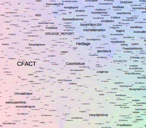
For each of the target Twitter accounts identified above, we grabbed a sample of 997 of their followers, along with the friends lists of each of those follower samplers. We then generated a network file for each target that includes the target account’s followers and the people followed by at least 50 followers of the target account. Which is where this post begins… with a quick visual analysis of the accounts commonly followed by the followers of @CFACT. Here’s a tease of the sort of thing we’re looking for…
If you want to play along, you can download the CFACT social positioning network data. You will need to unzip the file in order to make use of it.
The tool we’re going to use to explore the data is the open source, cross-platform application Gephi. (It does require Java, though…) Download Gephi here.
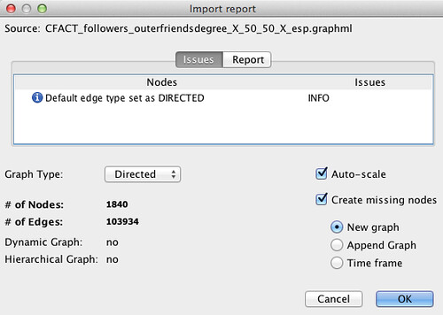
We can load the data file into Gephi using the File-Open menu option – the file dialogue gives us some basic information about the network data, which all looks fine; we can accept the defaults as they stand.
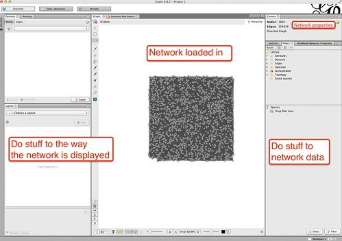
Once loaded in, a preview view of the network, randomly laid out, appears in the central Graph panel. (Mouse wheel or up-down slide on a trackpad can be used to zoom in and out using the cursor as the focal point. It’s a bit fiddly at first, but you soon get used to it… If you lose the graph, the magnifying glass icon in the toolbar along the lefthand side of the Graph panel will centre and resize the graph for you.) The tabs to the right contain tools for working with the graph and analysing the data numerically. Tools are provided for running netwrok statistics as well as filtering the network to highlight certain elements within it. The panels on the left hand side contain tools for working with the visual layout; the toolbar at the bottom of the Graph panel also has tools for working with the display of the graph.
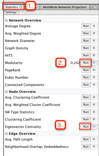
If you select the Statistics tab on the right hand side of the desktop, you will see a range of network statistics you can apply over the network. We’re going to use two – the Modularity statistic, which tries to group the nodes based on how highly connected they are to each other; and Eigenvector centrality, which gives a measure of how “influential” a node is, based on how many people follow the node and how “influential” they are. You can apply the statistics by clicking the appropriate Run button. A pop-up dialogue will appear for each, but we can just accept the default settings for now. Running each report also results in a report dialogue. We really should look at these, but for now just cancel them… (trust me;-)
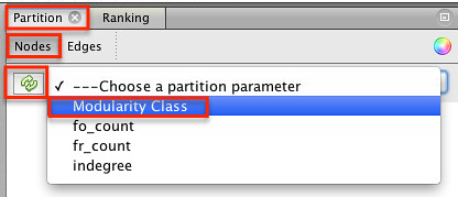
We’re now going to use the values we calculated by running the statistics to colour the graph (that is, the network). Select the Partition panel, and the node tab. Click on the recycle arrow to load in the grouping parameters we can colour the graph by, and select the Modularity.
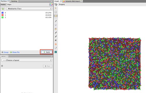
In this case, the Modularity statistic found three groups, and has coloured them randomly.
(You can change the colours if you want by right-clicking within the panel and selecting Randomise Colours or by click-and-hold over a colour option to pop up a colour selection palette. I often select pastel colours because it makes labels on the graph easier to read.)
If you Apply the colour selection, the nodes will be coloured correspondingly.
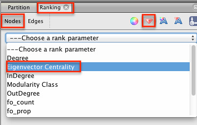
We can also change the size of the nodes to reflect their relative importance within the graph, as given by their eigenvector centrality value. Select the Ranking panel and choose the diamond icon. Select the Eigenvector Centrality as the dimension we will use to size the nodes.
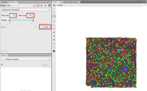
Now set appropriate minimum and maximum node sizes. (The Spline option defines how the Eigenvector Centrality values (in this case) actually map on to node sizes…) If you Apply the settings, you should see the nodes are resized.
That’s all very well, but still not that informative. We can now work some magic using the Layout settings:
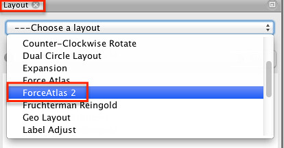
There are lots of different layout tools, and they each have their own strengths and weaknesses. The Force Atlas 2 algorithm was designed specifically for Gephi, and generates layouts that we can read as maps, grouping nodes that tend to be connected to each other in an effective way.
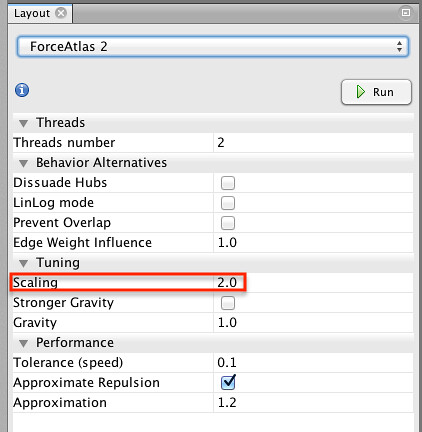
The are quite a few parameters associated with this layout algorithm, but the default settings often provide a good start. (If you use Gephi a lot, you soon start to develop your own aesthetic preferences…)
Now for the magic – click the Run button and watch the nodes fly! Sometimes the layout settles and stops running of it’s own accord; other times you need to stop it running explicitly.
If you find the nodes are too close together, increase the Scaling value and Run the layout tool again.
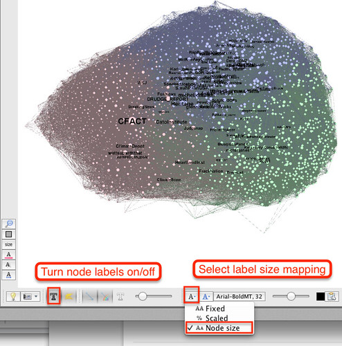
So now we have laid out our graph – what does it say? In this case, I read it as you would a geographical map. The colours represent interest countries and the nodes are cities. (The lines (also referred to as edges) show how nodes are connected to each other through following relationships.)
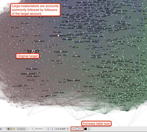
We can label the “city” nodes using a font size proportional to the node size to see, at a glance, which are the more important ones.
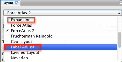
If you zoom in the graph, you may notice that a lot of labels overlap and the view is quite cluttered. One way of separating out the nodes is to tweak the ForceAtlas2 settings and rerun it. Increasing the scale separates out the graph, for example. Two other layout tools can also help us. The Expansion tool will stretch the layout out (or shrink it if you choose a scaling factor less than 1.); and the Label Adjust tool that moves nodes around that are in view (so it can be worth zooming in to cluttered areas and running this tool…) so that they don’t overlap.
If you do a bit of fiddling with the those two tools, you can start to generate something like this:
(If it all goes horribly wrong, just run the ForceAtlas2 layout again!)
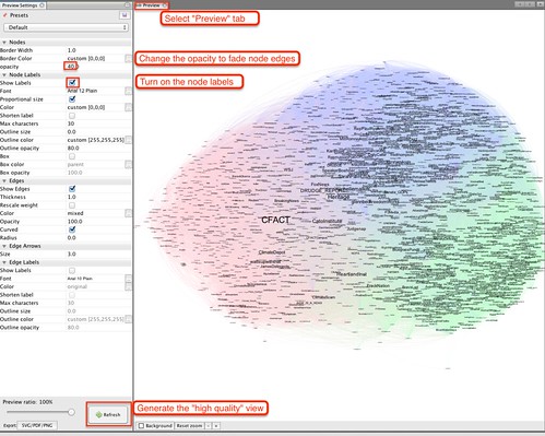
To generate a “print quality” version of the network, we can go to the Preview panel:
(To go back to the original view, click on the Overview button.)
The key Preview settings to know for now are Node labels/Show labels (to display the node labels) and Refresh, which generates a vector view of the graph displayed in the Graph panel. When you generate the preview, you may notice the node labels are the wrong size, overlapping etc.
You can tweak the node font size and refresh the preview, or go back to the Graph view and play with the layout tools again (expanding the network layout, using the slider to increase the displayed font size and using the Label Adjust tool to “un-overlap” labels in view. (It sounds complicated, but you do soon find an effective workflow – honestly!)
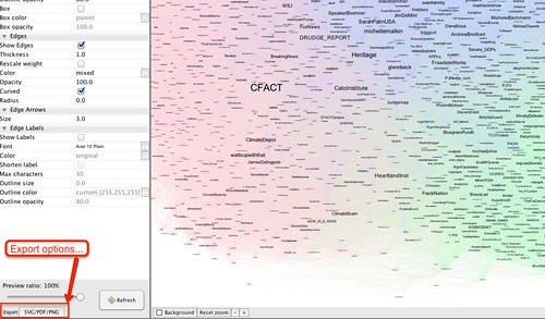
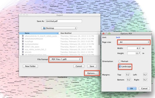
With a bit more fiddling we can get a prettier layout that we can export as PDF, SVG or a PNG graphic:
Use your judgement when selecting landscape or profile views. Exporting the file in a PDF or SCVG format means that you can zoom in to view detail clearly.
(One thing to bear in mind is that large, highly connected networks can generate large files!)
If you want to see the result of my attempt, here it is: Get the @CFACT followers’ common friends network [PDF].
If you would like to try generating maps for some of the Twitter accounts associated with the other top 20 Donor’s Trust climate change denial groups, we have the data – please get in touch for a download link.
In the next post, we’ll explore in a little more detail what distinguishes the make up of the different groups and who is most influential in these groups…

