You are browsing the archive for Tony Hirst.

Easy Access to World Bank and UN Development Data from IPython Notebooks

- September 12, 2014 in Uncategorized

Although more and more data is being published in an open format, getting hold of it in a form that you can quickly start to work with can often be problematic. In this post, I’ll describe one way in which we can start to make it easier to work with data sets from remote data sources such as the World Bank, the UN datastore and the UN Population division from an IPython Notebook data analysis environment.

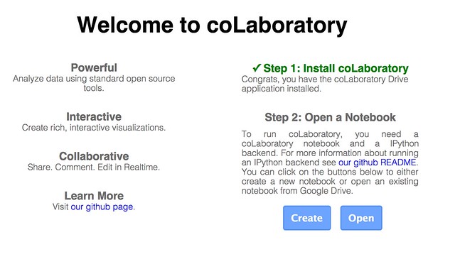
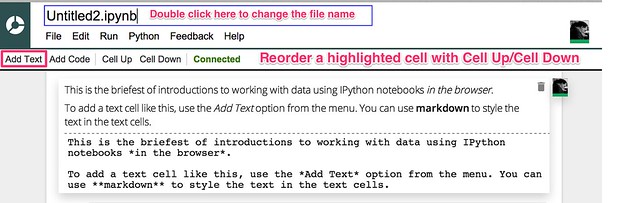
For an example of how to run an IPython Notebook in a Chrome browser as a browser extension, see Working With Data in the Browser Using python – coLaboratory. Unfortunately, of the wrappers described in this post, only the tools for accessing World Bank Indicators will work – the others currently require libraries to be installed that are not available within the coLaboratory extension.

The pandas Python library is a programming library that provides powerful support for working with tabular datasets. Data is loaded into a dataframe, the rows and columns of which can be manipulated in much the same way as the rows or columns of a spreadsheet in a spreadsheet application. For example, we can easily find the sum of values in a column of numbers, or the mean value; or we can add values from two or more columns together. We can also run grouping operations, a bit like pivot tables, summing values from all rows associated with a particular category as described by a particular value in a category column.

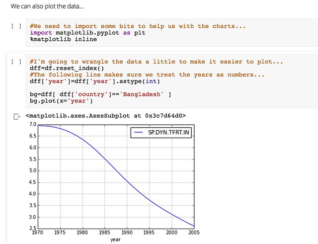
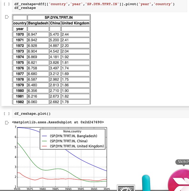
Dataframes can also be “reshaped” so we can get the data into a form that looks like the form we want to be.

But how do we get the data into this environment? One way is to load in the data from a CSV file or Excel spreadsheet file, either one that has been downloaded to our desktop, or one that lives on the web and can be identified by a URL. Another approach is to access the data directly from a remote API – that is, a machine readable interface that allows the data to be grabbed directly from a data source as a data feed – such as the World Bank indicator data API.

On most occasions, some work is needed to transform the data received from the remote API into a form that we can actually work with it, such as a pandas dataframe. However, programming libraries may also be provided that handle this step for you – so all you need to do is load in the programming library and then simply call the data in to a dataframe.

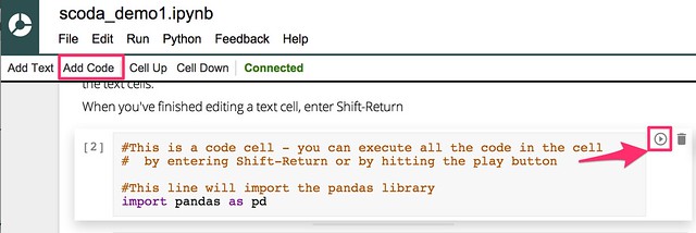
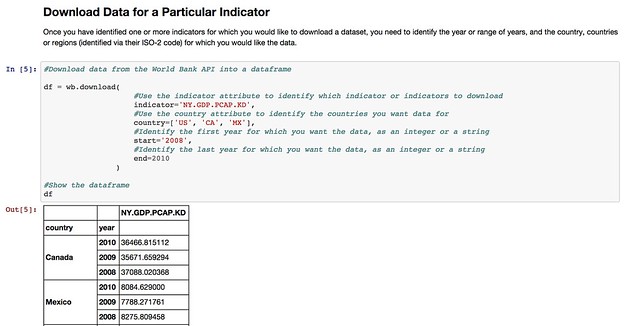
The pandas library offers native support for pulling data from several APIs, including the World Bank Development Indicators API. You can see an example of it in action in this example IPython notebook: World Bank Indicators API – IPython Notebook/pandas demo.

nbviewer_ipython_org_github_psychemedia_dataviz4development_blob_master_dataloaders_World_Bank_Demo_ipynb

Whilst the World Bank publishes a wide range of datasets, there are plenty of other datasets around that deal with other sorts of development related data. So it would be handy if we could access data from those sources just as easily as we can the World Bank Development Indicators data.

In some cases, the data publishers may offer an API, in which case we can write a library a bit like the pandas remote data access library for the World Bank API. Such a library would “wrap” the API and allow us to make calls directly to it from an IPython notebook, getting the data back in the form of a pandas dataframe we can work with directly.

Many websites, however, do not publish an API – or occasionally, if they do, the API may be difficult to work with. On the other hand, the sites may publish a web interface that allows us to find a dataset, select particular items, and then download the corresponding data file so that we can work with it.

This can be quite a laborious process though – rather than just pulling a dataset in to a notebook, we have to go to the data publisher’s site, find the data, download it to our desktop and then upload it into a notebook.

One solution to this is to write a wrapper that acts as a screenscraper, which does the work of going to the data publisher’s website, find the data we want, downloading it automatically and then transforming it into a pandas dataframe we can work with.

In other words, we can effectively create our own ad hoc data APIs for data publishers who have published the data via a set of human useable webpages, rather than a machine readable API.

A couple of examples of how to construct such wrappers are linked to below – they show how the ad hoc API can be constructed, as well as demonstrating their use – a use as simple as using the pandas remote data access functions show above.

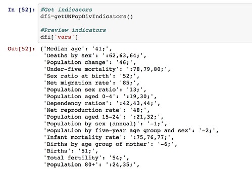
  • The UN Department of Social and Economic Affairs Population Division on-line database makes available a wide range of data relating to population statistics. Particular indicators and the countries you require the data for are selected from two separate listboxes, and the data is then downloaded as a CSV file. By scraping the contents of the list boxes, we can provide a simple command based interface for selecting a dataset containing data fro the desired indicators and countries, automatically download the data and parse it into a pandas dataframe: UN Population Division Data API.

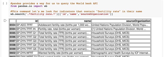
    So for example, we can get a list of indicators:
    nbviewer2_ipython_org_github_psychemedia_dataviz4development_blob_master_dataloaders_UN_Population_Division_Data_API_ipynb

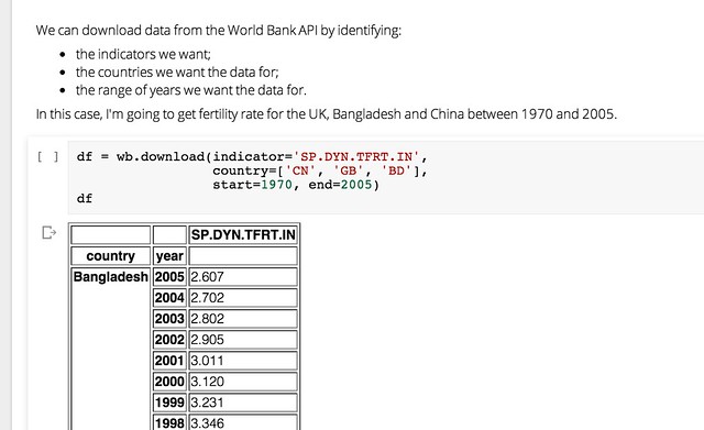
    We can also get a list of countries (that we can search on) and then pull back the required data for the specified countries and indicators.
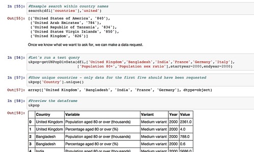
    nbviewer_ipython_org_github_psychemedia_dataviz4development_blob_master_dataloaders_UN_Population_Division_Data_API_ipynb.

    Note that the web interface limits how many countries and indicators can be specified in any single data download request. We could cope with this in our ad hoc API by making repeated calls to the UN website if we want to get a much wider selection of data, aggregating the results into a a single dataframe before presenting them back to the user.

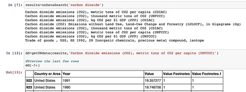
  • The UNdata website publishes an official XML API, but I couldn’t make much (quick) sense of it when I looked at it, so I made a simple scraper for the actual website that allows me to request data by searching for an indicator, pulling back the list of results, and then downloading the data I want as a CSV file from a URL contained within the search results and parsing it into a pandas dataframe: UNdata Informal API.

    nbviewer_ipython_org_github_psychemedia_dataviz4development_blob_master_dataloaders_UNdata_Informal_API_ipynb

By using such libraries, we can make it much easier to pull data into the environments within which we actually want to work with the data. We can also imagine creating “linked” data access libraries that can pull datasets from multiple sources and then merge them together – for example, we might pull back data from both the World Bank and the UN datastore into a single dataframe.

If there are any data sources that you think are good candidates for opening up in this sort of way, so that the data can be pulled more easily from them, please let us know via the comments below.

And if you create any of your own notebooks to analyse the data from any of the sources described above, please let us know about those too:-)

Flattr this!

Seven Ways to Create a Storymap

- August 25, 2014 in Data Stories, HowTo

If you have a story that unfolds across several places over a period of time, storymaps can provide an engaging interactive medium with which to tell the story. This post reviews some examples of how interactive map legends can be used to annotate a story, and then rounds up seven tools that provide a great way to get started creating your own storymaps.

Interactive Map Legends

The New York Times interactives team regularly come up with beautiful ways to support digital storytelling. The following three examples all mahe use of floating interactive map legends to show you the current location a story relates to as they relate a journey based story.

Riding the Silk Road, from July 2013, is a pictorial review featuring photographs captured from a railway journey that follows the route of the Silk Road. The route is traced out in the map on the left hand side as you scroll down through the photos. Each image is linked to a placemark on the route to show where it was taken.

Riding_the_New_Silk_Road_-_Interactive_Feature_-_NYTimes_com

The Russia Left Behind tells the story of a 12 hour drive from St. Petersburg to Moscow. Primarily a textual narrative, with rich photography and video clips to illustrate the story, an animated map legend traces out the route as you read through the story of the journey. Once again, the animated journey line gives you a sense of moving through the landscape as you scroll through the story.

The_Russia_Left_Behind

A Rogue State Along Two Rivers, from July 2014, describes the progress made by Isis forces along the Tigris and Euphrates Rivers is shown using two maps. Each plots the course of one of the rivers and uses place linked words and photos to tell the story of the Isis manoeuvres along each of the river ways. An interactive map legend shows where exactly along the river the current map view relates to, providing a wider geographical context to the local view shown by the more detailed map.

A_Rogue_State_Along_Two_Rivers_-_NYTimes_com

All three of these approaches help give the reader a sense of motion though the journey traversed that leads the narrator being in the places described at different geographical storypoints described or alluded to in the written text. The unfolding of the map helps give the reader the sense that a journey must be taken to get from one location to another and the map view – and the map scale – help the reader get a sense of this journey both in terms of the physical, geographical distance it relates to and also, by implication, the time that must have been expended on making the journey.

A Cartographic Narrative

Slave Revolt in Jamaica, 1760-1761, a cartographic narrative, a collaboration between Axis Maps and Harvard University’s Vincent Brown, describes itself as an animated thematic map that narrates the spatial history of the greatest slave insurrection in the eighteenth century British Empire. When played automatically, a sequence of timeline associated maps are played through, each one separately animated to illustrate the supporting text for that particular map view. The source code is available here.

Jamaican_Slave_Revolt

This form of narrative is in many ways akin to a free running, or user-stepped, animated presentation. As a visual form, it also resembles the pre-produced linear cut scenes that are used to set the scene or drive the narrative in an interactive computer game.

Creating you own storymaps

The New York Times storymaps use animated map legends to give the reader the sense of going on a journey by tracing out the route being taken as the story unfolds. The third example, A Rogue State Along Two Rivers also makes use of a satellite map as the background to the story, which at it’s heart is nothing more than a set of image markers placed on to an an interactive map that has been oriented and constrained so that you can only scroll down. Even though the maps scrolls down the page, the inset legend shows the route being taken may not be a North-South one at all.

The linear, downward scroll mechanic helps the reader feel as if they are reading down through a story – control is very definitely in the hands of the author. This is perhaps one of the defining features of the story map idea – the author is in control of unraveling the story in a linear way, although the location of the story may change. The use of the map helps orientate the reader as to where the scenes being described in the current part of the story relate to, particularly any imagery.

Recently, several tools and Javascript code libraries have been made available from a variety of sources that make it easy to create your own story maps within which you can tell a geographically evolving story using linked images, or text, or both.

Knight Lab StoryMap JS

The Knight Lab StoryMap JS tool provides a simple editor synched to a Google Drive editor that allows you to create a storymap as a sequence of presentation slides that each describe a map location, some header text, some explanatory text and an optional media asset such as an image or embedded video. Clicking between slides animates the map from one location to the next, showing a line between consecutive points to make explicit the linkstep between them. The story is described using a custom JSON data format saved to the linked Google Drive account.

knightStoryMap_editor

[StoryMapJS code on Github]

CartoDB Odyssey.js

Odyssey.js provides a templated editing environment that supports the creation of three types of storymap: a slide based view, where each slide displays a location, explanatory text (written using markdown) and optional media assets; a scroll based view, where the user scrolls down through a stroy and different sections of the story trigger the display of a particular location in a map view fixed at the top of the screen; and a torque view which supports the display and playback of animated data views over a fixed map view.

Odyssey_js_Sandbox

A simple editor – the Odyssey sandbox – allows you to script the storymap using a combination of markdown and map commands. Storymaps can be published by saving them to a central githib repository, or downloaded as an HTML file that defines the storymap, bundled within a zip file that contains any other necessary CSS and Javascript files.

[Odyssey.js code on Github]

Open Knowledge TimeMapper

TimeMapper is an Open Knowledge Labs project that allows you to describe location points, dates, and descriptive text in a Google spreadsheet and then render the data using linked map and timeline widgets.

Create_-_TimeMapper_-_Make_Timelines_and_TimeMaps_fast__-_from_the_Open_Knowledge_Foundation_Labs

[Timemapper code on Github]

JourneyMap (featuring waypoints.js

JourneyMap is a simple demonstration by Keir Clarke that shows how to use the waypoints.js Javascript library to produce a simple web page containing a scrollable text area that can be used to trigger the display of markers (that is, waypoints) on a map.

Journey_Map

[waypoints.js on Githhub; JourneyMap src]

Google Earth TourBuilder

Google Earth TourBuilder is a tool for building interactive 3D Google Earth Tours using a Google Earth browser plugin. Tours are saved (as KML files?) to a Google Drive account.

Tour_Builder

[Note: Google Earth browser plugin required.]

ESRI/ArcGIS Story Maps

ESRI/ArcGIS Story Maps are created using an online ArcGIS account and come in three type with a range of flavours for each type: “sequential, place-based narratives” (map tours), that provide either an image carousel (map tour) that allows you to step through a sequence of images that are displayed separately alongside a map showing a corresponding location or a scrollable text (map journal) with linked location markers (the display of half page images rather than maps can also be triggered from the text); curated points-of-interest lists that provide a palette of images, each member of which can be associated with a map marker and detailed information viewed via a pop-up (shortlist), a numerically sequence list that displays map location and large associated images (countdown list), and a playlist that lets you select items from a list and display pop up infoboxes associated with map markers; or map comparisons provided either as simple tabbed views that allow you to describe separate maps, each with its own sidebar description, across a series of tabs, with separate map views and descriptions contained within an accordion view, and swipe maps that allow you to put one map on top of another and then move a sliding window bar across them to show either the top layer or the lower layer. A variant of the swipe map – the spyglass view alternatively displays one layer but lets you use a movable “spyglass” to look at corresponding areas of the other layer.

App_List___Story_Maps

[Code on github: map-tour (carousel) and map journal; shortlist (image palette), countdown (numbered list), playlist; tabbed views, accordion map and swipe maps]

Leaflet.js Playback

Leaflet.js Playback is a leaflet.js plugin that allows you to play back a time stamped geojson file, such as a GPS log file.

LeafletPlayback

[Code on Github]

Summary

The above examples describe a wide range of geographical and geotemporal storytelling models, often based around quite simple data files containing information about individual events. Many of the tools make a strong use of image files as pat of the display.

it may be interesting to complete a more detailed review that describes the exact data models used by each of the techniques, with a view to identifying a generic data model that could be used by each of the different models, or transformed into the distinct data representations supported by each of the separate tools.

UPDATE 29/8/14: via the Google Maps Mania blog some examples of storymaps made with MapboxGL, embedded within longer form texts: detailed Satellite views, and from the Guardian: The impact of migrants on Falfurrias [scroll down]. Keir Clarke also put together this demo: London Olympic Park.

UPDATE 31/8/14: via @ThomasG77, Open Streetmap’s uMap tool (about uMap) for creating map layers, which includes a slideshow mode that can be used to create simple storymaps. uMap also provides a way of adding a layer to map from a KML or geojson file hosted elsewhere on the web (example).

Flattr this!

Working With Data in the Browser Using python – coLaboratory

- August 20, 2014 in Data Blog

IPython notebooks are attracting a lot of interest in the world of data wrangling at the moment. With the pandas code library installed, you can quickly and easily get a data table loaded into the application and then work on it one analysis step at a time, checking your working at each step, keeping notes on where your analysis is taking you, and visualising your data as you need to.

If you’ve ever thought you’d like to give an IPython notebook a spin, there’s always been the problem of getting it up and running. This either means installing software on your own computer and working out how to get it running, finding a friendly web person to set up an IPython notebook server somewhere on the web that you can connect to, or signing up with a commercial provider. But now there’s another alternative – run it as a browser extension.

An exciting new project has found a way of packaging up all you need to run an IPython notebook, along with the pandas data wrangling library and the matplotlib charting tools inside an extension you can install into a Chrome browser. In addition, the extension saves notebook files to a Google Drive account – which means you can work on them collaboratively (in real time) with other people.

The project is called coLaboratory and you can find the extension here: coLaboratory Notebook Chrome Extension. It’s still in the early stages of development, but it’s worth giving a spin…

Once you’ve downloaded the extension, you need to run it. I found that Google had stolen a bit more access to my mac by adding a Chrome App Launcher to my dock (I don’t remember giving it permission to) but launching the extension from there is easier than hunting for the extension menu (such is the way Google works: you give it more permissions over your stuff , and it makes you think it’s made life easier for you…).

When you do launch the app, you’ll need to give the app permission to work with your Google Drive account. (You may notice that this application is built around you opening yourself up to Google…)

Once you’ve done that, you can create a new IPython notebook file (which has an .ipynb file suffix) or hunt around your Google Drive for one.

CoLaboratory_Notebook

If you want to try out your own notebook, I’ve shared an example here that you can download, add to your own Google Drive, and then open in the coLaboratory extension.

Here are some choice moments from it…

The notebooks allow us to blend text (written using markdown – so you can embed images from the web if you want to! – raw programme code and the output of executing fragments of programme code. Here’s an example of entering some text…

coLaboratory_Notebook_text

(Note – changing the notebook name didn’t seem to work for me – the change didn’t appear in my Google Drive account, the file just retained it’s original “Untitled” name:-(

We can also add executable python code:

coLaboratory_Notebook_code

pandas is capable of importing data from a wide variety of filetypes, either in a local file directory or from a URL. It also has built in support for making requests from the World Bank indicators data API. For example, we can search for particular indicators:

coLaboratory_Notebook_wb

Or we can download indicator data for a range of countries and years:

coLaboratory_Notebook_wb_data

We can also generate a visualisation of the data within the notebook inside the browser using the matplotlib library:

coLaboratory_Notebook_plot

And if that’s not enough, pandas support for reshaping data so that you can get it into a from what the plotting tools can do even more work for you means that once you learn a few tricks (or make use of the tricks that others have discovered), you can really start putting your data to work… and the World Bank’s, and etc etc!

coLaboratory_Notebook_reshape

Wow!

The coLaboratory extension is a very exciting new initiative, though the requirement to engage with so many Google services may not be to everyone’s taste. We’re excited to hear about what you think of it – and whether we should start working on a set of School Of Data IPython Notebook tutorials…

Flattr this!

From Storymaps to Notebooks

- June 16, 2014 in HowTo

Construct your story: What is a storymap and how can we use technical tools to build narratives?

Storymaps can be used to visualize a linear explanation of the connections and relations between a set of geotemporarly distributed events.

In my recent presentation, I explore these topics. The talk was given at Digital Pedagogy: transforming the interface between research and learning?, hosted by KCL on behalf of the Hestia Project.

Flattr this!

Putting Points on Maps Using GeoJSON Created by Open Refine

- May 19, 2014 in Data for CSOs, HowTo

Having access to geo-data is one thing, quickly sketching it on to a map is another. In this post, we look at how you can use OpenRefine to take some tabular data and export it in a format that can be quickly visualised on an interactive map.

At the School of Data, we try to promote an open standards based approach: if you put your data into a standard format, you can plug it directly into an application that someone else has built around that standard, confident in the knowledge that it should “just work”. That’s not always true of course, but we live in hope.

In the world of geo-data – geographical data – the geojson standard defines a format that provides a relatively lightweight way of representing data associated with points (single markers on a map), lines (lines on a map) and polygons (shapes or regions on a map).

Many applications can read and write data in this format. In particular, Github’s gist service allows you to paste a geojson data file into a gist, whereupon it will render it for you (Gist meets GeoJSON).

Gists_and_test

So how can we get from some tabular data that looks something like this:

simple_geo_points-tab_-_OpenRefine

Into the geojson data, which looks something like this?

{"features": [   {"geometry": 
        {   "coordinates": [  0.124862,
                 52.2033051
            ],
            "type": "Point"},
         "id": "Cambridge,UK",
         "properties": {}, "type": "Feature"
    },
   {"geometry": 
        {   "coordinates": [ 151.2164539,
                 -33.8548157
            ],
            "type": "Point"},
         "id": "Sydney, Australia",
         "properties": {}, "type": "Feature"
    }], "type": "FeatureCollection"}

[We’re assuming we have already geocoded the location to get latitude and longitude co-ordinates for it. To learn how to geocode your own data, see the School of Data lessons on geocoding or this tutorial on Geocoding Using the Google Maps Geocoder via OpenRefine].

One approach is to use OpenRefine [openrefine.org]. OpenRefine allows you to create your own custom export formats, so if we know what the geojson is supposed to look like (and the standard tells us that) we can create a template to export the data in that format.

Steps to use Open Refine:

Locate the template export tool is in the OpenRefine Export drop-down menu:

export-_OpenRefine

Define the template for our templated export format. The way the template is applied is to create a standard header (the prefix), apply the template to each row, separating the templated output for each row by a specified delimiter, and then adding a standard footer (the suffix).

simple_geo_points_-_OpenRefine

Once one person has worked out the template definition and shared it under an open license, the rest of us can copy it, reuse it, build on it, improve it, and if necessary, correct it…:-) The template definitions I’ve used here are a first attempt and represent a proof-of-concept demonstration: let us know if the approach looks like it could be useful and we can try to work it up some more.

It would be useful if OpenRefine supported the ability to save and import different template export configuration files, perhaps even allowing them to be imported from and save to a gist. Ideally, a menu selector would allow column names to be selected from the current data file and then used in template.

Here are the template settings for template that will take a column labelled “Place”, a column named “Lat” containing a numerical latitude value and a column named “Long” containing a numerical longitude and generate a geojson file that allows the points to be rendered on a map.

Prefix:

{"features": [

Row template:

 {"geometry": 
        {   "coordinates": [ {{cells["Long"].value}},
                {{cells["Lat"].value}}
            ],
            "type": "Point"},
         "id": {{jsonize(cells["Place"].value)}},
         "properties": {}, "type": "Feature"
    }

Row separator:

,

Suffix:

], "type": "FeatureCollection"}

This template information is also available as a gist: OpenRefine – geojson points export format template.

Another type of data that we might want to render onto a map is a set of markers that are connected to each other by lines.

For example, here is some data that could be seen as describing connections between two places that are mentioned on the same data row:

point_to_point_demo_tab_-_OpenRefine

The following template generates a place marker for each place name, and also a line feature that connects the two places.

Prefix:

{"features": [

Row template:

 {"geometry": 
        {   "coordinates": [ {{cells["from_lon"].value}},
                {{cells["from_lat"].value}}
            ],
            "type": "Point"},
         "id": {{jsonize(cells["from"].value)}},
         "properties": {}, "type": "Feature"
    },
{"geometry": 
        {   "coordinates": [ {{cells["to_lon"].value}},
                {{cells["to_lat"].value}}
            ],
            "type": "Point"},
         "id": {{jsonize(cells["to"].value)}},
         "properties": {}, "type": "Feature"
    },
{"geometry": {"coordinates": 
[[{{cells["from_lon"].value}}, {{cells["from_lat"].value}}], 
[{{cells["to_lon"].value}}, {{cells["to_lat"].value}}]], 
"type": "LineString"}, 
"id": null, "properties": {}, "type": "Feature"}

Row separator:

,

Suffix:

], "type": "FeatureCollection"}

If we copy the geojson output from the preview window, we can paste it onto a gist to generate a map preview that way, or test it out in a geojson format checker such as GeoJSONLint:

GeoJSONLint_-_Validate_your_GeoJSON

I have pasted a copy of the OpenRefine template I used to generate the “lines connecting points” geojson here: OpenRefine export template: connected places geojson.

Finally, it’s worth noting that if we can define a standardised way of describing template generated outputs from tabular datasets, libraries can be written for other programming tools or languages, such as R or Python. These libraries could read in a template definition file (such as the gists based on the OpenRefine export template definitions that are linked to above) and then as a direct consequence support “table2format” export data format conversions.

Which makes me wonder: is there perhaps already a standard for defining custom templated export formats from a tabular data set?

Flattr this!

Mapping Social Positioning on Twitter

- February 14, 2014 in Uncategorized

Many of us run at least one personal or work-related Twitter account, but how do you know where your account is positioned in a wider social context? In particular, how can you map where your Twitter account is positioned with respect to other Twitter users?

A recent blog post by Catherine Howe, Birmingham maptastic, describes a mapping exercise intended “to support a discovery layer for NHS Citizen”. Several observations jumped out at me from that writeup:

The vast majority [of particpants] (have not counted but around 20/24 from memory) chose to draw diagrams of their networks rather than simply report the data.

So people like the idea of network diagrams; as anyone who has constructed a mind-map will know, the form encourages you to make links between similar things, use space/layout to group and differentiate things, and build on what you’ve already got/fill in the gaps.

We’ll need to follow up with desk research to get twitter addresses and the other organizational information we were after.

Desk research? As long as you don’t want too much Twitter data, the easiest way of grabbing Twitter info is programmatically…

I am not sure that we can collect the relationship data that we wanted as few of the participants so far have been able to include this with any great confidence. I am not sure how much of a problem this is if we are just looking at mapping for the purposes of discover[y].

So what’s affecting confidence? Lack of clarity about what information to collect, how to collect it, how to state with confidence what relationships exist, or maybe what categories accounts fall into?

We need to work out how to include individuals who have many ‘hats’. So many of the people we have spoken to have multiple roles within what will be the NHS Citizen system; Carers and service users are also often highly networked within the system and I think this needs to be captured in the mapping exercise more explicitly. I am thinking of doing this by asking these people to draw multiple maps for each of their contexts but I am not sure that this reflects how people see themselves – they are just ‘me’. This is an important aspect to understanding the flow within the discover space in the future – how much information/connection is passed institutionally and how much is as a result of informal or at least personal channels. This is perhaps something to consider with respect to how we think about identity management and the distinction between people acting institutionally and people acting as individuals.

People may wear different hats, but are these tied to one identity or many identities? If it’s a single identity, we may be able to identify different hats by virtue of different networks that exist between the members of the target individual’s own network. For example, many of the data folk I know know each other, and my family members all know each other. But there are few connections, other than me, joining those networks. If there are multiple identities, it may make sense to generate separate maps, and then maybe at a later stage look for overlaps.

Be specific. I need to make sure we are disciplined in the data collection to distinguish between specific and generic instances of something like Healthwatch. In the network maps people are simply putting ‘Healthwatch’ and not saying which one.

Generating a map of “Healthwatch” itself could be a good first step here: what does the Healthwatch organisation itself look like, and does it map into several distinct areas?

In another recent post, #NHSSM #HWBlearn can you help shape some key social media guidelines?, Dan Slee said:

You may not know this but there’s a corner of local government that’s has a major say in decisions that will affect how your family is treated when they are not well.

They’re called health and wellbeing boards and while they meet at Town Halls they cover the intersection between GPs, local authorities and patients groups.

They also have a say on spending worth £3.8 billion – an eye watering sum in anyone’s book. […]

Many of them do great work but there’s a growing feeling that they could do better to use social media to really engage with the communities they serve. So we’re helping see how some social media guidelines can help.

And maybe a mapping exercise or two?

One of the most common ways of mapping a social network around an individual is to look at how the followers of that individual follow each other. This approach is used to generate things like LinkedIn’s InMap. One issue with generating these sorts of maps is that to generate a comprehensive map we need to grab the friend/follower data for the whole friend/follower network. The Twitter API allows you to look up friend/follower information for 15 people every fifteen minutes, so to map a large network could take some time! Alternatively, we can get a list of all the followers of an individual and then see how a sample of those followers connect to the rest to see if we can identify any particular groupings.

Another way is to map conversation between individuals on Twitter who are discussing a particular topic using a specific hashtag. A great example is Martin Hawksey‘s TAGS Explorer, which can be used to archive and visualise hashtag-based Twitter conversations. One of the issues with this approach is that we only get sight of people who are actively engaged in a conversation via the hashtag we are monitoring at the time we are sampling the Twitter conversation data.

For Excel users, NodeXL is a social network analysis tool that supports the import and analysis of Twitter network data. I don’t have any experience of using this tool, so I can’t really comment any more!

In the rest of this post, I will describe another mapping technique – emergent social positioning (ESP) – that tries to identify the common friends of the followers of a particular individual.

Principle of ESP

The idea is simple: people follow me because they are interested in what I do or say (hopefully!). Those same people also follow other people or things that interest them. If lots of my followers follow the same person or thing, lots of my followers are interested in that thing. So maybe I am too. Or maybe I should be. Or maybe those things are my competitors? Or maybe a group of my followers reveal something about me that I am trying to keep hidden or am not publicly disclosing inasmuch as they associate me with a thing they reveal by virtue of following other signifiers of that thing en masse? (For more discussion, see the BBC College of Journalism on how to map your social network.)

Here’s an example of just such a map showing people commonly followed by a sample of 119 followers of the @SchoolOfData Twitter account.

schoolofdata

From my quick reading of the map, we can see a cluster of OKF-related accounts at the bottom, with accounts relating to NGOs around the 7 o’clock position. Moving round to 10 o’clock or so, we have a region of web publications and technology news sites; just past the 12 o’clock position, we have a group of people associated with data visualisation, and then a cluster of accounts relating more to data journalism; finally, at the 3 o’clock position, there is a cluster of interest in UK open data. Depending on your familiarity with the names of the Twitter accounts, you may have a slightly different reading.

Note that we can also try to label regions of the map automatically, for example by grabbing the Twitter bios of each account in a coloured group and running some simple text analysis tools over them to pick out common words or topics that we could use as interest area labels.

So how was it generated? And can you generate one for your own Twitter account?

The map itself was generated using a free, open-source, cross-platform network visualisation tool called Gephi. The data used to generate the map was grabbed from the Twitter API using something called an IPython notebook. An IPython notebook is an interactive, browser-based application that allows you to write interactive Python programmmes or construct “bare bones” applications that others can use without needing to learn any programming themselves.

Installing IPython and some of the programming libraries we’re using can sometimes be a bit of a pain. So the way I run the IPython notebook is on what is called a virtual machine. You can think of this as a bit like a “computer inside a computer”. Essentially, the idea is that we install another computer that contains everything we need into a container on our own computer and then work with that through a browser interface.

The virtual machine I use is one that was packaged to support the book Mining the Social Web, 2nd Edition (O’Reilly, 2013) by Matthew Russell. You can find out how to install the virtual machine onto your own computer at Mining the Social Web – Virtual machine Experience.

Having installed the machine, the script I use to harvest the data for the ESP mapping can be found here: Emergent Social Positioning IPython Notebook(preview). The script is inspired by scripts developed by Matthew Russell but with some variations, particularly in the way that data is stored in the virtual machine database.

Download the script into the ipynb directory in the Mining the Social Web directory. To run the script, click on the code cells in turn and hit the “play” button to execute the code. The final code cell contains a line that allows you to enter your own target Twitter account. Double-click on the cell to edit it. When the script has run, a network data file will be written out into the ipynb directory as a .gexf file.

This file can then be imported directly into Gephi, and the network visualised. For a tutorial on visualising networks with Gephi, see First Steps in Identifying Climate Change Denial Networks On Twitter.

While the process may seem to be rather involved – installing the virtual machine, getting it running, getting Twitter API credentials, using the notebook, using Gephi – if you work through the steps methodically, you should be able to get there!

Flattr this!

Scoping a Possible Data Expedition – Big Pharma Payments to Doctors

- December 19, 2013 in Data Blog


Do we need a register of interests for medics?

Picking up on an announcement earlier this week by GlaxoSmithKline (GSK) about their intention to “move to end the practice of paying healthcare professionals to speak on its behalf, about its products or disease areas, to audiences who can prescribe or influence prescribing …. [and to] stop providing financial support directly to individual healthcare professionals to attend medical conferences and instead will fund education for healthcare professionals through unsolicited, independent educational grant routes”, medic, popular science writer and lobbiest Dr Ben Goldacre has called for a register of UK doctors’ interests (Let’s see a register of doctors’ interests) into which doctors would have to declare payments and benefits in kind (such as ‘free’ education and training courses) received from medical companies. For as the GSK announcement further describes, “GSK will continue to provide appropriate fees for services to healthcare professionals for GSK sponsored clinical research, advisory activities and market research”.

An example of what the public face of such a register might look like can be found at the ProPublica Dollars for Docs site, which details payments made by several US drug companies to US practitioners.

Dollars for docs

The call is reinforced by the results of a public consultation on a register of payments by the Ethical Standards in Health and Life Sciences Group (ESHLSG) published in October 2013 which showed “strong support in the healthcare community and across life science companies for the public disclosure of payments through a single, searchable database to drive greater transparency in the relationship between health professionals and the companies they work with.”

The call for a register also sits in the context of an announcement earlier this year (April 2013) by the Association of the British Pharmaceutical Industry that described how the pharmaceutical industry was “taking a major step … in its on-going transparency drive by beginning to publish aggregate totals of payments made last year to doctors, nurses and other healthcare professionals.” In particular:

[t]hese figures set out the details of payments made by ABPI member companies [membership list] relating to sponsorship for NHS staff to attend medical education events, support such as training and development, as well as fees for services such as speaking engagements to share good clinical practice and participation in advisory boards. Companies will also publish the number of health professionals they have worked with who have received payments

Pfizer payments to healthtcare professionals 2012 UK

Payments from pharma into the healthcare delivery network appear to come in three major forms: payments to healthcare professionals for consultancy, participating in trials, etc; medical education payments/grants; payments to patients groups, support networks etc.

(A question that immediately arises is: should any register cover professional service payments as well as medical education payments, for example?)

The transparency releases are regulated according to the The Association of the British Pharmaceutical Industry’s (ABPI) Code of Practice. Note that other associations are available! (For example, the British Generic Manufacturers Association (BGMA).)

A quick look at a couple of pharma websites suggests that payment breakdowns are summary totals by practice (though information such as practice code is not provided – you have to try to work that out from the practice name).

As the Alliance Pharma transparency report shows, the data released does not need to be very informative at all…

ALliance pharma

Whilst the creation of a register is one thing, it is likely to be most informative when viewed in the context of a wider supply chain and when related to other datasets. For example:

  • clinical trials make use of medical practices in the later stages of a drug trial. To what extent to is participation in a clinical trial complemented by speaking engagements, educational jollies and prescribing behaviour? (Prescribing data at a practice level is available from the HSCIC.);
  • regulation/licensing of new products; this is a missing data hook, I think? One of the things that would help to close the loop a little in order to keep tabs on which practices are prescribing from which manufacturers would be a register or datafile that allows you to look up drugs by manufacturer or manufacturer by drug (eg the commercial electronic Medicines Compendium or Haymarket’s MIMs). In the UK, the Medicines and Healthcare Products Regulatory Agency regulates drug manufacture and issues marketing authorisations; but I don’t think there is any #opendata detailing manufacturers and the drugs they are licensed to produce?
  • pricing (eg the UK Pharmaceutical Price Regulation Scheme 2014). If we look at prescribing data and find some practices prescribing branded drugs where cheaper and/or generic alternatives are available, is there any relationship with manufacturer payments? That is, can we track the marketing effectiveness of the manufacturers’ educational grants?!
  • marketing of medicines to doctors, that is, things like the medical education grants;
  • I’m not sure if pharmacists have any discretion in the way they issue drugs that have been prescribed by a doctor. To what extent are medicines marketed to pharmacists by pharma and to what extent do pharmacists which compounds from which manufacturers to buy in and then hand over the counter?
  • organisational considerations: many GP practices are part of larger commercial groupings (eg CareUK or Virgin Care). I’m not sure if there is open data anywhere that associates GP practice codes with these wider parent corporate groupings? One question to ask might be the extent to which pharma payments map onto practices that are members of a particular corporate grouping (for example, are there ties up at a strategic level with parent companies?) Associated with this might be investigations that explore possible links with medics who have received payments from pharma and who sit on commissioning groups, and whether prescribing within those commissioning group areas unduly favours treatments from those pharma companies?

Educational payments to doctors by the drug manufacturers may be seen as one of the ways in which large corporations wield power and influence in the delivery and support of public services. In contrast to lobbying ‘at the top’, where companies lobby governments directly (for example, The Open Knowledge Foundation urges the UK Government to stop secret corporate lobbying), payments to practitioners and patient support groups can be seen as an opportunity to engage in a lower level form of grass roots lobbying.

When it comes to calls for disclosure in, and publication of, registers of interests, we should remember that this information sits within a wider context. The major benefit of having such a register may not lay solely in the ability to look up single items in it, but as a result of combing the data with other datasets to see if there are any structural patterns or correlations that jump out that may hint at a more systemic level of influence.

Flattr this!

Working With Large Text Files – Finding UK Companies by Postcode or Business Area

- December 5, 2013 in HowTo

A great way of picking up ideas for local data investigations, whether sourcing data or looking for possible story types, is to look at what other people are doing. The growing number of local datastores provide a great opportunity for seeing how other people are putting to data to work and maybe sharing your own investigative ideas back.

A couple of days ago I was having a rummage around Glasgow Open Data, which organises data set by topic, as well as linking to a few particular data stories themselves:

Glasgow Open Data - data.glasgow.gov.uk

One of the stories in particular caught my attention, the List of Companies Registered In Glasgow, which identifies “[t]he 30,000 registered companies with a registered address in Glasgow.”

The information is extracted from Companies House. It includes the company name, number, category (private limited, partnership), registered address, industry (SIC code), status (ex: active or liquidation), incorporation date.

Along with the Glasgow information is a link to the original Companies House site (Companies House – Data Products) and a Python script for extracting the companies registered with a postcode in the Glasgow area.

It turns out that UK Companies House publishes a Free Company Data Product “containing basic company data of live companies on the register. This snapshot is provided as ZIP files containing data in CSV format and is split into multiple files for ease of downloading. … The latest snapshot will be updated within 5 working days of the previous month end.”

The data is currently provided as four compressed (zipped) CSV files, each just over 60MB in size. These unpack to CSV files of just under 400MB each, each containing approximately 850,000 rows, so a bit over three million rows in all.

Among other things, the data includes company name, company number, address (split into separate fields, including a specific postcode field), the company category (for example, “private limited company”), status (for example, whether the company is active or not), incorporation date, and up to four SIC codes.

The SIC codes give a description of the business area that the company is associated with (a full list can be found at Companies House: SIC 2007).

SIC Codes

Given that the downloadable Companies House files are quite large (perhaps too big to load into a spreadsheet or text editor), what can we do with them? One approach is to load them into a database and work with them in that environment. But we can also work with them on the command line…

If the command line is new to you, check out this tutorial. If you are on Windows, will you need to install something like Cygwin.

The command line is a place where we can run powerful commands on text files. One command in particular, grep, allows us to run through a large text file and pull out just those rows whose contents, at least in part, match a particular pattern.

So for example, if I open the command line and navigate to the folder that contains the files I want to process (for example, one of the files I downloaded and unzipped from Companies House, such as BasicCompanyData-2013-12-01-part4_4.csv), I can create a new file that contains just the rows in which the word TESCO appears:

grep TESCO BasicCompanyData-2013-12-01-part4_4.csv > tesco.csv</tt>

We read this as: search for the pattern “TESCO” in the file BasicCompanyData-2013-12-01-part4_4.csv and send each matching row (>) into the file tesco.csv.

Note that this search is quite crude: it looks for an appearance of the pattern anywhere in the line. Hence it will pull out lines that include references to things like SITESCOPE LIMITED. There are ways around this, but they get a little bit more involved…

Thinking back to the Glasgow example, they pulled out the companies associated with a particular upper postcode area (that is, by matching the first part of the postcode to upper postcode areas associated with Glasgow). Here’s a recipe for doing that from the command line.

To begin with, we need a list of upper postcode areas. Using the Isle of Wight as an example, we can look up the PO postcode areas and see that Isle of Wight postcode areas are in the range PO30 to PO41. If we create a simple text file with 12 rows and one postcode area in each row (PO30 on the first row, PO31 on the second, PO41 on the last) we can use this file (which we might call iw_postcodes.txt) as part of a more powerful search filter:

grep -F -f iw_postcodes.txt BasicCompanyData-2013-12-01-part1_4.csv  >> companies_iw.txt

This says: search for patterns that are listed in a file (grep -F), in particular the file (-f) iw_postcodes.txt, that appear in BasicCompanyData-2013-12-01-part1_4.csv and append (>>) any matches to the file companies_iw.txt.

We can run the same command over the other downloaded files:

grep -F -f iw_postcodes.txt BasicCompanyData-2013-12-01-part<strong>2</strong>_4.csv  >> companies_iw.txt
grep -F -f iw_postcodes.txt BasicCompanyData-2013-12-01-part<strong>3</strong>_4.csv  >> companies_iw.txt
grep -F -f iw_postcodes.txt BasicCompanyData-2013-12-01-part<strong>4</strong>_4.csv  >> companies_iw.txt</tt>

(If it is installed, we can alternatively use fgrep in place of grep -F.)

We should now have a file, companies_iw.txt, that contains rows in which there is a match for one of the Isle of Wight upper postcode areas.

We might now further filter this file, for example looking for companies registered in the Isle of Wight that may be involved with specialist meat or fish retailing (such as butchers or fishmongers).

How so?

Remember the SIC codes? For example:

47220   Retail sale of meat and meat products in specialised stores
47230   Retail sale of fish, crustaceans and molluscs in specialised stores

Can you work out how we might use these to identify Isle of Wight registered companies working in these areas?

grep 47220 companies_iw.txt >> iw_companies_foodies.csv
grep 47230 companies_iw.txt >> iw_companies_foodies.csv

(We use >> rather than > because we want to append the data to a file rather than creating a new file each time we run the command, which is what > would do. If the file doesn’t already exist, >> will create it.)

example data - grepped foodshops

Note that companies may not always list the specific code you might hope that they’d use, which means this search won’t turn them up—and that as a free text search tool, grep is quite scruffy (as we saw with the TESCO example)!

Nevertheless, with just a couple of typed commands, we’ve managed to search through three million or so rows of data in a short time without the need to build a large database.

Flattr this!

An Introduction to Mapping Company Networks Using Gephi and OpenCorporates, via OpenRefine

- November 15, 2013 in Uncategorized

As more and more information about beneficial company ownership is made public under open license terms, we are likely to see an increase in the investigative use of this sort of data.

But how do we even start to work with such data? One way is to try to start making sense of it by visualising the networks that reveal themselves as we start to learn that company A has subsidiaries B and C, and major shareholdings in companies D, E and F, and that those companies in turn have ownership relationships with other companies or each other.

But how can we go about visualising such networks?!

This walkthrough shows one way, using company network data downloaded from OpenCorporates using OpenRefine, and then visualised using Gephi, a cross-platform desktop application for visualising large network data sets: Mapping Corporate Networks – Intro (slide deck version).

The walkthrough also serves as a quick intro to the following data wrangling activities, and can be used as a quick tutorial to cover each of them.

  • how to hack a web address/URL to get data-as-data from a web page (doesn’t work everywhere, unfortunately;
  • how to get company ownerships network data out of OpenCorporates;
  • how to download JSON data and get it into a nice spreadsheet/tabular data format using OpenRefine;
  • how to filter a tabular data file to save just the columns you want;
  • a quick intro to using the Gephi netwrok visualisation tool;
  • how to visualise a simple date file containing a list of how companies connect using Gephi;

Download it here: Mapping Corporate Networks – Intro.

So if you’ve ever wondered how to download JSON data so you can load it into a spreadsheet, or how to visualise how two lists of things relate to each other using Gephi, give it a go… We’d love to hear any comments you have on the walkthrough too, (what you liked, what you didn’t, what’s missing, what’s superfluous, what worked well for you, what didn’t and most of all – what use you put to anything you learned from the tutorial!:-)

If you would like to learn more about working with company network data, see the School of Data blogpost Working With Company Data which links to additional resources.

Flattr this!

Working With Company Data

- October 31, 2013 in Events, HowTo

We all think we know what we mean by “a company”, such as the energy giants Shell or BP, but what is a company exactly? As OpenOil’s Amit Naresh explained in our OGP Workshop on “Working With Company Data” last week, the corporate structure of many multinational companies is a complex network of interconnected countries domiciled or registered in a wide variety of countries across the world in order to benefit from tax breaks and intricate financial dealings.

Given the structure of corporate networks can be so complex, how can we start to unpick and explore the data associated with company networks?

The following presentation – available here: School of Data: Company Networks – describes some of the ways in which we can start to map corporate networks using open company data published by OpenCorporates using OpenRefine.

Placeholder

We can also use OpenRefine to harvest data from OpenCorporates relating to the directors associated with a particular company or list of companies: School of Data: Grabbing Director Dara

A possible untapped route to harvesting company data is Wikipedia. The DBpedia project harvests structured data from Wikipedia and makes it available as a single, queryable Linked Data datasource. An example of the sorts of network that can be uncovered from independently maintained maintained Wikipedia pages is shown by this network that uncovers “influenced by” relationships between philosophers, as described on Wikipedia:

WIkipedia philosophers influence map

See Visualising Related Entries in Wikipedia Using Gephi and Mapping Related Musical Genres on Wikipedia/DBPedia With Gephi for examples of how to generate such maps directly from Wikipedia using the cross-platform Gephi application. For examples of the sorts of data available from DBpedia around companies, see:

Using Wikipedia – or otherwise hosted versions of the MediWiki application that Wikipedia sits on top of – there is great potential for using the power of the crowd to uncover the rich network of connections that exist between companies, if we can identify and agree on a set of descriptive relations that we can use consistently to structure data published via wiki pages…

Flattr this!