Mapping Social Positioning on Twitter
Many of us run at least one personal or work-related Twitter account, but how do you know where your account is positioned in a wider social context? In particular, how can you map where your Twitter account is positioned with respect to other Twitter users?
A recent blog post by Catherine Howe, Birmingham maptastic, describes a mapping exercise intended “to support a discovery layer for NHS Citizen”. Several observations jumped out at me from that writeup:
The vast majority [of particpants] (have not counted but around 20/24 from memory) chose to draw diagrams of their networks rather than simply report the data.
So people like the idea of network diagrams; as anyone who has constructed a mind-map will know, the form encourages you to make links between similar things, use space/layout to group and differentiate things, and build on what you’ve already got/fill in the gaps.
We’ll need to follow up with desk research to get twitter addresses and the other organizational information we were after.
Desk research? As long as you don’t want too much Twitter data, the easiest way of grabbing Twitter info is programmatically…
I am not sure that we can collect the relationship data that we wanted as few of the participants so far have been able to include this with any great confidence. I am not sure how much of a problem this is if we are just looking at mapping for the purposes of discover[y].
So what’s affecting confidence? Lack of clarity about what information to collect, how to collect it, how to state with confidence what relationships exist, or maybe what categories accounts fall into?
We need to work out how to include individuals who have many ‘hats’. So many of the people we have spoken to have multiple roles within what will be the NHS Citizen system; Carers and service users are also often highly networked within the system and I think this needs to be captured in the mapping exercise more explicitly. I am thinking of doing this by asking these people to draw multiple maps for each of their contexts but I am not sure that this reflects how people see themselves – they are just ‘me’. This is an important aspect to understanding the flow within the discover space in the future – how much information/connection is passed institutionally and how much is as a result of informal or at least personal channels. This is perhaps something to consider with respect to how we think about identity management and the distinction between people acting institutionally and people acting as individuals.
People may wear different hats, but are these tied to one identity or many identities? If it’s a single identity, we may be able to identify different hats by virtue of different networks that exist between the members of the target individual’s own network. For example, many of the data folk I know know each other, and my family members all know each other. But there are few connections, other than me, joining those networks. If there are multiple identities, it may make sense to generate separate maps, and then maybe at a later stage look for overlaps.
Be specific. I need to make sure we are disciplined in the data collection to distinguish between specific and generic instances of something like Healthwatch. In the network maps people are simply putting ‘Healthwatch’ and not saying which one.
Generating a map of “Healthwatch” itself could be a good first step here: what does the Healthwatch organisation itself look like, and does it map into several distinct areas?
In another recent post, #NHSSM #HWBlearn can you help shape some key social media guidelines?, Dan Slee said:
You may not know this but there’s a corner of local government that’s has a major say in decisions that will affect how your family is treated when they are not well.
They’re called health and wellbeing boards and while they meet at Town Halls they cover the intersection between GPs, local authorities and patients groups.
They also have a say on spending worth £3.8 billion – an eye watering sum in anyone’s book. […]
Many of them do great work but there’s a growing feeling that they could do better to use social media to really engage with the communities they serve. So we’re helping see how some social media guidelines can help.
And maybe a mapping exercise or two?
One of the most common ways of mapping a social network around an individual is to look at how the followers of that individual follow each other. This approach is used to generate things like LinkedIn’s InMap. One issue with generating these sorts of maps is that to generate a comprehensive map we need to grab the friend/follower data for the whole friend/follower network. The Twitter API allows you to look up friend/follower information for 15 people every fifteen minutes, so to map a large network could take some time! Alternatively, we can get a list of all the followers of an individual and then see how a sample of those followers connect to the rest to see if we can identify any particular groupings.
Another way is to map conversation between individuals on Twitter who are discussing a particular topic using a specific hashtag. A great example is Martin Hawksey‘s TAGS Explorer, which can be used to archive and visualise hashtag-based Twitter conversations. One of the issues with this approach is that we only get sight of people who are actively engaged in a conversation via the hashtag we are monitoring at the time we are sampling the Twitter conversation data.
For Excel users, NodeXL is a social network analysis tool that supports the import and analysis of Twitter network data. I don’t have any experience of using this tool, so I can’t really comment any more!
In the rest of this post, I will describe another mapping technique – emergent social positioning (ESP) – that tries to identify the common friends of the followers of a particular individual.

The idea is simple: people follow me because they are interested in what I do or say (hopefully!). Those same people also follow other people or things that interest them. If lots of my followers follow the same person or thing, lots of my followers are interested in that thing. So maybe I am too. Or maybe I should be. Or maybe those things are my competitors? Or maybe a group of my followers reveal something about me that I am trying to keep hidden or am not publicly disclosing inasmuch as they associate me with a thing they reveal by virtue of following other signifiers of that thing en masse? (For more discussion, see the BBC College of Journalism on how to map your social network.)
Here’s an example of just such a map showing people commonly followed by a sample of 119 followers of the @SchoolOfData Twitter account.
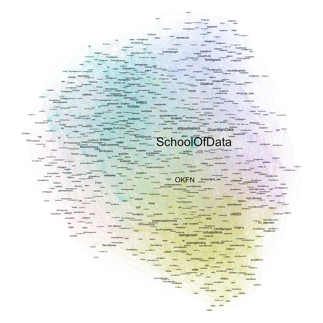
From my quick reading of the map, we can see a cluster of OKF-related accounts at the bottom, with accounts relating to NGOs around the 7 o’clock position. Moving round to 10 o’clock or so, we have a region of web publications and technology news sites; just past the 12 o’clock position, we have a group of people associated with data visualisation, and then a cluster of accounts relating more to data journalism; finally, at the 3 o’clock position, there is a cluster of interest in UK open data. Depending on your familiarity with the names of the Twitter accounts, you may have a slightly different reading.
Note that we can also try to label regions of the map automatically, for example by grabbing the Twitter bios of each account in a coloured group and running some simple text analysis tools over them to pick out common words or topics that we could use as interest area labels.
So how was it generated? And can you generate one for your own Twitter account?
The map itself was generated using a free, open-source, cross-platform network visualisation tool called Gephi. The data used to generate the map was grabbed from the Twitter API using something called an IPython notebook. An IPython notebook is an interactive, browser-based application that allows you to write interactive Python programmmes or construct “bare bones” applications that others can use without needing to learn any programming themselves.
Installing IPython and some of the programming libraries we’re using can sometimes be a bit of a pain. So the way I run the IPython notebook is on what is called a virtual machine. You can think of this as a bit like a “computer inside a computer”. Essentially, the idea is that we install another computer that contains everything we need into a container on our own computer and then work with that through a browser interface.
The virtual machine I use is one that was packaged to support the book Mining the Social Web, 2nd Edition (O’Reilly, 2013) by Matthew Russell. You can find out how to install the virtual machine onto your own computer at Mining the Social Web – Virtual machine Experience.
Having installed the machine, the script I use to harvest the data for the ESP mapping can be found here: Emergent Social Positioning IPython Notebook(preview). The script is inspired by scripts developed by Matthew Russell but with some variations, particularly in the way that data is stored in the virtual machine database.
Download the script into the ipynb directory in the Mining the Social Web directory. To run the script, click on the code cells in turn and hit the “play” button to execute the code. The final code cell contains a line that allows you to enter your own target Twitter account. Double-click on the cell to edit it. When the script has run, a network data file will be written out into the ipynb directory as a .gexf file.
This file can then be imported directly into Gephi, and the network visualised. For a tutorial on visualising networks with Gephi, see First Steps in Identifying Climate Change Denial Networks On Twitter.
While the process may seem to be rather involved – installing the virtual machine, getting it running, getting Twitter API credentials, using the notebook, using Gephi – if you work through the steps methodically, you should be able to get there!
![]()