You are browsing the archive for R.

Data Roundup, 12 March

- March 12, 2014 in Data Roundup

Code – mutednarayan

Tools, Events, Courses

Don’t miss the opportunity to design on of the page of Knowledge is Beautiful, the next book of David McCandless. The challenge is open until March 24 and is also well rewarded with a prize of a total of five thousand dollars.

Ampp3d, the Trinity Mirror-owned data journalism site, launched its own competition too. Aspiring journalists have to develop a mobile-friendly data visualization which will be published on the Ampp3d website. The winner gets a hundred-pound prize.

R is one of the top choices when it comes to programming languages for data visualization. Here you may find a tutorial from Daniel Waisberg on how to display Google Analytics Data with it.

The New York Times is about to reveal Upshot, its new data-driven website based on politics and economics, which will replace Nate Silver’s FiveThirtyEight. Read some updates here.

Data Stories

This week we would like to start by presenting a series of infographics that are detailed as well as interesting.

The funniest one is surely “Twelve world records you can break during your lunch hour”, posted by ChairOffice on Visual.ly.

Big tech companies mean big business transactions. Watch this interactive explanation from Simplybusiness on the history of the biggest Tech Giants Acquisitions

Among the others mentioned above, we strongly recommend you see Weather Radials, a poster representing all the climate changes occurring in 35 cities in the world last year, which is also a data visualization masterpiece to admire.

For a deeper understanding of visualization, take a moment to read this article written by Dorie Clark on the Forbes website, which reminds us why “Data Visualization is the Future”.

Data Sources

See how tech enterprises and organizations are spreading across Africa in this map on WomenTechAfrica.

The toolkit of a data addict is growing every day, and sometimes you have to choose the right tool for your own project. Here is a short list from Jerry Vermanen of software and programs that can be used for data extraction, filtering, and visualization.

Flattr this!

Exploratory Data Analysis – A Short Example Using World Bank Indicator Data

- July 7, 2013 in Data Stories, HowTo

Knowing how to get started with an exploratory data analysis can often be one of the biggest stumbling blocks if a data set is new to you, or you are new to working with data. I recently came across a powerful example from Al Essa/@malpaso where he illustrates one way in to exploring a new data set – explaining a set of apparent outliers in the data. (Outliers are points that are atypical compared to the rest of data, in this example by virtue of taking on extreme values compared to other data points collected at the same time.)

The case refers to an investigation of life expectancy data obtained from the World Bank (World Bank data sets: life expectancy at birth*), and how Al tried to find what might have caused an apparent crash in life expectancy in Rwanda during the 1990s: The Rwandan Tragedy: Data Analysis with 7 Lines of Simple Python Code

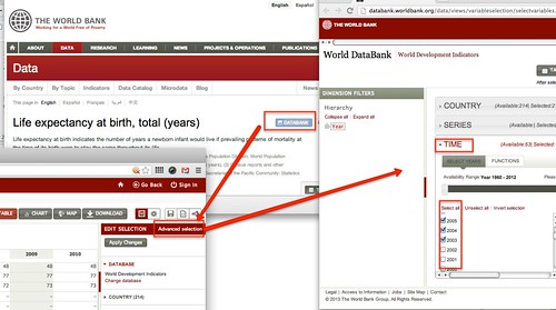
*if you want to download the data yourself, you will need to go into the Databank page for the indicator, then make an Advanced Selection on the Time dimension to select additional years of data.

world bank data

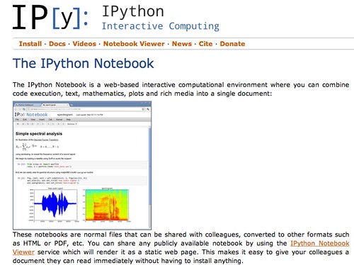
The environment that Al uses to analyse the data in the case study is iPython Notebook, an interactive environment for editing Python code within the browser. (You can download the necessary iPython application from here (I installed the Anaconda package to try it), and then followed the iPython Notebook instructions here to get it running. It’s all a bit fiddly, and could do with a simpler install and start routine, but if you follow the instructions it should work okay…)

Ipython notebook

iPython is not the only environment that supports this sort of exploratory data analysis, of course. For example, we can do a similar analysis using the statistical programming language R, and the ggplot2 graphics library to help with the chart plotting. To get the data, I used a special R library called to WDI that provides a convenient way of interrogating the World Bank Indicators API from within R, and makes it easy to download data from the API directly.

I have posted an example of the case study using R, and the WDI library, here: Rwandan Tragedy (R version). The report was generated form a single file written using a markup language called R markdown in the RStudio environment. R markdown provides a really powerful workflow for creating “reproducible reports” that combine analysis scripts with interpretive text (RStudio – Using Markdown). You can find the actual R markdown script used to generate the Rwanda Tragedy report here.

As you have seen, exploratory data analysis can be thought of as having a conversation with data, asking it questions based on what answers it has previously told you, or based on hypotheses you have made using other sources of information or knowledge. If exploratory data analysis is new to you, try walking through the investigation using either iPython or R, and then see if you can take it further… If you do, be sure to let us know how you got on via the comments:-)

Flattr this!