Climbing the d3.js Visualisation Stack
Over the last few months, the d3.js Javascript visualisation library has seen widespread use as the powerhouse behind a wide variety of highly effective interactive data visualisations. From the Sankey diagram we used to visualise horse meat exports in the EU, to Anna Powell Smith’s funnel plots generator, to the New York Times’ 512 Paths to the Whitehouse, d3.js provides a rich framework for developing an increasingly rich panoply of data driven animated graphics.
Despite the growing number of books and tutorials that are springing up around the library, such as Data-Driven Documents, Defined on the Data Driven Journalism site, creating even the simplest charts using d3.js out of the box can prove a major challenge to those of us who aren’t fluent in writing Javascript or manipulating the DOM (whatever that means!;-)
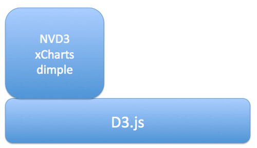
Help is at hand, though, in the form of several libraries that build on top of d3.js to provide a rather more direct path between getting your data into a web page and displaying it. Here are a few of the ones I’ve come across:
- NVD3 – one of the more mature libraries, includes line charts, scatterplots (and bubble charts), bar charts (grouped or stacked), stacked area charts
- xcharts – nicely animated line charts and bar charts
- dimple.js – “aims to give a gentle learning curve and minimal code to achieve something productive”
- Vega, “a visualization grammar, a declarative format for creating, saving and sharing visualization designs”. I think this probably sits somewhere between basic chart types and d3.js, so whilst it’s a step-up from d3.js, it’s not quite as “high level” as NVD3 and xcharts, for example.
The aim of these libraries is to wrap the lower level d3.js building blocks with function calls that allow you to call on preconfigured chart types, albeit corresponding to familiar charts.
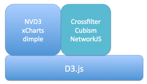
Further up the abstraction layer, we have more specialised Javascript libraries that provide support for complex or compound chart types:
- Crossfilter – explore large, cross-linked multivariate datasets in the browser
- cubism.js – produce scalable, and realtime animated, time series visualisations
- JSNetworkX – a library that builds on several other toolkits and approaches, including d3.js, to provide a library that support the construction, manipulation and display of networks in the browser.
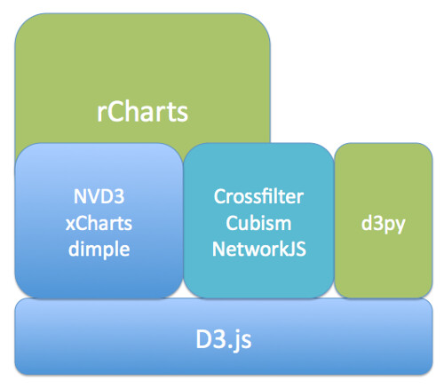
If programming in Javascript, even at these higher levels, is still not something you think you can cope with, there are several other alternatives that build on d3.js by generating templated web pages automatically that make use of your data:
- rCharts – generate a wide range of charts using d3.js helper libraries, as well as non-d3.js Javascript libraries, from within an R environment such as RStudio. (It’s extensible too.) The latest release also allows you to create dynamic visualisations using automatically populated control elements.
- d3py – generate d3.js powered webpages from Python using the Pandas library
If you want to create your own, novel visualisation types, then d3.js provides a great toolkit for doing so. If you are a confident web developer, you may still find it more convenient to use one of the abstraction libraries that offer direct axis to basic chart types built up from d3.js components. If you need access to more specialised chart types, things like Crossfilter, Cubism or NetworkJS may suit your needs. If you don’t class yourself as a web developer, but you can handle Python/Panda or are willing to give R a go, then the HTML and Javascript generating d3py and rCharts will do pretty much all the heavy lifting for you.
So – what are you waiting for…? Why not have a go at generating one of your own interactive browser based visualisations right now…:-)


