You are browsing the archive for Aid data.

Jargon busting the world of aid

- February 2, 2015 in

This is intended more as a reference point while you’re working through the Aid Data curriculum, rather than to be read or worked through from start to finish. Each specialist term, in bold, is listed in the glossary, and has two sections: its definition, and an explanation of why it might be relevant while you’re working with aid data.

If you come across other terms you think should be added, let us know!

Module Objectives:

  • Get familiar with some common words you’ll see while looking into aid data

Prerequisites/before you get started:

  • None!

Table of Contents:

  • Organisations and institutions to be aware of

  • General development terms

  • Aid + financial flow terms

  • Further resources

Introduction

We’ve talked about the accessibility of data, but what about the accessibility of language? As with many sectors, international development is full of acronyms and complex terms which might have different meanings to those you’re used to.

This module isn’t intended to be read from top to bottom, but rather to keep as a reference. Are there any you’d like to add? Suggest them on the School of Data mailing list, or tweet us

Inspiration for this glossary has been drawn heavily from others – wherever possible, we try to explain them in accessible language, and they are listed in the [Further Resources] section.

Content

Organisations/institutions to be aware of

G7 (previously, the G8): The Group of Eight is a forum of eight countries (Canada, France, Germany, Italy, Japan, Russia, United Kingdom and United States). Together, these eight countries represent about 14% of the world’s population, but about 60% of the world’s wealth. In March 2014, Russia was suspended from the group, in response to the country’s annexation of Crimea, leaving them as the G7. The group meet several times a year to discuss economic issues.

Data relevance: in 2013 the G8 released their ‘Open Data Charter’, pledging to ‘open’ more government data, and including the principle ‘Open Data by default’. If these pledges are implemented, there should be more data about these governments and their activities coming soon(ish.) Their actions against this charte**r will presumably be assessed at future G8 summits. The Open Data Charter is online to read here.

G20: The Group of Twenty (G20) is essentially a wider evolution of the G8, aiming to bring other nations into the economic discussions. It is relatively new, and held its first meeting in 2008. As with the G8, other non-member nations also attend meetings and summits, and some international institutions (eg. the UN, the African Union) also send delegations to attend the summits.

Data relevance: in 2009, the G20 launched their ‘Data Gaps’ initiative, which is a set of 20 recommendations on the enhancement of economics and financial statistics. One of the main outcomes is this “Principal Global Indicators” site, which brings together data for the G20 economies.

IATI – the International Aid Transparency Initiative – the largest global transparency initiative working on improving transparency of aid and development resources. It involves donors, recipient countries and civil society organisations, and they have developed a standard for publishing data – the IATI standard.

Data relevance: this is another major source of data about aid, though it’s difficult to know what has already been covered in OECD-DAC data (see above). Additionally, lots of major donors have committed to publishing their data to IATI – ie. via this standard – so the data in here will only improve. For more information, see module [A Guide to IATI data].

OECD – the Organisation for Economic Co-operation and Development, is an international economic organisation of 34 countries, founded in 1961. Most of these 34 countries are high-income countries. They work essentially through peer pressure, which occasionally leads to binding treaties between countries. Each year, they produce a number of publications, books and policy papers.

Data relevance: they are one of the biggest producers (and collectors) of data about the economic status of countries around the world. For more information on where to access this data, see module “A Guide to OECD data”.

OECD-DAC: A sub-committee of the OECD, as described above – the Development Assistance Committee (DAC) is made up of different countries which provide bilateral aid. Countries within the OECD can be ‘members’, and countries outside the OECD can apply to be ‘associates’.

Data relevance: they produce the most trusted and comprehensive sources of data on resource flows to developing countries – for more information on where to access this data, see module “A Guide to OECD data”.

General terms

GNI – Gross National Income – A term used to describe the total national income of a country. Essentially, it measures everything that nationals of a certain country are doing/producing – the output – whether they are living in that country or not. This differs from Gross Domestic Product, which measures the economic value of what is happening in that specific country by foreigners + nationals alike (but doesn’t count any activities happening outside the country.)

Data relevance: when you’re thinking about how ‘rich’ a country is, make sure you’re comparing similar statistics, as GNI can (in some cases) differ greatly from GDP)

Gross Domestic Product, GDP – A term used to measure a country’s economic productivity or national wealth, based purely on geographical location of production (ie. within the respective country).

Data relevance: this is often used as a measure of how ‘developed’ a country is – the higher the GDP (especially GDP per capita, or per person), the more developed the country.

Millennium Development Goals (MDGs) – A set of eight international development goals officially established following the UN Millennium Summit in 2000, to be met by 2015. It looks like some goals will be met, and others won’t. The goals include poverty and hunger, education, gender equality and empowering women, child mortality, maternal health, HIV/AIDS, malaria and other diseases, environmental sustainability and a global partnership for development.

Data relevance: the MDGs have been at the centre of the development agenda for almost the last 15 years. This means that measuring ‘progress’ in global development has largely been understood through the framework of measuring different areas against MDG indicators, and many are keen to use the data to display that as many goals as possible have been met. Keep an eye out for such claims, and wherever possible, have a look into the data behind these claims yourself. *

Official Development Assistance, (ODA): a grant or loan from a high-income country to a low-income country, with the aim of promoting economic development or welfare. Misleadingly, ODA does not always result in the actual transfer of money to the country “receiving” the ODA. It can be defined as debt relief, or technical cooperation, for example.

Read more:
*Fact sheet: Is it ODA? from the OECD, and a shorter description of what the OECD defines as ODA. (short definition) and longer fact sheet http://www.oecd.org/dac/stats/34086975.pdf

Data relevance: ODA is the official, or more politically correct, term for what is sometimes termed “foreign aid”, and the amounts spent by high-income countries on ODA is wildly misunderstood by the public. Be aware of public (mis)perceptions around how much is spent, as well as representing ODA accurately when looking at financial flows between high- and low- income countries.

Sustainable Development Goals, SDGS – A set of goals which will supercede the Millennium Development Goals (see above), and are due to be set in September 2015. Work is ongoing in establishing these by a designated UN working group.

Data relevance: it’s likely that these will be the basis of the development agenda for the next 15 years or so. So it’s good to be aware that they are being set, but for now (December 2014) there is nothing specific to keep an eye out for.

Aid / financial flows

Aid bundle: aid comes in many forms: as money, as food, in the form of skilled people coming and offering their services (= technical consultancy), or even items that mean that the money never actually leaves the donor country, such as debt relief, or grants for students from poor countries to study in a more economically developed country.

Data relevance: the combination of the above items, and more, which make up the ‘aid bundle’ can differ greatly between recipient countries. Be aware that these differences can mean that some countries get a “better deal” than others, despite seemingly receiving a lower amount of money.

Bilateral aid – Aid given by the government of one country directly to another.

Data relevance: it can also reveal a lot about a country’s political interests, if they are supporting certain countries more than others.

Commitments: Firm, written obligations of what resources will be distributed within ODA — but crucially, this is not always the actual amount that gets distributed. (see: disbursements)

Data relevance: be careful whether you are looking at ‘commitments’ or ‘disbursements’ when looking at amounts spent within ODA. If you are looking at what a donor was planning on giving in a given year, you’ll want to look at commitments.

Concessional loans: Loans given from a high-income country to a low-income country, which can form part of ODA (see above). To qualify as ‘concessional’ loans, they must give the low-income country a better deal than usual loans – this can be either by giving them more time to pay the loan off, or by having a lower interest rate.

Data relevance: money provided through ‘concessional loans’ can, somewhat misleadingly, be classed as ‘official development assistance’, but it is important to note that no money is actually given to the low-income country, and that they actually have to pay it back. So, if a country is providing ODA largely in the form of concessional loans, they’re not really providing that much money to the recipient country, as they will (eventually) receive all of it back.

Development aid: aid, or official development assistance, aimed at alleviating poverty in the long term. Also described as ‘development cooperation’.

Data relevance: be sure to note the difference between ‘humanitarian aid’ and ‘development aid’ – as development aid is typically focused on long term response, it should be entirely possible to provide forward-looking, and timely data, both of which are crucial for low-income countries to be able to plan their budgets appropriately.

Disbursements: the actual amount of money, or resources, given within ODA.

Data relevance: this is most likely the most useful measurement for you of how much money a donor has actually given to a certain country.

Earmarked aid/funds: aid which is given with certain restrictions placed on how, or when, it is used; this can be anything from specifying what the money is used for, specified services, or the timeframe within which it must be used. [Opposite = ‘unearmarked aid’]

Data relevance: for the recipient country, receiving ‘earmarked funds’ might leave them with a lot less freedom than ‘unearmarked funds’ – this is simply a classification to be aware of, when looking into ODA and aid flows.

Foreign Direct Investment (FDI) A long-term investment from one country to another, where an entity based in one country has a ‘controlling’ ownership in a business enterprise in another.

Data relevance: this is not considered as ‘official development assistance’, but is in many cases far larger in amount than ODA flows from rich countries to poor countries, so it is good to be aware of it as a potential financial flow to low-income countries.

Humanitarian/emergency aid: typically provided in response to humanitarian crises or emergencies – such as natural or man-made disasters, with the primary objective of saving lives and alleviating suffering in the short term.

Data relevance: inherently, this is hard to predict, so forward-facing data cannot really be provided, as different donors’ responses differ depending on the particular situation in hand, and how it progresses over time.

Multilateral aid – Aid given from the government of a country to an international agency such as the World Bank, the International Monetary Fund or the United Nations, who are then charged with distributing it among low-income countries.

Data relevance: it is important to bear in mind that international agencies such as the ones listed above are not, though they may seem like it, ‘neutral’. Some – like the World Bank – are very heavily funded by just one country, which means that they are somewhat tied to the interests of that country. Be aware of this when thinking about projects funded by international agencies.

Remittances: A remittance is a transfer of money by a foreign worker to their home country.

Data relevance: Money sent home by migrants constitutes the second largest financial inflow into many developing countries, in some cases far exceeding international aid. When thinking about financial flows between countries, be careful to think about ‘unusual suspects’.

Tied Aid: Aid which has a restriction placed upon it so that it must be used by the recipient country to purchase products or services from the donor country. More information. Opposite: Untied Aid.

Data relevance: providing tied aid is a clear way for a high-income country to establish strong links between itself and the recipient country, whether this be for political, cultural or economic reasons. Either way, putting these restrictions on the aid means that, like with earmarked aid, the recipient country has less freedom to make decisions for themselves on what the resources are spent on (or rather, where).

Unearmarked aid/funds – where the recipient has complete freedom to decide how the money/resources are used (this is a condition for multilateral aid)

Further resources

Glossaries provided by other organisations:

OECD DAC glossary

A question of Aid

From Development Initiatives, this Glossary

An introduction to OECD-DAC data

- November 27, 2014 in

Module Objectives:

  • Understand why you might use OECD-DAC data

  • Understand its strengths and weaknesses

  • Learn where to find it online

Prerequisites/before you get started:

  • Completed Introduction to Aid Data

Table of Contents:

  • Why are we looking at the OECD-DAC data?

  • What to expect from this data

  • Things to understand before diving into the data

  • Strengths of the OECD-DAC data

  • Where to find the data online

Introduction

As we mentioned in the Introduction to Aid Data, the OECD is a good source of development data. However, using it will be made much easier by understanding a few pieces of contextual information, thinking about its strengths and weaknesses, and of course, knowing where to actually find it online.

Why are we looking at the OECD-DAC data?

The DAC aid statistics are widely considered to be the “official” source of data on aid- in some cases, the data dates back to the 1960s.

Generally, the data included ranges from regional or national aggregates, to individual project level.

What to expect from this data?

Crucially, the data included here is on the money that flows out of donor countries, not necessarily the money that flows **into **low-income countries: as we’ve mentioned earlier, some of this money is spent in the donor countries themselves.

Also, as with all data on ‘aid’, or Official Development Assistance, remember that it is just a small part of a wider ecosystem of financial flows going into developing countries. In the case of the figures included here, they are also subject to the OECD’s definition of what they actually consider to be Official Development Assistance; ie.

  • Their main purpose must be the economic development or welfare of the developing country

  • The source must be “official” (eg. no informal financial flows like remittances or charitable contributions from individuals are included)

  • Must go to one of the countries which appear on a list of ‘Official Development Assistance’ recipients, agreed by the DAC.

  • It can be administered through grants or loans, but loans must be given at a more generous rate than usual loans – this can be done through either the recipient of the loan (the poorer country) having a longer time to pay the loan back, or having a lower interest rate. These kinds of loans are known as concessional loans.

The DAC database also includes:

  • OOF (Other official flows)

  • FDI (Foreign Direct Investment)

  • Some private flows

Things to understand before diving into the data

There are some structural and linguistic concepts it’s important to understand:

Commitment Disbursement
= written obligation or formal declaration of what will be paid or transferred
(ie. a promise of what donors will do)
= actual transfer of resources (money, or goods) to recipient country or agency
(ie. money has actually left the donor agency here)
Date of commitment = date that the written obligation/agreement is signed Date of disbursement:
for money: the point of payment by the official sector
for goods/resources: the date of transfer of ownership of the resources, or purchase of the goods

Special expenditures like humanitarian aid, where the date of disbursement = date of commitment are an exception

Bilateral aid Multilateral aid
Resources go from donor country directly to a low income country Resources go to a recipient institution which:
– works either fully or partly in development
– is an international agency – eg. United Nations agencies, the EU, international financial institutions, global multi-donor trust funds
Vertical Funds/Global Funds (e.g.
Global
Alliance for Vaccines and
Immunisation (GAVI))
Core contributions to UN, IFIs,
EU
Global multi-donor trust funds
Global Funds/Vertical Funds
Donor can specify how the funds should be spent (= earmarked funds) Recipient has complete freedom to decide how the funds are used (= unearmarked funds)
given through international organisations such as the World Bank rather than by one specific country

Strengths of the OECD-DAC data

Comprehensive: The data included here is fully comprehensive for what is defined as “Official Development Assistance”, and reporting to the database is mandatory for all 29 DAC member countries.

Less risk of double counting: Within the dataset itself, you don’t have to worry about double counting – ie. the same activity or event being counted more than once. This is a weakness of other aid datasets.

Validated/good quality: The data has been validated through the Development Cooperation Directorate, and via Peer Reviews (more information here)

Comparability: there are standard criteria (codes for sectors, types of aid, terms and conditions) – which are used universally, making the data comparable between donors, and over time

Historic: the data goes back as far as 1960 (in some cases; it’s not all complete)

Measuring against targets: the data is useful for measuring against commitment levels (eg. are donor countries meeting the 0.7% of GNI target?) – and, to a degree, sectoral targets, and geographical targets.

Weaknesses of the OECD-DAC data

Excludes much of the ‘aid bundle’: for example, remittances, charitable donations from the public, foreign investment, funds that don’t meet the ‘official’ definition of ODA – which means that the financial flows here are just a tiny portion of resources which are intended to reduce poverty in poor countries.

Slow to publish: full datasets are not published until December of the following year (although limited preliminary data is published in April)

Difficult to match up with money received: the data here is on money that flows out of donor countries, not necessarily the money that flows into** **low-income countries. There are multiple reasons why these two might not match up as lots of ODA is actually spent in the donor country (but still qualifies as ODA, if the economic welfare of a developing country is the ‘main’ aim). For example, some of it goes towards debt relief, or student costs in the donor country.

Difficult to match inputs with outcomes: as there are no economic/social indicators included here, it’s difficult to see whether projects had the desired outcomes – eg. increased spending on malaria prevention vs. a reduction in malaria prevalence

Not so useful for:

  • helping recipient countries manage their aid flows – for this, a dedicated Aid Management Platform is much more useful

  • tracking aid beyond recipient government level – what happened after it went to a specific government?

Where to find the data online

The OECD makes its data available in a number of ways: it can be slightly confusing to know where to go to get exactly what you’re looking for, so here is a quick guide to the various sites and sources.

Query Wizard for International Development Statistics

Where: http://stats.oecd.org/qwids/

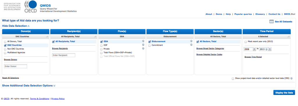
What: A way of getting data by CSV, filtered by options that you can select on the initial screen. It provides 6 different options: by Donor, Recipient, Flow(s) (eg. type of financial flow, ODA, or OOF) Flow type (see glossary above), Sector and Time Period. It allows you to export what you get back in CSV, or send a ‘bookmarked link’ to others.
Strengths:

  • No understanding of the structure of the DAC data is required to use this.

  • Includes a page of Popular Queries — ie. other ways that people have used the site, and allows you to do the same thing.

  • 6 “dimensions” are included here, so lots of options to get exactly the data you want.

Weaknesses:

  • If we’re being picky, technically not all data within DAC is accessible via QWIDS- it’s actually only about 95% of the total.

  • Again, picky, but it doesn’t look very appealing:

image_0

Who is it useful for?

People investigating a specific section within the world of aid — for example, if you wanted to see how much money is going from donor X to recipient Y, over a certain time period, and get the data in CSV.

Further guidance:

A demo screencast by the makers of the site (caution: it starts automatically)

OECD.Stat

Where: http://stats.oecd.org/

What: The main repository for all DAC data. Start by selecting a dataset in the left hand menu (‘Data by theme’), then click on Customise → Selection to change what data is displayed, and reorganise its layout via Customise → Layout. using the option at the top of the table. You can download the data via Export → Excel or Export → CSV.

There are a lot of in-browser display options given; realistically though, very few people who actually want to work with the data are going to use the browser to manipulate it the data nor to create any visualisations from it, as it’s much easier to download the raw data and then work with it in another tool (Excel or Google Spreadsheets, for example.)

Strengths:

  • It contains, apparently, everything available in the DAC database, so, not just official development assistance flows, but data on a huge range of topics, from agriculture, to education, health, cities and transport.

Weaknesses:

  • In terms of Official Development Assistance, it doesn’t appear to be possible to filter the data by ‘recipient country’, just by donor, or sector; clearly (and naturally, given it is from the OECD) the data is structured with the donor country in mind.

  • No option to send a link to a specific dataset (ie. the URL doesn’t change)

  • Some options include very specific options labelled with acronyms, with no explanation of what they stand for (eg. data from the African Economic Outlook is classed by various indicators – PRB, PRMB, PRMS – the user has to look this up on a separate site to understand what these are)

Further Guidance

OECD.stat Web Browser User Guide

OECD iLibrary Statistics

Where: http://www.oecd-ilibrary.org/statistics

What: Offers access to OECD core data – rather than simply split across indicator datasets (eg. Agriculture, Education), here it is also arranged according to projects or reports that the OECD releases. For example, the data used for the OECD Economic Outlook report can be found here.

Once you’ve selected the dataset, it appears through the OECD.stat interface (as above), and can be downloaded, as above.

Strengths:

  • It’s good to have a single place to go to to get aggregated datasets – especially if they have been used to draw out potentially important conclusions, such as those from the OECD Economic Outlook report.

  • Includes a ‘search’ function, too.

Weaknesses:

  • As above, the data appears through the OECD.stat interface — while this might be good in some ways, it means that exporting the raw data directly requires another step.

OECD Aid Statistics

Where: http://www.oecd.org/dac/stats/data.htm

What: All OECD projects, sites and data that data that focuses on aid.

Strengths:

  • Includes links to specific datasets that might be useful to inspire further thought or exploration, via the International Development Statistics page though it is a little confusing to understand the difference between these datasets and the ones presented above.

  • Good to have one page with all data organised thematically

Weaknesses:

  • Slightly difficult to find, and to understand the differences between the various options offered

  • The data visualisations presented could do with a little work…

Further resources:

Cleaning IATI data with OpenRefine

- November 27, 2014 in

Module Objectives:

  • Understand why IATI data might need ‘cleaning’

  • Learn familiarity with the data cleaning tool Open Refine

  • Work with IATI data (downloaded as CSV from the IATI registry)

Prerequisites/before you get started:

  • Basic understanding of spreadsheets

  • Basic understanding of what IATI data shows

  • Understanding of what a CSV is

Table of Contents:

  • Getting IATI data in CSV format

  • Creating a project in Open Refine

  • Sorting and facetting

  • Different kinds of facets

  • Cleaning multiple entries in single cells

Introduction

Why might data need “cleaning” anyway? We say the data needs cleaning when it has inconsistencies that make it difficult to work with; although it might already be in a spreadsheet, there are lots of ways that it could actually be “dirty” data.

For example, when dates are written in different formats in the same spreadsheet: 21st October, or 21/10/13, or Oct. 21. Or, when names are spelt slightly differently, but actually mean the same thing. All of these things (whether by human error, or machine) – make it very hard to analyse the data. As lots of IATI data has been processed by hand, little inconsistencies are common within the files you find in the IATI registry, and before you can properly work with it, it needs to be cleaned.

So, here is an introduction to a powerful data cleaning tool, which is free to download.

What you’ll need:

  • Refine – Download it from http://openrefine.org. If you’re downloading it using a Mac, there might be a bug, telling you:
    “Google Refine” is damaged and can’t be opened. You should move it to the Trash.”

To get around this problem, follow these instructions:

  • Open System Preferences

  • Open Security & Privacy

  • Go to the General Tab

  • Change the “Allow applications downloaded from:” setting to “Anywhere”

(This appears to be a security issue with Mountain Lion, but the above steps provide a workaround until it is fixed by Google.)

Step 1: get the data

We’re going to be working with data in csv format, downloaded from the IATI Registry. Go to the Registry and click on Search the Registry.

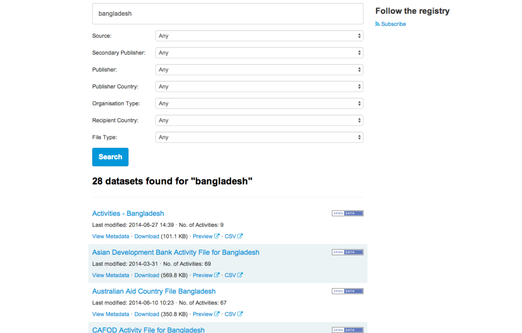
There are lots of ways to find what you need within the Registry – easiest though, is simply by searching. Let’s say we want to look at projects taking place in Bangladesh – so, type in ‘Bangladesh’ to the search bar.

You’ll get 28 datasets found for “bangladesh”.

image_0

Let’s take a look at what the Asian Development Bank is doing in Bangladesh – the second entry in the list.

We want to work with the data in CSV, so click straight on to the CSV button underneath the entry for the Asian Development Bank.

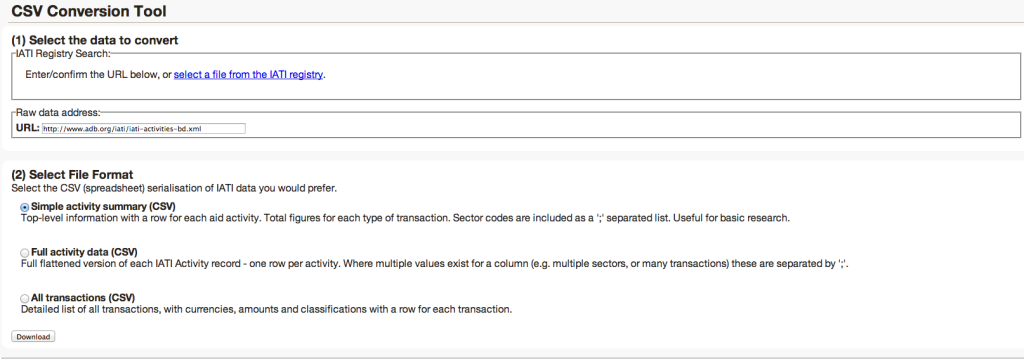
You’ll come to the CSV Conversion tool then, where you’ll see the URL for the raw data, from the Asian Development Bank site itself, and three options:

image_1

In this example, we’re going to use the data from the Simple activity summary, which has aggregated figures rather than a row per transaction, and allows you to see ‘implementing organisation’, contact details of the relevant organisation and contact person in Bangladesh, and other interesting information.

Select ‘Simple activity summary (CSV) and click ‘Download’.

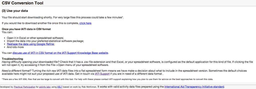
You’ll come to this page, and your data should start to be automatically downloaded.

image_2

Now, we need to open this data in Open Refine.

Step 2: Creating a new Project

Open Refine (previously Google Refine) is a data cleaning software that uses your web browser as an interface. This means it will look like it runs on the internet but all your data remains on your machine and you do not need an internet connection to work with it.

The main aim of Refine is to help you exploring and cleaning your data before you use it further. It is built for large datasets – so, as long as your spreadsheets can hold the information, Refine can too.

To work with your data in Refine you need to start a new project:

  1. Start Refine – this will open a browser window pointing to http://127.0.0.1:3333 – if this doesn’t happen open the link with your browser directly

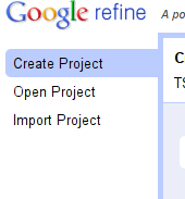
  2. Create a new project: On the left tab select the “Create Project” tab:

image_3

  1. Click on “Choose Files” to choose the downloaded file of Asian Development Bank activities in Bangladesh, and click on “next” – you can also use the URL to the CSV directly if your data is hosted on the web.

  2. You will get a preview on how Refine will interpret your data -as we have selected a well formatted CSV, this should be pretty automatic, and the ‘Columns separated by comma (CSV) option should be selected at the bottom of the page.

  3. Review the preview carefully to make sure the data looks right. Double check character encoding, to see if there are any funny characters that show up.

  4. You may want to turn off “guess data types”, particularly if you have data that contains leading zeros in numbers or identifiers which are significant.

  5. Name your project in the box on the top right side and click on “Create Project”

image_4

  1. The project will open in the ‘project view’; this is the basic interface you are going to work with. By default refine shows only 10 rows of data, but you can change this on the bar above the data rows. Also, you can use the navigation on the right to see the next or previous rows.

You now have successfully created your first refine project! Remember: although it runs in a web-browser, the Refine server is still on your machine – all the data is there.

Step 3: Sorting and Faceting

Now that we have created our project, let’s go and explore the data and the Refine interface a little. Using Refine might be intimidating at first, since it seems so different from spreadsheets, but once you get used to it you will notice how easily you can do things with it.

One of the commonly used functions in spreadsheets is sorting and filtering data – to figure out minima, maxima or things about certain categories. Refine can do the same thing.

One of the first things to notice when looking at the data, is that the first two entries under the column ‘aid_project_title’ appear to be the same text, but are written one in uppercase, one in lowercase, and with a spelling omission, too. Remember what we said earlier about messy data? This is a prime example.

To see if there are any others errors like this, let’s use the ‘facet’ function.

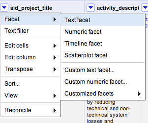
Click on the little arrow next to the column title, and then select Facet → Text Facet.

image_5

What does ‘Facet’ actually mean? Essentially, filtering. Faceting in Refine is really powerful – you can do a lot to your data using facets.

Here, we’re going to clean up the columns a little. Clicking Text Facet will open a facet in the left sidebar. You can see that there are 62 choices given – are any of them doubled up, like in the first two rows?

Scroll through and see.

The ‘Gas Transmission’ project that we noticed at the top is here, and we can see that there are just two projects with this title; however, they are considered as separate projects due to the spelling mistake + difference in caps used).

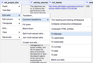
We can get rid of the block capital letters quite easily, by clicking on the triangle at the top of the aid_project_title column and selecting Edit cells → Common transforms → To titlecase.

image_6

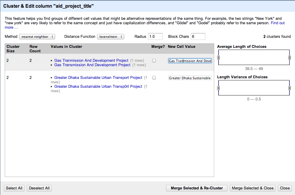
Then, we use the ‘Cluster’ feature to automatically find projects that have the same name. To activate clustering, click on the ‘Cluster’ button in the facet.

You will end up in the clustering menu – there, click on the drop down menu next to Method, and select ‘nearest neighbour’.

Then, you should see two entries come up: the Gas Transmission project we first noticed, and another one with an 0 instead of an O in the word ‘transport’.

If you click on one of the options, that text will appear in the corresponding New Cell Value window. It will also tick the ‘merge’ box. When you click the Merge button, the lines that are ticked will be rewritten with the appropriate New Cell Value.

image_7

Make sure the ‘New Cell Value’ is written out correctly, and then click ‘Merge Selected & Re-Cluster’. No others come up, so you can close the window. It is often worth trying one or two different measures (Distance Functions) when trying to cluster partially matching strings, as each measure works slightly differently.

What does ‘Distance Function’ mean? The different distance measures take different times to run and use different rules to try to work out what is the same as what. In levenshtein, the distance is the number of single character “edits” that map one string to another. If you try the ppm rather than levenshtein distance measure you get different results.

In the key collision method, there are a couple of interesting techniques that try to find strings that “sound alike” (metaphone3 and cologne phonetic). These are quite quick and dirty methods, but they can work well

Exercise 1:

You can check to see if there are similar problems in any of the other columns, too – for example, if you set a Text Facet up for the column ‘sectors’ you’ll see that there are two similarly named sectors:

Transport And Ict, and Transport and ICT.

Click ‘Cluster’ and see if you can merge them!

image_8

Exercise 2:

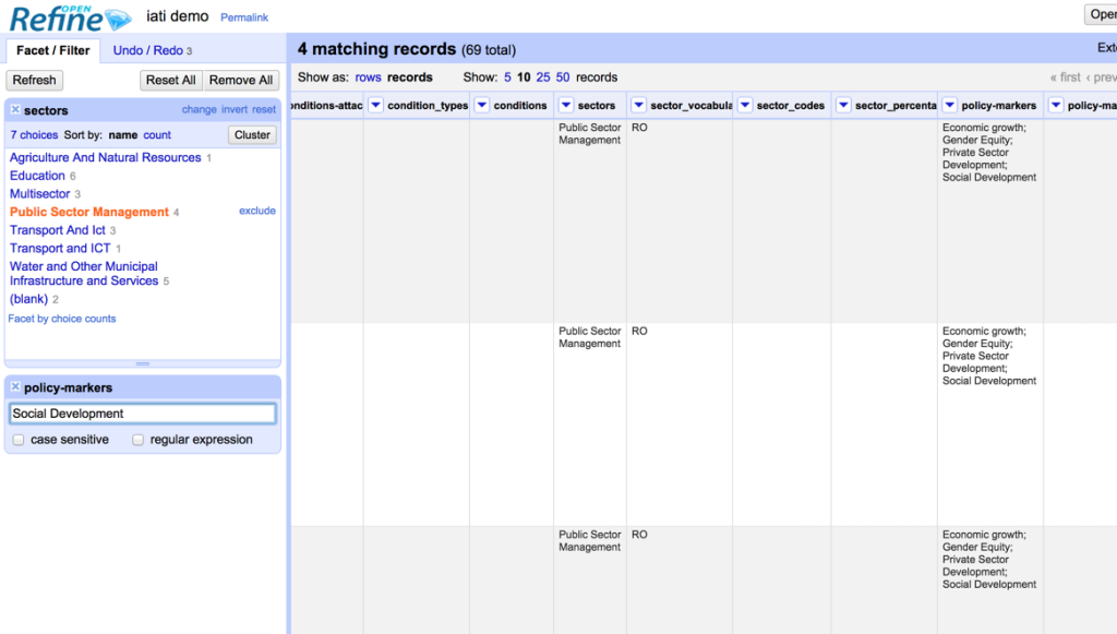
Narrowing down your search: try to find all projects in Public Sector Management that have a Social Development policy marker. (tip: try using a facet on one column, and a filter on another)

Different kinds of facets

As you saw when you created the Text facet just now, there are other kinds of facets – let’s create a Timeline one, to make it easy to see when projects started (and stopped.)

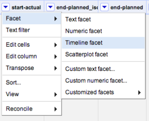
Go to the column start_actual; in this column, can see the dates that projects started. Create a Timeline facet, by clicking on Facet → Timeline facet.

image_9

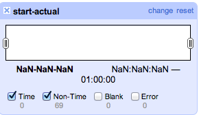
Hmm – it doesn’t seem to work- this is what we see, and it appears to be blank! Why?

image_10

The dates given in the start_actual column don’t seem to be recognised as dates (or ‘Time’) so they’re not coming up in the Timeline facet.

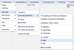
Luckily, if the date is in the format specified in the IATI standard this is easy to change: just ‘transform’ all of the entries into that cell into ‘dates’, by clicking Edit cells → Common transforms → To date

image_11

You can go ahead and do this transform on all of the columns that you can see which have dates in – start-planned, and end-planned too.

Once you have, you’ll be able to apply a Timeline Facet which allows us to see when projects were started.

Cleaning multiple entries in one cell

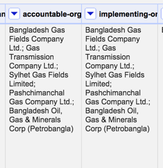
You may notice that in some of the columns, there are multiple entries:

image_12

If we wanted to list just the rows that involved Sylhet Gas Fields Limited we could select the Text filter option, enter the company name, and just see the corresponding rows.

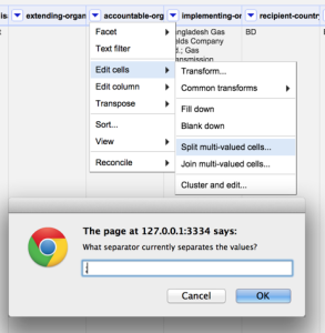
However, we might also want to reshape the data so that we have one line for each accountable-org or implementing-org. We can achieve this in OpenRefine in two steps. The first step involves generating a new row for each entry in a particular column. From the Edit Cells menu option select *Split multi-valued cells… * and then enter the character that is used to separate the different items within the cell – in this case, a semi-colon (;) character.

image_13

For each item in the cell, a new row is created and the distinct values filled in within the original column – that is, the column whose cell values we split.

If you inspect the other columns, you will notice that all the cells in the newly created rows are blank.

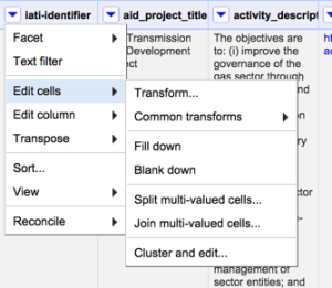
To fill in the blanks, we need a second step – for each column, select Edit cells then Fill down. This works down each row in the dataset, looking for empty cells and filling them with whatever value appears in the cell next filled cell above.

image_15

For a dataset such as this one, there are obviously of a lot of columns that need filling in – which could take some time. But do you really want data from every column? Perhaps all you really wanted was a list of accountable organisation aims and the IATI project identifier – in which case you’d only have to fill down on that column.

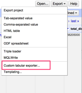
You could then export just these two columns of data using the Custom tabular exporter from the project Export menu; this would give you a more specific selection of the entire data set to work with.

image_16

Congratulations! You’ve cleaned up a dataset using Open Refine.

Further resources:

Inspiration module: how is aid data used in the media?

- November 27, 2014 in

Module Objectives:

  • Learn about how aid data is currently used in the media through a couple of case studies

  • Understand how to ‘reverse engineer’ these figures, to fact-check them from the source.

  • Understand why lots of these figures often deserve a second look, rather than being taken at face value

Prerequisites/before you get started:

Table of Contents:

  • Introduction

  • Case study #1

  • Case study #2

  • Exercise

  • Conclusion

Introduction

It’s all very well learning where aid data is, what it is, and how to find it – but most often, we come across the data already packaged up as ‘information’. In this module, we’ll try to ‘reverse engineer’ some of the figures that we come across in a couple of media outlets – this can give us a hint of where journalists might find their data, and it also helps us to fact check the information that is presented to the public.

Content

Case study 1: Why Is Afghanistan Sending Aid to Gaza?

Let’s start with this story: Afghanistan – a low-income country which receives Official Development Assistance from other, richer countries – is, apparently, sending aid to Gaza.

The way the headline is structured sounds almost indignant – by asking the question, we’re starting at the point of thinking that, in fact, Afghanistan shouldn’t be sending any aid. The story explains as much to begin with, and goes on to give some precise figures:

According to World Bank estimates, Afghanistan received more than $6.7 billion in foreign aid in 2012, the bulk of which came from the US.
Happily, there are links next to both of those claims – let’s follow them.

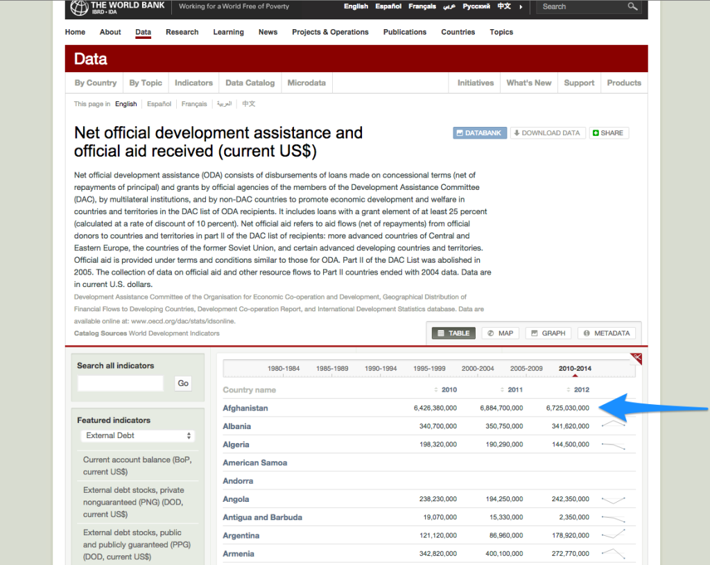
The first (following the link from ‘aid’ in the quote above) takes us to the World Bank’s databank:

image_0

And marked with the arrow, is the figure that is being quoted – that Afghanistan received over $6.7 billion in ODA in 2012. It’s great that the journalist here has actually linked to the data source, as this makes it much easier to verify the figure!

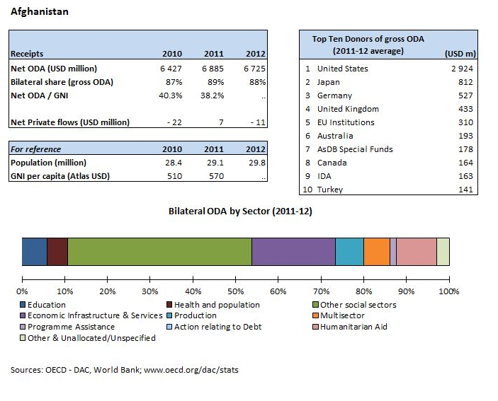
So, let’s move on to the next link in that sentence, which quotes where the ‘bulk’ of the aid comes from – this takes us directly to this image:

image_1

The table ‘Top Ten Donors of gross ODA’ seems to indicate that the US was by far the biggest donor to Afghanistan – although, presenting the information as an image is possibly the least useful way that it could be presented, as it is not machine readable and impossible to get the data in a structured way! In case we wanted to follow the trail further, the source of the data is however stated, as
www.oecd.org/dac/stats – this time though, we’ll leave it there.

We’ve now traced the source of the two main statistics stated – as you can see, it’s made quite simple if the writer links to where they got their information from. Unfortunately, however, that’s not always the case…

Case study 2: British aid money is funding corruption overseas, damning new report finds

This is something of an unusual case: the entire article is focused around a newly released report about the ‘impact’ of British Aid, conducted by the Independent Commission for Aid Impact . They carried out an investigation looking into how British aid was spent, and the results are somewhat controversial, hence the media coverage.

Let’s look into some figures that are quoted:

Figures earlier this year disclosed that Britain hiked its aid spending by more than any other country in Europe last year. Foreign aid soared by 28 per cent last year, meaning the UK hit its target of spending 0.7 per cent of GDP on overseas development. It left Britain with the second most generous aid budget in the world, outstripped only by the United States.

Where might we go to verify these figures?

To start with: ‘Foreign aid soared by 28% last year’.

Presumably, this means in 2013. First, let’s have a look at the OECD Aid Statistics– unfortunately, this seems to only give data for 2012.

How about the DevTracker portal, which tracks DFID (the agency discussed in the report) spending?

There, we can see various things: aid by sector, aid by location… but what about aid by year? This doesn’t seem to be an option, even by putting the keywords ‘2013’ ‘total’ into the search bar.

So… about a general search? “UK ODA 2013” brings up some reports: this one, entitled Statistics on International Development, 2013 – but although it says 2013 in the title, it means that it was written in 2013, about 2012 data.

What about searching on that same page for Statistics on International Development, 2014? As it turns out, we’re in luck: a new report was just published on October 30th, 2014, and seems to be an annual publication, with lots of statistics!

Let’s try the first table that comes up, Excel Tables: Statistics on International Development

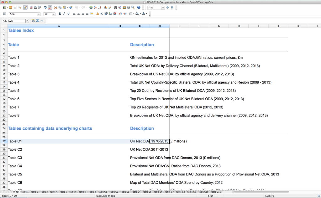
If we download this table (just by clicking on it) we see in Excel, or whatever spreadsheet software you are using, that there are a number of different tables provided, in the Index sheet:

image_3

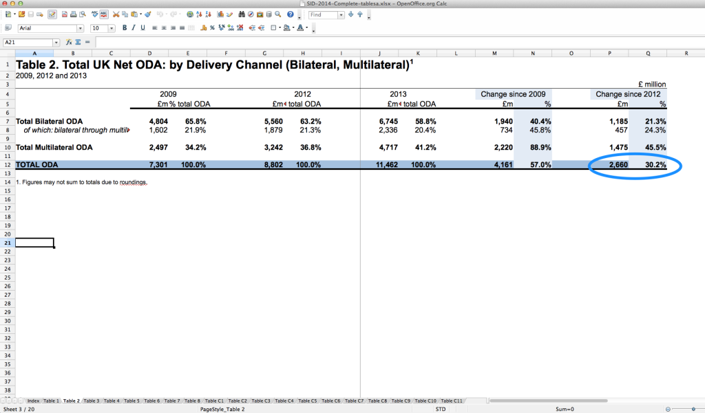
Table 2: Total UK Net ODA sounds like it might be what we’re looking for – so, select the tab ‘Table 2’ along the bottom.

And there, we find the answer! The columns P and Q show ‘change since 2012’, and in fact the % here given is 30.2%, actually higher than the 28% noted in the article.

image_4

While we’re on the this spreadsheet, it might be interesting to have a little look around the data provided – for example, how is that money spent? If we click on Table C10, we can see the ‘broad sector’ breakdown; are there any surprises?

image_5

Exercise:

*Have a look at, for example:

  • what has changed drastically from 2012 to 2013 (Columns O and P)

  • How much money is spent internally (Row 12)

  • What has changed a lot from 2009 until 2013? (Columns L and M)*

But before we get too distracted- wait, why did they say 28%, then?

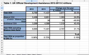
Maybe it’s because they were using older figures than these – at the top of this Statistics page it also mentions that DFID publishes ‘Provisional UK ODA’ statistics, which we can see here. Table 1 in this document looks like this:

image_6

Again – the change from 2012 to 2013 in Total ODA is 30% (actually, 30.5% here, in Cell E5).

So – the figure clearly isn’t from here.

Now that we’re simply looking for the source of the figure quoted in the original article, how about searching directly for it – “UK ODA 28%”. The third result we get is ]an article from Development Initiatives, which cites a data source at the bottom – OECD DAC – DAC provisional 2013 ODA release.

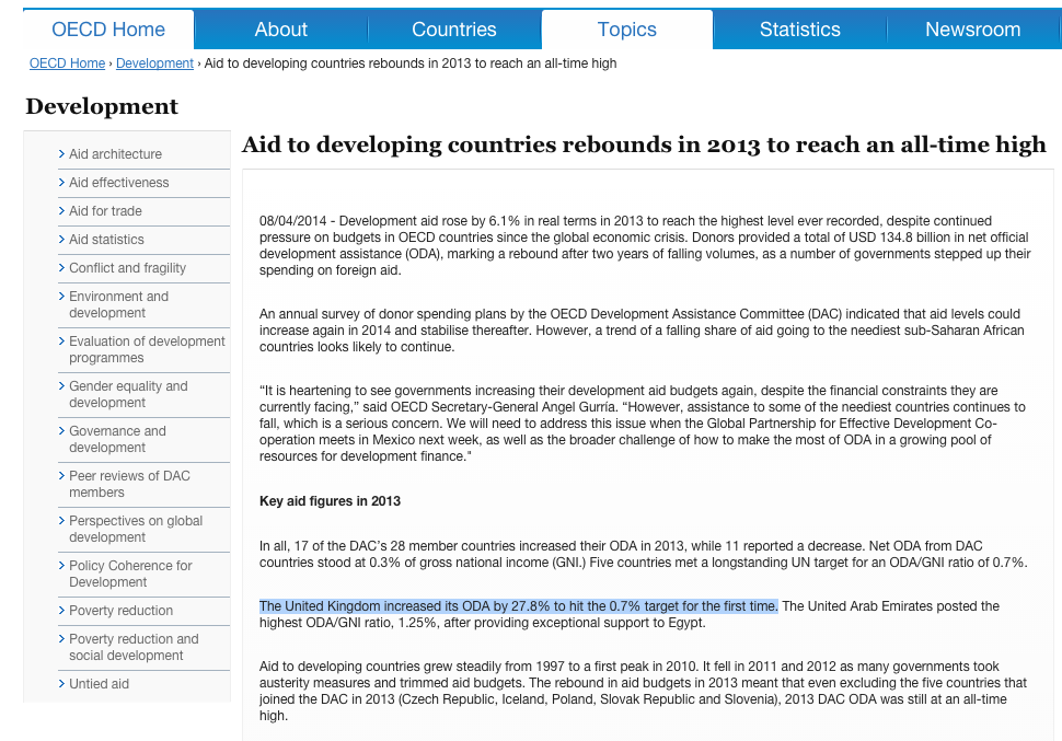
Following that link, we get to this press release, Aid to developing countries rebounds in 2013 to reach an all-time high.

Found it!

image_7

Great – so we can make a fairly informed guess as to why 28% is quoted as a figure in the article…but why is it different to the figure given by the UK Government?

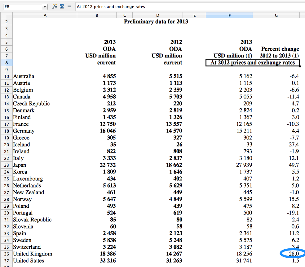
The data upon which this press released is based, is linked at the bottom of that page – if you click on ‘See the data behind the tables and charts’, you’ll get another spreadsheet download.

Here, we can see in Table 2 that the % change from 2012 to 2013 for the UK is down as 28%.

image_8

It also states that these figures are “At 2012 prices and exchange rates”.

Underneath this table (on the same sheet) – it also states:

Notes: The data for 2013 are preliminary pending detailed final data to be published in December 2014.

Another point to notice, though we’re concentrating here on the percentage change rather than the actual figures is that the OECD data gives the prices in USD million, and the UK govt. data is in GBP. Though of course, this should not make a difference with regards to percentage change!

Without diving deeper into finding out how the two institutions came up with those figures, it is difficult to understand why the percentage change is actually different here; we did, however, achieve our goal of finding out where that figure came from, in the original story.

Exercise

Take a look at this article, Why Israel and other foreign militaries — not the global poor — get the biggest US aid packages.

Can you spot any problems with the article? Think especially about the years mentioned, facts that are mentioned as though they are definite, when they might actually not happen…

Conclusion

As we’ve seen, it can sometimes take a few tries to find out the ‘original’ source of data quoted – but, it can definitely be worth it, especially if the claim in a news story sounds a little unlikely to you.

Once you have an idea of what the main sources of aid data are, it won’t take long to narrow it down to where you should go to find your answer – and, who knows what you might learn along the way!

Further resources:

Here are some more articles which mention aid data figures – why not see if you can reverse engineer these ones? If you come across any good ones, post them in the comments!

A guide to IATI data

- November 24, 2014 in

Module Objectives:

  • Understand what kinds of IATI data are online

  • Discover where to find the IATI data itself

  • Understand where to find metadata on IATI data online

Prerequisites/before you get started:

Table of Contents:

  • Introduction

  • Background

  • Sources of IATI data

  • A walkthrough of the IATI Registry

  • A walkthrough of the IATI Datastore Query Builder

  • Sources of data about IATI data (metadata!)

  • Further Resources

Introduction

We’ve already looked at what kind of aid data can be found online. As we mentioned, one big source of data on this topic is made available through the International Aid Transparency Initiative (IATI). There are a few different ways that you can access raw IATI data, so here’s a quick run through of what you can get, and where it is.

In this initial guide, we’ve just included sources of raw IATI data, not applications that are built using IATI data. To see some of those, check out the Tools tagged with ‘IATI’ from the Open Development Toolkit site.

Background

Before we begin, a few terms and concepts about IATI that are useful (though not essential) to understand as background:

The International Aid Transparency Initiative (IATI – normally pronounced as a full word, ‘aye-at-ee’) is an initiative aimed at increasing aid transparency, which encourages organisations to put data about their aid activities online. Where they are spending their money, what they are spending their money on – the aim is to make it as easy as possible to ‘follow the money’.

Aid data is important because without it, it is very difficult for all parties involved in the sector to plan their work, to know whether it is being used as intended, and to know how effective it is. The overarching aim of IATI is stated as seeking to “improve transparency of aid, development, and humanitarian resources in order to increase their effectiveness in tackling poverty.”

There are so many groups working in this space: donor governments, big donor agencies like different UN groups, private donors like the Gates Foundation… the list goes on. Not having good quality, easy-to-access data on this topic makes things difficult for everyone involved. Donors can’t keep track of where their money is going, and those in aid-recipient countries can’t keep track of what should be happening as a result of development projects.

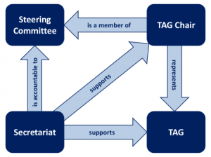
It’s run by a multi-stakeholder group in the Secretariat, but this sits within a wider governance structure, which organises itself as follows: (note, the TAG is the Technical Advisory Group.)

image_0

[Image taken from the IATI governance page, http://www.aidtransparency.net/governance]

To find out more about the Technical Advisory Group, you can follow what they’re talking about over on their discussion group.

OK, so the diagram might seem a little confusing, but it’s not strictly essential to understand it. There are, however, two quick things to mention before we look at data sources.

Firstly — that they (the groups above!) have developed a common, open standard for the publication of aid data, which is called the IATI Standard.

Why is this important?

Before the IATI standard came along, all of those organisations were producing (and collecting) data in various different ways, which made it impossible to compare them, or use them together. Now, the data is what we call ‘interoperable’, as it can be combined with other data sets, and used together to discover patterns, to see for example if lots of organisations are working on the same area, in the same region, or not.

The standard is regularly updated, and the latest update to version 2.01 was accepted formally by the Steering Committee in October 2014. If you’re interested in knowing more about the standard itself, go to the IATI Standard website, http://iatistandard.org/.

The version of the Standard doesn’t, or shouldn’t, affect too much how you use the data – but if you see various mentions of the IATI Standard popping up, this is what they are referring to.

More importantly though, they also manage the IATI Data Registry, which is where you can find links to all published IATI datasets. The datasets are usually hosted directly by the publishing organisation, but you can also find these links on other sites, which is what we’ll look at now:

Sources of IATI data

IATI Registry

What is it? The home of IATI data: the place to download IATI data in the datasets as they are provided by reporting organisations.
Who is it useful for? People wanting to download data in the way that reporting organisations have structured it in xml, or csv, which you can open in a standard spreadsheet application. For example, if you are a publisher wanting to see how other organisations have published their data.
Give me an example of what I can get here… A CSV or XML file of Asian Development Bank Activity in Bangladesh.
Bear in mind… The data here is structured as provided by the reporting organisation – this means it might well be too “split up” for your needs, unless you’re focusing on how donor organisations are publishing their data. If you want to look at, for example, all activities by a certain donor in a certain country, the CSV Query Builder below is a better option for you.
Where can I go for further guidance? Using IATI data

Note: “publishing organisation” and “reporting organisation” are used somewhat interchangeably, to signify the organisation who is making the data available and publishing it to IATI. In both cases, it’s normally a donor organisation – ie. the organisation giving the money – or an ‘implementing organisation’ – ie. an organisation receiving the money from a donor and actually carrying out the project.

Quick users’ guide:

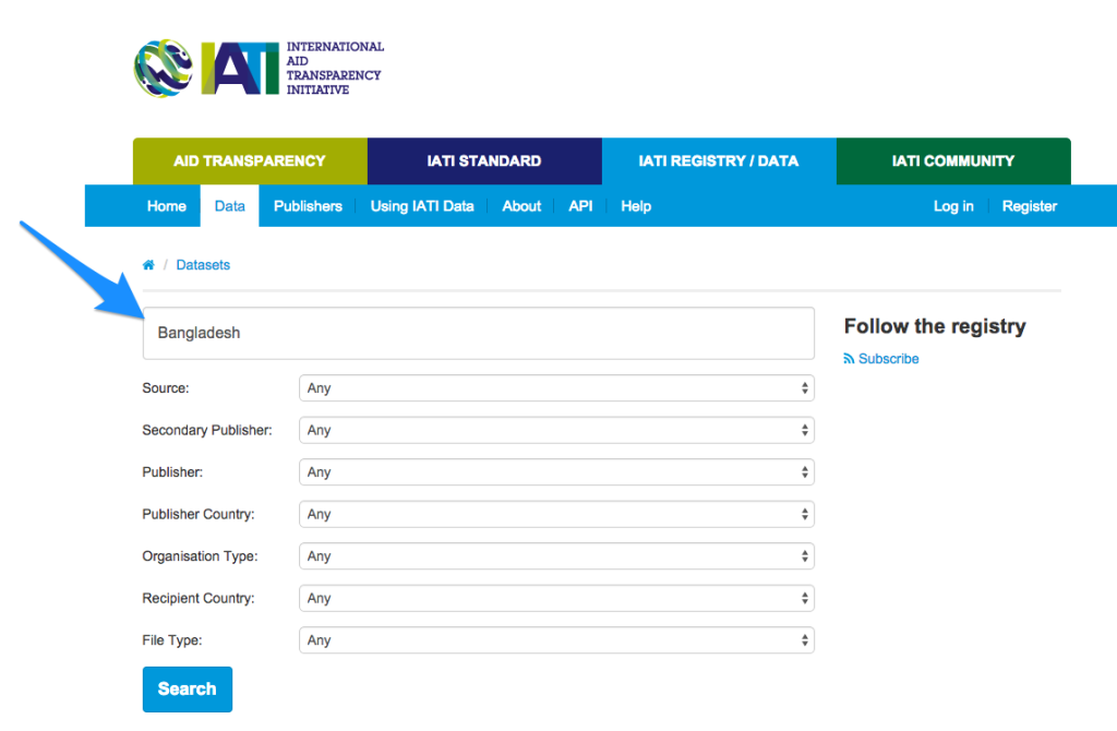
Go to http://iatiregistry.org/dataset – here you have two options for how to specify what you want.

You can either type keywords yourself, in the top box, for example here: Bangladesh, to see all files that mention ‘bangladesh’.

image_1

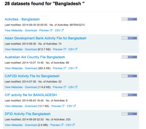
With this search, 28 datasets come up.

image_2

Under each file, you’ll see four options:

View Metadata: see data about the data – for example, the date it was published, the identifier of the publishing organisation, how many activities it includes, and the date range that these activities cover.

Download: clicking on this will give you the data in XML format, usually opening directly in your browser.

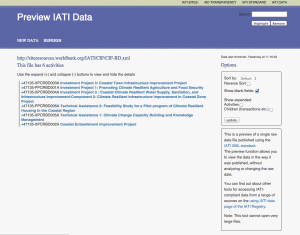
Preview: this uses a tool built by AidInfoLabs to allow you to ‘preview’ the data directly in your browser. It will bring up a screen that looks like this:

image_3

It can be a good idea to check on here before downloading big files to make sure they’re the ones with the information you need.

CSV: this will give you a download of the data in CSV format.

Another way of using this is through the drop down menus below; none of the fields are mandatory, and you don’t have to use them all, so just use the ones which are most relevant to what you’re looking for.

Remember though, the data here is structured and organised by how the publishing organisation has published it to IATI. Here’s a quick explanation of what the field names and options mean:

Source: who is publishing the data

Primary source: data which is published by the organisation which is carrying out the activities.

Secondary source: data published by a third party about the activities of another organisation.

Secondary publisher: specify which secondary source you’re interested in. You can ignore this field, unless you’re particularly interested in organisations publishing data about others’ activities.

Publisher: specify which publishing organisation you’re interested in (primary source). This is a long list to choose from!

Publisher Country: specify where the publishing organisation(s) should be based.

Organisation Type: specify what kind of organisation the publishing organisation should be. See ‘Jargon busting the Aid World’ for an explanation of the different types of organisations.

Recipient Country: specify in which country the activities should be taking place (ie. which country is ‘receiving’ the money, or the aid)

File type: this specifies whether you’re interested in finding out data about the organisation itself (Organisation) or about activities they have carried out (Activity). If you’re not sure, you can always leave it blank.

IATI Data Store CSV Query Builder (Alpha Version)

What is it? A “query builder” – a form where the user specifies what data is wanted from the IATI registry, presses “submit” and a CSV with the selections starts automatically downloading. Magic!
Who is it useful for? People wanting to download custom CSV files of IATI data: you can get data per reporting organisation, by sector, by recipient country, all in CSV format. It might need cleaning afterwards, but it’s a good 1st step!
Give me an example of what I can get here… All of the activities that take place in Bangladesh, that are published to IATI, by donor organisation, in a CSV.
Where can I go for further guidance? User Guide

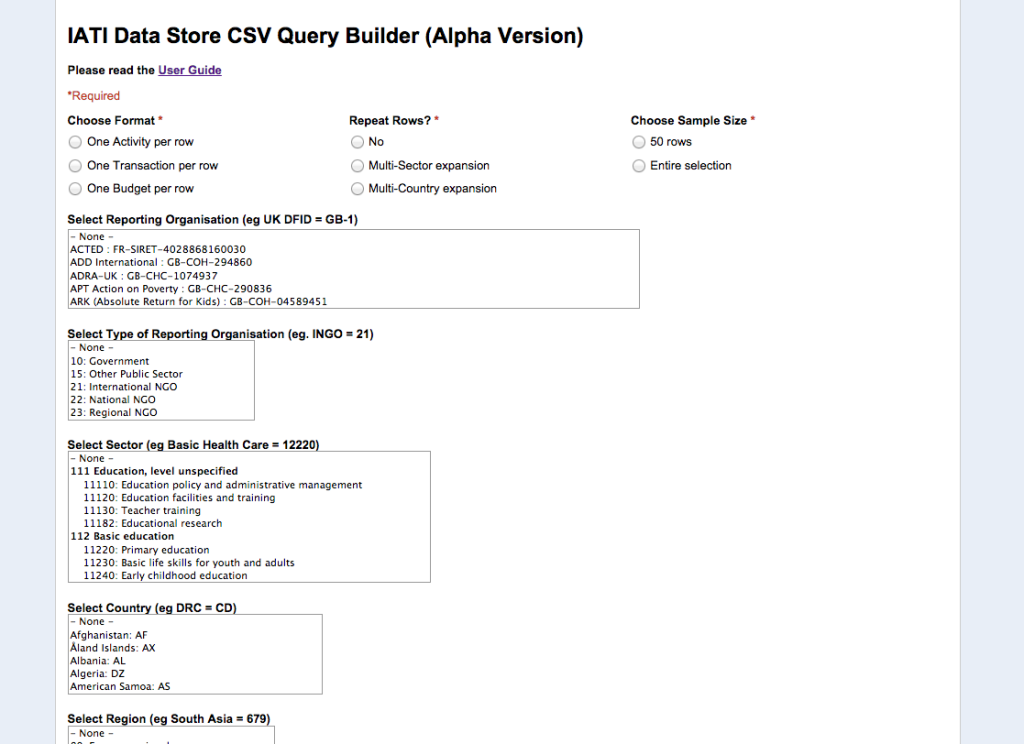
Step by step walkthrough

image_4

You should be met with something like the screen above when you click on the http://datastore.iatistandard.org/query/ .

The top three questions – Format, Repeat Rows, and Choose Sample Size are all mandatory.

Choose Format:

Here, you can choose the level of granularity you want in the CSV you will get. The easiest way to illustrate this is by looking at the data:

Let’s say we’re interested in what Action Aid UK is doing in Bangladesh.

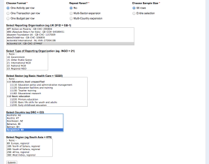
If we select ‘One Activity per row’, ‘No” to repeating Rows and ‘50 rows’ sample size, then we would select ‘Action Aid UK’ in Reporting Organisation, and Bangladesh in the Country option. The screen would look something like this:

image_5

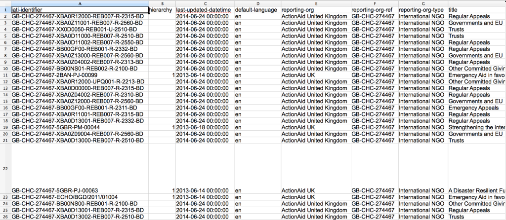
We’ll get a link to a dataset that looks like this:

image_6

You can also download this data directly from DataHub, here.

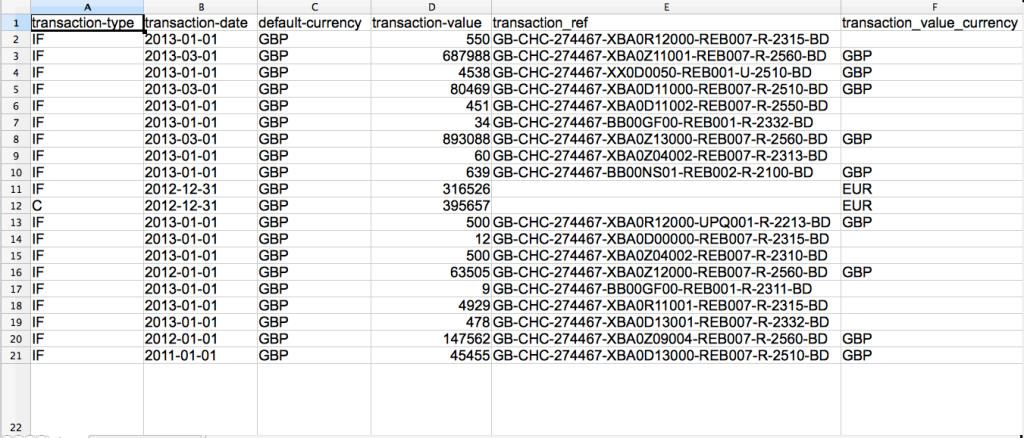
For comparison, now do the same (selecting ‘Action Aid UK’ and ‘Bangladesh’ as above) but instead of selecting One Activity per row,, choose One Transaction per row.

This looks something like:

image_7

(Download this data directly here)

And one last time – compare it to the data you get when selecting One Budget per row, which will give you:

image_8

(Download this data directly here)

So maybe we can now see the differences already: essentially, One Activity per row is showing activities, or projects, carried out by the reporting organisation.

One Transaction per row is much more granular: it has information on every transaction, or transfer of money, between donor organisation to implementing organisation (in this case, Action Aid UK to Action Aid Bangladesh), and each transaction has an identifier, so it can, in theory, be tracked further.

One budget per row is higher level, and more aggregated: it shows from which date range the budget from the donor organisation is open, or running. It shows how much money is spent in total on certain projects or budgets.

With the Choose Country – this can be either the country in which the activities are taking place, or the country of the donor organisation.

As with the IATI Registry, described above, you can also choose which fields you select- only the top three are actually mandatory. In general, this is probably the best way to get data to then work with afterwards- though usually, it will require some cleaning first. (See module, Cleaning IATI data with OpenRefine.)

Have a play!

IATI API

What is it? An [API (application programming interface)](https://schoolofdata.org/handbook/recipes/intro-to-apis/) for IATI data: ie. a way for applications to communicate with one another.
Who is it useful for? Developers building applications with IATI data, people wanting IATI data in XML, CSV, or JSON.
Give me an example of what I can get here… An XML of all DFID activities in the Democratic Republic of Congo.
Bear in mind… If you’ve not used APIs before directly, then there are other places (ie. the CSV query builder) through which you can get files of the data you’re looking for, in an easier way.
Where can I go for further guidance? It’s well documented on the page above, http://datastore.iatistandard.org/docs/api/

Sources of data about IATI data

ie. metadata about what is in the registry – how many datasets, how often certain publishers are publishing their data

IATI Registry API

What is it? An API on meta data (ie. data about the data) for IATI data, which returns the data in JSON format.
Who is it useful for? People wanting to build applications about what data is going into the IATI Registry, and where it is from.
Give me an example of what I can get here… Data about DFID’s publishing activities – how often they publish, how much they have published, etc.
Where can I go for further guidance? The IATI Technical Advisory Group discussion list

IATI Dashboard

What is it? It provides statistics, charts and metrics on data accessed via the IATI Registry, generated nightly from the IATI data on the registry. Essentially, metadata on IATI data (data about the data).
Who is it useful for? People wanting to track IATI data – see who is publishing and how much, rather than diving directly into the data itself. Or, for publishers themselves to see the state of data; it can also be a useful tool to point to when talking to publishers about their IATI data.
Give me an example of what I can get here… An overview of how many activities are published to IATI in total, updated daily.
Bear in mind…
Where can I go for further guidance? The IATI Dashboard README  and the IATI Dashboard FAQs

IATI Updates

What is it? A site which makes it really easy for you to see how often different organisations are publishing to IATI, and what they have most recently published.
Who is it useful for? People who might be specifically interested in a certain organisation: unlike on the Dashboard, you can search and select by organisation, to see what their average activities are, and via the [Revisions](http://tracker.publishwhatyoufund.org/iatiupdates/revision/) option, see what exactly they have recently published.
Give me an example of what I can get here… A list of the most recent files (=’packages’) that the African Development Bank published to IATI.
Where can I go for further guidance? It’s pretty self-explanatory, so no particular guidance documents here. If you have any particular problems, it’s probably easiest to open an issue on the Github repository

Further resources: