You are browsing the archive for HowTo.

Discover patterns in hundreds of documents with DocumentCloud

- August 20, 2016 in Fellowship, HowTo

If you’re a journalist (or a researcher), say goodbye to printing all your docs in a file, getting them into a folder, and highlighting those with markers, adding post-its and labels. This heavy burden of reading, finding repeated information and highlighting it can be done for you by DocumentCloud: it allows you to reveal the names of the people, places and institutions mentioned in your documents to line up dates in a timeline, to save your docs on the Cloud in a private way – and with the option to make them public later.

DocumentCloud is an Open Source platform, and journalists and other media professionals have been using it as online archive of digital documents and scanned text. It provides a space to share source documents.

A major feature of DocumentCloud is how well it works with printed files. When you upload a PDF scanned as an image, the platform will read it with Optical Character Recognition (OCR) to recognize the words in the file. This allows investigative journalists to upload documents from original sources and make them publically accessible, and for the documents to be processed much more easily.

Some other features include:

  • Running every document through OpenCalais, a metadata technology from Thomson Reuters that aggregates other contextual information to the uploaded files. It can take the dates from a document and graph them in a timeline or help you find other documents related to your story.

  • Annotating and highlighting important sections of your documents. Each note that you add will have its own unique URL so that you can have all in order.

  • Uploading files in a safe and private manner, but you have also the option to share those documents, make them public, and embed them. The sources and evidence of an investigation don’t have to stay in the computer of a journalist or the archives of a media organization – they can go public and become open.

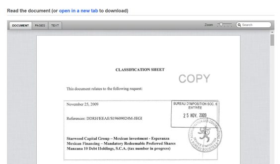
  • Review of the documents that other people have uploaded such as files, hearing transcripts, testimony, legislation, reports, declassified documents and correspondence.

The platform in action

A while ago, an investigation on the manipulation of the buying system at the Guatemalan social insurance revealed a network of attorneys, doctors, specialists and associations of patients that forced the purchase of certain medicines for terminal patients. It was led by Oswaldo Hernández from *Plaza Públic*a, and DocumentCloud was at the core of the investigation process.

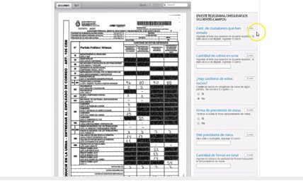
“I searched for words like ‘Doctor’ or ‘Attorney’ to find out the names of the people involved. That way I was able to put together a database and the relationships between those involved. It’s like having a big text document where you can explore and search everything”, explains Hernández.

When analysing one of the documents about medicines, DocumentCloud shows the names of people and institutions that are repeated in the text in a graphic plot.

image alt text

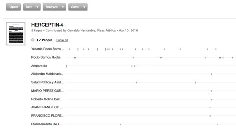
A screenshot of the graphic analysis that DocumentCloud plots from the uploaded files

Four creative uses of DocumentCloud

Below are some examples of how you can produce different types of content when you mix uploaded information, creativity and the functions of this tool.

The platform VozData, from the Argentinian newspaper La Nación, combines their own code with the technology of DocumentCloud to set up an openly collaborative platform that transforms Senate expense receipts into open and useful information by crowdsourcing it.

image alt text

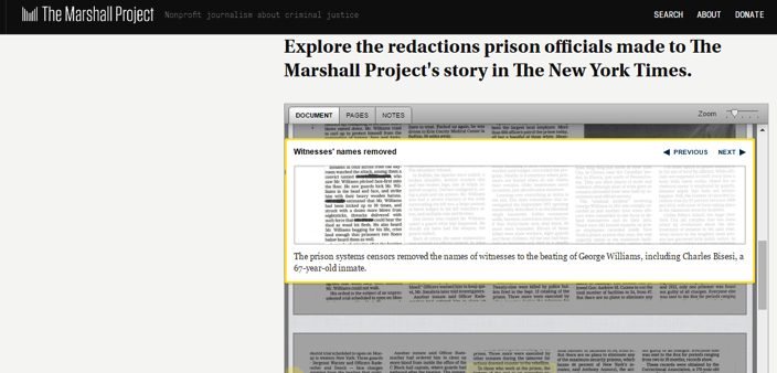
Due to the fact that their investigation about violence in a prison got published in The New York Times, *The Marshall Projec*t did a follow-up about how the prison officers censored the names of some guards and interns, and also aerial photos of the prison when the newspaper was distributed to prisoners.

image alt text

The I*nternational Consortium of Investigative Journalists *(ICIJ) uses DocumentCloud so that readers can access the original documents of the Luxembourg Leak, secret agreements that reduced taxes to 350 companies across the world and approved by the Luxembourg authorities.

image alt text

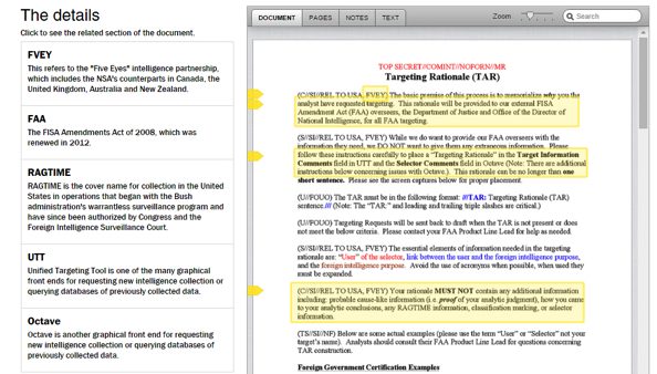
The* Washington Post *used the software to explain the set of instructions that the US National Security Agencys gives to their analysts, so that whenever they fill a form to access databases and justify their research, they don’t reveal too much suspicious or illegal information.

image alt text

So, next time, when you have to do tons of research using original documents, you can make it publicly available through DocumentCloud. And, even if you’re not a journalist, you can still use this tool to browse their extensive catalogue of documents uploaded by journalists across the world.

Flattr this!

Course outline: mobile data collection with ODK

- November 13, 2015 in HowTo

##Introduction

Decades ago, the use of papers and pen was a painstaking and very expensive effort to collect data. Most of us have experienced paper forms getting wet or damaged, or receiving paper forms that were barely answered. But as the age of smartphones and tablets arrived, mobile-based data collection technologies have also gained a huge following. The use mobile data collection tools has also improved the conduct of surveys and assessments. Some of the advantages of using mobile data collection are:

  • Most people are using smartphones for SMS messaging and have access to mobile data connection. According to Wikipedia, The Philippines is currently 12th across the world with the most number of cellphones, with more than 100 million cellphones which is more than our population!
  • In the absence of laptops and desktop computers, smartphones are cheaper and easier to use.
  • Mobile-based data collection compared with the use of paper forms, lessens the risk of losing the data when paper forms are damaged or lost.

One of the tools that was frequently used by information managers is the Open Data Kit (ODK). This was first introduced in the Philippines during the Typhoon Pablo response in 2011 for project monitoring. In the next emergency responses, ODK has been used to conduct one-off surveys and rapid needs assessments during and directly following disasters. While there is a huge variety of online and offline data collection tools, ODK has gained a lot of users because it is free, open source, easy to use and can be used both offline and online. Since ODK is a free and open source set of tools which help organizations author, field, and manage mobile data collection solutions, ODK in itself has evolved in several platforms and formats such as Kobo Toolbox which I prefer to use, GeoODK, KLL Collect, Formhub, Enketo, each one seeking to customize the use of ODK according to their own needs.

ODK provides an out-of-the-box solution for users to:

  1. Build a data collection form or survey (XLSForm is recommended for larger forms);
  2. Collect the data on a mobile device and send it to a server; and
  3. Aggregate the collected data on a server and extract it in useful formats.

This will be a basic course using Kobo Toolbox as one of the many platforms in which ODK forms are built, collected and aggregated for better data collection and management. According to Kobo Toolbox, acknowledging that many agencies are already using ODK, a de facto open source standard for mobile data collection, KoBo Toolbox is fully compatible and interchangeable with ODK but delivers more functionality such as an easy-to-use formbuilder, question libraries and integrated data management. It also integrates other open-source ODK-based developments such as formhub and Enketo. Kobo Toolbox can be used online and offline. You can share the data and monitor submissions together with other users and it offers UNLIMITED use for humanitarian actors.

##Course requirements

  • basic understanding of Excel
  • a good smartphone using Android 4.0 with at least 1 gb of disk space
  • a good understanding on how to design a survey questionnaire
  • a Kobo Toolbox account (you can create one here)

##Course Outline

Module 1: Creating your Data Collection Form (Excel)

Module 2: Uploading and Testing your forms using Kobo Toolbox

Module 3: Setting up and using your forms on your Android device

Module 4: Managing your data using Kobo Toolbox

Flattr this!

Quick tip: copy every item from a multi-page list

- May 18, 2015 in HowTo

A very simple but useful trick !

##The multipage lists

On the web, many websites publish lists over multiple pages. They allow for better browsing and quicker loading. But that makes copying them a hassle.

For this tutorial we will use the website Allflicks US. You will find on the homepage 7,365 movies spread over 295 pages (at the time of writing). 25 movies are shown on each page. Have fun copying that! Scraping them would not be that hard, but there is an easier way.

image alt text

Allflicks.net

###Word of warning

  • The trick only works with lists which have a menu to select the number of items being shown, along with previous and next buttons.

  • This trick works very well with average-sized lists: around 20,000 items. Over that number, your computer may freeze, as did mine when trying to load a 40,000 item list. A workaround can be found at the end of this tutorial.

###’Inspect Element’

The idea is to display all the 7,365 listed movies on a single page. To do so, right click the selector for the number of displayed items, and choose ‘Inspect Element’.

image alt text

Inspect Element

Once the code editor of your browser has opened, click on the small arrow at the right of the highlighted line. You should see the screen below:

The initial source code

What we want to change is the ‘value=100’. Edit it with a double click and replace 100 by 7365. If you feel it necessary, you can change the text of the button itself by modifying the other ‘100’, between the option tags. Any text put there will appear directly on the page::

The new source code

You now only have to select this button to make all the movies appear on a single page !

/!\ Be sure not to have this button selected before modifying it: if you modify the ‘value=100’ button, make sure that you were originally on the ‘value=25’ button or any other.

/!\ It might take a few seconds to load.

Copy/paste

When you have the whole list on a single page, just copy and paste it where you want (Excel, Google Spreadsheet). It might take some time here as well.

We’re done!

image alt text

###How not to freeze your computer

For bigger lists, you can split the work by limiting the number of items shown on the page: previous and next buttons still work! So a 80,000 list can be copied in 4 chucks of 20,000 using the ‘next’ button.

Flattr this!

Data expedition tutorial: UK and US video game magazines

- February 3, 2015 in HowTo

Data Pipeline

This article is part tutorial, part demonstration of the process I go through to complete a data expedition alone, or as a participant during a School of Data event. Each of the following steps will be detailed: Find, Get, Verify, Clean, Explore, Analyze, Visualize, Publish

Depending on your data, your source or your tools, the order in which you will be going through these steps might be different. But the process is globally the same.


FIND

A data expedition can start from a question (e.g. how polluted are european cities?) or a data set that you want to explore. In this case, I had a question: Has the dynamic of the physical video game magazine market been declining in the past few years ? I have been studying the video game industry for the past few weeks and this is one the many questions that I set myself to answer. Obviously, I thought about many more questions, but it’s generally better to start focused and expand your scope at a later stage of the data expedition.

A search returned Wikipedia as the most comprehensive resource about video game magazines. They even have some contextual info, which will be useful later (context is essential in data analysis).

Screenshot of the Wikipedia table about video game magazines
https://en.wikipedia.org/wiki/List_of_video_game_magazines

GET

The wikipedia data is formatted as a table. Great! Scraping it is as simple as using the importHTML function in Google spreadsheet. I could copy/paste the table, but that would be cumbersome with a big table and the result would have some minor formatting issues. LibreOffice and Excel have similar (but less seamless) web import features.

importHTML asks for 3 variables: the link to the page, the formatting of the data (table or list), and the rank of the table (or the list) in the page. If no rank is indicated, as seen below, it will grab the first one.

Once I got the table, I do two things to help me work quicker:

  • I change the font and cell size to the minimum so I can see more at once
  • I copy everything, then go to Edit→Paste Special→Paste values only. This way, the table is not linked to importHTML anymore, and I can edit it at will.

VERIFY

So, will this data really answer my question completely? I do have the basic data (name, founding data, closure date), but is it comprehensive? A double check with the French wikipedia page about video game magazines reveals that many French magazines are missing from the English list. Most of the magazines represented are from the US and the UK, and probably only the most famous. I will have to take this into account going forward.

CLEAN

Editing your raw data directly is never a good idea. A good practice is to work on a copy or in a nondestructive way – that way, if you make a mistake and you’re not sure where, or want to go back and compare to the original later, it’s much easier. Because I want to keep only the US and UK magazines, I’m going to:

  • rename the original sheet as “Raw Data”
  • make a copy of the sheet and name it “Clean Data”
  • order alphabetically the Clean Data sheet according to the “Country” column
  • delete all the lines corresponding to non-UK or US countries.

Making a copy of your data is important

Tip: to avoid moving your column headers when ordering the data, go to Display→Freeze lines→Freeze 1 line.

Ordering the data to clean it

Some other minor adjustments have to be made, but they’re light enough that I don’t need to use a specialized cleaning tool like Open Refine. Those include:

  • Splitting the lines where 2 countries are listed (e.g. PC Gamer becomes PC Gamer UK and PC Gamer US)
  • Delete the ref column, which adds no information
  • Delete one line where the founding data is missing

EXPLORE

I call “explore” the phase where I start thinking about all the different ways my cleaned data could answer my initial question[1]. Your data story will become much more interesting if you attack the question from several angles.

There are several things that you could look for in your data:

  • Interesting Factoids
  • Changes over time
  • Personal experiences
  • Surprising interactions
  • Revealing comparisons

So what can I do? I can:

  • display the number of magazines in existence for each year, which will show me if there is a decline or not (changes over time)
  • look at the number of magazines created per year, to see if the market is still dynamic (changes over time)

For the purpose of this tutorial, I will focus on the second one, looking at the number of magazines created per year Another tutorial will be dedicated to the first, because it requires a more complex approach due to the formatting of our data.

At this point, I have a lot of other ideas: Can I determine which year produced the most enduring magazines (surprising interactions)? Will there be anything to see if I bring in video game website data for comparison (revealing comparisons)? Which magazines have lasted the longest (interesting factoid)? This is outside of the scope of this tutorial, but those are definitely questions worth exploring. It’s still important to stay focused, but writing them down for later analysis is a good idea.

ANALYSE

Analysing is about applying statistical techniques to the data and question the (usually visual) results.

The quickest way to answer our question “How many magazines have been created each year?” is by using a pivot table.

  1. Select the part of the data that answers the question (columns name and founded)
  2. Go to Data->Pivot Table
  3. In the pivot table sheet, I select the field “Founded” as the column. The founding years are ordered and grouped, allowing us to count the number of magazines for each year starting from the earliest.
  4. I then select the field “Name” as the values. Because the pivot tables expects numbers by default (it tries to apply a SUM operation), nothing shows. To count the number of names associated with each year, the correct operation is COUNTA. I click on SUM and select COUNT A from the drop down menu.

This data can then be visualized with a bar graph.

Video game magazine creation every year since 1981

The trendline seems to show a decline in the dynamic of the market, but it’s not clear enough. Let’s group the years by half-decade and see what happens:

The resulting bar chart is much clearer:

The number of magazines created every half-decade decreases a lot in the lead up to the 2000s. The slump of the 1986-1990 years is perhaps due to a lagging effect of the North american video game crash of 1982-1984

Unlike what we could have assumed, the market is still dynamic, with one magazine founded every year for the last 5 years. That makes for an interesting, nuanced story.

VISUALISE

In this tutorial the initial graphs created during the analysis are enough to tell my story. But if the results of my investigations required a more complex, unusual or interactive visualisation to be clear for my public, or if I wanted to tell the whole story, context included, with one big infographic, it would fall into the “visualise” phase.

PUBLISH

Where to publish is an important question that you have to answer at least once. Maybe the question is already answered for you because you’re part of an organisation. But if you’re not, and you don’t already have a website, the answer can be more complex. Medium, a trendy publishing platform, only allows images at this point. WordPress might be too much for your need. It’s possible to customize the Javascript of tumblr posts, so it’s a solution. Using a combination of Github Pages and Jekyll, for the more technically inclined, is another. If a light database is needed, take a look at tabletop.js, which allows you to use a google spreadsheet as a quasi-database.


Any data expedition, of any size or complexity, can be approached with this process. Following it helps avoiding getting lost in the data. More often than not, there will be a need to get and analyze more data to make sense of the initial data, but it’s just a matter of looping the process.

[1] I formalized the “explore” part of my process after reading the excellent blog from MIT alumni Rahoul Bhargava http://datatherapy.wordpress.com

Flattr this!

Web scraping in under 60 seconds: the magic of import.io

- December 9, 2014 in HowTo

This post was written by Rubén Moya, School of Data fellow in Mexico, and originally posted on Escuela de Datos.


Import.io is a very powerful and easy-to-use tool for data extraction that has the aim of getting data from any website in a structured way. It is meant for non-programmers that need data (and for programmers who don’t want to overcomplicate their lives).

I almost forgot!! Apart from everything, it is also a free tool (o_O)

The purpose of this post is to teach you how to scrape a website and make a dataset and/or API in under 60 seconds. Are you ready?

It’s very simple. You just have to go to http://magic.import.io; post the URL of the site you want to scrape, and push the “GET DATA” button. Yes! It is that simple! No plugins, downloads, previous knowledge or registration are necessary. You can do this from any browser; it even works on tablets and smartphones.

For example: if we want to have a table with the information on all items related to Chewbacca on MercadoLibre (a Latin American version of eBay), we just need to go to that site and make a search – then copy and paste the link (http://listado.mercadolibre.com.mx/chewbacca) on Import.io, and push the “GET DATA” button.

Screen Shot 2014-12-08 at 20.30.28

You’ll notice that now you have all the information on a table, and all you need to do is remove the columns you don’t need. To do this, just place the mouse pointer on top of the column you want to delete, and an “X” will appear.

Screen Shot 2014-12-08 at 20.31.02

You can also rename the titles to make it easier to read; just click once on the column title.

Screen Shot 2014-12-08 at 20.32.30

Finally, it’s enough for you to click on “download” to get it in a csv file.

Screen Shot 2014-12-08 at 20.33.26

Now: you’ll notice two options – “Download the current page” and “Download # pages”. This last option exists in case you need to scrape data that is spread among different results pages of the same site.

Screen Shot 2014-12-08 at 20.34.21

In our example, we have 373 pages with 48 articles each. So this option will be very useful for us.

Screen Shot 2014-12-08 at 20.35.13

Screen Shot 2014-12-08 at 20.35.18
Good news for those of us who are a bit more technically-oriented! There is a button that says “GET API” and this one is good to, well, generate an API that will update the data on each request. For this you need to create an account (which is also free of cost).


Screen Shot 2014-12-08 at 20.36.07

As you saw, we can scrape any website in under 60 seconds, even if it includes tons of results pages. This truly is magic, no?
For more complex things that require logins, entering subwebs, automatized searches, et cetera, there is downloadable import.io software… But I’ll explain that in a different post.

Flattr this!

User Experience Design – Skillshare

- November 28, 2014 in HowTo

“User Experience Design is the process of enhancing user satisfaction and loyalty by improving usability, ease of use and pleasure provided in the the interaction between the user and the product.”

This week Siyabonga Africa, one of our fellows in South Africa, led an amazing introduction to how to think about your users when designing a project to make sure they get the most out of it. In case you missed it – you can watch the entire skillshare online and get Siya’s slides.

Video:

Slides:

Where can I learn more?

For more in the skillshare series – keep your eye on the Open Knowledge Google Plus page and follow @SchoolofData.

For more from Siyabonga – poke @siyafrica on Twitter.

Image Credits: Glen Scarborough (CC-BY-SA) .

Flattr this!

Tool Review: WebScraper

- October 13, 2014 in Community, HowTo

Crosspost from DataMeet.org

Usually when I have any scraping to do I ask Thej  if he can do it and then take a nap. However, Thej is on vacation so I was stuck either waiting for him to come back or I could try to do it myself. It was basic text, not much html, no images, and a few pages, so I went for it with some non coder tools.

I checked the School of Data scraping section for some tools and they have a nice little section on using browser based scraping tools. I did a chrome store search and came across WebScraper.

I glanced through the video sort of paying attention got the gist of it and started to play with the tool.  It took awhile for me to figure out.  I highly recommend very carefully going through the tutorials.  The videos take you through the process but are not very clear for complete newbies like me so it took a few views to understand the hierarchy concept and how to adapt their example to the site I was scraping.

I got the hang of doing one page and then figuring out how to tell it to go to another page, again I had to spend quite a bit of time rewatching the tutorial. At the end of the day I got the data in neat columns in CSV without too much trouble.  I would recommend WebScraper for people who want to do some basic scraping.

It is as visual as you can get though the terminology is still very technical.   You have to do into the developer tools folder which can feel intimidating but ultimately satisfying in the end.

Though I’ll probably still call Thej.

Flattr this!

Mapping Skillshare with Codrina

- October 10, 2014 in Community, Events, HowTo

Why maps are useful visualization tools? What doesn’t work with maps? Today we hosted a School of Data skillshare with Codrina Ilie, School of data Fellow.

Codrina Ilie shares perspectives on building a map project

What makes a good map? How can perspective, assumptions and even colour change the quality of the map? This is a one-hour video skillshare to learn all about map making from our School of Data fellow:

Learn some basic mapping skills with slides

Codrina prepared these slides with some extensive notes and resources. We hope that it helps you on your map journey.


Hand drawn map

Resources:

(Note: the hand drawn map was created at School of Data Summer Camp. Photo by Heather Leson CCBY)

Flattr this!

Data Visualization and Design – Skillshare

- September 26, 2014 in Community, Events, HowTo

Observation is 99 % of great design. We were recently joined by School of Data/Code for South Africa Fellow Hannah Williams for a skillshare all about the data visualization and design. We all know dataviz plays a huge part in our School of Data workshops as a fundamental aspect of the data pipeline. But how do you know that, beyond using D3 or the latest dataviz app, you are helping people actually communicate visually?

In this 40 minute video, Hannah shares some tips and best practices:

Design by slides

The world is a design museum – what existing designs achieve similar things? How specifically do they do this? How can this inform your digital storytelling?

Resources:

Want to learn more? Here are some great resources from Hannah and the network:

Hannah shared some of her other design work. It is great to see how data & design can be used in urban spaces: Project Busart.


We are planning more School of Data Skillshares. In the coming weeks, there will be sessions about impact & evaluation as well as best practices for mapping.

Flattr this!

Data Playlists

- September 25, 2014 in HowTo

Finding ways to learn new ways to play and work with data is always a challenge. Workshops, courses, and sprints are always a really great way to learn from people, and at the School of Data Fellow are doing that all over the world. In India there are lots of languages, different levels of literacy and technology adaption so we want experiment with different ways of sharing data skills.  It can be difficult put on a workshop or do a course, so we thought let’s start creating videos that can be accessed by people . It was important that the videos be easy to replicate and bite size, and that the format was flexible enough to accommodate different ways of teaching.  So we and others can experiment with different types of videos.

So instead of a single 10 minute video on how to use Excel we are asking people to create playlists of videos that are between 2 to 5 minutes long that are one concept or process presented i neach video.

Our first video is about formatting in Excel:

Don’t like excel? Do one for Open Spreadsheets or Fusion Tables.  English is not useful for your audience? Translate each video or put in subtitles, or do your own version. Have a new way to do this same skill? Create a 2 minute video and we can add it to the playlist.  Sharing your favorite tools and tricks for working with data is the main goal of this project.

If you want to do one there a few rules:

  1. Introduce yourself
  2. Break up the lesson by technique and make each video no more than 2 to 5 minutes.
  3. Make sure they are a playlist.
  4. Upload them to youtube and tag them DataMeet and School of Data
  5. Let us know!

If you have any feedback or a video request please feel free to leave it in the comments. We will hopefully release 2 playlists every month.

Adapting from post on DataMeet.org

Flattr this!