You are browsing the archive for Michael Bauer.

Hacking the world’s most complex election system: part 1

- August 22, 2014 in Uncategorized

School of Data Fellow Codrina and Michael spent their week hacking the Bosnian election system. This is their report back:

OLYMPUS DIGITAL CAMERA

Elections are one of the most data-driven events in contemporary democracies around the world. While no two states have the same system rarely can one encounter an election system as complex as in Bosnia and Herzegovina. It is of little surprise that even people living in the country and eligible to vote often don’t have a clear concept of what they can vote for and what it means. To solve this Zasto Ne invited a group of civic hackers and other clever people to work on ways to show election results and make the system more tangible.

Through our experience wrangling data we spent the first days getting the data from previous elections (which we received from the electoral commission) into a usable shape. The data levels were very dis-aggregated and we managed to create good overviews over the different municipalities, election units and entities for the 4 different things citizens vote on in general elections. All the four entities generally have different systems, competencies and rules they are voted for. To make things even more complicated ethnicities play a large role and voters need to choose between ethnic lists to vote on (does this confuse you yet?). To top this different regions have very different governance structures – and of course there is the Brcko district – where everything is just different.

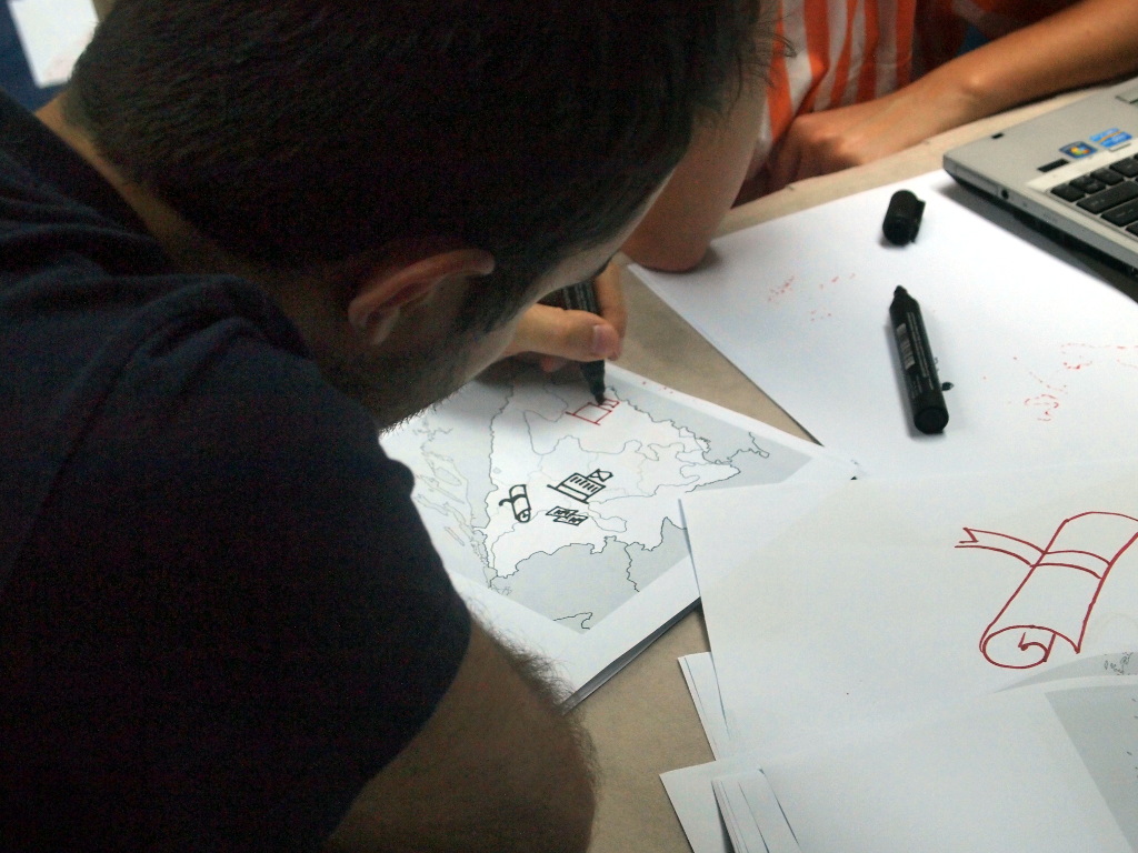
To be able to show election results on a map – we needed to get a complete set of municipal boundaries in Bosnia and Herzegovina. The government does not provide data like this: OpenStreetMap to the rescue! Codrina spent some time on importing what she could find on OSM and join it to a single shapefile. Then she worked some real GIS magic in QGis to fit in the missing municipal boundaries and make sure the geometries are correct.

Municipalities

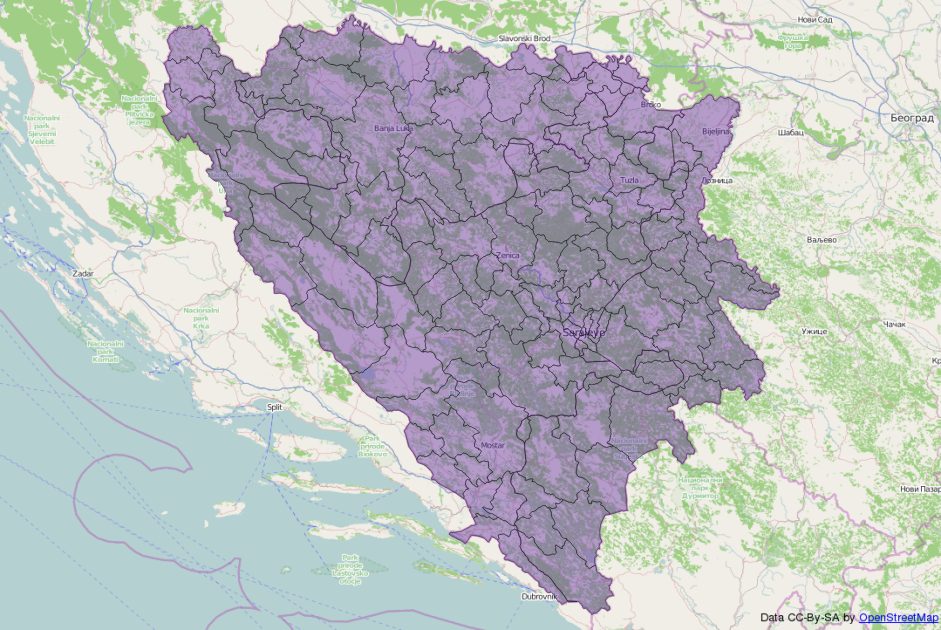
In the meanwhile Michael created a list of municipalities, their electoral codes and the election units they are part of (and because this is Bosnia, each municipality is part of 3-4 distinct electoral units for the different elections except of course Brcko where everything is different). Having this list and a list of municipalities in the shapefile we had to work some clever magic to get the election id’s into there. The names (of course) did not fully match between the different data sets. Luckily Michael had encountered this issue previously and written a small tool to solve this issue: reconcile-csv. Using OpenRefine in combination with reconcile-csv made the daunting task of matching names that are not fully the same less scary and something we could quickly accomplish. We discovered an interesting inaccuracy in the OpenStreetMap data we used and thanks to local knowledge Codrina could fix it quite fast.

What we learned:

  • Everything is different in Brcko
  • Reconcile-CSV was useful once again (this made michael happy and Codrina extremely happy)
  • Michael is less scared of GIS now
  • OpenRefine is a wonderful, elegant solution for managing tabular data

Stay tuned for part 2 and follow what is happening on github

Flattr this!

Join us! Explore Copenhagen’s bicycle paths using data

- June 19, 2014 in Data Expeditions


Do you ride a bicycle or know someone who does? If you live in Copenhagen, your answer to this question is probably a resounding “yes”.
Known as the most bike friendly city in the world, more people in greater Copenhagen commute by bicycle than everyone who rides bikes to work IN THE ENTIRE UNITED STATES.
There are many more interesting and surprising stories waiting to be discovered in the comprehensive cycling statistics that Denmark collects every day.

Riding a Bike

Help us unlock those stories – join our data expedition as part of the Kopenlab citizen science festival!
You will explore different aspects of cycling data in a small team and learn from each other as well as our guide in how best to create interesting and compelling stories using data.
No experience needed – just curiosity and a sense of adventure! Plus, you’ll have a guide to help you every step of the way.

Monday June 23rd
13:00 to 16:00
Thorvald Bindesbølls Plads.

Join the team by registering for free here. Everyone is welcome!

Flattr this!

An Expedition into Tanzanian Waterpoints

- June 12, 2014 in Data Expeditions


Recently our Fellow Ketty, David from Code For Africa and Michael spend a week in Tanzania. While their main task was to work with the Ministry of Water they decided to host a Data Expedition on their last day – diving with others into the data that was available. Here’s what they did:

image00

On Friday morning a mixed crowd of approximately 15 people met us at the Buni innovation space – run by the TanzICT project. We’ve split into groups and had a good look at the data – figuring out what it contains and what we can do with it. While one group decided to look whether there is a relationship between political affiliations of MPs and waterpoint construction, the other went ahead to do some mapping using QGIS.

Figuring out MP affiliations based on constituencies is not hard – interestingly the governing party holds a lot of seats. However, figuring out how constituencies really map to waterpoints is a hard task. There are no official boundaries for constituencies – so we couldn’t map the points and count the newly constructed points in each constituency. Also: there is no ward – constituency mapping (e.g. these wards belong to this consituency). The only thing we could get (from the national election committee) was a mapping of constituencies by region. By this point we realized the data we got is not good enough to do a proper analysis. Nevertheless, we did some scraping and a good introduction to descriptive statistics using stata (done by a participant who knew how to deal with it)

The mapping topic was inspired by people who wanted to learn more about mapping software. They were jointly running a project to map farmland plot ownership across Tanzania. We came to a conclusion that although, there was no official dataset detailing farmland plot ownership in Tanzania, the water point locations can still be mapped to farmland plots in the future since availability of water is an important part of farm activities- this was a shot at being inclusive!

We decided to use the Tanzania water dataset to demonstrate how they might use QGIS in their project while at the same time learning more about Tanzania waterpoints. We answered questions like:

How many water points are functional, non functional or need repair in the the country?

But thought it better to answer the question at a smaller administrative scale like the Iringa region to have more detailed analysis.

We also thought knowing only the number of functional water points alone might not be enough, so why not compare it with the population served? We visualised this on a map in QGIS.

image02
Key
image01

At a glance from the map, we noticed there are no water points in the Western part of Iringa region but also that on average, one functional water point serves 100 people, from the ratio 5159:466518 also ratio of number of functional water points in Iringa to population served by functional water points.

We rounded the day of with David doing an extensive presentation and workshop on visualizing some of the data using fusion tables and showing some of code for africas past projects. Digging deeper into ideas what can be done with similar data.

Overall, the day was insightful and the participants were interested and happy to have exploration of public data happening in Tanzania. We concluded with eager discussions and sharing our experience and outlooks on the Open Data process in Tanzania (it’s on the way – we’ll need some patience but it is happening). Special thanks to the Buni innovation space and TanzICT for hosting us!

Flattr this!

How to earn a Badge at the School of Data (screencast)

- March 11, 2014 in Update

How to Earn a Badge at the School of data

This is a short screencast on how to earn a Badge at the School of Data.

You can earn Badges by completing the following modules:

Also you can get badges by attending events or participating in a data expedition!

Flattr this!

Badges are Here! Get yourself some.

- February 28, 2014 in Update

Starting today the School of Data supports Open Badges to acknowledge and reward your efforts to use data effectively. Get them for learning, participating and special achievements and show what you are doing around the School of Data.

Badges

Open Badges are a fantastic way to track and reward all the informal learning you do around the web. At the School of Data we decided to use them as a main tool for you to keep a record what you’re doing. We are not alone: Around the world educational institutions and other groups are awarding badges for learning and engagement – the School of Data now joins in, allowing you to better show skills you gained and things you did.

You’ll ask yourself – so what exactly do I have to do to be awarded a badge? Depending on the badge you’ll have to:

More possibilities will come.

To display your badges you’ll need to sign-up to a backpack – don’t worry you can do so on the way. The backpack is a virtual accessory that collects all your badges and allows you to display subsections of it. If you’re proud that you participated in a Data Expedition e.g. you can select to show that badge off to everyone!

Now what are you waiting for? Get yourself some badges!

Flattr this!

Help us alpha test the School of Data

- February 24, 2014 in Update

Exciting times are ahead at the School of Data. Currently we’re working hard behind the scenes to implement Open Badges. Badges will allow you to show (informally) what you’ve learned and done at the School of Data.

To get badges we’re revamping the Quizzes found on the bottom of some courses – if you answer a quiz and give an email address, you’ll receive a badge!

If you have 5-10 minutes spare, your help in getting the new infrastructure ready would be greatly appreciated! You can test the new quizzes, and/or the feedback form.

Both will be embedded into the School of Data website – and if you play it right you’ll be awarded an exclusive “alpha tester” badge! To claim the badge you’ll need to sign up for Mozilla’s backpack – don’t worry you can do this along the way.

If you find any bugs or unintended behavior: Please notify us either on schoolofdata [at] okfn.org or post an issue on github

Thank you, dear community!

Flattr this!

A deep dive into fuzzy matching in Tanzania

- December 6, 2013 in Uncategorized

Map of school enrolment, Tanzania

Map of school enrolment

Our Data Diva Michael Bauer spent his last week in Dar Es Salaam working with the Ministry of Education, the Examination Council, and the National Bureau of Statistics on joining their data efforts.

As in many other countries, the World Bank is a driving force behind the Open Government Data program in Tanzania, both funding the initiative and making sure government employees have the skills to provide high-quality data. As part of this, they have reached out to School of Data to work with and train ministry workers. I spent the last week in Tanzania helping different sources of educational data to understand what is needed to easily join the data they collect and what is possible if they do so.

Three institutions collect education data in Tanzania. The Ministry of Education collects general statistics on such things as school enrollment, infrastructure, and teachers in schools; the Examination Council (NECTA) collects data on the outcomes of primary and secondary school standardized tests; and finally, the National Bureau of Statistics collects the location of various landmarks including markets, religious sites, and schools while preparing censuses. Until now, these different sets of data have been living in departmental silos. NECTA publishes the test results on a per-school level, the ministry only publishes spreadsheets full of barely usable pivot tables, and the census geodata has not been released at all. For the first time, we brought these data sources together in a two-day workshop to make their data inter-operable.

If the data is present, one might think we could simply use it and bring it together. Easier said than done. Since nobody had previously thought of using their data together with someone else’s before, a clear way of joining the datasets, such as a unique identifier for each school, was lacking. The Ministry of Education, who in theory should know about every school that exists, pushed hard for having their registration numbers used as unique identifiers. Since this was fine for everyone else, we agreed on using them. First question: where do we get them? Oh, uhhm…

There is a database used for the statistics created in NECTA’s aforementioned pivot table madness. A quick look at the data led everyone to doubt its quality. Instead of a consistent number format, registration numbers were all over the place and needed to be cleaned up. I introduced the participants to OpenRefine for this job. Using Refine’s duplicate facet, we found that some registration numbers were used twice, some schools were entered twice, and so on. We also discovered 19 different ways of writing Dar Es Salaam and unified them using the OpenRefine cluster feature—but we didn’t trust the list. On the second day of the workshop, we got our hands on a soft copy (and the books) of the school registry. More dirty data madness.

After seeing the data, I thought of a new way to join these datasets up: they all contained the names of the schools (although these were written differently) and the names of the region, district, and ward the schools were in. Fuzzy matching for the win! One nice feature Refine supports is reconciliation: A way of looking up entries against a database (e.g. companies in opencorporates). I decided to use the reconciliation service to look up schools in a CSV file using fuzzy matching. Fuzzy matching is handy whenever things might be written differently (e.g. due to typos etc.). Various algorithm help you to figure out which entry is closest to what you’ve got.

I went to work and started implementing a reconciliation service that can work on a CSV file, in our case a list of school names with registration numbers, districts, regions, and wards. I built a small reconciliation API around a fuzzy matching library I wrote in Clojure a while back (mainly to learn more about Clojure and fuzzy matching).

But we needed a canonical list to work from—so we first combined the two lists, until on the third day NECTA produced a list of registration numbers from schools signing up for tests. We matched all three of them and created a list of schools we trust, meaning they had the same registration number in all three lists. This contained a little less than half of the schools that allegedly exist. We then used this list to get registration numbers into all data that didn’t have them yet, mainly the NECTA results and the geodata. This took two more packed days working with NECTA and the Ministry of Education. Finally we had a list of around 800 secondary schools where we had locations (the data of the NBS does not yet contain all the regions), test results, and general statistics. Now it was all a matter of VLOOKUPs (or cell.cross in Refine), and we could produce a map showing the data.

After an intensive week, I left a group of government clerks that now had an air of breaking for new borders. We’ll continue to work together, getting more and more data in and making it useable inside and outside its institutions. Another result of the exercise is reconcile-csv, the fuzzy matching reconciliation service developed to be able to join messy datasets like the ones on hand.

Flattr this!

Visiting Electionland

- November 6, 2013 in Data Stories, HowTo


After the German elections, data visualization genius Moritz Stefaner created a map of election districts, grouping them not by geography but by election patterns. This visualisation impressively showed a still-existing divide in Germany. It is a fascinating alternative way to look at elections. On his blog, he explains how he did this visualization. I decided to reconstruct it using Austrian election data (and possibly more countries coming).

Austria recently published the last election’s data as open data, so I took the published dataset and cleaned it up by removing summaries and introducing names for the different states (yes, this is a federal state). Then I looked at how to get the results mapped out nicely.

In his blog post, Moritz explains that he used Z-Scores to normalize data and then used a technique called Multidimensional Scaling (MDS) to map the distances calculated between points into 2-dimensional space. So I checked out Multidimensional Scaling, starting on Wikipedia, where I discovered that it’s linear algebra way over my head (yes, I have to finish Strang’s course on linear Algebra at some point). The Wikipedia article fortunately mentions a R command cmdscale that does multidimensional scaling for you. Lucky me! So I wrote a quick R script:

First I needed to normalize the data. Normalization becomes necessary when the raw data itself is very hard to compare. In election data, some voting stations will have a hundred voters, some a thousand; if you just take the raw vote-count, this doesn’t work well to compare, as the numbers are all over the place, so usually it’s broken down into percentages. But even then, if you want to value all parties equally (and have smaller parties influence the graph as much as larger parties), you’ll need to apply a formula to make the numbers comparable.

I decided to use Z-Scores as used by Moritz. The Z-Score is a very simple normalization score that takes two things, the mean and the standard deviation, and tells you how many standard deviations a measurement is above the average measurement. This is fantastic to use in high-throughput testing (the biomed nerd in me shines through here) or to figure out which districts voted more than usual for a specific party.

After normalization, you can perform the magic. I used dist to calculate the distances between districts (by default, this uses Euclidean distance) and then used cmdscale to do the scaling. Works perfectly!

With newly created X and Y coordinates, the only thing left is visualization—a feat I accomplished using D3 (look at the code—danger, there be dragons). I chose a simpler way of visualizing the data: bubbles the size of voters in the district, the color of the strongest party.

Wahlland visualization of Austrian general Elections 2013
(Interactive version)

You can see: Austria is less divided than Germany. However, if you know the country, you’ll find curious things: Vienna and the very west of Austria, though geographically separated, vote very similarly. So while I moved across the country to study when I was 18, I didn’t move all that much politically. Maybe this is why Vienna felt so comfortable back then—but this is another story to be explored another time.

Flattr this!

Visualizing the US-Government Shutdown

- October 1, 2013 in Data Stories, HowTo


As of Today the US Government is in Shutdown. That means that a lot of employees are sent home and services don’t work. The Washington Post Wonkblog has a good story on What you need to know about the shutdown. In the story they list government departments and the percentage of employees to be sent home. I thought: this could be done better – visual!

Gathering the Data

The first thing I did is gather the data (I solely used the blog post mentioned above as a source). I started a Spreadsheet containing all the data on departments. I decided to do this manually, since the data is pretty unstructured and keep the descriptions – since I want to show them on the final visual.

Visualizing

Next up was visualization – I thought how can we show this. I quickly sketched a Mockup.

Mockup

Then I started to work. I love D3 for visualizations and Tarek had just written a fabulous tutorial on how to draw arcs in d3. So I set out…

I downloaded the data as CSV and used d3.csv to load the data…. Next I defined the scale for the angles – for this I had to know the total. I used underscore to sum it up and create the scale based on this.

var totale=.reduce(.map(raw, function (x) {
return parseInt(x.Employees) }),function (x,y) { return x+y })

var rad=d3.scale.linear()
.domain([0,totale])
.range([0,2*Math.PI]);

Perfect – next, I needed to convert the data to define my arc formula and do start and stop ranges…

var arc = d3.svg.arc()
.innerRadius(ri)
.outerRadius(ro)
.startAngle(function(d){return rad(d.start);})
.endAngle(function(d){return rad(d.end);});

data=[];
sa=0;
_.each(raw, function(d) {
data.push({"department":d.Department,
"description":d.Description,
"start":sa,
"end":sa+parseInt(d.Employees),
"home":parseInt(d.Home)})
sa=sa+parseInt(d.Employees);
})

Great – this allowed me to define a graph and draw the first set of arcs…

svg=d3.select("#graph")
.append("svg")
.attr("width",width)
.attr("height",height);

g=svg.append("g")
.attr("transform","translate("+[width/2,height/2]+")")

depts=g.selectAll("g.depts")
.data(data)
.enter()
.append("g")
.attr("class","depts")

depts.append("path")
.attr("class","total")
.attr("d",arc)
.attr("style", function(d) { return "fill: "+
colors(d.department)})

You’ll notice how I created a group for the whole graph (to translate it to the center) and a group for each department. I want to use the department groups to have both the total employees and the employees still working…

Next, I wanted to draw another arc on top of the arcs for the employees still working. This looked easy at first – but we want our visualization to represent the percentages also in percentage area right? So we can’t just say: Oh if there’s 50% working we just draw a line in the middle between inner and outer radius. What we need is to calculate the second radius (using a quite complicated formula (it took me a while to deduct and I thought I should be able to do that much maths…))

The formula is implemented here:

var rd=function(d) {
var rho=rad(d.end-d.start);
var i=0.5Math.pow(ri,2)rho;
var p=(100-d.home)/100.0;
x2=Math.pow(ro,2)p-(ip-i)/(0.5*rho)
return Math.sqrt(x2);
}

I’ll need another arc function and then I can draw the arcs:

var arcso = d3.svg.arc()
.innerRadius(ri)
.outerRadius(function(d) {return rd(d) })
.startAngle(function(d){return rad(d.start);})
.endAngle(function(d){return rad(d.end);});

depts.append("path")
.attr("class","still")
.attr("d",arcso)
.attr("style", function(d) {
return "fill: "+
colors(d.department)})

Perfect – some styling later this already looks good. The last thing i needed to add was the hovers (done here) and we’re done:

See the Full code on github!

Flattr this!

Seeing is believing – measuring is evidence.

- September 9, 2013 in Uncategorized


graphic

Recently an Austrian newspaper published the graph above. It was part of an interesting story on how people viewed the different political parties. One thing is notable: The first row and the fourth row are nearly similar – except the fourth row has much more on the left side (distrust) then the first. Let’s put them together to see this:

together

Now check the numbers – telling the percentage of people (dis)-trusting – note how the bar on the fourth (that says 31%) is nearly as long as the one next to it saying 40%? Let’s look at it with a line helping us:

graphic-line

Look at this: Someone made a mistake (or intended to show a difference bigger than it really was). This is pretty clear cut and several readers noted this in the comments below the article.

How much is it off?

Let’s find out how much it is wrong. Going back from graphs to numbers is challenging and a tricky process – I use a tool called imagej made to measure graphics (you can also do this using your graphics manipulation program). I measure the length of all the bars. Based on this and the value we can calculate whether the graph is well made. Two things are important to us: the start point (y) and the scale (x). The scale tells us how many pixels were used per unit, the start point at which value the graph started.

This gives the following formula for any bar: L=y+x*V (L is the length in pixels, V the value of the data-point). Since we do have two unknowns we need a second value/length pair to do the calculation L1=y+x*V1 – transforming this tells us x=(L-L1)/(V-V1) and y=L-x*V. This way we can calculate both scale and starting point. I did this in a spreadsheet for all the bars next to each other – since your measuring will be slightly inaccurate x and y will vary. I simply took the median of all x and y as their final values. Now we can calculate the expected length for each value point and the difference it has to the measured length: Most of the bars are about the right size (I do think this is measurement mistakes) – however the bar in question is 13-14 pixels too long. Gotcha sloppy data journalist.

Want more: @adrianshort did this for uk election advertisements

Flattr this!